Green with envy – or was it ivy?
July 31, 2010

Kruispoorte version #1, 2009, a lovely painting but perhaps the development of the greens was a little flat.
Anyone who attempts to paint landscape has to deal sooner or later with the problem of green. Of course, some might not even consider it to be a difficulty – but I do. So what’s the problem? In a nutshell: #1) the profusion of greens in the natural world contrasted to #2) the difficulty of rendering them to any degree of accuracy on the pallete/canvas/panel.

Kruispoorte version #2, 2010, blue level, I’m struggling with my differentiations here.
From a pigment point of view, there are relatively few tube greens out there in contrast to the wide arrary of tube choices for other colors. Viridian, the strongest green pigment, is widely used, otherwise if you need something different, you just mix it up from some combo of yellow and blue, or even yellow and black. However, if you attempt (as I do) to arrive at a beautiful green through color layering (for example, a blue glaze over a yellow substrate) then you might indeed create a wonderful green, but find yourself unable to modulate it very much to it’s other (very green) surroundings. Hence an indirect technique for color development is a bit too inflexible.

Kuuispoorte #2, 2010, brown glaze level, a solution of sorts.
Thus, my current approach, to painting in general, but also to green in particular, is to minimize my pigment choice, decide on an approach and then modulate my color relations to it. For painting greens, this can mean using or mixing a master green, modulating a master chartreuse, blue green and/or gray green from that. Then tints and shades from each of those. If I am painting wet into wet, then the color of my glaze will certainly have a direct (color) effect. If it is an earth glaze (umber or sienna), the effect is quite grounding (no pun intended). Nevertheless, color is absolutely relational (a la Josef Albers) and nowhere is this more true than in the attempt to render the multitudinous greens of the natural world.
I’d rather be blue…
July 14, 2010
 My theory of painting is simply this: travelling has to be at least as interesting as finally arriving. It helps to have a numinal idea of what arriving should actually look like, but it wouldn’t be “art” if I already knew, would it? Thus, I always experience a certain kind of hesitancy as I approach the final levels in a painting. Do I really want the journey to end? Will this level “do” it? Or will it need more? And if so: what, where, how? Will the final image end up looking like a bored adult in comparison to its earlier youthful promise? Should I have stopped at some earlier vantage point along the way and just grabbed the ‘chute?
 Additionally, imposing a chromatic structure on image development allows for lots of lateral exploration at each level of additional color. Or to put it in even simpler terms, it helps me to control chaos. Chaos of my own emotions and my emotional reactions either to the subject matter or the developing image in front of my nose. But too much control results in lifelessness, too little, and it’s just chaos.
 Riding the surge of that inbetween space, of that wave, is richly rewarding: both exhilirating and terrifying. Committing myself to it involves a kind of surrender and also a kind of trust. If I imagine that the landscape I paint is essentially external to me, if I imagine that the paints I use are essentially “other”, if I imagine that the world itself is not a part of me and myself a part of it, then there is fear.
So, instead of experiencing distance to it all like some alien stranger, I’d rather be blue (thalo or ultramarine, to be exact)…
I am curious, yellow?
June 17, 2010
 It isn’t often that I have numerous paintings completed to the same level at the same time. However, since I am preparing for an exposition and have entered into production mode on a number of pieces, right now I have four paintings drying in their yellow stage. There is something particular and special to be seen in these “monochromatic” stages which soon will be integrated into full blown colorful images.
 It is a curious level, one of overall hue reduction, of lowered value contrast too, of subtle nuances and above YELLOW, contrasted against gray (which of course becomes pushed towards its complement, purple). The underpainted hues that have been developed in the egg tempera stage shine through subtly, as gentle reminders of potential futures, still yet to be heeded or ignored. Who can tell?
 Even an abstract background that I know is intended to become a “blue” sky will have elements of the sun’s yellow light within it. If I state it now, it will always be there, ready to rise to the occassion by the brush’s trumpet call.
 Thus, succcessive stages build back upon the basic statements made in the yellow layer. Warm reds and vibrant greens depend upon a good solid yellow. Yet sometimes, I find myself satisfied with the yellow layer just as it is. Fini. Perhaps it’s only my insatiable curiosity which keeps me wondering about what’s round the next bend, keeping me from lingering with the yellow level and just calling it “done”. So, I document it here: an interesting level, worthy of note, even if today it’s only electronic.
Recently, I surfed around to see if I could find information relating to a painting process I use which I’ve always called “the mixed technique” or “the mixed method”. I didn’t find much info (in English) using that term, but got a lot more results when I used the term “mische technique”. Although “a rose is a rose is a rose is a rose”, I can see that people who want to inform themselves about this particular process of indirect painting could very well find themselves confused (which I have been), not only about the name, but more importantly about its properties. So I thought I’d try to post what I know. I am no expert and make no claims to be so. I’m just an enthusiastic experimenter.
Thus, there appears to be a very specific application of indirect painting currently called the “mische technique” or even the “mischtechnik” (from Wikipedia). It’s described as an attempt to reconstruct the methods of the early Flemish masters by using “egg tempera to build up volume which is then glazed over with oil paints mixed with resin to produce a jewel-like effect”. The contemporary painters Ernst Fuchs, his student Brigid Marlin and the Society of Art of Imagination seem to me to be the most active exponents of this particular method. Although I’m not sure that the Flemish masters used Red, Yellow and Blue for their imprimatura-undercoats (as it is described on a Brigid’s website) nevertheless, their “mische technique” process appears to be highly effective for luminous, surrealistic Dali-esque imagery. If you are drawn to both this kind of subject matter and this manner of execution, I suggest you check out their links.

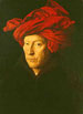
Near the village, October by George Inness
Yet the super realism of the “mische technique” – as it is presented on the web – is not really my thing. I tend to be drawn to softly abstracted, beautifully modulated, luminous landscape. Think: George Inness. Think: Tonalism and Luminism. Thus I am deeply drawn to a method of indirect painting which takes advantage of building up an image through multiple layers of paint, allowing for transcendent effects of both light and color. And I use something I call the “mixed method” or “mixed technique” to achieve that.
The process I know, which was taught by Nicholas Wacker at the Ecole des Beaux Arts in Paris during the nineteen sixties and seventies, is also called “the mixed technique” or “mixed method” . It, too, is touted as a reconstruction of the methods of the old masters, although I tend to think its application extends far beyond the precise realism of the Flemish school and the modern surrealists of the “mische technique”. The main aspect of this method is the mixing of an emulsion of water and oil which allows for lean, siccative image development through multiple layers of paint: the essence of an indirect technique. It also allows for soft sensuous blending (without contamination) of adjacent color areas (really luscious wet on wet effects). It demands a well considered composition with interesting value development so that you have a good idea of where you intend to go. Nevertheless, many surprising chromatic events occur during the act of painting, making each “alla prima” session an exciting, challenging process of discovery.
So is the “mixed technique” fundamentally different than the “mische technique” as taught by Wacker? No, not really, but instead of egg yolk, alcasit (a methyl cellulose glue) is used to emulsify the painting emulsion – so there is a longer shelf life. Additionally, high quality, lean, tube oil colors can be used and mixed with the painting emulsion. This has the effect of enhancing the flow and siccative qualities of the tube paint, without forcing the laborious work of grinding each pigment into emulsion in order to create paint. The side effect of that being an extended range of quickly available colors along with the acknowledged down side of a probable reduction in the number of layers of paint that are finally possible. Thus, the rule of fat over lean always applies, even though it can be extended.
The bottom line: the term “mixed” or “mische” refers to the mixing or extending of a water based medium like that of egg tempera into the region of oils – and vice versa – that is, limiting the oily quality of an oil paint through applying resins and emulsion so that it, too, can more easily interact and receive the benefits of the leaner application of a water based paint, like that of egg tempera.
the Disadvantages/Requirements
- long learning curve
- patience
- vision
the Advantages:
- luminosity
- surprising “in the moment” color effects
- seductive tactile blending
If there is someone reading this who has more information or experience than I on this subject, please consider yourself more than welcome to comment or correct mine. Thanks…
Painting: backwards and forwards
March 4, 2010
OK, OK, I admit it. I am in love with glazing. Like non-duality, it has the capacity of unifying many disparate elements, without negating them. (And isn’t that wonderful???) As ever, translucency is the key. But the tricky thing is the application. Too much glazing and the painting has a tendency to float off the panel; too little and the thick opaque paint just stays stuck in the mud, reflecting little or no light. Of course, you can see the same principle reflected in people’s lives. Too little inspiration and we have the tendency to stay stuck in our comfortable grooves; too much inspiration – without a transparent application to the mundane activities of living – and that wonderful poetry, lacking substance, falls short of its mark.

Korte Sint Annastraat value study

Korte Sint Anna black and white
I began the piece by transposing my black and white drawing to a 30 x 60 cm. gessoed panel. I like to use silverpoint for the first level of drawing. It is very soft and can render lots of intimate details. It tends to create an ambience that invites image development. Silverpoint catches well on the toothy gesso, so the mark lands and does not require too much repetitive movement. Then using india ink, I add touches of higher contrast that push forward the gesture of the composition – but only in the foreground. The idea is to build up the visual effects of distance from the get go. Every layer will play a role. So the black and white level sets up the basics. I’ve decided to add “I Am” to the sky. (the decision occurred after I made the photograph, so Photoshop has come to my display rescue)

Korte Sint Anna Egg tempera

Korte Sint Annastraat mixed technique #1

Korte Sint Annastraat mixed technique #2

Korte Sint Annastraat mixed technique #3
Comments, as usual are welcome…
After years of experimentation and study, I have come to a technique that at least allows for the possibility of fine painting, in my case landscapes. I’ll try to describe it briefly here below using illustrations from a current project, the Sint Anna Kerk here in Brughes. The value study is completed “en plen air”; the studio work is done in the atelier in successive stages, each oil session is completed “alla prima” (within a few hours). The intent is to capture as much spontneity as possible, within the long time frame that defines an indirect technique.
 The start is a value study describing mid-afternoon light. It’s usually a simplified version of where I hope to finally go. I consider it invaluable for setting up both the composition and tonality of the final piece. This study here is done with pencil, white chalk and ink on standard charcoal paper. Highlights and shadows are developed to render a simple direct statement. Any addition information needed can be augmented from photographs and direct observation, since I live around the corner, though I try more and more to rely on my own pictorial memory.
 The main elements of the composition are transposed to a panel using line, texture, shading and form. Traditionally, fine drawing pens loaded with india ink are used for transferring the linear, graphical part of the drawing but I have recently been experimenting with using a silverpoint stylus for my underdrawing. The final result is softer, warmer and subtler than india ink (see the grey tones). However, that descriptive subtlety is often lost in the intervening layers of paint, thus, I have begun augmenting the silver point with india ink in order to accentuate the contrasts of the foreground. Thus, distance is described from the beginning in a few ways. The decisions made now guide many aspects of the final result, so it is important to be sure and thus avoid pentimento.
 In order to minimize the amount of oil needed to achieve layers of color, I use a traditional egg tempera technique to begin the painting. Oil can be painted over egg (fat over lean), however egg cannot be painted over oil. In addition, egg tempera must be painted on a hard, firm surface, otherwise it will crack, thus the panel is prepared with a traditional gesso surface.
I use the egg tempera technique to indicate basic broad areas of local color. All objects at this point are better stated as pastel suggestions rather than full strong colors. In this version of the Sint Anna Kerk, I have been careful to keep my colors light in order to avoid an oversaturated painting in the middle and background areas. I have learned (the hard way) that control of hue, saturation and value are critical for describing distance. The vibrations of complimentary colors are hinted at but not yet fully explored. Also, I try to use single pigments only for spectral purity; no color mixing is done on the pallette. Colors (like certain greens and oranges) that might require mixing are indicated through separate layers of translucent paint. This layer will be dry to the touch almost immediately, but it should dry at least one week before attempting to work in oil.
 Although it may seem like a sin to cover the fine egg tempera painting with a blanket of brown, the imprimatura quickly helps to establish the overall key of the piece as well as to unify any disparate elements. The previous egg tempera layer must be not only completely dried but sealed with a layer of glue size to protect it from the succeeding layers of oil based paints. The lines and colors of the previous layers continue to shine through, adding texture and interest, particularly in the mid tones and shadows. The imprimatura is a mixture of damar varnish, turpentine, and brown pigment (in this case, burnt umber). I brush it on, wait a minute or so and then wipe it off with a dry, lint free, soft clean cloth.
Since I was very interested to retain the purity of the whites in the highlight areas of the picture, I went back into the fresh imprimatura with a brush dipped in fresh turpentine to remove the brown tint from the highlight areas. My theory/concept is that even though I will be painting over these areas in white oil paint to create mass and to soften edges, whatever is underneath ultimately does matter. If I want to somehow simulate the intensity of pure light – even if it is reflective and not transmissive – then the purity of the original gessoed board is important. I let the imprimatura then dry a day or so, and begin painting in the Mixed Technique.
 I squeeze a quantity of cadmium yellow onto the pallette and dip a thin, wide bristle brush into the clear medium (1 part Damar, 1 part Stand Oil, 1 part Turps), then scumble in a very thin coat of yellow over the whole surfce. It sets for a minute or so and then I wipe it back off with a soft, lint free cloth. The idea is to leave some translucent color tint with some tack and work the first levels of oil back into it. Because it’s a panel and not canvas, the tackiness of the oil/varnish medium catches the brush stroke well, functioning like the weave of a canvas in attracting the brushstroke yet leaving no trace of a fabric-like texture.
At this stage, I work with two basic colors, yellow and gray. I mix up a gray to match the same value of the pure cadmium yellow medium, in order to set the overall darkest value. I then mix up a series of tints (5 or 6 steps) from both the gray and the yellow to white. I begin painting in large areas trying to quickly cover the whole painting with one of these tints, using a thick bristle brush and an emulsion for the pigments (1 methyl cellulose glue, .5 oil/.5 varnish, 1 water) which hastens the drying time. The drawing and egg tempera levels have already set the stage, so to speak, and function not only as guides but also as mirror like reflections. It takes only a few strokes to bring out a form. I use a fan shaped dry brush to merge forms together.
It’s fine to be working with a limited palette now, thinking ahead by laying in a more saturated yellow for both the greens and the oranges. I use the gray for neutral tonalities, shadow and to suggest distance. The overall contrast is quite low.
 I squeeze a small amount of a cool, translucent red pigment out onto a pallette board. In this case I use crimson lake, in the past I have used alizarin crimson. Dipping a wide, flat bristle brush into clear medium (1T,1D,1SO) and then into the pigment, I proceed to scumble a thin layer of translucent red over the entire piece. After a minute or so, I wipe this off with a clean soft cloth, taking off as much pigmented medium as possible. The remaining surface has a slight tack to the touch.
I mix up three colors this time. Red, in a series of tints up to white. Warm gray mixed in a series of tints up to white and yellow, mixed in the same way. (The value of the pure red is the same value as the pure warm gray, both being close to a pure medium gray value.) Using a big bristle brush and emulsion, I work quickly to re-establish all the values and colors of the intended piece. Occassionally I need to mix a color that requires a combination of two of the premixed tints.
But look, some strong greens are emerging although I haven’t used any green or blue pigment yet! It’s only yellow refracting back through levels of drawing, egg tempera, imprimatura and glaze. Because I use an emulsion (1 methyl cellulose glue, .5 oil/.5 varnish, 1 water) as my painting medium, the work dries quickly, the colors maintain a level of transparency, and the layers of paint are rather lean.
 This is the blue level. I premix my intended colors: yellow in a series of 5-6 tints up to white, red, blue and Payne’s gray all mixed in the same way. There are about 20 little blobs of paint, which I may or may not use but I want to be able to work quickly and precisely in my choices.
I squeeze out a small amount of pure cyan (Thalo Blue) and dip my brush in clear medium (1T, 1V, 1 SO). Cyan is a highly saturated pigment with strong tinting power so a little goes a long way. I scumble it on and after a few moments wipe it back off, leaving a slightly tacky surface that has still more blue in it than I would actually prefer. I remind myself to use Ultramarine Blue next time…
I begin to reclaim the highlights and quarter tones, working with a big brush for starters. Any color I paint now picks up a bit of blue from the glaze. Hmmm…that’s good and it unifies the painting, but is there too much blue? A lot of unexpected colors start to happen. OK, let them emerge. I need to reintroduce the main color contrasts, like the orange for the clay tile roof, the brown bricks and the green vegetation. After the main value and hue statements are set, a few details are reintroduced with a smaller brush to help refine those shapes: window and trim, shadows and highlights. After a few hours, I’ve covered the panel. But is it done?
 After the blue session, all the color statements have been made and I’m happy, sort of, but there remains a bluish tint to the whole piece. I could leave it that way, but the intended gray of the church steeple and road pavement encourage me to attempt some gray balance adjustment. So, I cover the entire piece with a clear glaze of medium and wipe it back off (as usual). I mix up a series of tints using Payne’s gray this time as it is both darker and more neutral than the lighter warm gray pigment I have been using. I squeeze out lead white but mix it 50/50 with titanium white; since the painting is moving into it’s oilier stages. I strengthen the pure whites, the gray steeple and pavement, even scumble some body back into the buildings on the shadow side of the street. I put a glaze of yellow on the buildings on the left for local color, and add the final highlights to the tree. There is not much to do, but what is done crisps up value contrasts and defines gray balance.
Eh, voila. C’est fini! The cherries on top are the final touches of gold to the church steeple.
Mixed Technique
May 7, 2009
Jan van Eyck mixed technique
The term mixed method or mische technique is generally used to refer to the painting technique of Jan Van Eyck and the Flemish Masters. The mixed part quite literally refers to the method of intermixing the usage of both water based and oil based mediums to create a pictorial image. It requires both patience and sufficient knowledge in order to achieve an attractive result. Traditionally the resulting image was super realistic, but it does not have to be. The main thing is you need to know where you are going. This method allows for the creation of multiple layers of paint which through their superimposition over one another create beautiful effects of both light and color: the essence of abstraction. My own “mische technique” is a bit of a hybrid, using the traditional recipes for sessions of indirect painting and yet allowing each session to be a complete alla-prima painting session.
Nicolas Wacker
The originator of the modern adaptation of the so called mische technique, is a Russian man named Nicholas Wacker, who taught at the Ecole des Beaux Arts, Paris in the early 80’s. I’ve received it from a friend who studied there at that time, thus here below are her class notes:
It is useful for brushability, quickness of drying and glaze layering. Through using this technique one can maximize the use of glaze while simultaneously painting opaque areas into the freshly laid on medium. A fan shaped dry brush can be used to blend and unify the surface. Strong areas can sink into the background while lighter tones can be emphasized. It seems possible that the yolk of an egg could be substituted for the alcasit, though I have never tried it.
Emulsion:
- 1- volume alcasit (methyl cellulose glue)
- 1- volume half of which is pure linseed oil with 1/5 eburit dryer (or sun thickened linseed) and half damar varnish 2:1
- 1- volume water
- Put liquids in a jar in the order written ( alcasit first) and with each addition cover the jar and shake it in well. I heard water could be as much as 3 volumes but never tried it. The result looks like mayonaise. (don’t eat it!)
Medium:
- 1 part damar varnish
- 1 part turpentine
- 1 part stand oil (sun thickened is also fine)
Coat panel or canvas with a light coat of glue size. For canvas, use a recipe for good lean priming (commercial lead white in oil, 1 pound thick paint, diluted with 3 fluid ounces of turpentine). Add at least 3 coats brushed on in opposite directions, lightly sanded in between (if you sand a surface containing any amount of lead white be sure to take precautions. Wear an appropriate mask to avoid inhaling the dust.). For gesso grounds on panels it is best to apply at least 10 thin coats painted in alternating directions, sanding in between coats.
The Design
Find an image from which you wish to work. It can be a reproduction of a painting you admire, or a drawing of your own. You should be able to render it in black and white value studies as well as forsee the addition of color. Transfer the drawing to the primed canvas or prepared panel. Render it in waterproof india ink. Be sure to erase all pencil lines after the drawing is transposed into ink. A final glue size is applied on all surfaces after the preliminary drawing but before the imprimatura.
Paints
It is best to mix fresh white for every session. Use a white powdered pigment (titanium or zinc – but not lead white for toxic reasons) and emulsion. I prefer titanium because of its covering power but it you want a more translucent white then you might choose zinc. Take a glass muller or spatula, pressing, dragging and blending the two together until a consistent texture is achieved. This helps considerably with quick drying. Pour a small amount of emulsion into a small cup or bowl. Use this to increase the brushability of your oil colors. Remember to always honor the fat over lean principle. If you are able grind up your own colors, you will be able to avoid buttery, oily colors from the manufacturer. In additon, you will learn first hand which pigments require more oil to achieve a workable consistency or in contrast which grind up easily and are therefore ‘lean’.
Imprimatura
The white ground is covered with a translucent middle tone. I usually use damar varnish diluted with turpentine 3(T):1(D) mixed with an earth tone (yellow ochre, an umber or a sienna). Using a wide bristle brush apply over the whole panel to achieve a common medium value for the beginning of the image. If you are painting over a traditional gesso ground this priming step is crucial so as to reduce the absorbency of your substrate. If you neglect doing this step you may have trouble with the “sinking in” of your oils later on. If you are painting over an oil primed canvas, just be sure to keep this imprimatura diluted enough to establish a good transparent middle tone. If it is too dilute you may have adhesion issues with the oil ground, if it is too oily, you will have adhesion issues with your successive layers. Time and experience will tell.
Session 1
After this imprimatura is dry, few days should suffice, you can begin to globally establish the values of the painting. Cover the entire painting with a fresh coat of clear medium. Take a clean, dust free cloth and wipe the surface of excess medium. The surface should be tacky and receptive.
Into this slightly tacky surface work in white mixed with emulsion for strong light areas and drag them into the background with a dry brush. This produces a soft way to suggest future values. After that, using a diluted tint of dark pigment (a sienna or an umber) to establish some of the three quarter tones in the shadows. This quickly establishes the values of the painting and you can step back and assess how your idea is working and correct where necessary at an early stage. At this stage it is important to work in passages of opacity, mixing your tones and colors with a bit of white pigment. Let it dry.
Session 2
Repeat the steps as described above. Starting to work in large blocks of color, alternating glaze or emulsion for transparent or opaque effects, respectively. Values can slowly be adjusted. One proceedes from coarse to fine detail. Highlights and shadows can be further refined by moving away from the midtones of the imprimatura while still remaining ‘unfocussed’. Later sessions can define fine highlights and precise shadows. Allow the image to emerge slowly. Don’t fall into the details – yet.
One lovely advantage of the mixed technique is brushability. You can paint one color next to another area of color, then using a dry brush gently blend one area into the other. The colors softly merge without contaminating each other. Good sable brushes are invaluable for manipulating paint; fine bristle brushes can be used for painting larger areas and dry merging. Each painter needs to find his/her own taste. But remember to keep your pigments as pure as possible. Color is color. Mud is mud.
Session 3 or more?
The painting needs to dry thoroughly in between sessions. By using the Mixed Technique and one’s own ground up lean colors, drying time can be greatly reduced. A week is usually enough. In the beginning stage when the painting is less saturated, the drying time might be only a few days. Techniques to insure a lean and thirsty ground are useful. I prefer painting on a firm panel coated with 10 thin coats of traditional chalk gesso. If you do not fully cover this panel with an underpainting of egg tempera, then a coat of size or an imprimatura as described above will be necessary to reduce the absorbency of the gesso. This technique will act differently on canvas, primed with white lead than it will on a panel primed with traditional gesso. The white lead will not be as absorbent.
How many sessions does it take to complete an image? This is best answered by experience. In general, don’t be impatient but also don’t be over generous with your (oily) glazes. Sooner or later there will be a point where the surface cannot receive any more paint. This is not a fast results technique. It can create lovely possibilites for translucent color effects enhanced in layers of glaze, yet contrasted by areas of solid color. Try it out for yourself.

