Indirect Painting with the Mixed Technique: Sint Anna Kerk
July 19, 2009
After years of experimentation and study, I have come to a technique that at least allows for the possibility of fine painting, in my case landscapes. I’ll try to describe it briefly here below using illustrations from a current project, the Sint Anna Kerk here in Brughes. The value study is completed “en plen air”; the studio work is done in the atelier in successive stages, each oil session is completed “alla prima” (within a few hours). The intent is to capture as much spontneity as possible, within the long time frame that defines an indirect technique.
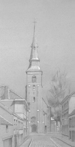 The start is a value study describing mid-afternoon light. It’s usually a simplified version of where I hope to finally go. I consider it invaluable for setting up both the composition and tonality of the final piece. This study here is done with pencil, white chalk and ink on standard charcoal paper. Highlights and shadows are developed to render a simple direct statement. Any addition information needed can be augmented from photographs and direct observation, since I live around the corner, though I try more and more to rely on my own pictorial memory.
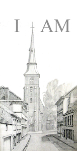 The main elements of the composition are transposed to a panel using line, texture, shading and form. Traditionally, fine drawing pens loaded with india ink are used for transferring the linear, graphical part of the drawing but I have recently been experimenting with using a silverpoint stylus for my underdrawing. The final result is softer, warmer and subtler than india ink (see the grey tones). However, that descriptive subtlety is often lost in the intervening layers of paint, thus, I have begun augmenting the silver point with india ink in order to accentuate the contrasts of the foreground. Thus, distance is described from the beginning in a few ways. The decisions made now guide many aspects of the final result, so it is important to be sure and thus avoid pentimento.
 In order to minimize the amount of oil needed to achieve layers of color, I use a traditional egg tempera technique to begin the painting. Oil can be painted over egg (fat over lean), however egg cannot be painted over oil. In addition, egg tempera must be painted on a hard, firm surface, otherwise it will crack, thus the panel is prepared with a traditional gesso surface.
I use the egg tempera technique to indicate basic broad areas of local color. All objects at this point are better stated as pastel suggestions rather than full strong colors. In this version of the Sint Anna Kerk, I have been careful to keep my colors light in order to avoid an oversaturated painting in the middle and background areas. I have learned (the hard way) that control of hue, saturation and value are critical for describing distance. The vibrations of complimentary colors are hinted at but not yet fully explored. Also, I try to use single pigments only for spectral purity; no color mixing is done on the pallette. Colors (like certain greens and oranges) that might require mixing are indicated through separate layers of translucent paint. This layer will be dry to the touch almost immediately, but it should dry at least one week before attempting to work in oil.
 Although it may seem like a sin to cover the fine egg tempera painting with a blanket of brown, the imprimatura quickly helps to establish the overall key of the piece as well as to unify any disparate elements. The previous egg tempera layer must be not only completely dried but sealed with a layer of glue size to protect it from the succeeding layers of oil based paints. The lines and colors of the previous layers continue to shine through, adding texture and interest, particularly in the mid tones and shadows. The imprimatura is a mixture of damar varnish, turpentine, and brown pigment (in this case, burnt umber). I brush it on, wait a minute or so and then wipe it off with a dry, lint free, soft clean cloth.
Since I was very interested to retain the purity of the whites in the highlight areas of the picture, I went back into the fresh imprimatura with a brush dipped in fresh turpentine to remove the brown tint from the highlight areas. My theory/concept is that even though I will be painting over these areas in white oil paint to create mass and to soften edges, whatever is underneath ultimately does matter. If I want to somehow simulate the intensity of pure light – even if it is reflective and not transmissive – then the purity of the original gessoed board is important. I let the imprimatura then dry a day or so, and begin painting in the Mixed Technique.
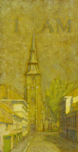 I squeeze a quantity of cadmium yellow onto the pallette and dip a thin, wide bristle brush into the clear medium (1 part Damar, 1 part Stand Oil, 1 part Turps), then scumble in a very thin coat of yellow over the whole surfce. It sets for a minute or so and then I wipe it back off with a soft, lint free cloth. The idea is to leave some translucent color tint with some tack and work the first levels of oil back into it. Because it’s a panel and not canvas, the tackiness of the oil/varnish medium catches the brush stroke well, functioning like the weave of a canvas in attracting the brushstroke yet leaving no trace of a fabric-like texture.
At this stage, I work with two basic colors, yellow and gray. I mix up a gray to match the same value of the pure cadmium yellow medium, in order to set the overall darkest value. I then mix up a series of tints (5 or 6 steps) from both the gray and the yellow to white. I begin painting in large areas trying to quickly cover the whole painting with one of these tints, using a thick bristle brush and an emulsion for the pigments (1 methyl cellulose glue, .5 oil/.5 varnish, 1 water) which hastens the drying time. The drawing and egg tempera levels have already set the stage, so to speak, and function not only as guides but also as mirror like reflections. It takes only a few strokes to bring out a form. I use a fan shaped dry brush to merge forms together.
It’s fine to be working with a limited palette now, thinking ahead by laying in a more saturated yellow for both the greens and the oranges. I use the gray for neutral tonalities, shadow and to suggest distance. The overall contrast is quite low.
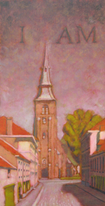 I squeeze a small amount of a cool, translucent red pigment out onto a pallette board. In this case I use crimson lake, in the past I have used alizarin crimson. Dipping a wide, flat bristle brush into clear medium (1T,1D,1SO) and then into the pigment, I proceed to scumble a thin layer of translucent red over the entire piece. After a minute or so, I wipe this off with a clean soft cloth, taking off as much pigmented medium as possible. The remaining surface has a slight tack to the touch.
I mix up three colors this time. Red, in a series of tints up to white. Warm gray mixed in a series of tints up to white and yellow, mixed in the same way. (The value of the pure red is the same value as the pure warm gray, both being close to a pure medium gray value.) Using a big bristle brush and emulsion, I work quickly to re-establish all the values and colors of the intended piece. Occassionally I need to mix a color that requires a combination of two of the premixed tints.
But look, some strong greens are emerging although I haven’t used any green or blue pigment yet! It’s only yellow refracting back through levels of drawing, egg tempera, imprimatura and glaze. Because I use an emulsion (1 methyl cellulose glue, .5 oil/.5 varnish, 1 water) as my painting medium, the work dries quickly, the colors maintain a level of transparency, and the layers of paint are rather lean.
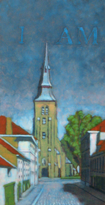 This is the blue level. I premix my intended colors: yellow in a series of 5-6 tints up to white, red, blue and Payne’s gray all mixed in the same way. There are about 20 little blobs of paint, which I may or may not use but I want to be able to work quickly and precisely in my choices.
I squeeze out a small amount of pure cyan (Thalo Blue) and dip my brush in clear medium (1T, 1V, 1 SO). Cyan is a highly saturated pigment with strong tinting power so a little goes a long way. I scumble it on and after a few moments wipe it back off, leaving a slightly tacky surface that has still more blue in it than I would actually prefer. I remind myself to use Ultramarine Blue next time…
I begin to reclaim the highlights and quarter tones, working with a big brush for starters. Any color I paint now picks up a bit of blue from the glaze. Hmmm…that’s good and it unifies the painting, but is there too much blue? A lot of unexpected colors start to happen. OK, let them emerge. I need to reintroduce the main color contrasts, like the orange for the clay tile roof, the brown bricks and the green vegetation. After the main value and hue statements are set, a few details are reintroduced with a smaller brush to help refine those shapes: window and trim, shadows and highlights. After a few hours, I’ve covered the panel. But is it done?
 After the blue session, all the color statements have been made and I’m happy, sort of, but there remains a bluish tint to the whole piece. I could leave it that way, but the intended gray of the church steeple and road pavement encourage me to attempt some gray balance adjustment. So, I cover the entire piece with a clear glaze of medium and wipe it back off (as usual). I mix up a series of tints using Payne’s gray this time as it is both darker and more neutral than the lighter warm gray pigment I have been using. I squeeze out lead white but mix it 50/50 with titanium white; since the painting is moving into it’s oilier stages. I strengthen the pure whites, the gray steeple and pavement, even scumble some body back into the buildings on the shadow side of the street. I put a glaze of yellow on the buildings on the left for local color, and add the final highlights to the tree. There is not much to do, but what is done crisps up value contrasts and defines gray balance.
Eh, voila. C’est fini! The cherries on top are the final touches of gold to the church steeple.

December 27, 2009 at 7:22 pm
Hi, I stumbled across your blog, while searching for certain photographs, more specifically, realist ones, I mean REALIST, not just taken from reality. What kind are yours and would you please send some examples to me, thanks.I’m also keen on Art, if you have time you can visit: http://www.allartclassic.com
Philip
August 19, 2015 at 9:32 am
[…] You can read about the work-up of this piece here. […]