Notes on figure drawing
June 28, 2012
I’ve been attending a weekly figure drawing session for over a year now. A local artist loves to draw from the live model so he throws open his studio on Monday nights and invites any and all like-minded others to join in. There’s usually jazz blowing through his sound system and a small fire in the wood burning stove. We chip in for the model’s fee and that’s that, no teacher, no guru: one naked body in motion and rest.
When I began coming to these sessions I hadn’t drawn from the figure in almost 25 years so I felt pretty rusty. For these last decades I’ve been concentrating on rendering landscape, which doesn’t move even though the light and atmospheric effects on it certainly do. So from my terrestrial work I knew about my penchant for motion, for tracing the land’s skeleton, for shapes and the contrasts of light and dark, but how to get the essence of model’s pose down quickly and with some sense of accuracy?
I began with medium toned gray paper, slashing out indistinct highlights and blocking in coarse shadows. Most days the figure floated somewhere in space, sometimes a bit amputated, or just distorted from forcing a three dimensional entity onto a two dimensional space. I experimented with different grades of pencil, conté crayon, oil pastels and sticks of black carbon.  I tried white sketching paper, cheap recycled toned drawing paper, charcoal paper and Canson Mi-Tientes, each medium possessing a different tactile quality for recording sensation. I felt myself like a caterpillar with legs and antennae outstretched, sensing these forward vibrations with my own febrile tentacles.
Ingrained in my little head are the words of a friend’s former teacher, Nicholas Wacker, of the Ecole des Beaux Arts in Paris.
- Mise en page (placement on the page)
- Circulation de la lumière (circulation of light)
- Grisaille (gray/shading)
Thankfully, these principles guide me like a mantra in each sucessive attempt. Over time I developed an approach. For longer poses I sketch in the outline of the figure using a 6B or 8B lead pencil on a heavy weight Canson pastel paper. When I am satisfied, I block in the essential highlights with white chalk or pastel. If I have time, I return for the shadow accents.
For the shorter poses, 8B pencil, red conté crayon or black chalk on toned paper suffices. I remember that no line is superfluous so I try to erase as little as possible. John Ruskin in The Elements of Drawing advises, if you begin gently enough, any inaccuracies can be corrected with a new and heavier line. All lines are forays into the unknown, honor them as such. But if it at some point it all turns into an illegible chaos then it’s simply time to start over. And no harm done.
More Painting Backwards
October 20, 2011
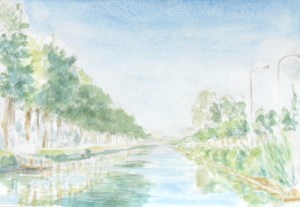
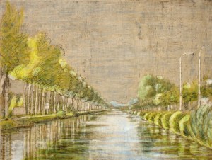
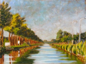
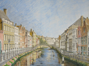
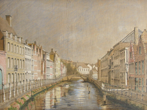
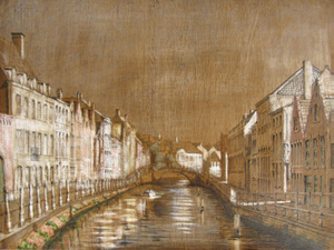
In early July this year I created a watercolor of a view along the Damse Vaart nearby Bruges, just in front of where the steamboat, the Lamme Goedzak, docks. I really liked the composition created by the canal stretching out into the distance, as well as the light of the evening as it progressed.
By remaining in one location for a few hours, just painting, just watching, I could let the scene tell me precisely which light to try and capture. The sun was slowly setting in the west (here in midsummer, it doesn’t completely descend until almost 11:00 p.m.), so although the composition in terms of land, trees and water did not change, the light on them certainly did. I snapped a few photographs of the different transitions as I made my choice.
Back in the studio I transposed the composition to a panel and quickly sketched in the main elements, suggesting the central movements and thrusts as I felt them, the textures and the chiaroscuro. I used india ink for the stronger value details and silver point for the lighter, softer ones. (sorry, no photo of this stage available) The next time the weather was good, I went back out to do an underpainting using egg tempera (in the field). Egg tempera is not a technique that easily lends itself to field work but I wanted to experiment. I worked with a limited palette and preground my colors into a paste using distilled water. Since I knew the last levels of painting would probably be in the studio, I wanted as much authenticity-of-place as possible. I decided to use the landscape color convention of stong yellows in the foreground, greens in the middle and blues for the background. Values were kept fairly light, with everything suggested yet still fairly coarse. (no photo available)
Two months later, after a rainy August, one month’s holiday and tons of other stuff inbetween, I had the chance to do the imprimatura. I mixed up a blob of burnt umber tube oil-color with retouch varnish (1 damar to 2 turps). I painted it on, letting it absorb into the panel for about a minute and then wiped it back off. It left a thin veil of warm brown over the whole image. With another small brush dipped in turpentine, I began wiping the brown tint back off from the pre-painted highlighted areas. Within fifteen minutes the process was complete, the highlights jumped out and the shadows pushed back, both filled with descriptive details and vibrating with life. I was tempted to call it done.
Nevertheless, the following year I decided to finish the piece – in the studio. I covered it with a tinted glaze of bunrt sienna and painted directly into that, wet-on-wet. This kept the wood areas vibrating with additional warmth and the greens and the blues well grounded. The challenge as always was to mix an array of receding greens to describe the distance. When it was dry I brought some highlights back in using tempera white (zinc white mixed with emulsion). Some of those final highlights required a little glazing just to bring it all back in balance. The resulting painting had a lovely color vibe, the red warmth of the wood contrasted to the greens (and yellows) of the vegetation.
Painting, Backwards
January 3, 2010
Painting (any painting) always involves pigment mixed into a medium and set upon a ground. The ground is usually white (or possibly even translucent), thus any pigment added to its surface subtracts from its luminosity and is a movement towards darkness. Alternatively stated, light is the source and darkness its covering. Painting reveals light and uses darkness to do so. If the ground is white, then the primal source of light in any painting is its substrate. This being the case, using and manipulating that source of luminosity is of utmost importance. I continually ask myself, is there a way to paint which can maximize the quality of transmissive light in its ground while contrasting it to the reflective quality of opaque pigments? Painting backwards could be one approach. I stumbled upon it by accident. Here’s what happened:
About a year ago, I began preparing a landscape painting in the usual way. First by gessoing a wooden panel, then by transferring my composition to it using silverpoint. The composition was of the canal in front of my house. I had already created a value study as well as a small oil of the same landscape setting. I was well pleased with both works but felt the composition could benefit from a grander view. So I added buildings to the right and left as well as more sky and water in the foreground. This had the effect of deepening the overall perspective. Nice. Additionally, to enhance the depth from the get go, I highlighted the darker contrasts of the foreground using india ink on top of the already established silverpoint drawing. Nice, again.
In order to minimize the number of layers necessary to create an image in oil, I started the underpainting in egg tempera. Rather than mixing a fully saturated color of the chosen pigment for each element in the image, I added white to each color to avoid oversaturated colors in the final painting. (Oversaturated colors can be lethal to the softly diminishing effects of an ephemerally suggested distance: a lesson I had learned the hard way.) So, all the colors were now set up and were rather pastel in character, complimentary color relationships were established, even if at this point they were still rather subtle.
The next step was unifying all the elements by establishing an overall mood. This is usually done by covering the ground with an imprimatura: a diluted oil color washed over the surface to establish a middle tone. So I painted on a brown imprimatura and then wiped it off. A tonality was established, but it wasn’t quite dark enough. I painted on a second layer of imprimatura just to increase the tonality. But then, rather than painting the highlights back in using white pigment, I decided to erase the imprimatura from the highlight areas using turpentine (I already knew exactly where these areas were as they were well articulated in the underdrawing). This erasing was working well, until I accidentally dipped my brush in distilled water instead of turps. My brush began to delete not only the imprimatura, but also the egg tempera underpainting, the india ink, and then the silverpoint, too. Oops!!! Not what I had intended…
Amidst my curses and exclamations, it became clear to me that I needed to continue this treatment to balance out the rest of the composition, a work of about 15 minutes. When I was done, my husband took a look at the painting and said, “I think you’re done.” And it was true.
Comments are welcome…
After years of experimentation and study, I have come to a technique that at least allows for the possibility of fine painting, in my case landscapes. I’ll try to describe it briefly here below using illustrations from a current project, the Sint Anna Kerk here in Brughes. The value study is completed “en plen air”; the studio work is done in the atelier in successive stages, each oil session is completed “alla prima” (within a few hours). The intent is to capture as much spontneity as possible, within the long time frame that defines an indirect technique.
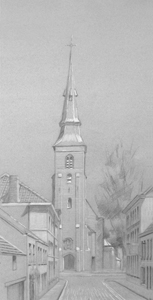 The start is a value study describing mid-afternoon light. It’s usually a simplified version of where I hope to finally go. I consider it invaluable for setting up both the composition and tonality of the final piece. This study here is done with pencil, white chalk and ink on standard charcoal paper. Highlights and shadows are developed to render a simple direct statement. Any addition information needed can be augmented from photographs and direct observation, since I live around the corner, though I try more and more to rely on my own pictorial memory.
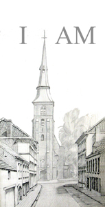 The main elements of the composition are transposed to a panel using line, texture, shading and form. Traditionally, fine drawing pens loaded with india ink are used for transferring the linear, graphical part of the drawing but I have recently been experimenting with using a silverpoint stylus for my underdrawing. The final result is softer, warmer and subtler than india ink (see the grey tones). However, that descriptive subtlety is often lost in the intervening layers of paint, thus, I have begun augmenting the silver point with india ink in order to accentuate the contrasts of the foreground. Thus, distance is described from the beginning in a few ways. The decisions made now guide many aspects of the final result, so it is important to be sure and thus avoid pentimento.
 In order to minimize the amount of oil needed to achieve layers of color, I use a traditional egg tempera technique to begin the painting. Oil can be painted over egg (fat over lean), however egg cannot be painted over oil. In addition, egg tempera must be painted on a hard, firm surface, otherwise it will crack, thus the panel is prepared with a traditional gesso surface.
I use the egg tempera technique to indicate basic broad areas of local color. All objects at this point are better stated as pastel suggestions rather than full strong colors. In this version of the Sint Anna Kerk, I have been careful to keep my colors light in order to avoid an oversaturated painting in the middle and background areas. I have learned (the hard way) that control of hue, saturation and value are critical for describing distance. The vibrations of complimentary colors are hinted at but not yet fully explored. Also, I try to use single pigments only for spectral purity; no color mixing is done on the pallette. Colors (like certain greens and oranges) that might require mixing are indicated through separate layers of translucent paint. This layer will be dry to the touch almost immediately, but it should dry at least one week before attempting to work in oil.
 Although it may seem like a sin to cover the fine egg tempera painting with a blanket of brown, the imprimatura quickly helps to establish the overall key of the piece as well as to unify any disparate elements. The previous egg tempera layer must be not only completely dried but sealed with a layer of glue size to protect it from the succeeding layers of oil based paints. The lines and colors of the previous layers continue to shine through, adding texture and interest, particularly in the mid tones and shadows. The imprimatura is a mixture of damar varnish, turpentine, and brown pigment (in this case, burnt umber). I brush it on, wait a minute or so and then wipe it off with a dry, lint free, soft clean cloth.
Since I was very interested to retain the purity of the whites in the highlight areas of the picture, I went back into the fresh imprimatura with a brush dipped in fresh turpentine to remove the brown tint from the highlight areas. My theory/concept is that even though I will be painting over these areas in white oil paint to create mass and to soften edges, whatever is underneath ultimately does matter. If I want to somehow simulate the intensity of pure light – even if it is reflective and not transmissive – then the purity of the original gessoed board is important. I let the imprimatura then dry a day or so, and begin painting in the Mixed Technique.
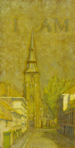 I squeeze a quantity of cadmium yellow onto the pallette and dip a thin, wide bristle brush into the clear medium (1 part Damar, 1 part Stand Oil, 1 part Turps), then scumble in a very thin coat of yellow over the whole surfce. It sets for a minute or so and then I wipe it back off with a soft, lint free cloth. The idea is to leave some translucent color tint with some tack and work the first levels of oil back into it. Because it’s a panel and not canvas, the tackiness of the oil/varnish medium catches the brush stroke well, functioning like the weave of a canvas in attracting the brushstroke yet leaving no trace of a fabric-like texture.
At this stage, I work with two basic colors, yellow and gray. I mix up a gray to match the same value of the pure cadmium yellow medium, in order to set the overall darkest value. I then mix up a series of tints (5 or 6 steps) from both the gray and the yellow to white. I begin painting in large areas trying to quickly cover the whole painting with one of these tints, using a thick bristle brush and an emulsion for the pigments (1 methyl cellulose glue, .5 oil/.5 varnish, 1 water) which hastens the drying time. The drawing and egg tempera levels have already set the stage, so to speak, and function not only as guides but also as mirror like reflections. It takes only a few strokes to bring out a form. I use a fan shaped dry brush to merge forms together.
It’s fine to be working with a limited palette now, thinking ahead by laying in a more saturated yellow for both the greens and the oranges. I use the gray for neutral tonalities, shadow and to suggest distance. The overall contrast is quite low.
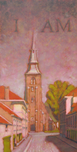 I squeeze a small amount of a cool, translucent red pigment out onto a pallette board. In this case I use crimson lake, in the past I have used alizarin crimson. Dipping a wide, flat bristle brush into clear medium (1T,1D,1SO) and then into the pigment, I proceed to scumble a thin layer of translucent red over the entire piece. After a minute or so, I wipe this off with a clean soft cloth, taking off as much pigmented medium as possible. The remaining surface has a slight tack to the touch.
I mix up three colors this time. Red, in a series of tints up to white. Warm gray mixed in a series of tints up to white and yellow, mixed in the same way. (The value of the pure red is the same value as the pure warm gray, both being close to a pure medium gray value.) Using a big bristle brush and emulsion, I work quickly to re-establish all the values and colors of the intended piece. Occassionally I need to mix a color that requires a combination of two of the premixed tints.
But look, some strong greens are emerging although I haven’t used any green or blue pigment yet! It’s only yellow refracting back through levels of drawing, egg tempera, imprimatura and glaze. Because I use an emulsion (1 methyl cellulose glue, .5 oil/.5 varnish, 1 water) as my painting medium, the work dries quickly, the colors maintain a level of transparency, and the layers of paint are rather lean.
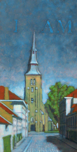 This is the blue level. I premix my intended colors: yellow in a series of 5-6 tints up to white, red, blue and Payne’s gray all mixed in the same way. There are about 20 little blobs of paint, which I may or may not use but I want to be able to work quickly and precisely in my choices.
I squeeze out a small amount of pure cyan (Thalo Blue) and dip my brush in clear medium (1T, 1V, 1 SO). Cyan is a highly saturated pigment with strong tinting power so a little goes a long way. I scumble it on and after a few moments wipe it back off, leaving a slightly tacky surface that has still more blue in it than I would actually prefer. I remind myself to use Ultramarine Blue next time…
I begin to reclaim the highlights and quarter tones, working with a big brush for starters. Any color I paint now picks up a bit of blue from the glaze. Hmmm…that’s good and it unifies the painting, but is there too much blue? A lot of unexpected colors start to happen. OK, let them emerge. I need to reintroduce the main color contrasts, like the orange for the clay tile roof, the brown bricks and the green vegetation. After the main value and hue statements are set, a few details are reintroduced with a smaller brush to help refine those shapes: window and trim, shadows and highlights. After a few hours, I’ve covered the panel. But is it done?
 After the blue session, all the color statements have been made and I’m happy, sort of, but there remains a bluish tint to the whole piece. I could leave it that way, but the intended gray of the church steeple and road pavement encourage me to attempt some gray balance adjustment. So, I cover the entire piece with a clear glaze of medium and wipe it back off (as usual). I mix up a series of tints using Payne’s gray this time as it is both darker and more neutral than the lighter warm gray pigment I have been using. I squeeze out lead white but mix it 50/50 with titanium white; since the painting is moving into it’s oilier stages. I strengthen the pure whites, the gray steeple and pavement, even scumble some body back into the buildings on the shadow side of the street. I put a glaze of yellow on the buildings on the left for local color, and add the final highlights to the tree. There is not much to do, but what is done crisps up value contrasts and defines gray balance.
Eh, voila. C’est fini! The cherries on top are the final touches of gold to the church steeple.
Silverpoint
May 15, 2009

Hans Holbein silverpoint
Silverpoint is another ancient technique that is receiving renewed attention these days. Jan van Eyck and the Flemish masters are reputed to have regularly used it as a drawing tool. Artists like Picasso and Joseph Stella brought it into the 20th century art world. The final design stands softly but well on its own or can be incorporated as an underdrawing into a painting.
There is an informative site at silverpointweb.com which offers a lot of practical information as well as sales of silver tips and a ground for the drawing support. I bought some of my pure silver tips from him a few years ago. The silver renders a soft, warm gray line that can darken upon exposure to light – just like the silver content of a photograph. The line itself is indelible so it cannot be erased. Another experiential resource is international silverpoint archives.
Drawing with silver is a very simple but time consuming technique. A thin piece of silver is inserted into a drawing stylus instead of a piece of lead. The silver can be obtained from a local silversmith. I have used both pure silver and sterling. The pure silver is reputed to create a slightly darker line, but I have not yet noticed the difference (which could be due to my gessoed surface not having enough tooth, so take my experience with a grain of salt). Points can be chiselled fine or beveled. Darker tones are achieved by repeated gestures and not by an increase in pressure.

silverpoint Joseph Stella
The drawing surface seems to make a great difference in results. The surface should have a slight “tooth” to it, to draw out the silver particles. I have used both white gessoed panels and toned paper. The toned watercolor paper clearly had the tooth to pull out the silver, but the value of the silver was so close to that of the paper that I finally opted for the white panels. Thus far the panels have given fine results which I have then used as underdrawings for some of my paintings.
Value Study
May 12, 2009

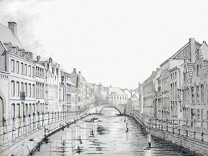
Langerei North value study
I spent years dragging my portable easel out to inspiring locations to paint. Although I managed to create a few interesting paintings, I threw away just as many failures. The changes of season, weather, and light caused any particular landscape to fluctuate enough so that I ended up with mud more often than not. Thus, I had to ask myself, how is it possible to capture anything eternal about what I am viewing?
One solution, I knew, was an impressionistic alla prima technique, and although its effects can be strikingly fresh, for better or worse, my own temperament is drawn to painting in layers, often termed “indirect painting”. Yet attempting to use an indirect technique for sequential forays of painting “en plein air” spelled trouble if I didn’t know fairly precisely where I wanted the painting to go.
Thus, I began to create fairly detailed studies both in watercolor and in pencil in order to understand what I felt and wanted to finally express in paint. Of the two approaches, I felt the (pencil, charcoal or ink) value study to be the most effective for describing my essential reaction to a view. The medium toned paper gives space for imagination to roam, inviting the perceiver in to participate in forms as they arise.
Alternatively, although it is clearly possible to take a photograph in order to capture “a moment” as preparation for a painting, photographs themselves are a mechanistic interpretation of visual reality, inevitably reducing three dimensional space to two. If I want to personally interact with the view before me, to dance with it, to make love to it, to merge with it, then the means needs to be an extension of my fingertips, vibrating with the energetic impulses of my own blood. This is in no way intended as a criticism of the fine art of photography, only a criticism of the use of photography as a means for a study upon which to base a painting.
When I have created a value study that resonates, then I transpose it to a panel and begin preparing for development of the painting.


