More Painting Backwards
October 20, 2011
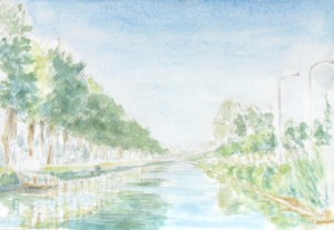
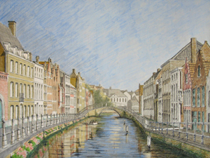
In early July this year I created a watercolor of a view along the Damse Vaart nearby Bruges, just in front of where the steamboat, the Lamme Goedzak, docks. I really liked the composition created by the canal stretching out into the distance, as well as the light of the evening as it progressed.
By remaining in one location for a few hours, just painting, just watching, I could let the scene tell me precisely which light to try and capture. The sun was slowly setting in the west (here in midsummer, it doesn’t completely descend until almost 11:00 p.m.), so although the composition in terms of land, trees and water did not change, the light on them certainly did. I snapped a few photographs of the different transitions as I made my choice.
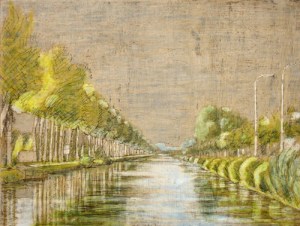
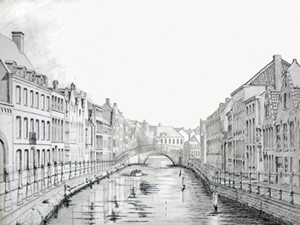
Back in the studio I transposed the composition to a panel and quickly sketched in the main elements, suggesting the central movements and thrusts as I felt them, the textures and the chiaroscuro. I used india ink for the stronger value details and silver point for the lighter, softer ones. (sorry, no photo of this stage available) The next time the weather was good, I went back out to do an underpainting using egg tempera (in the field). Egg tempera is not a technique that easily lends itself to field work but I wanted to experiment. I worked with a limited palette and preground my colors into a paste using distilled water. Since I knew the last levels of painting would probably be in the studio, I wanted as much authenticity-of-place as possible. I decided to use the landscape color convention of stong yellows in the foreground, greens in the middle and blues for the background. Values were kept fairly light, with everything suggested yet still fairly coarse. (no photo available)
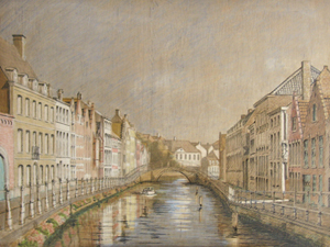
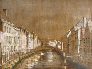
Two months later, after a rainy August, one month’s holiday and tons of other stuff inbetween, I had the chance to do the imprimatura. I mixed up a blob of burnt umber tube oil-color with retouch varnish (1 damar to 2 turps). I painted it on, letting it absorb into the panel for about a minute and then wiped it back off. It left a thin veil of warm brown over the whole image. With another small brush dipped in turpentine, I began wiping the brown tint back off from the pre-painted highlighted areas. Within fifteen minutes the process was complete, the highlights jumped out and the shadows pushed back, both filled with descriptive details and vibrating with life. I was tempted to call it done.
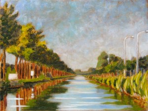
Nevertheless, the following year I decided to finish the piece – in the studio. I covered it with a tinted glaze of bunrt sienna and painted directly into that, wet-on-wet. This kept the wood areas vibrating with additional warmth and the greens and the blues well grounded. The challenge as always was to mix an array of receding greens to describe the distance. When it was dry I brought some highlights back in using tempera white (zinc white mixed with emulsion). Some of those final highlights required a little glazing just to bring it all back in balance. The resulting painting had a lovely color vibe, the red warmth of the wood contrasted to the greens (and yellows) of the vegetation.
Green with envy – or was it ivy?
July 31, 2010

Kruispoorte version #1, 2009, a lovely painting but perhaps the development of the greens was a little flat.
Anyone who attempts to paint landscape has to deal sooner or later with the problem of green. Of course, some might not even consider it to be a difficulty – but I do. So what’s the problem? In a nutshell: #1) the profusion of greens in the natural world contrasted to #2) the difficulty of rendering them to any degree of accuracy on the pallete/canvas/panel.
From a pigment point of view, there are relatively few tube greens out there in contrast to the wide arrary of tube choices for other colors. Viridian, the strongest green pigment, is widely used, otherwise if you need something different, you just mix it up from some combo of yellow and blue, or even yellow and black. However, if you attempt (as I do) to arrive at a beautiful green through color layering (for example, a blue glaze over a yellow substrate) then you might indeed create a wonderful green, but find yourself unable to modulate it very much to it’s other (very green) surroundings. Hence an indirect technique for color development is a bit too inflexible.
Thus, my current approach, to painting in general, but also to green in particular, is to minimize my pigment choice, decide on an approach and then modulate my color relations to it. For painting greens, this can mean using or mixing a master green, modulating a master chartreuse, blue green and/or gray green from that. Then tints and shades from each of those. If I am painting wet into wet, then the color of my glaze will certainly have a direct (color) effect. If it is an earth glaze (umber or sienna), the effect is quite grounding (no pun intended). Nevertheless, color is absolutely relational (a la Josef Albers) and nowhere is this more true than in the attempt to render the multitudinous greens of the natural world.
Seeing red
July 9, 2010
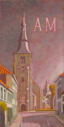 Well, OK. Since I started documenting this current production series with the yellow level, I thought I’d continue with the red. Usually, when I trace the development of a painting through its different stages, the thread is the image. But this time the common denominator is color. So, its a different focus, a different challenge. Comparing chromatic qualities instead of developmental ones.
The Sint AnnaKerk piece is shifting towards purple now. This seems to be due to the combination received through the massive amounts of warm gray tints that I worked into the crimson lake (red) tint. The church was a lovely yellow but I decided it needed a darker more massive tonality in order to provide enough contrast and mass for the strong highlights on its right side. I used clear glaze to eliminate the red tint from most of the green areas. The composition does not have a lot of strong color statements, so it’s interesting to attempt to pull out whatever is possible.
 The Predijkherenrij Grande has a strong value composition containing a lot of colors. The red level was a marathon session of 14 hours, working the paints in before the medium dried. Applying the tint, erasing the same from the highlights and some greens and then building up the masses with (mostly) semi-opague tints of warm gray and lead white. Strong reds, yellows and oranges were restated with emulsified pigment. It feels quite hot now, doesn’t it?
 The concept for the Kruispoorte Grande was simple. Could I take the process-color studio painting technique out into plen air? The yellow level had worked out great. But the red level presented challenges because the composition itself doesn’t have a lot of strong reds in it. I found myself making choices between value (warm gray tints) or hue (yellow) statements: always keeping the overall composition in mind. Still, I’m not at all sure this will be a successful approach. Time will tell.
Stay tuned for the next episode…
I am curious, yellow?
June 17, 2010
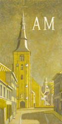 It isn’t often that I have numerous paintings completed to the same level at the same time. However, since I am preparing for an exposition and have entered into production mode on a number of pieces, right now I have four paintings drying in their yellow stage. There is something particular and special to be seen in these “monochromatic” stages which soon will be integrated into full blown colorful images.
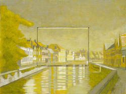 It is a curious level, one of overall hue reduction, of lowered value contrast too, of subtle nuances and above YELLOW, contrasted against gray (which of course becomes pushed towards its complement, purple). The underpainted hues that have been developed in the egg tempera stage shine through subtly, as gentle reminders of potential futures, still yet to be heeded or ignored. Who can tell?
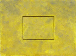 Even an abstract background that I know is intended to become a “blue” sky will have elements of the sun’s yellow light within it. If I state it now, it will always be there, ready to rise to the occassion by the brush’s trumpet call.
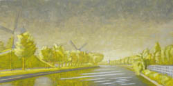 Thus, succcessive stages build back upon the basic statements made in the yellow layer. Warm reds and vibrant greens depend upon a good solid yellow. Yet sometimes, I find myself satisfied with the yellow layer just as it is. Fini. Perhaps it’s only my insatiable curiosity which keeps me wondering about what’s round the next bend, keeping me from lingering with the yellow level and just calling it “done”. So, I document it here: an interesting level, worthy of note, even if today it’s only electronic.
Painting, Backwards
January 3, 2010
Painting (any painting) always involves pigment mixed into a medium and set upon a ground. The ground is usually white (or possibly even translucent), thus any pigment added to its surface subtracts from its luminosity and is a movement towards darkness. Alternatively stated, light is the source and darkness its covering. Painting reveals light and uses darkness to do so. If the ground is white, then the primal source of light in any painting is its substrate. This being the case, using and manipulating that source of luminosity is of utmost importance. I continually ask myself, is there a way to paint which can maximize the quality of transmissive light in its ground while contrasting it to the reflective quality of opaque pigments? Painting backwards could be one approach. I stumbled upon it by accident. Here’s what happened:
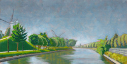
About a year ago, I began preparing a landscape painting in the usual way. First by gessoing a wooden panel, then by transferring my composition to it using silverpoint. The composition was of the canal in front of my house. I had already created a value study as well as a small oil of the same landscape setting. I was well pleased with both works but felt the composition could benefit from a grander view. So I added buildings to the right and left as well as more sky and water in the foreground. This had the effect of deepening the overall perspective. Nice. Additionally, to enhance the depth from the get go, I highlighted the darker contrasts of the foreground using india ink on top of the already established silverpoint drawing. Nice, again.
In order to minimize the number of layers necessary to create an image in oil, I started the underpainting in egg tempera. Rather than mixing a fully saturated color of the chosen pigment for each element in the image, I added white to each color to avoid oversaturated colors in the final painting. (Oversaturated colors can be lethal to the softly diminishing effects of an ephemerally suggested distance: a lesson I had learned the hard way.) So, all the colors were now set up and were rather pastel in character, complimentary color relationships were established, even if at this point they were still rather subtle.
The next step was unifying all the elements by establishing an overall mood. This is usually done by covering the ground with an imprimatura: a diluted oil color washed over the surface to establish a middle tone. So I painted on a brown imprimatura and then wiped it off. A tonality was established, but it wasn’t quite dark enough. I painted on a second layer of imprimatura just to increase the tonality. But then, rather than painting the highlights back in using white pigment, I decided to erase the imprimatura from the highlight areas using turpentine (I already knew exactly where these areas were as they were well articulated in the underdrawing). This erasing was working well, until I accidentally dipped my brush in distilled water instead of turps. My brush began to delete not only the imprimatura, but also the egg tempera underpainting, the india ink, and then the silverpoint, too. Oops!!! Not what I had intended…
Amidst my curses and exclamations, it became clear to me that I needed to continue this treatment to balance out the rest of the composition, a work of about 15 minutes. When I was done, my husband took a look at the painting and said, “I think you’re done.” And it was true.
Comments are welcome…
the Oil Pallette
May 20, 2009
I suspect that every artist has his or her favorite pigments and colors. It is necessary to find your own. It can be quite challenging at first to sort one’s way through the huge selection of colors available at any art supply store. Experience is the best guide. But that’s hard when you don’t have it.
Here’s what I use:
Color
- Two yellows (a cool and a warm one, like citron yellow and cadmium yellow medium)
- Two reds (a cool and a warm one, like alizarin crimson and cadmium red medium)
- Two blues (a cool and a warm one, like thalo blue and ultramarine blue)
The Earth Colors
- Sienna (burnt and raw, though I most use burnt)
- Umber (burnt and raw, though I mostly use raw)
- Mars Red (a red iron oxide)
- Yellow Ochre
Neutrals
- Two whites (Lead white and Titanium)
- Warm gray
- Mars black
From these basic colors I can mix just about any thing I need while maintaining a clear idea of how I got there. In addition, the spectral purity of a color can best be appreciated by employing it directly out of the tube, unmixed. Therefore, one can try to achieve certain ‘mixed’ colors through translucent layers of paint, rather than mixing on the pallette. Doing this means becoming familiar with the characteristics of the pigments themselves (opacity/translucency, saturation/tinting power and capacity to absorb oil). It also means using the translucency effects of the oil medium to create rich vibrant colors, that resonate like a sunset.
Light and Color
May 19, 2009
To talk about color divorced from whatever medium in which it is suspended means necessarily taking a theoretical approach. So, a small digression here:
There are many ways in which both the painter and the scientist approach color. For the scientist, a rational model is constructed to categorize and describe it as a phenomena. At colorsystem.com there is an excellent presentation in German of the various scientific theories that have been created over time. Additional to scientific theories, artistic color theories tend to be more relational, more psychological, and ultimately more visceral. The theories of Josef Albers, in ‘The Interaction of Color’ and Johannes Itten, in ‘The Art of Color’ are two such 20th century examples.
Another way to approach color involves viewing it from the standpoint of light itself, that is, additive and subtractive light. Notebook has an interesting resource page on the topic of Light and its qualities. Thus, while the painter’s craft necessarily exists in the world of subtractive light, by manipulating mediums and pigments to experientially stimulate thoughts, emotions and sensations, it derives – as does life itself – from the world of additive light.

additive primaries
The primary colors for additive light are red, green and blue. Thus, if three different spotlights are focused together upon one location, and one light is covered with a filter of red, the second of green and the third blue, the location itself will reveal white light to the human eye. The technologies of television, computer screens and color separation in the printing industry are all based upon additive light theory or RGB (red, green, blue).

subtractive primaries
The primary colors of subtractractive color theory are yellow, red, and blue. Every young child learns this in kindergarden. He/she learns quickly that yellow plus red makes orange, yellow plus blue makes green, red plus blue makes purple, and all three together create black (or a very mucky brown). I call this kindergarden primary color.

process pramaries
A further refinement to subtractive color theory are the primary colors of the printing industry. Rather than the yellow, red and blue of kindergarten, the printing industry uses process yellow, magenta, cyan and black. Process yellow actually contains the slightest bit of green in it – a cool, translucent, lemon yellow. Cyan is a translucent and dark turquoise kind of blue. While magenta is a cool, translucent ruby red, similar to the external fleshy covering of pomegranate seeds. These subtractive primaries, derived from additive light theory combine in different ways – principally through layering – to create the whole gamut of visual color that we experience in 99% of our printed material.
I tend to speculate that if magazine green never comes from green ink, then why should an artist mix his or her colours so easily on the pallette? Similarly, through the luminosity of oil, a painter’s green created from superimposed layers of yellow and blue is qualitatively a different experience than that of a mixed green on the pallette. Thus, since painting occurs in the world of reflective light, and subtractive color combinations are intuitively clear, it’s reasonable to ask, how much palette mixing is truly necessary if the beauty of light itself is the goal? Additionally, any colour we perceive in the natural world is always more beautiful in the degree to which it can transmit light. The ancient techniques for creating imagery are time tested procedures for isolating, cherishing and showcasing the spectral purity and luminosity of individual pigments. The medium of oil is particularly adept at transmitting light through layers.
