Seeing red
July 9, 2010
 Well, OK. Since I started documenting this current production series with the yellow level, I thought I’d continue with the red. Usually, when I trace the development of a painting through its different stages, the thread is the image. But this time the common denominator is color. So, its a different focus, a different challenge. Comparing chromatic qualities instead of developmental ones.
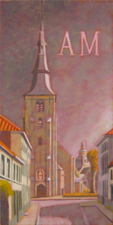
The Sint AnnaKerk piece is shifting towards purple now. This seems to be due to the combination received through the massive amounts of warm gray tints that I worked into the crimson lake (red) tint. The church was a lovely yellow but I decided it needed a darker more massive tonality in order to provide enough contrast and mass for the strong highlights on its right side. I used clear glaze to eliminate the red tint from most of the green areas. The composition does not have a lot of strong color statements, so it’s interesting to attempt to pull out whatever is possible.
 The Predijkherenrij Grande has a strong value composition containing a lot of colors. The red level was a marathon session of 14 hours, working the paints in before the medium dried. Applying the tint, erasing the same from the highlights and some greens and then building up the masses with (mostly) semi-opague tints of warm gray and lead white. Strong reds, yellows and oranges were restated with emulsified pigment. It feels quite hot now, doesn’t it?
 The concept for the Kruispoorte Grande was simple. Could I take the process-color studio painting technique out into plen air? The yellow level had worked out great. But the red level presented challenges because the composition itself doesn’t have a lot of strong reds in it. I found myself making choices between value (warm gray tints) or hue (yellow) statements: always keeping the overall composition in mind. Still, I’m not at all sure this will be a successful approach. Time will tell.
Stay tuned for the next episode…
