I’d rather be blue…
July 14, 2010
 My theory of painting is simply this: travelling has to be at least as interesting as finally arriving. It helps to have a numinal idea of what arriving should actually look like, but it wouldn’t be “art” if I already knew, would it? Thus, I always experience a certain kind of hesitancy as I approach the final levels in a painting. Do I really want the journey to end? Will this level “do” it? Or will it need more? And if so: what, where, how? Will the final image end up looking like a bored adult in comparison to its earlier youthful promise? Should I have stopped at some earlier vantage point along the way and just grabbed the ‘chute?
 Additionally, imposing a chromatic structure on image development allows for lots of lateral exploration at each level of additional color. Or to put it in even simpler terms, it helps me to control chaos. Chaos of my own emotions and my emotional reactions either to the subject matter or the developing image in front of my nose. But too much control results in lifelessness, too little, and it’s just chaos.
 Riding the surge of that inbetween space, of that wave, is richly rewarding: both exhilirating and terrifying. Committing myself to it involves a kind of surrender and also a kind of trust. If I imagine that the landscape I paint is essentially external to me, if I imagine that the paints I use are essentially “other”, if I imagine that the world itself is not a part of me and myself a part of it, then there is fear.
So, instead of experiencing distance to it all like some alien stranger, I’d rather be blue (thalo or ultramarine, to be exact)…
Seeing red
July 9, 2010
 Well, OK. Since I started documenting this current production series with the yellow level, I thought I’d continue with the red. Usually, when I trace the development of a painting through its different stages, the thread is the image. But this time the common denominator is color. So, its a different focus, a different challenge. Comparing chromatic qualities instead of developmental ones.
The Sint AnnaKerk piece is shifting towards purple now. This seems to be due to the combination received through the massive amounts of warm gray tints that I worked into the crimson lake (red) tint. The church was a lovely yellow but I decided it needed a darker more massive tonality in order to provide enough contrast and mass for the strong highlights on its right side. I used clear glaze to eliminate the red tint from most of the green areas. The composition does not have a lot of strong color statements, so it’s interesting to attempt to pull out whatever is possible.
 The Predijkherenrij Grande has a strong value composition containing a lot of colors. The red level was a marathon session of 14 hours, working the paints in before the medium dried. Applying the tint, erasing the same from the highlights and some greens and then building up the masses with (mostly) semi-opague tints of warm gray and lead white. Strong reds, yellows and oranges were restated with emulsified pigment. It feels quite hot now, doesn’t it?
 The concept for the Kruispoorte Grande was simple. Could I take the process-color studio painting technique out into plen air? The yellow level had worked out great. But the red level presented challenges because the composition itself doesn’t have a lot of strong reds in it. I found myself making choices between value (warm gray tints) or hue (yellow) statements: always keeping the overall composition in mind. Still, I’m not at all sure this will be a successful approach. Time will tell.
Stay tuned for the next episode…
I am curious, yellow?
June 17, 2010
 It isn’t often that I have numerous paintings completed to the same level at the same time. However, since I am preparing for an exposition and have entered into production mode on a number of pieces, right now I have four paintings drying in their yellow stage. There is something particular and special to be seen in these “monochromatic” stages which soon will be integrated into full blown colorful images.
 It is a curious level, one of overall hue reduction, of lowered value contrast too, of subtle nuances and above YELLOW, contrasted against gray (which of course becomes pushed towards its complement, purple). The underpainted hues that have been developed in the egg tempera stage shine through subtly, as gentle reminders of potential futures, still yet to be heeded or ignored. Who can tell?
 Even an abstract background that I know is intended to become a “blue” sky will have elements of the sun’s yellow light within it. If I state it now, it will always be there, ready to rise to the occassion by the brush’s trumpet call.
 Thus, succcessive stages build back upon the basic statements made in the yellow layer. Warm reds and vibrant greens depend upon a good solid yellow. Yet sometimes, I find myself satisfied with the yellow layer just as it is. Fini. Perhaps it’s only my insatiable curiosity which keeps me wondering about what’s round the next bend, keeping me from lingering with the yellow level and just calling it “done”. So, I document it here: an interesting level, worthy of note, even if today it’s only electronic.
Painting: backwards and forwards
March 4, 2010
OK, OK, I admit it. I am in love with glazing. Like non-duality, it has the capacity of unifying many disparate elements, without negating them. (And isn’t that wonderful???) As ever, translucency is the key. But the tricky thing is the application. Too much glazing and the painting has a tendency to float off the panel; too little and the thick opaque paint just stays stuck in the mud, reflecting little or no light. Of course, you can see the same principle reflected in people’s lives. Too little inspiration and we have the tendency to stay stuck in our comfortable grooves; too much inspiration – without a transparent application to the mundane activities of living – and that wonderful poetry, lacking substance, falls short of its mark.

Korte Sint Annastraat value study

Korte Sint Anna black and white
I began the piece by transposing my black and white drawing to a 30 x 60 cm. gessoed panel. I like to use silverpoint for the first level of drawing. It is very soft and can render lots of intimate details. It tends to create an ambience that invites image development. Silverpoint catches well on the toothy gesso, so the mark lands and does not require too much repetitive movement. Then using india ink, I add touches of higher contrast that push forward the gesture of the composition – but only in the foreground. The idea is to build up the visual effects of distance from the get go. Every layer will play a role. So the black and white level sets up the basics. I’ve decided to add “I Am” to the sky. (the decision occurred after I made the photograph, so Photoshop has come to my display rescue)

Korte Sint Anna Egg tempera

Korte Sint Annastraat mixed technique #1

Korte Sint Annastraat mixed technique #2

Korte Sint Annastraat mixed technique #3
Comments, as usual are welcome…
about Giclée or digital printing
January 29, 2010
With the advent of the digital revolution, the “giclée” or digitally produced ink-jet art print is an upscale and promising venue of digital imaging technology. Images can be easily created, shared and printed the world over. It is clear that inks, paper and techology will consistently improve to offer high resolution, archival prints which can qualitatively equal or even surpass traditional lithography for only a fraction of the cost. As a new medium it promises to be an art in itself, because the tools are back in the hands of the artist.
But as a new medium, it is also important to distinguish a few basic elements of the larger printing world to which it belongs. Printing, be it digital or lithographic, occurs in the world of CMYK, or subtractive light and refers to multiple identical reproductions. It is to be differentiated from the world of painting which usually (but not always) occurs in the world of subtractive light and whose pallette is greatly expanded beyond four basic colors. Additionally, the act of painting refers to a unique product.
What can be confusing for consumers/collectors is the term “limited edition print”. Traditionally this term referred to a run of prints which were created from a means that became dissipated through the action of printing. For example, etching plates whose fine lines grew softer after repeated use. More often, the term “limited edition print” simply referred to the amount of prints generated at any one particular time for economic reasons, not necessarily technical.
In the current world of printing, whether lithographic or digital, the term “limited edition print” refers to economic factors and not physical dissipation, that is the number of copies generated at any one time is determined by how much the artist can spend to produce the images he/she hopes to sell rather than the dissipation of digital pixels (which is absurd) or lithographic plates, which do in fact dissipate in extremely large runs.
In this regard, the Giclée print is directly advantageous to the artist: no huge lithographic print run to manage, pay for and inventory. Artists can now “print on demand” and even sign their work, completely bypassing the “limited edition print” run event, potentially rendering the term altogether meaningless (buyer beware).
Technically, the Giclée print may also be superior to traditional lithography since the ink jets do not require the intervention of tiny lithographic dots to hold the ink. Finer gradations and subtler details can be rendered. For example, the current top range digital printers includes two levels of jets for the cyan and magenta inks (one for the normal range of values and one particularly sensitized to reproduce highlight detail). The archival qualities of the inks are consistently being improved (but still do not retain the longevity of a well executed oil painting) while the substrate is whatever quality technology or ecomomics allow.
The drawback of the Giclée print is the same as it ever was for lithography: CMYK cannot reproduce certain secondary colors, as well as even certain pigments of yellow, red and blue; what is visible on the LED monitor in RGB may not be reproducible in CMYK. Additionally, importantly, and in contrast to painting, a print surface offers extremely little refraction of light through its micro millimetered surface-depth. So the play of light through its surface remains predictably (mechanically) stable, unlike the subtle differences that can be experienced when viewing an original painting. So although the Giclée or digiprint offers many possibilities, a print is still a print…
Oils
May 26, 2009
Most books advise a beginner to begin with oils as it is more forgiving. It is easier to correct a mistake for example, than with watercolor. That may be true – especially if one uses opaque pigments – but oils, by nature of the medium itself, are viscously translucent, thus understanding their innate capacity to transmit light through a clear film is ultimately critical for both succesful manipulations of form without pentimento as well as transmission of light. Eastlake noted, in referring to Jan Van Eyck, “The leading attribute of the material of oil painting, as distinguished from those of tempera and fresco, viz. its power to transmit light of an internal surface through superimposed substances more or less diaphanous…”.
There are two main approaches to painting in oils, alla prima and indirect. Although much art is created as a mixture of the two approaches, in themselves they are distinct. The contemporary art world relies quite heavily upon directly percieved and expressed imagery, thus an “alla prima” approach is emphasized. Information on the indirect methods of painting is out of style, so you have to search for it. More and more sites, blogs and forums continue to pop up on the internet. Here is one site I have found that is a fine, yet relatively dis-interested treasure trove. There are others.
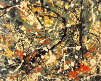
Jackson Pollock Abstract Expressionism
Alla prima essentially means executed in one session as exemplified by Jackson Pollock in his drip paintings. There can be no argument against this method of approach as both its demands and results can be superlative. After all, if a painting has any chance of reflecting the evanescent truth of the moment, it needs to be created in the same spirit, with a Zen-like accuracy and intensity.

the Mona Lisa
What then are the values or possibilities of a more indirect technique? Does a laborious technique result in a tedious and heavy painting (it often does!)? Can a painting developed indirectly still retain the freshness of the moment? If so, then how? Thus, for those who feel themselves drawn to an indirect method, the knowledge of ancient techniques is extremely helpful. Indirect painting simply means developing an image through a series of manipulations over time and calculated to achieve a particular result. A further refinement of the indirect painting technique is the mixed technique. Both allow for a methodological layering which in itself creates optical effects of great beauty and luminescence. Subject matter aside – what can be more eternal than that?
Light and Color
May 19, 2009
To talk about color divorced from whatever medium in which it is suspended means necessarily taking a theoretical approach. So, a small digression here:
There are many ways in which both the painter and the scientist approach color. For the scientist, a rational model is constructed to categorize and describe it as a phenomena. At colorsystem.com there is an excellent presentation in German of the various scientific theories that have been created over time. Additional to scientific theories, artistic color theories tend to be more relational, more psychological, and ultimately more visceral. The theories of Josef Albers, in ‘The Interaction of Color’ and Johannes Itten, in ‘The Art of Color’ are two such 20th century examples.
Another way to approach color involves viewing it from the standpoint of light itself, that is, additive and subtractive light. Notebook has an interesting resource page on the topic of Light and its qualities. Thus, while the painter’s craft necessarily exists in the world of subtractive light, by manipulating mediums and pigments to experientially stimulate thoughts, emotions and sensations, it derives – as does life itself – from the world of additive light.

additive primaries
The primary colors for additive light are red, green and blue. Thus, if three different spotlights are focused together upon one location, and one light is covered with a filter of red, the second of green and the third blue, the location itself will reveal white light to the human eye. The technologies of television, computer screens and color separation in the printing industry are all based upon additive light theory or RGB (red, green, blue).

subtractive primaries
The primary colors of subtractractive color theory are yellow, red, and blue. Every young child learns this in kindergarden. He/she learns quickly that yellow plus red makes orange, yellow plus blue makes green, red plus blue makes purple, and all three together create black (or a very mucky brown). I call this kindergarden primary color.

process pramaries
A further refinement to subtractive color theory are the primary colors of the printing industry. Rather than the yellow, red and blue of kindergarten, the printing industry uses process yellow, magenta, cyan and black. Process yellow actually contains the slightest bit of green in it – a cool, translucent, lemon yellow. Cyan is a translucent and dark turquoise kind of blue. While magenta is a cool, translucent ruby red, similar to the external fleshy covering of pomegranate seeds. These subtractive primaries, derived from additive light theory combine in different ways – principally through layering – to create the whole gamut of visual color that we experience in 99% of our printed material.
I tend to speculate that if magazine green never comes from green ink, then why should an artist mix his or her colours so easily on the pallette? Similarly, through the luminosity of oil, a painter’s green created from superimposed layers of yellow and blue is qualitatively a different experience than that of a mixed green on the pallette. Thus, since painting occurs in the world of reflective light, and subtractive color combinations are intuitively clear, it’s reasonable to ask, how much palette mixing is truly necessary if the beauty of light itself is the goal? Additionally, any colour we perceive in the natural world is always more beautiful in the degree to which it can transmit light. The ancient techniques for creating imagery are time tested procedures for isolating, cherishing and showcasing the spectral purity and luminosity of individual pigments. The medium of oil is particularly adept at transmitting light through layers.

