Painting: backwards and forwards
March 4, 2010
OK, OK, I admit it. I am in love with glazing. Like non-duality, it has the capacity of unifying many disparate elements, without negating them. (And isn’t that wonderful???) As ever, translucency is the key. But the tricky thing is the application. Too much glazing and the painting has a tendency to float off the panel; too little and the thick opaque paint just stays stuck in the mud, reflecting little or no light. Of course, you can see the same principle reflected in people’s lives. Too little inspiration and we have the tendency to stay stuck in our comfortable grooves; too much inspiration – without a transparent application to the mundane activities of living – and that wonderful poetry, lacking substance, falls short of its mark.
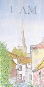
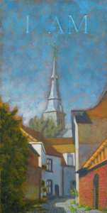
I have admired this very colorful alley view of the Sint Anna Kerk in midday light for a number of years now. Over time, I have made watercolor and value studies of it, photographs, too (here is the all important value study). The light at midday creates a strikingly vertical composition. The color relationships of the tile roofs are quite exciting along with the added bonus of it being the only street in Bruges whose street is lined with bricks glazed in blue ceramic. Over time, I collected enough material for a winter studio production this year.
I began the piece by transposing my black and white drawing to a 30 x 60 cm. gessoed panel. I like to use silverpoint for the first level of drawing. It is very soft and can render lots of intimate details. It tends to create an ambience that invites image development. Silverpoint catches well on the toothy gesso, so the mark lands and does not require too much repetitive movement. Then using india ink, I add touches of higher contrast that push forward the gesture of the composition – but only in the foreground. The idea is to build up the visual effects of distance from the get go. Every layer will play a role. So the black and white level sets up the basics. I’ve decided to add “I Am” to the sky. (the decision occurred after I made the photograph, so Photoshop has come to my display rescue) I use egg tempera to set out the basic color relationships. In contrast to the methods of the old masters, who used their underpainting primarily for value work, I bring color in early in order to test out the vibrations – particularly of complimentary colors. I use a limited palette and usually avoid any color mixing on the palette – with the exception of white since I add zinc white to all my colors in order to avoid an oversaturated final painting. At this stage, the colors are light and somewhat pastel-like. With this method of painting, by the time you reach the oil level, you cannot really paint white over a color to lighten it very much as each successive layer adds a layer of darkness, so to speak. You have to to rely as much as possible on the original white of the panel (that’s why I call it painting backwards). When I’m finished with egg tempera, I seal the surface with a light coat of (rabbitskin) glue size. Oil painting with the mixed technique essentially involves alternating transparent glazes with opaque pigments mixed into a painting emulsion. I start with a yellow glaze and then set out bringing the highlights back in. Yellow paint mixed in a series of tints up to white goes back into areas that will contain differing degrees of that color. Warm Gray mixed up in an array of tints is worked back in to shadow blocks, or alternatively into areas of color that will not contain much yellow. At this point, using a large brush, I try to cover most of the panel with emulsion mixed paint. The work goes quickly. In a few hours, I have set the groundwork for both hue and value development. The overall effect is harmonious and low contrast. Because emulsion has been mixed into the paint, the areas of paint blend smoothly into adjacent areas and will dry to the touch within a few days. Between the yellow and the red layer, I decided that the “I Am” text in the sky needed to be more luminous, so using turpentine and a stiff brush, I took the earlier levels of paint away (painting backwards). The text may now seem rather stark but I know that it will be softly blended by the time I am done. On the palette I mix up a series of tints in yellow, red and warm gray. There are about 15 little blobs of paint. I cover the panel with a thin glaze of Crimson Lake and begin working the colors back into the surface. Reclaiming the highlights is best done by removing the red glaze rather than painting emulsified white paint back into it (more painting backwards). Shadows and other colors receive their appropriate tint (the normal approach of painting forwards). Every area should receive some work; if glaze is not painted into, it can become unreceptive to further manipulations in successive layers. The final level is the blue level. I mix up a series of tints of yellow, red, blue and Payne’s Gray (at this stage I switch from Warm Gray to Payne’s as it is more neutral). Now I have about 20 little blobs of paint. I cover the panel with a light glaze of Cyan. This pigment is quite saturated so I am careful to dilute it well and begin painting. I “erase” the glaze from all the strongly highlighted areas. The warm colors of the underpainted tile roofs pop out and glow (very nice!). I reclaim all the neutrals by painting a gray tint back in, beginning from the background and moving forward. Additional colors arise as needed with a brushstroke of the appropriate color. For example, the strong greens of the foreground shadow, left, are aided by its underlying yellow color structure. Soon I have covered most of the panel and am working details back into the foreground. This is the last session: it takes the longest time since it combines the blue color adjustments along with the final gray balance work. I finally step back, satisfied and ready for dinner.
Comments, as usual are welcome…


March 5, 2010 at 9:14 am
Dear Ellen,
Like your other friends, I am amazed at this piece. It’s a pity you can’t keep each stage as an original and yet still go to the next level. That would work in Vonnegut’s world, but not here. Fantastic!
Regards,Tina
March 5, 2010 at 9:28 am
Hi Tina,
Yes, its true. I had a visitor to the studio last fall who wanted to buy the panel in its yellow stage. I protested, “but its not finished!”. He protested, “but I like it just as it is”. So I gave him my business card and said “OK, I’ll have to think about a price, contact me”. But he didn’t. (and I didn’t have to start over)
April 9, 2010 at 5:28 pm
I’m not the person you refer to… but I’d be interested in finding out what the panels cost.
March 12, 2012 at 9:19 am
I am glad to catch idea from your article. This looks absolutely perfect. All these tiny details are made with lot of background information. Keep up the great writing!
August 15, 2015 at 3:40 pm
[…] You can read about the work-up this piece here. […]