Egg tempera and indirect painting
November 11, 2019

A Piece of Me #1, egg tempera on panel, 21 x 13.3 cm or 8 1/4 x 5 1/4 in.
Most of the information on egg tempera that I’ve posted on this blog thus far has referred to my use of egg tempera as an underpainting for oils. However in my most recent multi media project I’ve created a series of images painted exclusively in egg tempera, as a stand alone painting technique. This is the first time in about forty years that I have done this. So I have been both in and out of my comfort zone: there was familiarity but not mastery.
Thus I tried to create fully saturated, full value-range paintings, which in this medium can be challenging. Due to the pre-established nature of my subject matter (see link above for an explanation of the overall project), composition played less of a role: my challenge was simply to create a unified field of paint that was aesthetically pleasing. Here below are a few of the things I learned in the process:
-

A Pice of Me #41, egg tempera on panel, 21 x 13.3 cm or 8 1/4 x 5 1/4 in.
I began each panel with a well established black and white underdrawing. Often this meant creating a detailed value study, beautiful in itself, but which also contained enough meaningful information for the three dimensional, coloured forms to come. I began by executing these studies in silverpoint but for technical reasons, which you can read about here, I had to shift washes of india ink. For this I used the brush – not the pen nib – since I felt the pen nib would create too harsh a graphical line for this incredibly subtle medium.
- I applied my egg tempera in many very light, successive washes. I especially wish to thank the contemporary egg tempera artist, Koo Schadler, for her painting insights. They helped me to improve my use of the technique in many different ways.
- Of especial help was her suggestion to use fine celled cosmetic sponges for my glazes. They helped me to achieve unified fields of wash which are otherwise difficult to achieve in this fast drying medium.
- I avoided mixing colors. All hues in the paintings (well, almost all) were achieved by superimposing layers of wash in order to achieve any particular colour. This honors the chromatic purity of each pigment as well as allows light to interpenetrate any nuanced mix of color. Strange as it might seem, even though it’s time consuming, in another way it’s also simpler, as this kind of “glazing” helped to create chromatically unified paintings.
- Additionally, and as a related point, I tried to paint with as limited a palette as possible. I kept a list of the pigments I had used on the back of each panel. I expect this to be helpful information as I move into other panels with other media to describe similar subject matter.
- Perhaps the most important understanding came in my own understanding about “light” and “white”. While many artists may advocate the mixture of white pigment (either zinc or titanium) with tempered paints – and I did experiment with that on some of these panels – I ultimately had to follow my own intuition and avoid the addition of white pigment whenever possible. This meant working up my mid tones slowly, yet fully, through a series of washes, many of which were partially translucent. As the painting gained in hue and saturation, I always tried to kept my brightest highlights clear of paint. When you paint with an indirect method like this, this is possible. It is also possible (another hat tip to Koo Schadler) because you can add significant amounts of water to your egg tempera paint without harming its internal integrity. This meant that the white of the gesso ground always served as my source of light. The difference between the intrinsically emanating light-beauty of the gesso ground to the dead weight of adding white pigment back in at some later stage is huge. So I avoid it whenever possible.
- A full view of all thirteen panels is available here.
A work in progress…
August 3, 2013
After a long hiatus (precipitated by moving into an old Bruges row house and renovating it, along with creating a little painting studio for myself) I finally had the chance to get back into painting these last few weeks – and the weather has been great!
I decided to do an oil of a watercolor study I had completed in 2011 of the bend along the Damse Vaart canal outside Bruges. It’s a great perspective, particularly around mid-day. There are some interesting middle ground structures on the left, while on the right the receding treeline stretches almost all the way to Damme. The strong mid-day shadows complement the movement and function as an anchor.
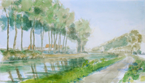
watercolor of the bend in the Damse Vaart, 2011
I transposed the basic composition of the watercolor to a panel, but decided to do the foundational ink drawing and egg tempera levels en plein air. For the ink level, I reverted to the stylus and nib quill-pen style of my youth, instead of the technical drawing pens I’ve been using ever since. I wanted to let the pen nib respond to my hand pressure with a thinner or thicker line, mirroring my response to nature. It worked quite well, except the ink jar fell over spilling most of its contents. Enough remained to complete my work, even if the drawing ended up being a little sketchier than I might have envisioned it.
So I quickly moved onto the egg tempera stage. I brought three pigments with me pre-ground into pastes: cadmium yellow medium, alizarin crimson and thalo blue, in addition of course to the egg yolk. In future, I plan to mix up my paints with egg in the studio before going out – just to minimize the hassle: there are already enough uncontrollable factors to contend with in nature, like the wind, rain, sun and insects, why shoot yourself in the foot? In any case, I mixed up my paints in situ and laid in some washes over my ink drawing to indicate future color developments.
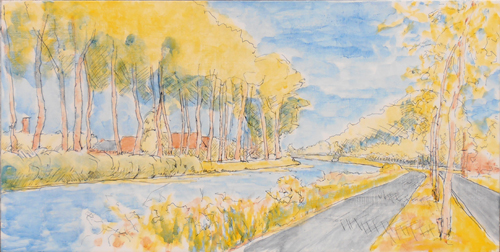
india ink and egg tempera underpainting of the Damse Vaart bend
Though it may not be very visible in the reproduction image here, I paid special attention to lay in more saturated colors in the foreground and lighter washes in the distance. I’ve learned from experience that it all makes a difference in the long run – any color, no matter how subtle equates to less light.
After a week or so, the egg tempera level was cured enough to paint over. It dries immediately but don’t be deceived, the egg/oil combo also has to cure. Gentle UV light can help. I painted a toned imprimatura of burnt sienna over the piece. My purpose in doing so was to unify the disparate foundational parts and lay in a preliminary value study. Using turpentine, I extracted the imprimatura from the highlights and lighter quarter tones revealing the underpainting beneath, while painting a more saturated layer into the shadows. I did this in the studio and it came out quite well(!). Now it’s starting to get exciting.
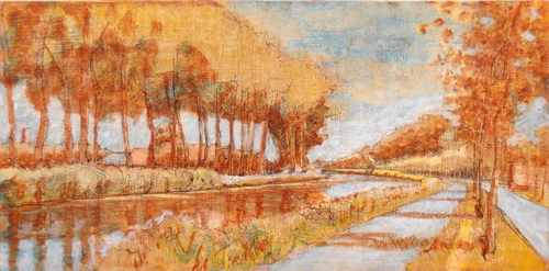
imprimatura, bend in the Damse Vaart
I let this level dry for almost a week. That’s not really necessary, at least if you don’t mind a little imprimatura bleeding into the next level of glaze, but since I did, I let it dry. Also, the shadowed areas were painted with a slightly heavier sienna wash, so they needed more time.
Finally, I set my field easel up in situ on a clear sunny day with a mild breeze. My homework was all done, the question was how far would I be able to bring the painting in one working session? I covered the whole panel with medium, wiped it back off leaving a slight tack to the panel surface and started in. Four hours later, I had the following result:
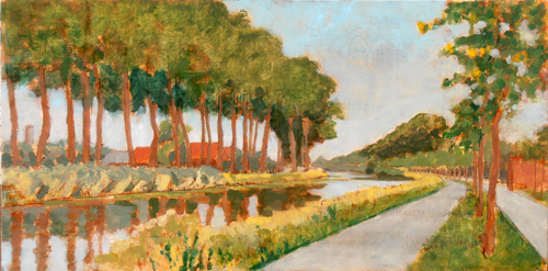
Level 1 oil, Bend of the Damse Vaart
I consider it an excellent start, though a little too coarse and graphic for my taste. I’d like to reintroduce the atmosphere of the imprimatura by softening a number of transitions and reintroducing the light. We’ll see if that’s possible. Fingers crossed for Bend in the Damse Vaart, part II.
A question of balance…
August 22, 2012

Langs de Vaartdijk
Today I created the final glaze on one of my favorite views along the Vaartdijk, a canal on the outskirts of Bruges, Belgium. On a clear day by about 11:00 a.m. the light makes a nice silhouette of a distant church tower with great rooftop variations inbetween: an interesting study of light. Additionally (at least in summer), the green vegetation and red roofs create a wonderful complimentary color juxtaposition, too. I wanted to try to maximize both in a painting.
I began last year with a watercolor study. This was helpful for setting out the general composition but didn’t come close to conveying what I saw (or felt about what I saw). I knew oil was needed to set it right. After working up an underdrawing in india ink followed by an underpainting in egg tempera, I set out attempting to maximize the reds and greens as I felt them through layers of pigment – in the studio. Working en plein air is great for quick studies but it’s almost a contradiction in terms for manipulating layers of oil here in rainy and unpredictable Belgium. Additionally, I knew I needed to concentrate on my own vision and not become distracted by the changeful atmospheric conditions attendant to working in situ. Describing distance with oil paint is a huge challenge, as any hue or value too weak (or too strong) belies the intended effect: it’s a question of balance.
I ended up dancing between cadmium yellow light and cadmium yellow medium for my yellow pigments and ultramarine or thalo for my blues. So my greens would vary from an almost neon green (cadmium YL and thalo) in the foreground, to just slightly dirty in the middle (cadmium YM and ultramarine), to a warmish gray at the back (cadmium Y M and thalo plus burnt sienna). And my reds alternated between two wonderful earth pigments: an opaque mars red and a more translucent burnt sienna.
But these developing color thrusts demanded a regular rebalancing of the whole through reasserting the original statement of light. I often had to reintroduce opaque white pigment in order to reclaim a highlighted area that had become obscured. Of course, it’s always best not to lose light in the first place, but perhaps it’s just a necessary evil of the glazing process? In any case, in addition to the vibration of color, the circulation of light was an equally important factor to integrate in this piece. The image above is the final result. I quite like it.
More Painting Backwards
October 20, 2011
In early July this year I created a watercolor of a view along the Damse Vaart nearby Bruges, just in front of where the steamboat, the Lamme Goedzak, docks. I really liked the composition created by the canal stretching out into the distance, as well as the light of the evening as it progressed.

Damse Vaart watercolor
By remaining in one location for a few hours, just painting, just watching, I could let the scene tell me precisely which light to try and capture. The sun was slowly setting in the west (here in midsummer, it doesn’t completely descend until almost 11:00 p.m.), so although the composition in terms of land, trees and water did not change, the light on them certainly did. I snapped a few photographs of the different transitions as I made my choice.
Back in the studio I transposed the composition to a panel and quickly sketched in the main elements, suggesting the central movements and thrusts as I felt them, the textures and the chiaroscuro. I used india ink for the stronger value details and silver point for the lighter, softer ones. (sorry, no photo of this stage available) The next time the weather was good, I went back out to do an underpainting using egg tempera (in the field). Egg tempera is not a technique that easily lends itself to field work but I wanted to experiment. I worked with a limited palette and preground my colors into a paste using distilled water. Since I knew the last levels of painting would probably be in the studio, I wanted as much authenticity-of-place as possible. I decided to use the landscape color convention of stong yellows in the foreground, greens in the middle and blues for the background. Values were kept fairly light, with everything suggested yet still fairly coarse. (no photo available)

Damse Vaart Oil
Two months later, after a rainy August, one month’s holiday and tons of other stuff inbetween, I had the chance to do the imprimatura. I mixed up a blob of burnt umber tube oil-color with retouch varnish (1 damar to 2 turps). I painted it on, letting it absorb into the panel for about a minute and then wiped it back off. It left a thin veil of warm brown over the whole image. With another small brush dipped in turpentine, I began wiping the brown tint back off from the pre-painted highlighted areas. Within fifteen minutes the process was complete, the highlights jumped out and the shadows pushed back, both filled with descriptive details and vibrating with life. I was tempted to call it done.

Damse Vaart Oil on panel
Nevertheless, the following year I decided to finish the piece – in the studio. I covered it with a tinted glaze of bunrt sienna and painted directly into that, wet-on-wet. This kept the wood areas vibrating with additional warmth and the greens and the blues well grounded. The challenge as always was to mix an array of receding greens to describe the distance. When it was dry I brought some highlights back in using tempera white (zinc white mixed with emulsion). Some of those final highlights required a little glazing just to bring it all back in balance. The resulting painting had a lovely color vibe, the red warmth of the wood contrasted to the greens (and yellows) of the vegetation.
Encaustic revisited
May 10, 2011

Nils #26, encaustic on collage, summer 1978
About 30 years ago I did some mixed media “puzzle” paintings using, among others, a melted wax technique called encaustic. Although I liked the final result, the cumbersome nature of the materials that the technique required has not suited my nomadic lifestyle since that earlier time. It’s only recently that I decided to give it a re-try. In the intervening years on the world stage, encaustic has become quite a hobby craft, so there is a lot of information and materials available for it on the internet.
One main element needed for encaustic painting is a metal pallette whose heating temperature can be adjusted. 30 years ago, for 5$, I had a welder create a pallette for me from scrap metal, found a few hotplates to insert under it and voila, I could mix my pigments, varnish and melted beeswax, no problem. However, one piece of equipment I never did get was a hot lamp to “fuse” the final painting. Back then, I just left some of the finished paintings out in the sun (it was summertime) to heat up and “fuse”. It seemed to work well enough, and the paintings I created at that time are still alive and well. The memory I retained from this experiment was that this was a coarse technique full of wonderful textural surprises but hard to control for realistic detail.

Anna, #18, encaustic with collage, April 2011
This time around, I found a raclette warming tray at my local thrift store. For about 10$ I got my pallette, adjustable hot plate and fusing element all in one. Nice coup! Main equipment hurdle: check.
Next step: making the medium. I ordered some bleached beeswax and pulled out my pulverized damar varnish crystals. I melted the beeswax and then added the damar crystals to it at a portion of 4 to 1 (wax to varnish) by weight. The varnish requires a higher temperature than the wax to melt, so I had to adjust and stir constantly. When the liquid was clear I poured it into small molds. Both toxicity and flammability are factors in this process, so if you do it yourself, be sure to research it well first and be attentive all the way through. Don’t use your favorite souffle pan; any pan or wooden spoon called to arms will be ruined (at least for cooking).
Once the medium is created you can go two different ways: one way is to remelt the medium and add dry pigment directly to it or add oil colors from the tube. Having now experimented with both, I would heartily recommend adding dry pigments directly. Although it’s more effort up front, there is no question of shelf life due to the oxidation of the oil. Thus now I have a few cakes of different colors ready to go. Hurdle #2, paint: check.

Anna, #09, encaustic on panel over egg tempera, April 2011
I began slowy, carefully, selecting the first squares of open abstract patterns, knowing that I had already determined to do half of the face in this technique, so I needed to get up to speed. If the Fayum mummy portrait painters could paint such beautiful portraits, there must be a way. Due to the quick hardening time of the wax, my first strokes reaffirmed the clumsiness I had expected. How to render facial detail? After more research and surfing, I located a hobby source for an electric hot-pen or brush. Yes! This tool made all the difference. I could load up my hot-brush and render a long gentle stroke without the wax hardening in transit. Fine lines became possible, softer transitions, too. Hooray for hobby-craft!
Even though it is still a work in progress (because the backside of each panel will also be painted) you can view the front side of this mixed media collage here.
Egg tempera revisited
May 10, 2011

Anna, #17, egg tempera, silverpoint and india ink
Although I’m a huge fan of egg tempera, as a medium I generally use it for underpainting. It’s quick drying and relatively easy to manipulate, establishing firm graphical forms, through firm graphical brushstrokes that tend to be light in tonality. But for creating soft, smooth, subtle gradations that’s not its forte unless you have boatloads of patience. So in my book, that makes it great for underpainting, but as a stand alone medium, I’m not a purist, at least, not yet.
However, in my most recent “puzzle” painting project I planned to do just that. Each of the 25 squares involved were developed in silverpoint, india ink and egg tempera – as underpainting or underdrawing, respectively. Then, many of those panels received a further development in oil or wax or a combination thereof. But, I planned to leave 8 of thsoe panels alone remaining as a treatment in pure egg tempera, so for those 8, my skills in manipulating the medium had to suffice. Would they?

Anna, #8, egg tempera
The trickiest section by far was the face (which I left for the last). Early on I had decided to underpaint all the flesh tones with green earth, or terra verte pigment, similar to the Siennese painters of the Renaissance. (At that stage the figure looked rather ghoulish and I had to console myself that it would change.) Darker facial details were also painted with the same green earth. As I began to overlay with my warmer colors, the face came to life. Great! That particular facial square had also received some pre texturing with sculpting putty so the sculpting contributed in its own way, for example, the hair on the left only required of a few layers of burnt umber as a wash.
The final mixed media collage can be seen here.
Recently, I surfed around to see if I could find information relating to a painting process I use which I’ve always called “the mixed technique” or “the mixed method”. I didn’t find much info (in English) using that term, but got a lot more results when I used the term “mische technique”. Although “a rose is a rose is a rose is a rose”, I can see that people who want to inform themselves about this particular process of indirect painting could very well find themselves confused (which I have been), not only about the name, but more importantly about its properties. So I thought I’d try to post what I know. I am no expert and make no claims to be so. I’m just an enthusiastic experimenter.
Thus, there appears to be a very specific application of indirect painting currently called the “mische technique” or even the “mischtechnik” (from Wikipedia). It’s described as an attempt to reconstruct the methods of the early Flemish masters by using “egg tempera to build up volume which is then glazed over with oil paints mixed with resin to produce a jewel-like effect”. The contemporary painters Ernst Fuchs, his student Brigid Marlin and the Society of Art of Imagination seem to me to be the most active exponents of this particular method. Although I’m not sure that the Flemish masters used Red, Yellow and Blue for their imprimatura-undercoats (as it is described on a Brigid’s website) nevertheless, their “mische technique” process appears to be highly effective for luminous, surrealistic Dali-esque imagery. If you are drawn to both this kind of subject matter and this manner of execution, I suggest you check out their links.

Near the village, October by George Inness
Yet the super realism of the “mische technique” – as it is presented on the web – is not really my thing. I tend to be drawn to softly abstracted, beautifully modulated, luminous landscape. Think: George Inness. Think: Tonalism and Luminism. Thus I am deeply drawn to a method of indirect painting which takes advantage of building up an image through multiple layers of paint, allowing for transcendent effects of both light and color. And I use something I call the “mixed method” or “mixed technique” to achieve that.
The process I know, which was taught by Nicholas Wacker at the Ecole des Beaux Arts in Paris during the nineteen sixties and seventies, is also called “the mixed technique” or “mixed method” . It, too, is touted as a reconstruction of the methods of the old masters, although I tend to think its application extends far beyond the precise realism of the Flemish school and the modern surrealists of the “mische technique”. The main aspect of this method is the mixing of an emulsion of water and oil which allows for lean, siccative image development through multiple layers of paint: the essence of an indirect technique. It also allows for soft sensuous blending (without contamination) of adjacent color areas (really luscious wet on wet effects). It demands a well considered composition with interesting value development so that you have a good idea of where you intend to go. Nevertheless, many surprising chromatic events occur during the act of painting, making each “alla prima” session an exciting, challenging process of discovery.
So is the “mixed technique” fundamentally different than the “mische technique” as taught by Wacker? No, not really, but instead of egg yolk, alcasit (a methyl cellulose glue) is used to emulsify the painting emulsion – so there is a longer shelf life. Additionally, high quality, lean, tube oil colors can be used and mixed with the painting emulsion. This has the effect of enhancing the flow and siccative qualities of the tube paint, without forcing the laborious work of grinding each pigment into emulsion in order to create paint. The side effect of that being an extended range of quickly available colors along with the acknowledged down side of a probable reduction in the number of layers of paint that are finally possible. Thus, the rule of fat over lean always applies, even though it can be extended.
The bottom line: the term “mixed” or “mische” refers to the mixing or extending of a water based medium like that of egg tempera into the region of oils – and vice versa – that is, limiting the oily quality of an oil paint through applying resins and emulsion so that it, too, can more easily interact and receive the benefits of the leaner application of a water based paint, like that of egg tempera.
the Disadvantages/Requirements
- long learning curve
- patience
- vision
the Advantages:
- luminosity
- surprising “in the moment” color effects
- seductive tactile blending
If there is someone reading this who has more information or experience than I on this subject, please consider yourself more than welcome to comment or correct mine. Thanks…
Painting: backwards and forwards
March 4, 2010
OK, OK, I admit it. I am in love with glazing. Like non-duality, it has the capacity of unifying many disparate elements, without negating them. (And isn’t that wonderful???) As ever, translucency is the key. But the tricky thing is the application. Too much glazing and the painting has a tendency to float off the panel; too little and the thick opaque paint just stays stuck in the mud, reflecting little or no light. Of course, you can see the same principle reflected in people’s lives. Too little inspiration and we have the tendency to stay stuck in our comfortable grooves; too much inspiration – without a transparent application to the mundane activities of living – and that wonderful poetry, lacking substance, falls short of its mark.

Korte Sint Annastraat value study

Korte Sint Anna black and white
I began the piece by transposing my black and white drawing to a 30 x 60 cm. gessoed panel. I like to use silverpoint for the first level of drawing. It is very soft and can render lots of intimate details. It tends to create an ambience that invites image development. Silverpoint catches well on the toothy gesso, so the mark lands and does not require too much repetitive movement. Then using india ink, I add touches of higher contrast that push forward the gesture of the composition – but only in the foreground. The idea is to build up the visual effects of distance from the get go. Every layer will play a role. So the black and white level sets up the basics. I’ve decided to add “I Am” to the sky. (the decision occurred after I made the photograph, so Photoshop has come to my display rescue)

Korte Sint Anna Egg tempera

Korte Sint Annastraat mixed technique #1

Korte Sint Annastraat mixed technique #2

Korte Sint Annastraat mixed technique #3
Comments, as usual are welcome…
Painting, Backwards
January 3, 2010
Painting (any painting) always involves pigment mixed into a medium and set upon a ground. The ground is usually white (or possibly even translucent), thus any pigment added to its surface subtracts from its luminosity and is a movement towards darkness. Alternatively stated, light is the source and darkness its covering. Painting reveals light and uses darkness to do so. If the ground is white, then the primal source of light in any painting is its substrate. This being the case, using and manipulating that source of luminosity is of utmost importance. I continually ask myself, is there a way to paint which can maximize the quality of transmissive light in its ground while contrasting it to the reflective quality of opaque pigments? Painting backwards could be one approach. I stumbled upon it by accident. Here’s what happened:

silverpoint with india ink
About a year ago, I began preparing a landscape painting in the usual way. First by gessoing a wooden panel, then by transferring my composition to it using silverpoint. The composition was of the canal in front of my house. I had already created a value study as well as a small oil of the same landscape setting. I was well pleased with both works but felt the composition could benefit from a grander view. So I added buildings to the right and left as well as more sky and water in the foreground. This had the effect of deepening the overall perspective. Nice. Additionally, to enhance the depth from the get go, I highlighted the darker contrasts of the foreground using india ink on top of the already established silverpoint drawing. Nice, again.

Sint Annarei egg tempera
In order to minimize the number of layers necessary to create an image in oil, I started the underpainting in egg tempera. Rather than mixing a fully saturated color of the chosen pigment for each element in the image, I added white to each color to avoid oversaturated colors in the final painting. (Oversaturated colors can be lethal to the softly diminishing effects of an ephemerally suggested distance: a lesson I had learned the hard way.) So, all the colors were now set up and were rather pastel in character, complimentary color relationships were established, even if at this point they were still rather subtle.

Sint Annarei imprimatura
The next step was unifying all the elements by establishing an overall mood. This is usually done by covering the ground with an imprimatura: a diluted oil color washed over the surface to establish a middle tone. So I painted on a brown imprimatura and then wiped it off. A tonality was established, but it wasn’t quite dark enough. I painted on a second layer of imprimatura just to increase the tonality. But then, rather than painting the highlights back in using white pigment, I decided to erase the imprimatura from the highlight areas using turpentine (I already knew exactly where these areas were as they were well articulated in the underdrawing). This erasing was working well, until I accidentally dipped my brush in distilled water instead of turps. My brush began to delete not only the imprimatura, but also the egg tempera underpainting, the india ink, and then the silverpoint, too. Oops!!! Not what I had intended…

Sint Annarei Final
Amidst my curses and exclamations, it became clear to me that I needed to continue this treatment to balance out the rest of the composition, a work of about 15 minutes. When I was done, my husband took a look at the painting and said, “I think you’re done.” And it was true.
Comments are welcome…
After years of experimentation and study, I have come to a technique that at least allows for the possibility of fine painting, in my case landscapes. I’ll try to describe it briefly here below using illustrations from a current project, the Sint Anna Kerk here in Brughes. The value study is completed “en plen air”; the studio work is done in the atelier in successive stages, each oil session is completed “alla prima” (within a few hours). The intent is to capture as much spontneity as possible, within the long time frame that defines an indirect technique.
 The start is a value study describing mid-afternoon light. It’s usually a simplified version of where I hope to finally go. I consider it invaluable for setting up both the composition and tonality of the final piece. This study here is done with pencil, white chalk and ink on standard charcoal paper. Highlights and shadows are developed to render a simple direct statement. Any addition information needed can be augmented from photographs and direct observation, since I live around the corner, though I try more and more to rely on my own pictorial memory.
 The main elements of the composition are transposed to a panel using line, texture, shading and form. Traditionally, fine drawing pens loaded with india ink are used for transferring the linear, graphical part of the drawing but I have recently been experimenting with using a silverpoint stylus for my underdrawing. The final result is softer, warmer and subtler than india ink (see the grey tones). However, that descriptive subtlety is often lost in the intervening layers of paint, thus, I have begun augmenting the silver point with india ink in order to accentuate the contrasts of the foreground. Thus, distance is described from the beginning in a few ways. The decisions made now guide many aspects of the final result, so it is important to be sure and thus avoid pentimento.
 In order to minimize the amount of oil needed to achieve layers of color, I use a traditional egg tempera technique to begin the painting. Oil can be painted over egg (fat over lean), however egg cannot be painted over oil. In addition, egg tempera must be painted on a hard, firm surface, otherwise it will crack, thus the panel is prepared with a traditional gesso surface.
I use the egg tempera technique to indicate basic broad areas of local color. All objects at this point are better stated as pastel suggestions rather than full strong colors. In this version of the Sint Anna Kerk, I have been careful to keep my colors light in order to avoid an oversaturated painting in the middle and background areas. I have learned (the hard way) that control of hue, saturation and value are critical for describing distance. The vibrations of complimentary colors are hinted at but not yet fully explored. Also, I try to use single pigments only for spectral purity; no color mixing is done on the pallette. Colors (like certain greens and oranges) that might require mixing are indicated through separate layers of translucent paint. This layer will be dry to the touch almost immediately, but it should dry at least one week before attempting to work in oil.
 Although it may seem like a sin to cover the fine egg tempera painting with a blanket of brown, the imprimatura quickly helps to establish the overall key of the piece as well as to unify any disparate elements. The previous egg tempera layer must be not only completely dried but sealed with a layer of glue size to protect it from the succeeding layers of oil based paints. The lines and colors of the previous layers continue to shine through, adding texture and interest, particularly in the mid tones and shadows. The imprimatura is a mixture of damar varnish, turpentine, and brown pigment (in this case, burnt umber). I brush it on, wait a minute or so and then wipe it off with a dry, lint free, soft clean cloth.
Since I was very interested to retain the purity of the whites in the highlight areas of the picture, I went back into the fresh imprimatura with a brush dipped in fresh turpentine to remove the brown tint from the highlight areas. My theory/concept is that even though I will be painting over these areas in white oil paint to create mass and to soften edges, whatever is underneath ultimately does matter. If I want to somehow simulate the intensity of pure light – even if it is reflective and not transmissive – then the purity of the original gessoed board is important. I let the imprimatura then dry a day or so, and begin painting in the Mixed Technique.
 I squeeze a quantity of cadmium yellow onto the pallette and dip a thin, wide bristle brush into the clear medium (1 part Damar, 1 part Stand Oil, 1 part Turps), then scumble in a very thin coat of yellow over the whole surfce. It sets for a minute or so and then I wipe it back off with a soft, lint free cloth. The idea is to leave some translucent color tint with some tack and work the first levels of oil back into it. Because it’s a panel and not canvas, the tackiness of the oil/varnish medium catches the brush stroke well, functioning like the weave of a canvas in attracting the brushstroke yet leaving no trace of a fabric-like texture.
At this stage, I work with two basic colors, yellow and gray. I mix up a gray to match the same value of the pure cadmium yellow medium, in order to set the overall darkest value. I then mix up a series of tints (5 or 6 steps) from both the gray and the yellow to white. I begin painting in large areas trying to quickly cover the whole painting with one of these tints, using a thick bristle brush and an emulsion for the pigments (1 methyl cellulose glue, .5 oil/.5 varnish, 1 water) which hastens the drying time. The drawing and egg tempera levels have already set the stage, so to speak, and function not only as guides but also as mirror like reflections. It takes only a few strokes to bring out a form. I use a fan shaped dry brush to merge forms together.
It’s fine to be working with a limited palette now, thinking ahead by laying in a more saturated yellow for both the greens and the oranges. I use the gray for neutral tonalities, shadow and to suggest distance. The overall contrast is quite low.
 I squeeze a small amount of a cool, translucent red pigment out onto a pallette board. In this case I use crimson lake, in the past I have used alizarin crimson. Dipping a wide, flat bristle brush into clear medium (1T,1D,1SO) and then into the pigment, I proceed to scumble a thin layer of translucent red over the entire piece. After a minute or so, I wipe this off with a clean soft cloth, taking off as much pigmented medium as possible. The remaining surface has a slight tack to the touch.
I mix up three colors this time. Red, in a series of tints up to white. Warm gray mixed in a series of tints up to white and yellow, mixed in the same way. (The value of the pure red is the same value as the pure warm gray, both being close to a pure medium gray value.) Using a big bristle brush and emulsion, I work quickly to re-establish all the values and colors of the intended piece. Occassionally I need to mix a color that requires a combination of two of the premixed tints.
But look, some strong greens are emerging although I haven’t used any green or blue pigment yet! It’s only yellow refracting back through levels of drawing, egg tempera, imprimatura and glaze. Because I use an emulsion (1 methyl cellulose glue, .5 oil/.5 varnish, 1 water) as my painting medium, the work dries quickly, the colors maintain a level of transparency, and the layers of paint are rather lean.
 This is the blue level. I premix my intended colors: yellow in a series of 5-6 tints up to white, red, blue and Payne’s gray all mixed in the same way. There are about 20 little blobs of paint, which I may or may not use but I want to be able to work quickly and precisely in my choices.
I squeeze out a small amount of pure cyan (Thalo Blue) and dip my brush in clear medium (1T, 1V, 1 SO). Cyan is a highly saturated pigment with strong tinting power so a little goes a long way. I scumble it on and after a few moments wipe it back off, leaving a slightly tacky surface that has still more blue in it than I would actually prefer. I remind myself to use Ultramarine Blue next time…
I begin to reclaim the highlights and quarter tones, working with a big brush for starters. Any color I paint now picks up a bit of blue from the glaze. Hmmm…that’s good and it unifies the painting, but is there too much blue? A lot of unexpected colors start to happen. OK, let them emerge. I need to reintroduce the main color contrasts, like the orange for the clay tile roof, the brown bricks and the green vegetation. After the main value and hue statements are set, a few details are reintroduced with a smaller brush to help refine those shapes: window and trim, shadows and highlights. After a few hours, I’ve covered the panel. But is it done?
 After the blue session, all the color statements have been made and I’m happy, sort of, but there remains a bluish tint to the whole piece. I could leave it that way, but the intended gray of the church steeple and road pavement encourage me to attempt some gray balance adjustment. So, I cover the entire piece with a clear glaze of medium and wipe it back off (as usual). I mix up a series of tints using Payne’s gray this time as it is both darker and more neutral than the lighter warm gray pigment I have been using. I squeeze out lead white but mix it 50/50 with titanium white; since the painting is moving into it’s oilier stages. I strengthen the pure whites, the gray steeple and pavement, even scumble some body back into the buildings on the shadow side of the street. I put a glaze of yellow on the buildings on the left for local color, and add the final highlights to the tree. There is not much to do, but what is done crisps up value contrasts and defines gray balance.
Eh, voila. C’est fini! The cherries on top are the final touches of gold to the church steeple.

