The Mixed Technique and indirect painting
October 14, 2020
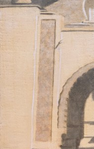
A Piece of Me #07, the mixed technique on panel.
The “mixed technique”, as I use it, refers to the development of an egg/oil emulsion that can be used to grind amounts of dry pigment powder into a useable paint OR using that same emulsion to extend already existing manufactured tube oil colour into a faster drying, leaner paint. Some scholars and painters claim that the “oil technique” discovered in the fifteenth century by the Northern Renaissance painters (beginning with Van Eyck) was actually a discovery of this emulsion. While others claim that Van Eyck’s new oil technique (or “mische techniek”) consisted of the judicious use of oil glazes over a well developed egg tempera underpainting. Whether there actually was an in-between phase of a new emulsion (as described above) appears to be a matter of debate. You can find authoritative resources either way. For myself, I have tried creating paintings with both approaches but, like a moth to the flame, continue to be drawn to this new emulsion and the effects it creates. My results have reflected the analogy correspondingly: sometimes scintillating; sometimes trash.
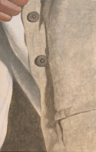
A Piece of Me #37, the mixed technique on panel.
This “new emulsion” then dries more slowly than egg tempera and yet faster than oil. It allows for smoother transitions in blending. It also allows for wet-in-wet brush stroke integrity (which the oil technique, when applied wet-in-wet tends to slur). Relative to the emulsion recipe I use, when created freshly, it looks and handles like mayonnaise. Because it’s created with methyl cellulose glue instead of an egg yolk it lasts a lot longer. An emulsion created with the yolk of an egg should create a well functioning “mayonnaise” too, I just haven’t tried it.
For this series of panels I applied the few steps with which I have become familiar over the years:
- the choice of a firm substrate, in this case, a 3 mm HDF panel with a hardwood veneer on both sides
- sizing the panel with rabbit skin glue
- coating the panel with approximately 10 layers of traditional chalk gesso
- another coat of size to reduce absorbency
- a well developed underdrawing, created with india ink. Depending on the subject matter, sometimes pen and ink, sometimes a series of washes, sometimes both.
- a well developed underpainting
- a clear glaze painted on and allowed to dry for approximately 15 minutes before wiping off
- mixing emulsion into my colors as I painted into this clear glaze
- doing so made for smooth, easy to blend transitions
- you can click this link for a full view of the mixed technique series of panels for the A Piece of Me project
Painting backwards, again
July 6, 2020
I just finished creating a series of panels using the mixed technique. It’s an indirect method of painting that works best when you already have a clear design in mind: you know where the lights and the darks will be; and you have a pretty good idea about your placement of chromatic masses. Depicting something realistic, or surrealistic, then is usually its best application.
Speaking very, very generally, because realism or representational art (in terms of subject matter) has been out of fashion for a century or so, so has interest in the techniques best suited to it. That is, an indirect technique has not been valued as highly as an alla prima one. Artistic expression then has been seen (again for the most part) as the process of allowing the artist’s unconscious mind to freely roam, expressing itself spontaneously through lines, shapes and colours – with as little conscious-mind interference as possible. Certainly, it may bounce off externals of self and other, but abstraction is the aim. The artist then functions as a midwife, through which process one hopes to create something universal and beautiful. If not beautiful, then at least shocking in an insightful way. That’s modern/contemporary art.
But because of the valuation for this alla prima, zen-like spontaniety, the mixed technique as an indirect method of painting has been out of vogue. In a world of deconstructed subject matter, artistic expression too has become deracinated. Techniques developed over centuries for building up layers of beauty have either been largely forgotten, thrown onto the trash heap, or preserved by conservators and reactionary geeks like myself. In that sense, it’s been difficult for me to learn about them, though internet forums these days have been very helpful. All in all, I have had more failures than successes as I’ve gone back to the drawing board again and again, reinventing the wheel. One success though, has been what I call “painting backwards”. It’s a process whereby the underlying layers of substrate or underpainting are used to reclaim the highlights and quarter tones – instead of slapping white pigment back in on top.
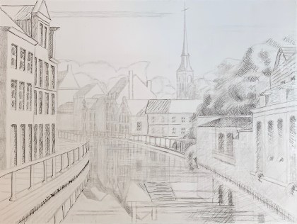
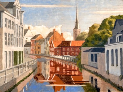
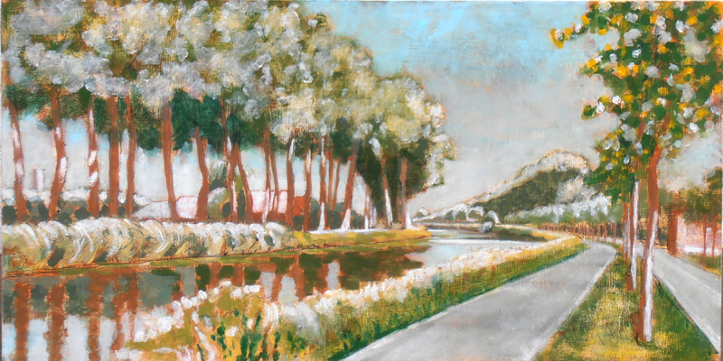
Final layer of paint on the Vaardijk. Note the highlights of the green tree in the foreground, right and the building roofs on the right side of the canal. They are highlights reclaimed through painting backwards and/or light glazes.The highlights of the white building foreground, left, are a more impasto lead white.
So to return to my recent experiments in indirect painting. The subject matter of the panel on the left was based on a (realistic) black and white study of my own, while the panel on the right, below, was based on cut up pieces of a photograph for the A Piece of Me project. In both cases, because I already knew where I was going, I could develop the image: first in black and white (using india ink); then through a chromatic underpainting (in egg tempera). These under layers served as guides for later levels but they also assisted in reclaiming the highlights during the painting process.
This is one of the more delicious panels created through the mixed technique. The luminosity of the linen jacket was a pure delight to discover. This was possible by rediscovering the forms I had already supplied as suggestions. The oil level created mass.
I consistently asked myself: What is the difference between a white or yellowish highlight created with a full-on coarse impasto applied alla prima and a highlight rediscovered through layers of nuanced translucence? Huge! Both have their roles to play in the grand scheme of things although I frankly admit my passion for the latter. The A Piece of Me mixed media project mentioned above then is envisioned not only as a mixture of different media but also a mixture of approach, that is, some will be executed all prima and others indirect. The proof, I expect, will be in the visual pudding.
A Piece of Me – the beginning
September 12, 2019

Self portrait in Casablanca outside of the Hasan II mosque.
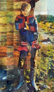
Last week I finished the preparation of 64 identically sized panels (21 x 13.3 cm or 8 1/4 x 5 1/4 in.) for a new project. It consists of cutting up a full length photograph (which happens to be a self-portrait, see left) into 64 identically sized pieces and then painting each piece differently, so in a different medium. Since there are not 64 different mediums, in effect, I’ve reduced my approach to five: egg tempera, encaustic, the mixed technique, oils and acrylics. Preparation-wise then, each medium receives the ground appropriate to it: egg tempera receives chalk gesso; encaustic and mixed technique, ditto; while oils receive an oil ground; and acrylics, acrylic gesso. Additionally each panel receives a pre-treatment (or not) thus: plain wood (so, no treatment); linen (glued on, using rabbit-skin glue); collage (glued on, again using rabbit-skin glue); pre-textured sculpting (I used acrylic modeling paste for the acrylic and oil panels while I experimented with pastiglia for the egg tempera, encaustic and mixed technique panels). Needless to say such an approach presents a bit of a logistical nightmare but excel spreadsheets can, indeed, work miracles.
Nils, 1978, final full-sized assembled painting. 6‘ 02” x 3‘ 6” or 188 x 107 cm
Anyway, instead of this appearing to be a new direction, actually, it’s not. It’s a return to the kind of work I was doing approximately forty years ago, see “Nils” right. You can read more about that painting project here. I also did a few other smaller pieces at that time trying out that same approach and I briefly dabbled with it again (as an approach) in 2011. But after stumbling upon an appropriate photograph earlier this year, I’m drawn to return to it now with a deeper understanding of many things. So, here we go. I love how the compositions you receive with this approach are completely arbitrary and spontaneous. The challenge, as always, is to create a sensorial unity, something beautiful and interesting in its own right individually and of course, in the final assembled result.
Haunted by Hopper
September 9, 2019
Sometime in 2012, I think, I was struck by the morning light as I crossed the bridge connecting the Langestraat to the Hoogstraat here in Bruges (where I live). So I did a value study of it, imagining that I would soon create a painting of it in the studio. Well, “soon” turns out to have been a bit longer. In the interim we renovated an outbuilding of our house so that I actually had a functional place to paint, but also, I returned to the university in order to attain a Masters degree in Western Philosophy @ KULeuven. That latter project turned out to be a five year hiatus from the studio(!). So now I’m returning now, clearing out old projects and beginning new ones.
Here below is the value study that I had completed before dropping the ball.

Also, I had already transposed the drawing to a gessoed panel and sketched it in using silverpoint touched up with black ink for the deepest shadows. See below.
To restart I mixed up some egg tempera pigment pastes and began blocking in the main areas of color for the underpainting, sticking with light tonalities even of areas that I know will become deeply shadowed. I can always take light away but, using this technique, it’s hard to add it back. See below.
After letting the egg tempera to dry for about a week I applied some retouch varnish (mixed up with a small blob of burnt-umber oil color) in order to unify the imagery but also to minimize the absorbency of oils on traditional chalk gesso. Then I began using oils, tempered with emulsion. My first working session was the sky. See below.
The second was the foreground both right and left. Again, see below.
The third, the middle ground buildings, right. See below.
Then the reflections in the water.
In all cases, I paint some clear glaze medium on the area I plan to paint on that day. Let it dry about 15 minutes and then wipe it off. The surface then is tacky to the touch and receptive to emulsified paint.
At this point, the image is developing nicely; what remains is a question of balance, adjusting the value range, pointing up the highlights and deepening the shadows. Here below is the final result:

Picking up the pieces of my broken love
June 4, 2019
I recently picked back up on a painting project that I had left behind me a number of years ago. During this interim I had pursued achieving a Masters degree in philosophy at KULeuven in Belgium – which was great fun – but did not leave much time for artistic projects. So now, getting back to the drawing board certainly feels good even as I shake off the rust/dust.
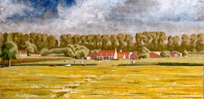
The piece I’m discussing here is based on a watercolor I did back in 2014 of a farm along the Dammsevaart outside Bruges, Begium. The watercolor is high in quarter tones, so, low in contrast, thus it does not reproduce well. Still it gives me what I need.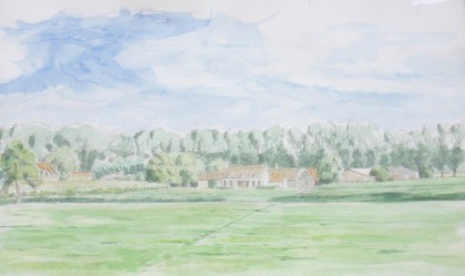
I had already transcribed it using silverpoint (no image available) and then worked up an egg tempera underpainting before letting go of the ball sometime back in 2015.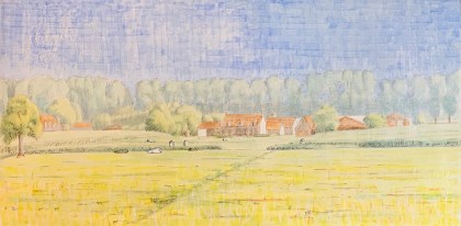
So now, before I began to work in layers of oil in the studio I covered it first with a light size and then also laid in a light coat of raw umber-tinted retouch varnish. The size protects the egg tempera while reducing the porosity of the traditional gesso while the retouch varnish also reduces the porosity while providing a unifying middle tone. It seems possible that I could have done either the one or the other (but not both) but I decided to do it anyway – and I’ll assess how the porosity of my oil glazes functions. I ended up with the following image. It may be ugly now but still, I think it will serve my purposes.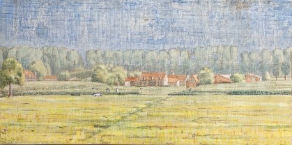
The next step was to begin laying in areas of oil paint using the mixed technique. Basically, this requires covering the area on which I intend to work that day with a light glaze of clear medium (my recipe is 1 stand oil:1 damar:1 turpentine). The medium should sit for a few minutes (about 10 – 15) so as to penetrate into the gessoed surface. Then it is wiped off using a clean, lint free rag. When all goes well, this produces a slightly tacky, wet surface into which I can introduce oil paint (tempered with emulsion, recipe here). This tackiness is quite important because the gessoed panel is quite smooth (in contrast to the weave of a linen canvas) so this tackiness give the paint something to hold on to. The “wet” surface is good to paint on for about 8 – max 12 hours max – so it’s important to only glaze an area that I feel I can cover in that time.
Since I already felt a bit rusty for this piece, I decided to tackle the sky first (no picture of just that phase), then followed it up with the line of trees in the background. This produced the following image. I began to think this might just work out. 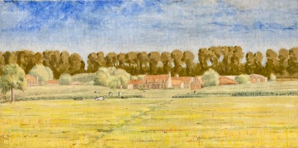
The next working session was the whole middle-ground area, the farm buildings and the middle-ground greens. The chromatic contrast of complimentary colors was now becoming quite evident and satisfying. After an approximately four hour working session I had the following image. Notice the transition from a blocked-in-dream to a Hopper-esque statement of light, flesh on bones: 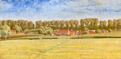
After that working session dried (about four days) I glazed up the foreground field and worked for about three-four hours to complete the painting. The brightest highlights were deeply informed by revealing the original gesso by “painting backwards”. This is done by erasing passages of emulsified paint using a small flats brush dipped in medium. Below is the result. 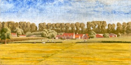
Finally, after a few days I decided to improve, that is add some dynamic energy to, the sky. The day here yesterday was blustery (as the contestants at the French Open can testify). It inspired me to add some clouds. I glazed the entire sky with a unifying burnt umber glaze and then started slashing in blobs of titanium white and dry brushing it into the existing underpainting. A few days later I added more detail to the foreground field of grasses. Here is the final painting:
*******************************************************************
All this work might seem like an unnecessarily complicated and esoteric technique to someone interested in achieving a zen-like spontaneity to their paintings. All I can say is, if that’s what you want, then don’t even think about attempting the mixed technique. However, I myself was seduced by it almost 40 years ago and have been a devotee ever since. That’s not to say I have always been successful with it – for the most part I have not – as it is challenging in a variety of ways. But when it does work, the results are, or at least can be, sublime.
But why all the devotion? Because mixing emulsion into the oil paint tempers it, that is, turns it into a firmer, water receptive paint-medium (which bye-the-bye also dries more quickly than straight oil). This means that you are actually painting wet-in-wet (wet emulsion into the wet glaze medium). You can place two strokes of color adjacent to one another – yet each retains its own integrity. You can leave the strokes as is, or you can take a dry, fan-shaped brush (or your own fingertips) to lightly blend them. This allows for the best of egg tempera (with its hard edged chromatic purity) to be conjoined to the soft blending possibilities of oil.
And because you paint in layers you can, using clear medium, erase a freshly painted section or modulate an already existing dried passage by applying a new layer of tinted glaze. But the whole point of painting in layers is not to over-paint or over-work the surface but rather to allow the luminous nature of the original gesso ground to “speak” through, at least in places. Thus a luminosity is achievable that is not readily available by other means. The levels of painting possess hidden secrets (and/or directions) while simultaneously creating unexpected surprises. There are many possibilities, the greatest danger of which consists in walking past a perfection that you may not have noticed you have already achieved (!).
For the mixed technique you’ll need to:
- paint on a hardboard surface prepared with traditional gesso
- have a relatively clear vision (both in black and white and in color) about where you want to go
- pay attention to your recipes
- work in the studio (as en plan air conditions are just too demanding – besides being counterproductive)
- use a limited palette (for example, for this piece I used: lead white, burnt umber, cadmium yellow medium, ultramarine blue and mars red)
- realize that the spontaneity you seek already lies in the materials lying at your fingertips
- trust yourself and let go
Reinventing the wheel – Tempera White
August 24, 2015
After years of experimenting with the mixed technique I have confirmed two things. I love glazing; and too much glaze absolutely kills oil’s refracting light. Thus I have often, even repeatedly, found myself at cross-purposes.
Most of my experiments in the recent years have been attempts to preserve this light. Painting backwards is one of my more notable successes. However, reclaiming the white of the original panel through painting backwards doesn’t really work tactically speaking if the neighboring areas of paint have already been worked-up. And adding it back at the finish line (like I did here) is OK but you can’t always guarantee that the surface will accept it by then or that the light so added will be integrated in the way you want it to be. I needed light within the painted surface, a reintroduced light, applied within and over the developing image. And of course it needed to be lean enough to bear a layer or two of glaze. How did the old masters accomplish this? Tempera white.
What is tempera white? Basically, white pigment (I use zinc white but the old masters most probably used lead) ground up in a very lean egg/oil emulsion. The emulsion I use comes from the mixed technique (one could just as easily substitute an egg yolk for the methyl-cellulose glue component of the recipe I list here). I have used white (lead ground in oil from the tube) before for reintroducing light values within each layer of colored glaze while developing an image chromatically. For examples see: I am curious yellow, Seeing red, and I’d rather be blue. But in all previous attempts, I did not introduce tempera white directly over the egg tempera/imprimatura underpainting, from the get-go, so to speak. That’s what I wanted to do this time, as doing so can free me from any pre-conceived plan of chromatic image development via glazing.
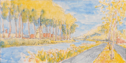
So I’ve been working on a landscape of a farm on the Dammevaart just outside of Bruges. I created a watercolor study of it a few years ago. This functions for the basic composition, color relations and light study.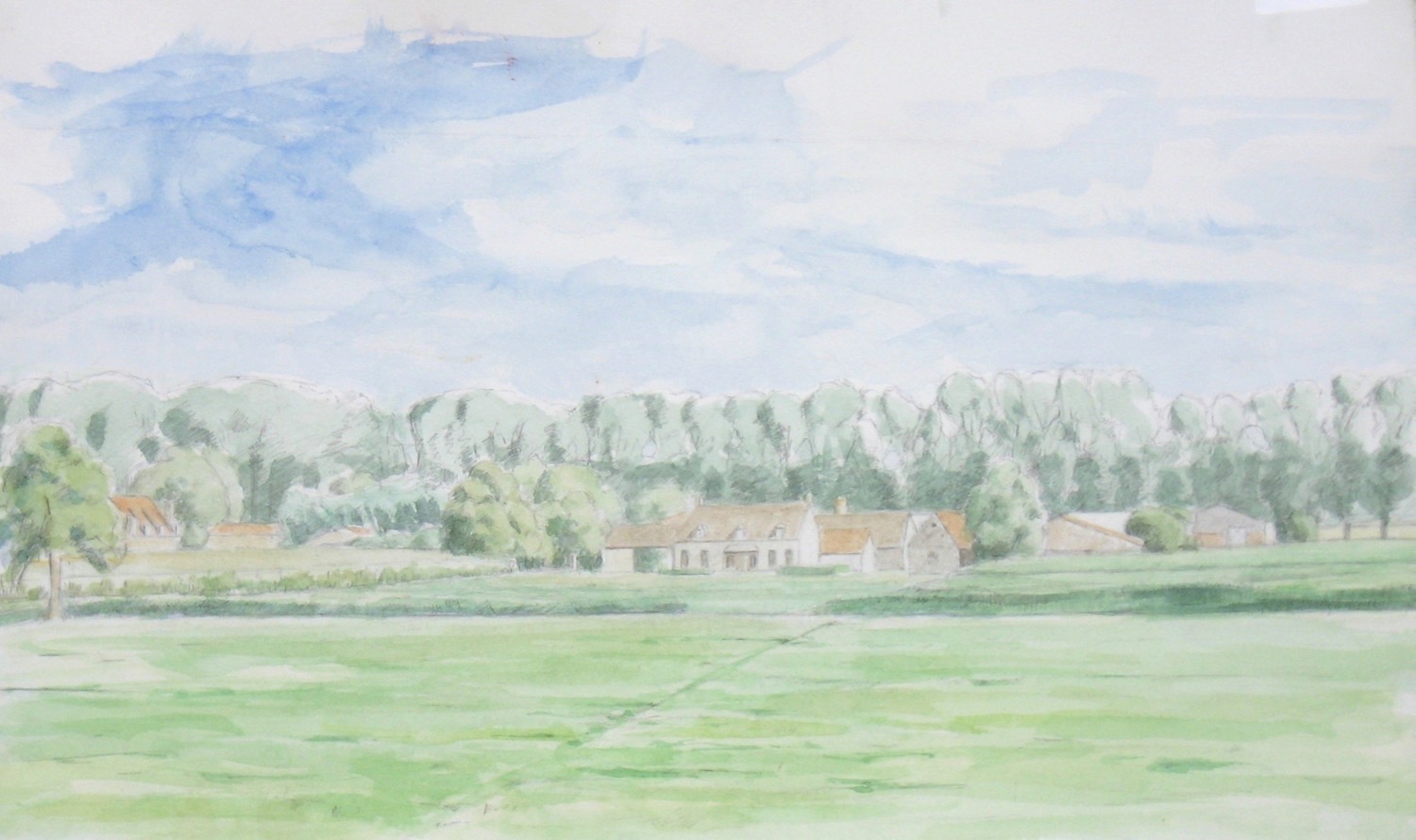
Based on this watercolor then, I transposed the design to a gessoed panel and worked it up in silverpoint, which tends to be very light valued.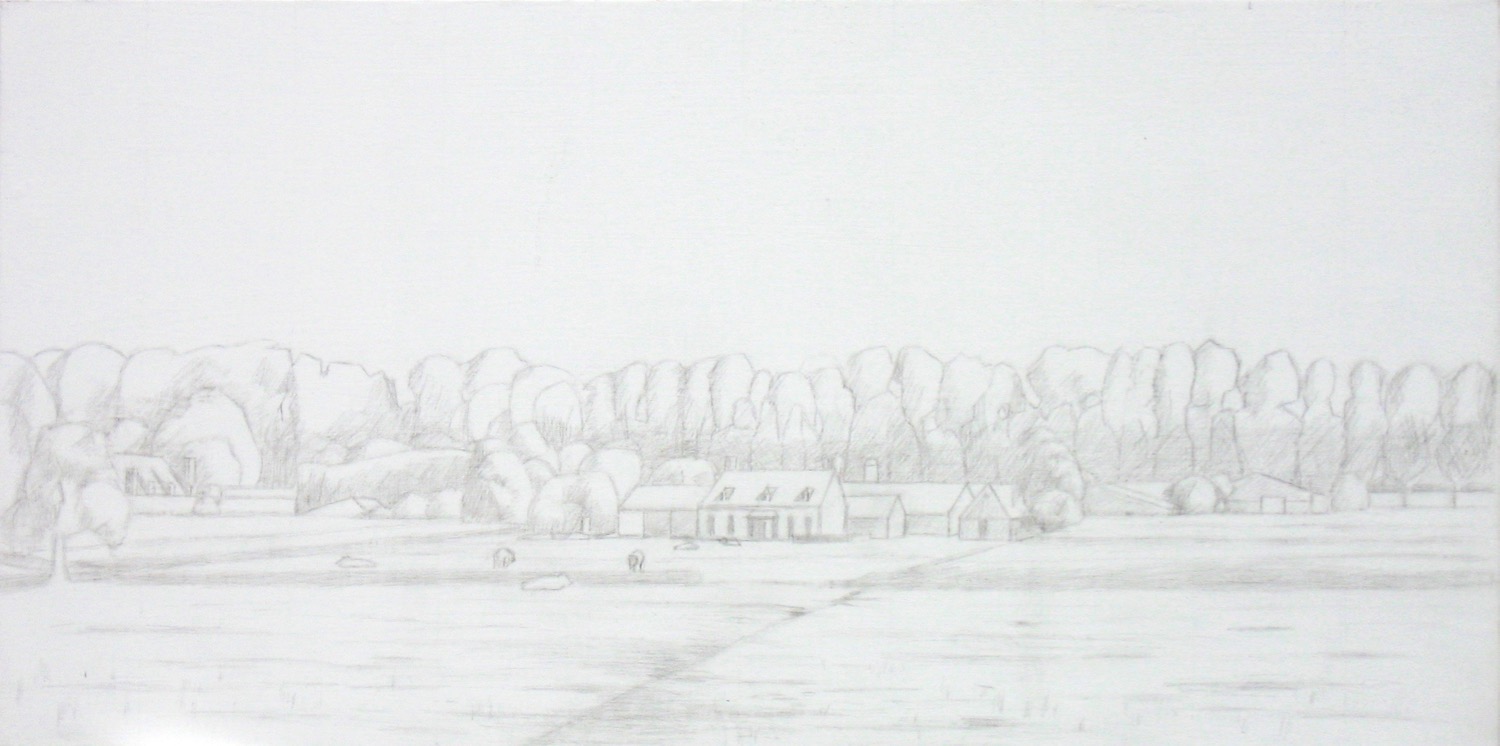 I then laid in light areas of color via egg tempera, anticipating the colors to come. Sorry, no picture of this stage is available (but just imagine the watercolor laid in over the silverpoint drawing and you won’t be far off). My interest for the ET level was stating color relations but keeping them as just hints – not fully developed and certainly not saturated. I let the ET fully dry and oxidize for a few weeks before laying in a toned (burnt sienna) imprimatura. Sorry, no image is available of this stage either. The imprimatura acts like a very lean glaze, bringing everything into relation through its hue and tonality. But additionally it also places an inevitable veil over all design elements. The already lightly developed composition got flatter and the ET colors were only slightly visible, as though through a tinted filter.
What to do? White tempera to the rescue. 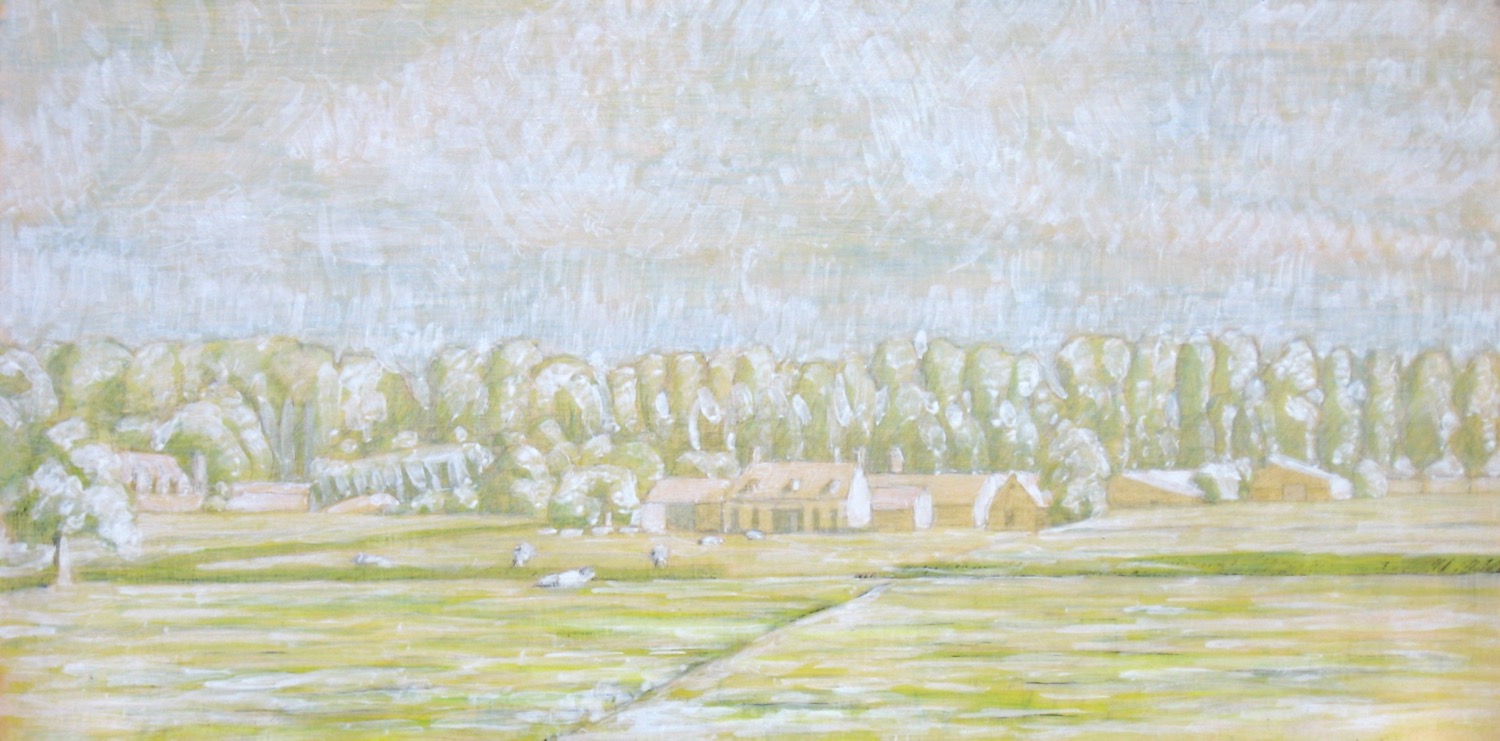 It helped to reintroduce the forms by stating the highlight and quarter tone values. All my seeming tedious homework from the earlier layers played through. My aim now is to complete the painting with just one session of painting into a glaze. The aforementioned homework should allow me to work quickly, spontaneously and yet accurately. And despite all the detail of the under layers, I don’t aim to create a fully detailed realistic painting, rather my goal is a painting that gives the viewer’s imagination space to wander – even if just a little bit. So stay tuned.
NB: When I returned later to do the first glaze my white paint dissolved. I’m thinking that my emulsion was no longer fresh so it’s binding properties broke down. Rather than delete this post, I’m leaving it up just to show and document my mistakes which can be just as teachable as any success.
Bend in the Damse Vaart
August 30, 2013
I posted a WIP (work-in-progress) about a month ago. Yesterday I completed the last glaze on that project so here’s the final result. I’m quite happy with it, as there were a number of technical challenges.
Bend in the Damse Vaart, Oil on panel. August 2013.
The first challenge was the light. I felt that the previous en-plein-air painting session (see WIP) had been quite successful but that I had lost the light statement which had been so apparent in the imprimatura. I decided on major surgery. I extracted the paint from the highlight areas (using medium instead of turpentine because it’s a softer method of extraction of fresh paint and you can paint back into it quickly and easily). Then I reintroduced light via a fast drying tempera white (zinc white mixed with emulsion). The resulting impression was a bit like a coarse blanket of snow(!).
Snow on the Damse Vaart…
The second challenge was what’s called a sunken-in painting surface. What’s that, you might ask? Well, as the en-plein-air painting session dried, I noticed that many areas of the painted surface had become dull and gray instead of luminous and light. (Yuk!) This can occur when the chalk gesso ground is too thirsty and absorbs paint too quickly. Luckily this can be remedied by a light coat of retouch varnish, which I did and it was. So now the painting had been resuscitated but it was defo an ugly duckling: functional but with an unpleasant tactile quality.
I decided to complete the project in the studio, since technically there were too many balls to juggle. I kept with the same minimal palette that I had used en-plein-air: cadmium yellow, alizarine crimson and thalo blue – mixing any color I needed from these three with the addition of lead white and warm gray for my tints and shades. I started by glazing and painting the left bank only. I hate working this way since the development isn’t global but there wasn’t a way around it (that I could see). After the first studio session I had the image below:
Rive gauche
Now the painting was starting come alive and I was in love (really!). When this begins to happen it’s very important to listen to what the painting is saying instead of imposing any extraneous ideas upon it. For example, working en-plein-air at this point would be counter-productive. The hard part was waiting the few days it took for the glaze to dry enough so as to work on the adjacent area. When it was, the challenge was simply in staying true to the developments of the other side. See image here below:
Rive droit
So then again, after the appropriate drying time, the final step was more of a follow through than a creation: mirroring the development of the painting in the water’s reflections while attempting to give it a sense of wind-life. (See the initial image above)
Now, on to the next…
A work in progress…
August 3, 2013
After a long hiatus (precipitated by moving into an old Bruges row house and renovating it, along with creating a little painting studio for myself) I finally had the chance to get back into painting these last few weeks – and the weather has been great!
I decided to do an oil of a watercolor study I had completed in 2011 of the bend along the Damse Vaart canal outside Bruges. It’s a great perspective, particularly around mid-day. There are some interesting middle ground structures on the left, while on the right the receding treeline stretches almost all the way to Damme. The strong mid-day shadows complement the movement and function as an anchor.
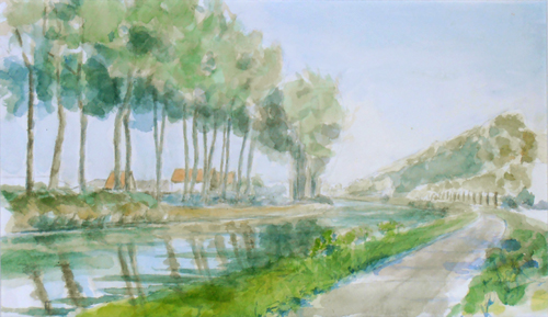
watercolor of the bend in the Damse Vaart, 2011
I transposed the basic composition of the watercolor to a panel, but decided to do the foundational ink drawing and egg tempera levels en plein air. For the ink level, I reverted to the stylus and nib quill-pen style of my youth, instead of the technical drawing pens I’ve been using ever since. I wanted to let the pen nib respond to my hand pressure with a thinner or thicker line, mirroring my response to nature. It worked quite well, except the ink jar fell over spilling most of its contents. Enough remained to complete my work, even if the drawing ended up being a little sketchier than I might have envisioned it.
So I quickly moved onto the egg tempera stage. I brought three pigments with me pre-ground into pastes: cadmium yellow medium, alizarin crimson and thalo blue, in addition of course to the egg yolk. In future, I plan to mix up my paints with egg in the studio before going out – just to minimize the hassle: there are already enough uncontrollable factors to contend with in nature, like the wind, rain, sun and insects, why shoot yourself in the foot? In any case, I mixed up my paints in situ and laid in some washes over my ink drawing to indicate future color developments.
india ink and egg tempera underpainting of the Damse Vaart bend
Though it may not be very visible in the reproduction image here, I paid special attention to lay in more saturated colors in the foreground and lighter washes in the distance. I’ve learned from experience that it all makes a difference in the long run – any color, no matter how subtle equates to less light.
After a week or so, the egg tempera level was cured enough to paint over. It dries immediately but don’t be deceived, the egg/oil combo also has to cure. Gentle UV light can help. I painted a toned imprimatura of burnt sienna over the piece. My purpose in doing so was to unify the disparate foundational parts and lay in a preliminary value study. Using turpentine, I extracted the imprimatura from the highlights and lighter quarter tones revealing the underpainting beneath, while painting a more saturated layer into the shadows. I did this in the studio and it came out quite well(!). Now it’s starting to get exciting.
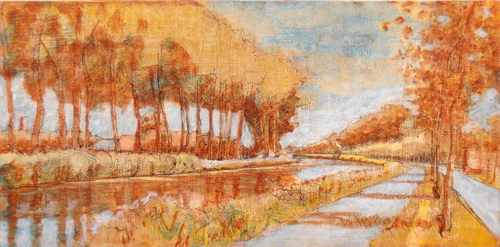
imprimatura, bend in the Damse Vaart
I let this level dry for almost a week. That’s not really necessary, at least if you don’t mind a little imprimatura bleeding into the next level of glaze, but since I did, I let it dry. Also, the shadowed areas were painted with a slightly heavier sienna wash, so they needed more time.
Finally, I set my field easel up in situ on a clear sunny day with a mild breeze. My homework was all done, the question was how far would I be able to bring the painting in one working session? I covered the whole panel with medium, wiped it back off leaving a slight tack to the panel surface and started in. Four hours later, I had the following result:
Level 1 oil, Bend of the Damse Vaart
I consider it an excellent start, though a little too coarse and graphic for my taste. I’d like to reintroduce the atmosphere of the imprimatura by softening a number of transitions and reintroducing the light. We’ll see if that’s possible. Fingers crossed for Bend in the Damse Vaart, part II.
A question of balance…
August 22, 2012

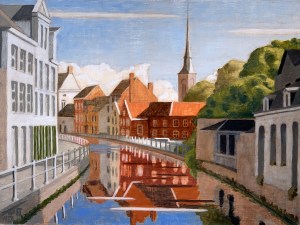
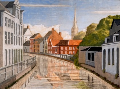
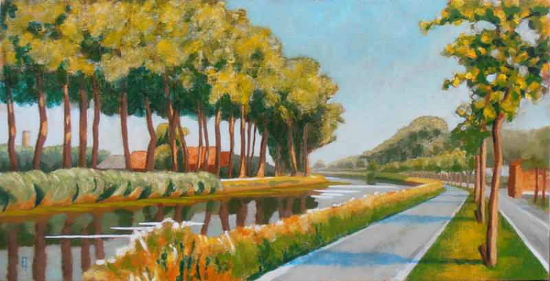
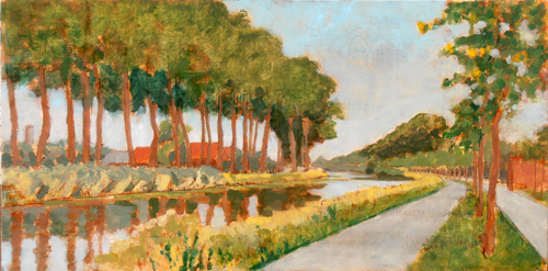
Langs de Vaartdijk
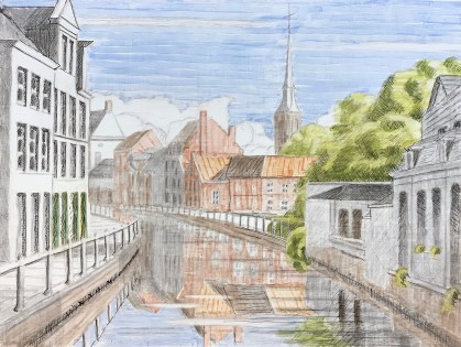
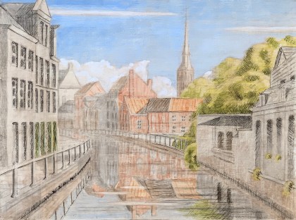
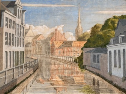
Today I created the final glaze on one of my favorite views along the Vaartdijk, a canal on the outskirts of Bruges, Belgium. On a clear day by about 11:00 a.m. the light makes a nice silhouette of a distant church tower with great rooftop variations inbetween: an interesting study of light. Additionally (at least in summer), the green vegetation and red roofs create a wonderful complimentary color juxtaposition, too. I wanted to try to maximize both in a painting.
I began last year with a watercolor study. This was helpful for setting out the general composition but didn’t come close to conveying what I saw (or felt about what I saw). I knew oil was needed to set it right. After working up an underdrawing in india ink followed by an underpainting in egg tempera, I set out attempting to maximize the reds and greens as I felt them through layers of pigment – in the studio. Working en plein air is great for quick studies but it’s almost a contradiction in terms for manipulating layers of oil here in rainy and unpredictable Belgium. Additionally, I knew I needed to concentrate on my own vision and not become distracted by the changeful atmospheric conditions attendant to working in situ. Describing distance with oil paint is a huge challenge, as any hue or value too weak (or too strong) belies the intended effect: it’s a question of balance.
I ended up dancing between cadmium yellow light and cadmium yellow medium for my yellow pigments and ultramarine or thalo for my blues. So my greens would vary from an almost neon green (cadmium YL and thalo) in the foreground, to just slightly dirty in the middle (cadmium YM and ultramarine), to a warmish gray at the back (cadmium Y M and thalo plus burnt sienna). And my reds alternated between two wonderful earth pigments: an opaque mars red and a more translucent burnt sienna.
But these developing color thrusts demanded a regular rebalancing of the whole through reasserting the original statement of light. I often had to reintroduce opaque white pigment in order to reclaim a highlighted area that had become obscured. Of course, it’s always best not to lose light in the first place, but perhaps it’s just a necessary evil of the glazing process? In any case, in addition to the vibration of color, the circulation of light was an equally important factor to integrate in this piece. The image above is the final result. I quite like it.
The Inside-Out: final version
October 17, 2010
A few years ago I located a couple of carpenters who spoke enough English (and were pretty good at sign-language) to readily understand what I wanted them to create. A few weeks later they contacted me, “het is klaar” (it’s ready). My concept: I wanted to create a two sided painting (on a wooden panel) with a rotating inner core. The core needed to be extractable duing my creation process but afterwards could be fixed (permanently) in place.
 But why create two paintings on one panel? It’s a ton of work. And what would be the reward? That’s very hard to say, except this: it’s a clear and definite way to demonstrate relation. Relation of what to what? You choose, but of course it offered the fundamental and very pregnant possibility of contrasting realism with abstraction in a direct and visceral way. For one side, I chose a landscape. A realistic, almost academic landscape based upon a value study of one of my favorite views of the Predijkherrenrij here in Bruges, Belgium.
 And for the other side? Initially, and for a long time, I planned on an open blue field containing a text from Nisargadatta Maharaj, “I am, I am aware, I like it.” My thinking was simply this: if you have to use words to convery your intent, then these words from Maharaj summarize just about all that you ever really need to know. So, that’s what I created.

The Inside-Out

The Outside-In
When the inner core was rotated, it offered views as seen here left and right:
Thus, so far so good, kinda, but the text really bugged me. It took up way too much mental activity – thus creating a tendency to negate not only the unique mental-activity-bypass possibilities of the visual arts, but also the inner intent of the quotation itself! So last week, I painted over the text, to render a pure open field of blue. Ahhhhhh…

The Inside-Out revised
The Outside-In
When the inner core was rotated into “reality” I got this revised version as seen here left and right. Double ahhhhhhh……. Mucho bueno.

