Preparing Grounds for Silverpoint
April 25, 2021
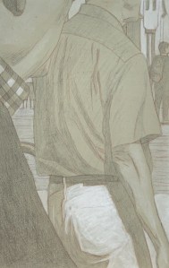
The winning test panel. Silverpoint over tinted acrylic gesso, treated with GOLDEN Pastel Ground, highlighted with acrylic titanium white. 13.3 cm x 21 cm, or 5 1/4 x 8 1/4 in.
I’ve been doing a number of tests in preparation for an upcoming project. It will consist of a series of uniformly sized HDF panels prepared with a tinted ground upon which I intend to create images executed in silverpoint. These silverpoint images will be touched up with white (probably gouache). Since silverpoint does not create a strong dark line (that’s part of its beauty) I wanted to create tinted grounds that were not too dark, say, between a 10 – 20% grey value. The silverpointed strokes could softly emerge from this but never become stronger than a 40-50% value. Likewise the highlights could softly arise in the opposite direction, creating a nuanced chiaroscuro effect. Further, I imagined the hue of the background to be a terre verte. Since I planned to create a series of these panels whose grounds should be uniform I wanted to create a tint which could be reproducible across the whole series.
Relative to the ground itself, silverpoint requires a drawing surface prepared with a significant amount of “tooth” to catch the silver of the stylus. The substrate for that ground can be flexible or inflexible. The grounds for flexible substrates, such as paper or cloth, then need to create this tooth while also remaining somewhat flexible. Such grounds tend to be acrylic based (though this rule is, in itself, not inflexible). The grounds for inflexible substrates possess more latitude. They can be acrylic or traditional (based on rabbit skin glue), these latter tend to be more brittle. In the case of this project, since I had already chosen HDF, I had a range of media to choose from.
Additionally, contrary to what the word “tooth” might seem to imply, it does not so much refer to the texture of the ground as it does to its hardness. Because the silver (or any metal point) creates its mark by leaving tiny deposits of metal, the hardness of the pigment filler suspended in that ground is what provides this tooth. The carrier might be acrylic or rabbit skin glue while for the filler an array of white pigment particles may be used. These may include mixtures of chalk whiting (calcium carbonate), titanium white and/or zinc white. After it dries, the ground may be polished smooth or left with a bit of texture – artist’s choice. Experience quickly demonstrates that small, meditative motions of the stylus create soft, almost indelible lines whose value intensity increases only with repetition – not pressure.
At the outset of this project then, I had a few questions to answer:
- Since I already knew I would be using an inflexible substrate, should I use an acrylic based carrier or a traditional rabbit skin glue for my gesso? In theory, both might be appropriate.
- If acrylic, how should I introduce my tint? Terre verte in dry pigment form is known to be chemically incompatible with acrylics, so mixing up a combination of other pigments in an aqueous dispersion would be my best option.
- Alternatively, if I choose RSG as my carrier how do I introduce the tint? From a technical point of view, terre verte could be added to the dry pigment filler base of my RSG ground. However because it has such a low tinting index and its hue varies greatly from supplier to supplier, it’s not a good choice. An aqueous dispersion of high tinting dry pigments might be necessary here too.
- Whatever medium I choose, along with whatever tinting mechanism, its hue should be reproducible.
I began creating a number of test panels using different carriers and differing tinting solutions. After much experimentation I discovered:
- I experimented with adding a few blobs of tube acrylic “terre verte” to my acrylic gesso. It worked well enough for one panel but would clearly be difficult to calibrate chromatically across a large series. Also, I thought it would be a more expensive.
- By combining small but precisely measured amounts of cadmium yellow, burnt sienna, mars black and viridian I could grind up a hue that I liked. I added small amounts of distilled water until I had a paste which could be further diluted into a well-dispersed yet concentrated tinting solution.
- This hue could be reproducible across the series since I had not only maintained records of my dry pigment tints but also how much gesso base I had used (either various GOLDENS acrylic gessoes or various RSG recipes). In this way I knew how to ultimately manage my white component.
- Finally, the winner was an acrylic combination. See above, left. Though I truly prefer the haptic experience of a traditional RSG gesso for silverpoint, in this case acrylics won out. My reasons were: facility, it’s easy to use, for when you are planning on creating sixty four panels, this matters (RSG recipes can be more finicky); uniformity, the tinted, sanded surface of the acrylic ground was uniform (this was not always the case with my RSG gessoes); value, the silverpoint line was not too dark on the acrylic ground (surprisingly, the RSG/zinc white ground created a darkest line of all); line clarity/or not, a transparent coat of GOLDENS Pastel Ground applied onto the acrylic ground turned the surface texture into a rough sandpaper. In turn this made my silverpoint strokes a whispy sfumato, whereas the baby butt-smoothness of the burnished RSG grounds created fine, strong, clear lines (not what I was looking for in this project). Highlighting, washes of white gouache were well received on the acrylic ground and easily manipulated (because they were in an aqueous solution, this was not the case with the water-permeable RSG grounds). However, ultimately I opted for doing my highlights in (titanium white) acrylic since in the long run it requires less protection. Versatility, since I am beginning to imagine further (semi-translucent) coats of paint over the whole series after they are completed and fully assembled, the robust versatility of the acrylic medium seems to be the best choice.
It can sometimes seem like a lot of extra effort to do your homework like this, but it’s worse to create a whole project only to find that the materials you use don’t let you do whatever it is that you envision.
Besides, I think you have to enjoy creating mud-pies. 😉
Underdrawing for egg tempera
October 2, 2019
About ten years ago I began to experiment with silverpoint. It’s a beautiful and ancient technique that was used long before lead pencils or even the wide-spread distribution of paper. A metal point (in this case silver, though other metals were also used) is inserted into a stylus and you begin making light scratches on a ground with enough tooth to be receptive to a light deposit of the metal particles. Since silverpoint works extremely well on traditional chalk gesso, and this had already been my ground of choice for decades, there was no learning curve for me in terms of the preparation of the ground. So I began to employ silverpoint to develop underdrawings for landscapes (intended to be created in the studio). This went seamlessly since I had already transitioned to creating my paintings in the studio based on en-plein-air value studies.
silverpoint with india ink
As for the silverpoint, I was very pleased with its tactile feel. Yet – in contrast to lead pencil or ink as I quickly learned – the amount of pressure you exert has no influence whatsoever on the value you create (!). It’s only possible to create deeper values through repeated motions. Because such values are developed slowly through repetitive motions silverpoint is a time consuming yet meditative activity. Nice! It creates a great deal of fine detail – softly. Deeper values can and do develop over time, especially when the surface is exposed to light for extended periods of time. But I expected my silverpoint underdrawing to become sealed under many coats of paint so I was never too concerned about its tarnishing/darkening factor. And, since I was interested in creating landscapes where describing distance is an intrinsic factor, I began implementing india ink cross-hatching to specific dark value areas of my foreground. This enhanced the contrast. I thought I had developed a pretty cool underdrawing technique for myself. I was happy.
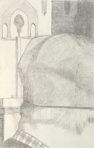
Silverpoint on traditional gesso panel
However, recently when I began a project of 13 panels to be executed exclusively in egg tempera, I discovered otherwise. I had naturally turned to silverpoint for my underdrawings. The work flowed. I was a happy little camper creating beautiful little silverpoint panel underdrawings in my cozy little studio. Until at some point it dawned on me that the silver of the silverpoint would naturally tarnish in the presence of the egg’s sulphur. It would be an organic process over which I would have little control. Banksy might be fine designing his paintings to self-destruct in a shredder at auction but that really wasn’t my intention here.
I quickly contacted Koo Schadler, a contemporary artist who creates beautiful paintings in egg tempera and who also does drawings in silverpoint. She was very kind and informative though in fact she did confirm my suspicions. At the same time she introduced me to the MITRA Forum, a website hosted by the University of Delaware where conservation experts are available to answer such (geeky) questions. They, too confirmed the difficulty.
Well, so what did the Old Masters do? While there does not appear to have been one set solution, because individual studios/guilds and masters all had their own approach, there does appear to have been a convention: washes of ink (or later diluted oil paint). It was fast, easy, cheap and versatile. Using it you could quickly achieve a wide range of values and on a large scale, if necessary (neither of which is silverpoint’s forté). Silverpoint may have been used early on in the design/transfer process (if you were working on panel) but even so, why carry it through when a fluid medium is so much quicker and easier?
Returning to my project, the question remained: what to do with my already completed silverpoints? Koo had initially suggested that washes of india ink (which contains shellac) might be able to seal off the silverpoint level from the egg tempera level (though the efficacy of such a maneuver was questionable). So, I began creating light washes of india ink over my existing silverpoints. I proceeded slowly and gently in order to avoid creating values too darkly, too quickly. This worked out great and seemed to enhance my silverpoint panels! I was happy (again) though nagging doubts remained. Additionally, the MITRA Forum experts had confirmed that there are no sealers on the market able to fully prohibit oxygenation/tarnish – and attempting to create a seal that would be strong enough to do so would compromise the adhesion capacities of the egg tempera. OK, got it.
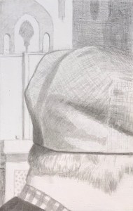
India ink underdrawing after erasing the silverpoint.
So I got up yesterday and took an eraser to my panels. I began to erase all of my beloved silverpoint work. You will hear people say that silverpoint is not erasable. That’s not my experience. With some diligent rubbing the silver came off leaving only the india ink behind. Did I get it all? I don’t know, I think so, but only time will tell. But I’m no longer worried. Thus in the end, the silverpoint drawings that I did served me well: they gave me enough information to create subtle and detailed india ink underdrawings. Now I am confident enough to proceed with my egg tempera.
Bullet dodged.
The yoga of figure drawing
April 14, 2014
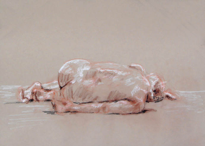
Figure Drawing #31. Conté crayon on warm gray pastel paper.
Back in the seventies when I was discovering my wings as a young art student, I fell in love with a book called “The Zen of Seeing/Drawing” by Frederick Franck. It was filled with inspiring text and drawings about the experience of drawing itself. Over the years, though I may have forgotten about the specific contents of that book, the direction it fed has remained, such that I always regard drawing as a meditative experience.
How so?
The way I see it (in life in general, and in drawing specifically) there is one main element to transcend – myself as a separated personality. And if you are into transcendence (as I am) it’s good to know exactly how that restricted sense-of-self functions. So there are two primary aspects to it: one temporal and one spatial. The temporal aspect is especially mind based while the spatial aspect is especially body based and although there are a million and one ways to transcend these limits, participating in timed drawing sessions of a naked human being is surely one of them. It provides a visceral impetus to concentrate temporally, into the moment, while simultaneously expanding spacially, into the other. In a certain way it’s that simple.
Figure Drawing #32. Pencil and white conté pencil on warm gray pastel paper.
Most of the time figure drawing sessions are very open situations. There is a studio space and a model. Everyone chips in to pay the model’s fee. No guru, no teacher. Usually also there is a loose structure for the number and duration of the poses. And that’s it. It’s really about chopping your head off (in order to avoid drawing from some preconceived kind of place) and getting into your tactile body. Feeling the paper, feeling the chalk, feeling the model (as yourself), letting go and staying aware. Sometimes I don’t look at the paper at all, content with just feeling the chalk explore the contours of the model’s body. Sometimes I wait to feel the model’s pose in my own body before I start. Where is the weight? Where is the movement? But then, also, what is happening on the paper? Seeing the model there, watching the figure taking shape. Feeling its life coursing through my fingers.
Additionally, drawing in this way isn’t about achieving some external standard of “likeness”, rather it’s about discovering your own authenticity. It’s about making footprints in the sand: remnants of a journey whose importance far outweighs it’s trace.
Notes on figure drawing
June 28, 2012

Figure drawing, March 2012
I’ve been attending a weekly figure drawing session for over a year now. A local artist loves to draw from the live model so he throws open his studio on Monday nights and invites any and all like-minded others to join in. There’s usually jazz blowing through his sound system and a small fire in the wood burning stove. We chip in for the model’s fee and that’s that, no teacher, no guru: one naked body in motion and rest.
When I began coming to these sessions I hadn’t drawn from the figure in almost 25 years so I felt pretty rusty. For these last decades I’ve been concentrating on rendering landscape, which doesn’t move even though the light and atmospheric effects on it certainly do. So from my terrestrial work I knew about my penchant for motion, for tracing the land’s skeleton, for shapes and the contrasts of light and dark, but how to get the essence of model’s pose down quickly and with some sense of accuracy?
I began with medium toned gray paper, slashing out indistinct highlights and blocking in coarse shadows. Most days the figure floated somewhere in space, sometimes a bit amputated, or just distorted from forcing a three dimensional entity onto a two dimensional space. I experimented with different grades of pencil, conté crayon, oil pastels and sticks of black carbon.  I tried white sketching paper, cheap recycled toned drawing paper, charcoal paper and Canson Mi-Tientes, each medium possessing a different tactile quality for recording sensation. I felt myself like a caterpillar with legs and antennae outstretched, sensing these forward vibrations with my own febrile tentacles.

Figure drawing, May 2012
Ingrained in my little head are the words of a friend’s former teacher, Nicholas Wacker, of the Ecole des Beaux Arts in Paris.
- Mise en page (placement on the page)
- Circulation de la lumière (circulation of light)
- Grisaille (gray/shading)
Thankfully, these principles guide me like a mantra in each sucessive attempt. Over time I developed an approach. For longer poses I sketch in the outline of the figure using a 6B or 8B lead pencil on a heavy weight Canson pastel paper. When I am satisfied, I block in the essential highlights with white chalk or pastel. If I have time, I return for the shadow accents.

Figure drawing, June 2012
For the shorter poses, 8B pencil, red conté crayon or black chalk on toned paper suffices. I remember that no line is superfluous so I try to erase as little as possible. John Ruskin in The Elements of Drawing advises, if you begin gently enough, any inaccuracies can be corrected with a new and heavier line. All lines are forays into the unknown, honor them as such. But if it at some point it all turns into an illegible chaos then it’s simply time to start over. And no harm done.
Silverpoint
May 15, 2009

Hans Holbein silverpoint
Silverpoint is another ancient technique that is receiving renewed attention these days. Jan van Eyck and the Flemish masters are reputed to have regularly used it as a drawing tool. Artists like Picasso and Joseph Stella brought it into the 20th century art world. The final design stands softly but well on its own or can be incorporated as an underdrawing into a painting.
There is an informative site at silverpointweb.com which offers a lot of practical information as well as sales of silver tips and a ground for the drawing support. I bought some of my pure silver tips from him a few years ago. The silver renders a soft, warm gray line that can darken upon exposure to light – just like the silver content of a photograph. The line itself is indelible so it cannot be erased. Another experiential resource is international silverpoint archives.
Drawing with silver is a very simple but time consuming technique. A thin piece of silver is inserted into a drawing stylus instead of a piece of lead. The silver can be obtained from a local silversmith. I have used both pure silver and sterling. The pure silver is reputed to create a slightly darker line, but I have not yet noticed the difference (which could be due to my gessoed surface not having enough tooth, so take my experience with a grain of salt). Points can be chiselled fine or beveled. Darker tones are achieved by repeated gestures and not by an increase in pressure.

silverpoint Joseph Stella
The drawing surface seems to make a great difference in results. The surface should have a slight “tooth” to it, to draw out the silver particles. I have used both white gessoed panels and toned paper. The toned watercolor paper clearly had the tooth to pull out the silver, but the value of the silver was so close to that of the paper that I finally opted for the white panels. Thus far the panels have given fine results which I have then used as underdrawings for some of my paintings.
Value Study
May 12, 2009

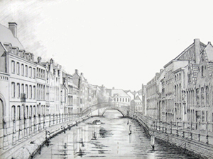
Langerei North value study
I spent years dragging my portable easel out to inspiring locations to paint. Although I managed to create a few interesting paintings, I threw away just as many failures. The changes of season, weather, and light caused any particular landscape to fluctuate enough so that I ended up with mud more often than not. Thus, I had to ask myself, how is it possible to capture anything eternal about what I am viewing?
One solution, I knew, was an impressionistic alla prima technique, and although its effects can be strikingly fresh, for better or worse, my own temperament is drawn to painting in layers, often termed “indirect painting”. Yet attempting to use an indirect technique for sequential forays of painting “en plein air” spelled trouble if I didn’t know fairly precisely where I wanted the painting to go.
Thus, I began to create fairly detailed studies both in watercolor and in pencil in order to understand what I felt and wanted to finally express in paint. Of the two approaches, I felt the (pencil, charcoal or ink) value study to be the most effective for describing my essential reaction to a view. The medium toned paper gives space for imagination to roam, inviting the perceiver in to participate in forms as they arise.
Alternatively, although it is clearly possible to take a photograph in order to capture “a moment” as preparation for a painting, photographs themselves are a mechanistic interpretation of visual reality, inevitably reducing three dimensional space to two. If I want to personally interact with the view before me, to dance with it, to make love to it, to merge with it, then the means needs to be an extension of my fingertips, vibrating with the energetic impulses of my own blood. This is in no way intended as a criticism of the fine art of photography, only a criticism of the use of photography as a means for a study upon which to base a painting.
When I have created a value study that resonates, then I transpose it to a panel and begin preparing for development of the painting.

