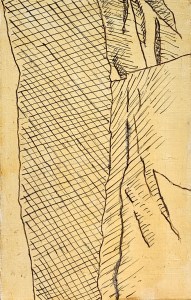
The Silverpoint Composite Underdrawing
June 6, 2022
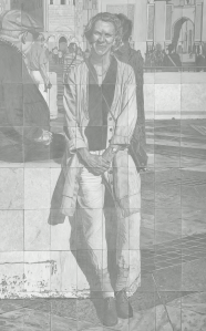
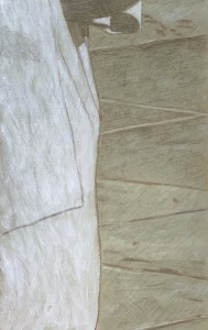
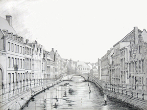
Silverpoint on tinted acrylic ground. 3 1/2 feet wide by 5 1/2 feet tall or 106 cm x 168 cm.
I’ve finally completed the sixty-four silverpoint underdrawings in preparation for a painting – as yet to come. The panels were developed individually – and were based on black and white sectionals of a photograph. The MDF panels were all prepared with an acrylic ground tinted with a mixture of dry pigments to simulate terre verte, because the actual dry pigment, terre verte, reacts negatively with acrylic rendering it unworkable – in that particular medium. Of course, I could have used a tint of white for my ground colour but I already knew how much I enjoyed working from a toned ground. The silver lines could be used to subtly create linear form while then the addition of an acrylic wash of white highlights could help it to “pop”! In addition, I coated each tinted gesso panel with a transparent covering of Golden’s Pastel Ground, in order to create a fuzzy toothiness.
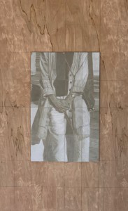
Assembling the panels on the backing board.
Now, since this level has been completed I’ve encountered two main problems-to-solve: 1) in the areas of darkest value which required a lot of cross-hatching of the silver particles, the image possesses a reflective sheen. Is it possible to minimise this reflectivity?; 2) even though silverpoint has the reputation for leaving an indelible mark, I have found that that is not really the case. Both water and a kneaded eraser can, in fact, diminish the image. So, before I proceed any further, I want to “fix” the drawing. What material should I use to do this? A traditional pastel fixative or a matte acrylic varnish? In addition, would this proposed fixative help to diminish my sheen problem?
After some research and consultation with the expert folks at the University of Delaware’s MITRA forum, I have decided to spray an adequate covering of Lascaux (an acrylic medium containing B-72) Fixative over the whole assemblage before proceeding any further. Because I anticipate further layers of abstraction, using a Liquitex transparent titanium white spray over the image my silver sheen issue may take care of itself?
Fast forward to a few months later. The fixative, fixed, and the matte spray pain reduced the sheen.
What remained was for me to throw some paint at it.
Underdrawings in silverpoint, batch #3
October 8, 2021
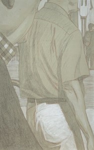
Pieces of Me #36, silverpoint underdrawing on toned ground tightened with acrylic
After a long hiatus (at least from posting here) I’ve got another batch of silverpoint underdrawings to publish. These were created during our recent trip to California – in my new studio there. The new studio is in our garage, so besides the new working-space, I envision that I will have more room to create larger pieces there (who needs cars anyway?). My current working-space here in Belgium exists in a long rear hallway to the house. It measures about 4 x 10 feet but since Euro-compression-design rules the day I have been able to pack many useful features into it. Still. it’s cramped.
Pieces of Me #58, silverpoint underdrawing over toned ground tightened with acrylic
When I began this project I knew of course that the silverpoint pencil nib is quite restrictive, so the challenge in these panels was how to render various highly textured, amorphous and abstract shapes with a very fine, low in value line. Mostly impossible. For many of these compositions then, if I were to use just silverpoint, I’d have only very flat uninteresting underdrawings to offer. But since they are executed on a toned ground, the addition of the while highlights (using tubes of titanium white acrylic) allows for greater manipulations. Washes quickly establish the tonality, texture and gesture – things which are otherwise very difficult to achieve in silverpoint alone.
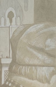
Pieces of Me #38, silverpoint underdrawing over toned ground hightened with white
The silverpoint then establishes the basics of the design and hints toward the darker values, while the white moves the image forward. I enlisted the help not only of brushes but also sponges, hands and fingers. And since each panel is about the size of a standard book, I could rotate the panel to get my washes to drip in whatever direction I needed. Nice. That’s really hard to do with a big panel or canvas. 😉
Pieces of Me #57, silverpoint underdrawing on toned ground tightened with white
All in all I created fourteen panels during this recent time. They are still resting in their little beds in California, however I was able to take some photographs of them before leaving. I’m hoping to put the whole series together there during our next trip, where I will have enough space in that garage to throw some paint at the final assemblage. As ever, we’ll see.
Underdrawings in silverpoint, batch #1
May 12, 2021
Panel #10. Silverpoint underdrawing over tinted gesso, highlighted with white. 13.3 cm x 21 cm, or 5 1/4 x 8 1/4 in.
I’ve been doing some underdrawings for a new project. It will be a different approach to the same image/subject matter as the “A Piece of Me” project, completed in December 2020.
Panel #01. Silverpoint underdrawing over tinted gesso, highlighted with white. 13.3 cm x 21 cm, or 5 1/4 x 8 1/4 in.
However, instead of being executed in a full textural and chromatic range this one will be untextured, monochromatic and ghosted back. It will be done in silverpoint on acrylic and overpainted (in acrylic or oil, TBD) on sixty four panels.
Illustrated here is a selection of some of the individual panels I’ve created so far, along with some of my notes. 1) Using silver point means that I can never reach a rich dark value (SP is not india ink!). So that’s fantastic and exactly what I’m looking for. 2) In addition, since I’m creating them on already tinted grounds, the darkest values provide less contrast than if I were starting from a white ground. Again, excellent! 3) The tinted ground itself establishes a middle value and allows me to lay in white washes for the highlights. 4) Inevitably, the value range is compressed and subtlety reigns. Nice. That’s how I like it.
Panel #02. Silverpoint underdrawing over tinted gesso, highlighted with white. 13.3 cm x 21 cm, or 5 1/4 x 8 1/4 in.
Also, even though these are intended as underdrawings I can already see that, when the composition warrants it, a few of them are or will be worthy of individual display – though I’m not sure how I’ll handle that. Should I create them (only) for integration into the final piece? Or should I create some for appreciating in isolation (only)? It’s a great problem to have which, for the moment, I don’t have to solve. I can simply create the little panels, fall in love and see where it all goes
Underdrawing, why bother?
October 27, 2020
Many years ago, when I lived in California and spent my time roving the landscape, I loved creating en plein air paintings, out there in the field, hugely ignorant about the role the underdrawing could play – but always curious. Out I would go, usually with a little thalo blue tempered with an egg yolk, to sketch in the forms I hoped to capture onto my chalk gessoed panel (never painted on canvas, as panels had irretrievably won me over early on). Thus even that starting sketch would take some time to dry, but worked well enough, since I lived in close proximity to my subject matter and California summers were hot and dry.
Fast forward some forty years and I still find myself refining the role the underdrawing plays. All this research has been self-taught, supplemented of course by the masters (the museums and the manuals). And since I no longer live in California, I no longer have the luxury of painting en plain air. Here in Northern Europe the summers can be divine – but fleeting. So I quickly reverted to drawing value studies on site that could later be used to create paintings on in the studio. This value study then, as potential underdrawing, became foundational for the future painting. During this phase I used silverpoint for the most part, sometimes enhanced with india ink. Here is a recent example of this approach.
A Piece of Me #08, encaustic on panel, notice how the underdrawing comes through, especially in the fine filigree architectural detail.
The india ink underdrawing for A Piece of Me #08, rendered in pen and wash.
All this brings me to my current project of creating 64 paintings (in different media) based on cut up sections of one original photograph. For lack of a better term, I call it “deconstructed realism”. Each section of this photograph then possesses an arbitrary layout, which when rendered in black and white, serves for my underdrawing.
But wait.
Do I use this black and white design in a mechanical way – to transfer the image – so it can then be rendered later in color? That is, do I transpose only the linear elements? Or do I render the value changes, too? Do I use silverpoint or india ink or a diluted black oil paint? Do I use a pen nib (to create strong harsh lines) or a brush (for subtler washes)? And, depending on the intended medium for painting, how do I want to make use of this underdrawing? Do I want it to completely disappear? Or do I want it to tantalisingly play through the levels of paint to come?
As the project has progressed I find myself continually opting for the latter. Thus at first the egg tempera and mixed technique underdrawings were subtle studies in fifty shades of grey (brushwork washes rendered in india ink), while the later encaustic, acrylic and oil panels became stronger underdrawing statements (rendered for the most part with india ink and a pen nib). Illustrated here is an example from one encaustic panel. The main point, always for myself as a painter, do I want to be identified with rendering, in this case, some (completely arbitrary) subject matter? Or do I want to create a painting? The answer of course is obvious.
Underdrawing for oils
October 24, 2020
I hesitate to say something about a topic that may (or should) already be well covered in artist manuals and/or the blog-o-sphere but since I have had a steep learning curve myself these past few weeks, I thought it might be helpful to document these lessons for others. I’m thinking that the main reason there is less information out there is because most painters these days prefer to paint on an acrylic gesso ground. It’s cheaper, easier, faster and less toxic. I also think that most painters are interested in using an alla prima approach to painting, it’s the fashion and one which generally does not make use of an underdrawing. ‘Nuff said.
To set the stage for my problem: I had a series of 3mm HDF panels (note, not canvases) which were sized with rabbit skin glue and then primed with a lead white primer. I had used Old Holland Lead White, in a 120 ml can: lead carbonate ground with cold-pressed linseed oil which was diluted with five parts turpentine (to one part stand oil, my mistake, NEVER do that again. The stand oil introduces an unnecessary element of fat into a ground that should always be as lean as possible). These panels were primed over one year ago. They were fully cured.
I now wanted to transfer my designs onto these panels – and from that design, create an indelible underdrawing which could serve as a foundation upon which to build an image. The problem/challenge was to find a medium that would be absorbed by this lean oil ground and yet (after an adequate amount of drying time) would not dissolve into the successive layers of fatter oil paint on top. (This business of painting is always a two way street.)
I set about transferring my first set of designs by printing a black and white version of the image to size onto a piece of paper, covering the back side of the paper with vine charcoal, and then tracing the design by pressing the tip of a dull stylus into the main lines. The resulting charcoal design on the panel could be erased or modified, but now I had something upon which to base a more permanent underdrawing.
Acrylic Ink?
Due to my recent experience in developing underdrawings for acrylic, I already knew that black acrylic ink (which is perfect for drawing on an acrylic gesso ground and then painting in acrylics over that) would not be appropriate for drawing on an oil ground. The practical and simple logic is such: oil can be superimposed upon acrylic but not vice versa.
India ink?
I set about drawing in my designs with a pen nib using permanent india ink. They appeared to bead up. The ground was not receptive to india ink. No amount of drying time would change that. It was an oil and water thing. My ground was too fat for the india ink, so I cleaned it off and started over.
Underdrawing in light black oil wash over collaged panel primed with lead oil ground.
Mars black oil paint heavily diluted with turpentine and painted in with thin washes?
What did painters, painting on oil based grounds for centuries, do? Well, first, surely they did not add stand oil to their ground(!) (my bad.) But still, since the oil ground is oil, they must have used a medium to which it was receptive. My first series of underdrawings then were done with mars black oil paint heavily diluted with turpentine. They looked great and appeared to be well received by the oil ground. Hooray #1. See image above, left. However after three or four days of drying time, they began to lift off the ground when lightly touched with a kneaded eraser to lift off that original charcoal tracing design. Not good. I began to think I would have to start over by priming a whole new set of panels without the addition of that nasty stand oil.
Underdrawing created with a mars black oi paint diluted 25:75 or so with turpentine, drawn on an oil based ground using a pen stylus.
Mars black oil paint less heavily diluted and drawn in with a pen nib?
Then I also realised that I could try creating a black oil drawing medium which was less diluted (that is, contained more oil). So I mixed up a small jar with a blob of oil paint and an amount of turpentine, roughly 25:75. Test strokes. Trial and error. I wanted to create something fluid and siccative, which would work with a pen nib but which was thicker than my previous dilutions. I reasoned that this new batch would fare better with firm, linear lines rather than the fugitive, heavily diluted brush strokes. The paint/ink could be thicker than before and also this form of thick strokes could take up less “space” on the ground. I completed a few yesterday and will let them fully dry but I think and hope I have solved my problem. Time will tell. I hope to update this page as the project progresses.
Book review: Underdrawings in the Renaissance
October 16, 2020
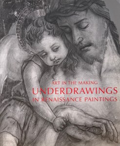
Book cover for: Art in the Making, Underdrawings in the Renaissance
I picked up this book about a year ago, upon the recommendation of Koo Schadler, a contemporary artist proficient in the practice of egg tempera. It is produced by the National Gallery in London and consists of four essays. They cover: an informative introduction, the materials that were used for underdrawings back in the day, the underdrawings of the artists of the Northern Renaissance (Germany, Belgium and the Netherlands), and the underdrawings of the artists of the Southern Renaissance (Italy). Suceeding these essays is an in-depth analysis of the role underdrawings played in sixteen well known paintings from the National Gallery’s collection. Scientific methods of detection and the test of time don’t get better than this
I had contacted Koo last year because I had questions about the usefulness of silverpoint as an underdrawing for a painting to be fully realised later in egg tempera. Now one year later I am returning to the book with a different question. What is the best material to use for an underdrawing executed on a panel primed with a lead white oil ground? It’s not a question that arises much since most artists these days paint upon canvases primed with acrylic gesso. That’s the ground of choice for anyone painting on a flexible support. It covers well, provides a good level of absorption for acrylic or oil, is not as thirsty as traditional chalk gesso, yet it’s not as resistant as an oil ground might be. Relative to the underdrawing, acrylic gesso is receptive to either acrylic black ink or traditional waterproof india ink. Both types of inks do not bleed through into successive layers, while also they do not harm the oil’s adhesion to its ground. Thus, they hold their integrity in both directions. I sorted out these underdrawing questions recently for my series of panels executed in acrylic.
However, for my own personal touchy-feely research reasons I wanted to paint on the ground that had been used by artists since the late middle ages up to the mid-twentieth century. After all, that’s what you’re looking at when you go to a museum and view any painting created on canvas before, say, 1950. Now, due to its toxicity, lead white has become almost unavailable. I have been able to secure some though through my local art shop, skull-and-cross-bones warning and all. Of course, I took great precautions with its application. My research informs me that lead white toxicity is virtually nonexistent in its liquid form, though I did wear gloves, goggle and a mask. I did not and certainly would not recommend handling it as a powder (or sanding it, either).
Toxicity aside, I now had twelve panels primed in lead white: how to proceed from there with my underdrawings? I already knew that for adhesion reasons acrylic black ink could not be used over oil but I thought that traditional india ink might be OK. I quickly discovered that it is not. My drawings beaded up. So what did the Renaissance artists do? How did they move from conception to realization? The short answer is charcoal, but without a binder, charcoal is indeed a very short-lived answer. It’s great for transferring designs or for sketching out big ideas but it lacks permanency. According to this book, it appears that Renaissance artists used a variety of inks or diluted oil paint to render their black and white designs the permanency that charcoal lacked. (The charcoal preliminary lines were then dusted away.) However, when you consider the ground/substrate issue (this book does not distinguish between the traditional chalk gesso ground created for an inflexible substrate and an oil ground created for a flexible substrate) it was clear that a diluted dark oil paint would be the tool of choice. Thus, I had found my answer and proceeded happily along my way. One more technical challenge solved.
Encaustic and indirect painting
October 8, 2020
I just finished a series of thirteen identically sized panels executed in the encaustic technique. This was the third time in my artistic life that I have jumped into painting with melted wax.
Nils, #53, encaustic on panel. 23.5 x 13.3 cm or 9 1/4 x 5 1/4 in.
Anna, #18, encaustic with collage on panel. 12.7 x 9 cm or 5 x 3.5 in.
The first time was back in 1978, with the Nils project. At that time I created approximately sixteen panels in encaustic, see one example here to the left. Relative to the technique, there was no internet to consult. I only had only my handbook from Reed Kay, The Painter’s Guide to Studio Methods and Materials. It contained useful and reliable information that I and others still consult to this day.
The next time was in 2011 so, post internet. At that time I quickly discovered that there was a vast amount of information and resources on encaustic now available. I located a youtube source which showed me on how to create my own ready-to-use cakes of clear medium (beeswax and melted damar resin). This would save me time during the painting process. Also, due to this general new-found popularity in the arts and crafts world, I discovered an electrified hobby pen for encaustic with ironing, drawing and painting nibs. In this way my use of the technique received a leg up (or two).
And then there is today, 2020, where my own education continues – as well as the proliferation of internet resources. Most of what you will discover with a quick Google is a collection of enthusiastic arts and crafts blog sites. I found them to be very informative but also a little superficial. Very few, if any, address the deeper complexities of using melted wax for realistic rendering. Yet since that has always been my interest I would like to address how I have tried to do that with this most recent series of panels. The subject matter is a given, the rendering of it is the challenge.
Ground
Of course, first and foremost, the main issue is the relationship between the support, the ground and the paint. The support should not bend; the ground should be absorbent to the melted wax. I use traditional chalk gesso ground on a 3 mm hardboard panel. That is standard practice. You can buy fully prepared $$ Ampersand panels in art shops but also you can create your own. I have always preferred the latter.
Underdrawing
I consulted the University of Delaware MITRA forum experts about my choice of materials for the underdrawing. They affirmed my intuitive choice of india ink but warned me from using egg tempera for the underpainting. So I used charcoal to transfer my designs and then laid them in with india ink. After the india ink was dry I used a kneaded eraser to erase all traces of the charcoal. That left me with thirteen highly graphic panels, resembling the individual panels of a comic book. But what about the underpainting? Because encaustic is such a viscous, opaque technique would an underpainting be of any help? And was it even necessary? Also, beyond the bare function of outlining would the underdrawings I had already done prove useful? I did not know.
Underpainting
A Piece of Me #53, encaustic on panel. 21 x 13.3 cm or 5 1/4 x 8 1/4 in.
So I decided to forego the underpainting. Instead I opted to cover each panel with a beginning layer of yellow ochre imprimatura. This was achieved in two steps, first by melting up some yellow ochre paint and slapping it on, then by warming up the iron covering the panel with some cheesecloth and melting it back off. That produced the effect of burning in a yellow ochre glow into the chalk gesso ground. It provided a middle-value, warm starting position, without much wax. Highlights could go in one direction, shadows in another. As the panels progressed, I learned more and more how to make use of my underdrawing. I allowed it to peep through here and there, adding a level of built-in dimensionality and graphical contrast to the shadows. I also learned how to make use of the imprimatura. In the highlights I allowed it to show through on occasion.
As the panels developed in complexity of subject matter I began to reconsider the underpainting question. This happened quite by accident. I had painted a panel with a variety of hues and values. But it was too coarse for my purposes so I decided to (gently) melt it off. I warmed up the iron and covered the panel with cheesecloth. The paint melted quickly into the cloth. Perhaps too much? Yet as I removed the cloth I saw that in the process I had created an underpainting(!). The main masses had melted into the gesso. It would now take only an additional hour or two of fresh impasto to rebuild significant highlights and shadows, add in the final linear touch ups, then I would be done. And I was – for that panel at least. You can read its full story here.
This then became a way forward for me whenever I wished to create an underpainting for more complex compositions. So, underdrawing, underpainting, not to mention collage or pre-sculpted relief can truly enhance encaustic’s ability to describe form in a visceral yet realistic way. I think it goes without saying that this type of preparatory underwork has little significance if you are interested in using encaustic for purely abstract purposes. But then again, maybe not? Show me, baby, I’m open to it. 🙂
Acrylics and indirect painting
September 13, 2020
I just finished a series of paintings all executed in acrylic. These panels were conceived of so as to be included within a larger project. That project consists of sixty-four panels all executed in different techniques, but which, when assembled, would create one completed image (currently, still yet to be completed). Yet when taken on its own, each panel is/was intended to function independently – aesthetically independent of any overriding visual-conceptual structure. Some might say that is a tall order. And it is, but in my experience, if the original image is well chosen, it can work out.
The subject matter for each individual panel then can be seen as either an abstract “background composition” or a piece of “deconstructed realism” (though in actual fact all sixty four panels are pieces of deconstructed reality). Additionally, depending on the technique used and the preparation of its substrate, each panel lends itself to a coarser or more refined approach. In a sense, there was nothing to be done about either as they were my givens to myself: the rules of the game, so to speak.
The abstract compositions then were relatively easy: lines, shapes, forms, textures, hue and value contrasts. I could riff off any given composition with relative freedom. And I did. The (deconstructed) realism ones were more difficult because there were obvious body parts referring to a reality for which the story was (as yet) unknown. So these details were (potentially) more significant.
With acrylics it was relatively easy to switch back and forth between a coarse, impasto approach (using the painting knife and/or a coarsely textured sponge) and a refined, detailed approach using a brush or maybe a fine-celled sponge. In fact, many panels combined both. Nevertheless, what I want to speak of here is the degree to which the underwork, that is, the underdrawing, underpainting and impasto can prepare the panel for a quick, spontaneous, alla-prima final painting session. This is entirely possible in acrylics – just as it is in oils – though of course it all proceeds more quickly in acrylics. If you do your homework you already know where you are going, so the final session may take an hour or two at the most(!). The preparation work itself might be slow and laborious so that the final session need not.
A Piece of Me #44, acrylic over collage on panel.
There were panels where the painting proceeded quickly and spontaneously in a forward developing motion. I could build upon my structure and leave many elements exposed in the process, creating more visual and structural depth. The shading in the floor tiles on panel #24 is a case in point. The shadows on my face and hair in panel #04 is another. The collage, underdrawing and imprimatura in panel #44 illustrated here to the left (with link) is yet another example of how much the underwork can contribute to a final painting – again, when you know where you are going.
A Piece of Me #39, acrylic on panel.
There were times however, during the process of over painting when I needed to reclaim that preparational understructure. I have come to call this process “painting backwards”. This means, reclaiming your underwork particularly in the quarter tones and highlight areas. There are a few panels where I used this extensively. Normally I use a small bright bristle brush to reclaim some detail or highlight that has become obfuscated by a larger, wider brush stroke. For example, I used my small bright bristle brush to reclaim the grouting lines in panel #39, see image with link to the left. I used the same technique on the tile work in panel #54. When I paint with oil I have used turpentine as my solvent, but in this acrylic series I used water and, because acrylic dries so fast, I had to work quickly.
All this work and paint manipulation applies to the recognition that painting is essentially about creating an illusion. An illusory world to which you are inviting the viewer to participate in. It may be realistic, it may not, but mostly you are creating a sensory space/place for the viewer to wander in with their own gevoeslmatig (feeling-sense) consciousness, disconnected from the world of concepts. When you can create this illusion with a minimum of means, a sense of freshness arises. In addition, when you operate through layers, the original luminosity of the substrate is able to show through delightfully in places – even in the shadows(!). That luminosity is so much more pleasing that any amount of opaque white you can ever slap back on. For this reason, I have become an advocate for an indirect technique and I’m pleased to see how well acrylics can adapt itself to it.
Underdrawing for acrylic
August 24, 2020

Pen and ink Underdrawing for A Piece of Me #59
I am currently involved in a project which calls for thirteen panels to be executed in acrylic according to a pre conceived design. Thus for starters I wanted to transfer the basic elements of the design to each panel. Since I haven’t used the medium for about forty years I had to search around a bit to see how best to do that.
To my surprise I did not find a lot of information online about creating an underdrawing for painting in acrylic. Most information I found concerned transfer of the design and then getting rid of the drawing as soon as possible. That’s not what I wanted. I want the underdrawing itself to play a role in the final painting – and not just in a paint-by-number, outline kind of way. What I sense (but don’t know) is that painting indirectly, which makes use of underdrawings in a foundational and yet implicit way, has gone somewhat out of vogue. Thus the information I found only partially addressed my interest.
Anyway, the first important thing I did find was to avoid traditional shellac based india ink. This is because the subsequent acrylic paint would act as a solvent to the shellac and (at least partially) dissolve any careful design. Solving that problem was relatively easy as there were acrylic based black inks readily available at my local art supply store. I dipped a pen nib into the ink and proceeded to lay in basic elements of the designs. The pen and ink approach proved to be especially useful for the abstract composition parts of the series. There is an illustration of one of these above, left.
Underdrawing for A Piece of Me #14 in pencil. (before the smear campaign)
However I also had some more complex designs that required more detail and subtle changes of gradation than the pen and ink method allows for so I switched to pencil drawings – mostly because I was most comfortable with that medium. Not a good idea. There had been information online warning about the use of a graphite pencil, but a few artists recommended spraying the completed underdrawing with an intervening level of fixative before beginning to paint. So I tried that. But it didn’t work. My softly detailed underdrawing quickly smeared into my first coat of imprimatur. Thus I definitely do not recommend using pencil for your underdrawings in acrylic (or oils).

Reclaimed underdrawing in acrylic ink wash (with pen and ink touch ups) for A Piece of Me #14
What I do recommend is transferring your design using vine charcoal, then drawing it in either with a pen nib or painting it in with a brush, or a combination of the both. Then, after the basics of the design have been created and the acrylic ink has dried, go over the entire surface with a kneaded eraser to get rid of all traces of charcoal. At that point you will have an indelible black and white underdrawing that can be used in whatever way you choose for further levels of acrylic paint.
Underdrawing for egg tempera
October 2, 2019
About ten years ago I began to experiment with silverpoint. It’s a beautiful and ancient technique that was used long before lead pencils or even the wide-spread distribution of paper. A metal point (in this case silver, though other metals were also used) is inserted into a stylus and you begin making light scratches on a ground with enough tooth to be receptive to a light deposit of the metal particles. Since silverpoint works extremely well on traditional chalk gesso, and this had already been my ground of choice for decades, there was no learning curve for me in terms of the preparation of the ground. So I began to employ silverpoint to develop underdrawings for landscapes (intended to be created in the studio). This went seamlessly since I had already transitioned to creating my paintings in the studio based on en-plein-air value studies.
silverpoint with india ink
As for the silverpoint, I was very pleased with its tactile feel. Yet – in contrast to lead pencil or ink as I quickly learned – the amount of pressure you exert has no influence whatsoever on the value you create (!). It’s only possible to create deeper values through repeated motions. Because such values are developed slowly through repetitive motions silverpoint is a time consuming yet meditative activity. Nice! It creates a great deal of fine detail – softly. Deeper values can and do develop over time, especially when the surface is exposed to light for extended periods of time. But I expected my silverpoint underdrawing to become sealed under many coats of paint so I was never too concerned about its tarnishing/darkening factor. And, since I was interested in creating landscapes where describing distance is an intrinsic factor, I began implementing india ink cross-hatching to specific dark value areas of my foreground. This enhanced the contrast. I thought I had developed a pretty cool underdrawing technique for myself. I was happy.
Silverpoint on traditional gesso panel
However, recently when I began a project of 13 panels to be executed exclusively in egg tempera, I discovered otherwise. I had naturally turned to silverpoint for my underdrawings. The work flowed. I was a happy little camper creating beautiful little silverpoint panel underdrawings in my cozy little studio. Until at some point it dawned on me that the silver of the silverpoint would naturally tarnish in the presence of the egg’s sulphur. It would be an organic process over which I would have little control. Banksy might be fine designing his paintings to self-destruct in a shredder at auction but that really wasn’t my intention here.
I quickly contacted Koo Schadler, a contemporary artist who creates beautiful paintings in egg tempera and who also does drawings in silverpoint. She was very kind and informative though in fact she did confirm my suspicions. At the same time she introduced me to the MITRA Forum, a website hosted by the University of Delaware where conservation experts are available to answer such (geeky) questions. They, too confirmed the difficulty.
Well, so what did the Old Masters do? While there does not appear to have been one set solution, because individual studios/guilds and masters all had their own approach, there does appear to have been a convention: washes of ink (or later diluted oil paint). It was fast, easy, cheap and versatile. Using it you could quickly achieve a wide range of values and on a large scale, if necessary (neither of which is silverpoint’s forté). Silverpoint may have been used early on in the design/transfer process (if you were working on panel) but even so, why carry it through when a fluid medium is so much quicker and easier?
Returning to my project, the question remained: what to do with my already completed silverpoints? Koo had initially suggested that washes of india ink (which contains shellac) might be able to seal off the silverpoint level from the egg tempera level (though the efficacy of such a maneuver was questionable). So, I began creating light washes of india ink over my existing silverpoints. I proceeded slowly and gently in order to avoid creating values too darkly, too quickly. This worked out great and seemed to enhance my silverpoint panels! I was happy (again) though nagging doubts remained. Additionally, the MITRA Forum experts had confirmed that there are no sealers on the market able to fully prohibit oxygenation/tarnish – and attempting to create a seal that would be strong enough to do so would compromise the adhesion capacities of the egg tempera. OK, got it.
India ink underdrawing after erasing the silverpoint.
So I got up yesterday and took an eraser to my panels. I began to erase all of my beloved silverpoint work. You will hear people say that silverpoint is not erasable. That’s not my experience. With some diligent rubbing the silver came off leaving only the india ink behind. Did I get it all? I don’t know, I think so, but only time will tell. But I’m no longer worried. Thus in the end, the silverpoint drawings that I did served me well: they gave me enough information to create subtle and detailed india ink underdrawings. Now I am confident enough to proceed with my egg tempera.
Bullet dodged.

