The Silverpoint Composite Underdrawing
June 6, 2022
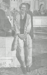
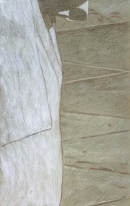
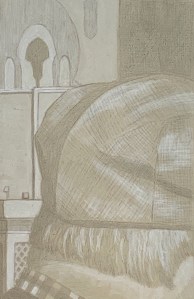
Silverpoint on tinted acrylic ground. 3 1/2 feet wide by 5 1/2 feet tall or 106 cm x 168 cm.
I’ve finally completed the sixty-four silverpoint underdrawings in preparation for a painting – as yet to come. The panels were developed individually – and were based on black and white sectionals of a photograph. The MDF panels were all prepared with an acrylic ground tinted with a mixture of dry pigments to simulate terre verte, because the actual dry pigment, terre verte, reacts negatively with acrylic rendering it unworkable – in that particular medium. Of course, I could have used a tint of white for my ground colour but I already knew how much I enjoyed working from a toned ground. The silver lines could be used to subtly create linear form while then the addition of an acrylic wash of white highlights could help it to “pop”! In addition, I coated each tinted gesso panel with a transparent covering of Golden’s Pastel Ground, in order to create a fuzzy toothiness.
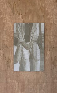
Assembling the panels on the backing board.
Now, since this level has been completed I’ve encountered two main problems-to-solve: 1) in the areas of darkest value which required a lot of cross-hatching of the silver particles, the image possesses a reflective sheen. Is it possible to minimise this reflectivity?; 2) even though silverpoint has the reputation for leaving an indelible mark, I have found that that is not really the case. Both water and a kneaded eraser can, in fact, diminish the image. So, before I proceed any further, I want to “fix” the drawing. What material should I use to do this? A traditional pastel fixative or a matte acrylic varnish? In addition, would this proposed fixative help to diminish my sheen problem?
After some research and consultation with the expert folks at the University of Delaware’s MITRA forum, I have decided to spray an adequate covering of Lascaux (an acrylic medium containing B-72) Fixative over the whole assemblage before proceeding any further. Because I anticipate further layers of abstraction, using a Liquitex transparent titanium white spray over the image my silver sheen issue may take care of itself?
Fast forward to a few months later. The fixative, fixed, and the matte spray pain reduced the sheen.
What remained was for me to throw some paint at it.
Underdrawings in silverpoint, batch #3
October 8, 2021
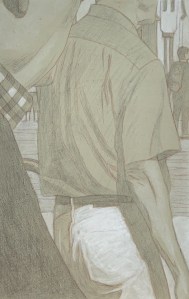
Pieces of Me #36, silverpoint underdrawing on toned ground tightened with acrylic
After a long hiatus (at least from posting here) I’ve got another batch of silverpoint underdrawings to publish. These were created during our recent trip to California – in my new studio there. The new studio is in our garage, so besides the new working-space, I envision that I will have more room to create larger pieces there (who needs cars anyway?). My current working-space here in Belgium exists in a long rear hallway to the house. It measures about 4 x 10 feet but since Euro-compression-design rules the day I have been able to pack many useful features into it. Still. it’s cramped.
Pieces of Me #58, silverpoint underdrawing over toned ground tightened with acrylic
When I began this project I knew of course that the silverpoint pencil nib is quite restrictive, so the challenge in these panels was how to render various highly textured, amorphous and abstract shapes with a very fine, low in value line. Mostly impossible. For many of these compositions then, if I were to use just silverpoint, I’d have only very flat uninteresting underdrawings to offer. But since they are executed on a toned ground, the addition of the while highlights (using tubes of titanium white acrylic) allows for greater manipulations. Washes quickly establish the tonality, texture and gesture – things which are otherwise very difficult to achieve in silverpoint alone.
Pieces of Me #38, silverpoint underdrawing over toned ground hightened with white
The silverpoint then establishes the basics of the design and hints toward the darker values, while the white moves the image forward. I enlisted the help not only of brushes but also sponges, hands and fingers. And since each panel is about the size of a standard book, I could rotate the panel to get my washes to drip in whatever direction I needed. Nice. That’s really hard to do with a big panel or canvas. 😉
Pieces of Me #57, silverpoint underdrawing on toned ground tightened with white
All in all I created fourteen panels during this recent time. They are still resting in their little beds in California, however I was able to take some photographs of them before leaving. I’m hoping to put the whole series together there during our next trip, where I will have enough space in that garage to throw some paint at the final assemblage. As ever, we’ll see.
Underdrawings in silverpoint, batch #2
June 3, 2021
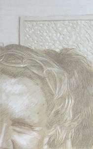
Silverpoint #05 over toned gesso ground. 13.3 x 21 cm or 5 1/4 x 8 1/2 in.
I’ve completed six more panels, so I figure it’s time for an update. Illustrated here are a few of those that I that have found to be particularly interesting/beautiful for various reasons. The most evocative seem to be those whose compositions include human beings or parts thereof. It’s as though each one is from some unwritten comic book – captions not included. (Hergé would have understood.) Additionally, the abstract panels cause me to wonder/admire anew at how the iconoclastic impulse of Islamic art continues to produce such interesting varieties of texture and pattern.

Silverpoint #08 over toned gesso ground. 13.3 x 21 cm or 5 1/4 x 8 1/2 in.
Further, one very general note. I feel I am serendipitously creating 21st century daguerreotypes(!). (Who knew?) It’s as though by using silver to recreate images based on a digital photograph the mechanistic process has come full circle: human to machine back to human. And again, because the drawing stylus is silver it’s almost impossible to achieve a line darker than a 50% grey value. All values are compressed thereby, necessitating a multitude of small decisions. Then, adding in the white highlights truly makes each panel come alive. That’s my artist’s pleasure.

Silverpoint #11 over toned gesso ground. 13.3 x 21 cm or 5 1/4 x 8 1/2 in.
Finally, the raison d’être for these remains as underdrawings. And I have no doubt that their beauty and subtlety will contribute to the whole in yet-to-be-experienced ways. (Can’t wait) However, because of their beauty and subtlety – which at least compositionally I don’t take credit for – some will be held back for individual display and appreciation. For this, I think I have a plan…
Underdrawings in silverpoint, batch #1
May 12, 2021
Panel #10. Silverpoint underdrawing over tinted gesso, highlighted with white. 13.3 cm x 21 cm, or 5 1/4 x 8 1/4 in.
I’ve been doing some underdrawings for a new project. It will be a different approach to the same image/subject matter as the “A Piece of Me” project, completed in December 2020.
Panel #01. Silverpoint underdrawing over tinted gesso, highlighted with white. 13.3 cm x 21 cm, or 5 1/4 x 8 1/4 in.
However, instead of being executed in a full textural and chromatic range this one will be untextured, monochromatic and ghosted back. It will be done in silverpoint on acrylic and overpainted (in acrylic or oil, TBD) on sixty four panels.
Illustrated here is a selection of some of the individual panels I’ve created so far, along with some of my notes. 1) Using silver point means that I can never reach a rich dark value (SP is not india ink!). So that’s fantastic and exactly what I’m looking for. 2) In addition, since I’m creating them on already tinted grounds, the darkest values provide less contrast than if I were starting from a white ground. Again, excellent! 3) The tinted ground itself establishes a middle value and allows me to lay in white washes for the highlights. 4) Inevitably, the value range is compressed and subtlety reigns. Nice. That’s how I like it.
Panel #02. Silverpoint underdrawing over tinted gesso, highlighted with white. 13.3 cm x 21 cm, or 5 1/4 x 8 1/4 in.
Also, even though these are intended as underdrawings I can already see that, when the composition warrants it, a few of them are or will be worthy of individual display – though I’m not sure how I’ll handle that. Should I create them (only) for integration into the final piece? Or should I create some for appreciating in isolation (only)? It’s a great problem to have which, for the moment, I don’t have to solve. I can simply create the little panels, fall in love and see where it all goes
Preparing Grounds for Silverpoint
April 25, 2021
The winning test panel. Silverpoint over tinted acrylic gesso, treated with GOLDEN Pastel Ground, highlighted with acrylic titanium white. 13.3 cm x 21 cm, or 5 1/4 x 8 1/4 in.
I’ve been doing a number of tests in preparation for an upcoming project. It will consist of a series of uniformly sized HDF panels prepared with a tinted ground upon which I intend to create images executed in silverpoint. These silverpoint images will be touched up with white (probably gouache). Since silverpoint does not create a strong dark line (that’s part of its beauty) I wanted to create tinted grounds that were not too dark, say, between a 10 – 20% grey value. The silverpointed strokes could softly emerge from this but never become stronger than a 40-50% value. Likewise the highlights could softly arise in the opposite direction, creating a nuanced chiaroscuro effect. Further, I imagined the hue of the background to be a terre verte. Since I planned to create a series of these panels whose grounds should be uniform I wanted to create a tint which could be reproducible across the whole series.
Relative to the ground itself, silverpoint requires a drawing surface prepared with a significant amount of “tooth” to catch the silver of the stylus. The substrate for that ground can be flexible or inflexible. The grounds for flexible substrates, such as paper or cloth, then need to create this tooth while also remaining somewhat flexible. Such grounds tend to be acrylic based (though this rule is, in itself, not inflexible). The grounds for inflexible substrates possess more latitude. They can be acrylic or traditional (based on rabbit skin glue), these latter tend to be more brittle. In the case of this project, since I had already chosen HDF, I had a range of media to choose from.
Additionally, contrary to what the word “tooth” might seem to imply, it does not so much refer to the texture of the ground as it does to its hardness. Because the silver (or any metal point) creates its mark by leaving tiny deposits of metal, the hardness of the pigment filler suspended in that ground is what provides this tooth. The carrier might be acrylic or rabbit skin glue while for the filler an array of white pigment particles may be used. These may include mixtures of chalk whiting (calcium carbonate), titanium white and/or zinc white. After it dries, the ground may be polished smooth or left with a bit of texture – artist’s choice. Experience quickly demonstrates that small, meditative motions of the stylus create soft, almost indelible lines whose value intensity increases only with repetition – not pressure.
At the outset of this project then, I had a few questions to answer:
- Since I already knew I would be using an inflexible substrate, should I use an acrylic based carrier or a traditional rabbit skin glue for my gesso? In theory, both might be appropriate.
- If acrylic, how should I introduce my tint? Terre verte in dry pigment form is known to be chemically incompatible with acrylics, so mixing up a combination of other pigments in an aqueous dispersion would be my best option.
- Alternatively, if I choose RSG as my carrier how do I introduce the tint? From a technical point of view, terre verte could be added to the dry pigment filler base of my RSG ground. However because it has such a low tinting index and its hue varies greatly from supplier to supplier, it’s not a good choice. An aqueous dispersion of high tinting dry pigments might be necessary here too.
- Whatever medium I choose, along with whatever tinting mechanism, its hue should be reproducible.
I began creating a number of test panels using different carriers and differing tinting solutions. After much experimentation I discovered:
- I experimented with adding a few blobs of tube acrylic “terre verte” to my acrylic gesso. It worked well enough for one panel but would clearly be difficult to calibrate chromatically across a large series. Also, I thought it would be a more expensive.
- By combining small but precisely measured amounts of cadmium yellow, burnt sienna, mars black and viridian I could grind up a hue that I liked. I added small amounts of distilled water until I had a paste which could be further diluted into a well-dispersed yet concentrated tinting solution.
- This hue could be reproducible across the series since I had not only maintained records of my dry pigment tints but also how much gesso base I had used (either various GOLDENS acrylic gessoes or various RSG recipes). In this way I knew how to ultimately manage my white component.
- Finally, the winner was an acrylic combination. See above, left. Though I truly prefer the haptic experience of a traditional RSG gesso for silverpoint, in this case acrylics won out. My reasons were: facility, it’s easy to use, for when you are planning on creating sixty four panels, this matters (RSG recipes can be more finicky); uniformity, the tinted, sanded surface of the acrylic ground was uniform (this was not always the case with my RSG gessoes); value, the silverpoint line was not too dark on the acrylic ground (surprisingly, the RSG/zinc white ground created a darkest line of all); line clarity/or not, a transparent coat of GOLDENS Pastel Ground applied onto the acrylic ground turned the surface texture into a rough sandpaper. In turn this made my silverpoint strokes a whispy sfumato, whereas the baby butt-smoothness of the burnished RSG grounds created fine, strong, clear lines (not what I was looking for in this project). Highlighting, washes of white gouache were well received on the acrylic ground and easily manipulated (because they were in an aqueous solution, this was not the case with the water-permeable RSG grounds). However, ultimately I opted for doing my highlights in (titanium white) acrylic since in the long run it requires less protection. Versatility, since I am beginning to imagine further (semi-translucent) coats of paint over the whole series after they are completed and fully assembled, the robust versatility of the acrylic medium seems to be the best choice.
It can sometimes seem like a lot of extra effort to do your homework like this, but it’s worse to create a whole project only to find that the materials you use don’t let you do whatever it is that you envision.
Besides, I think you have to enjoy creating mud-pies. 😉

