I’ve already created a few pochade boxes for oil painting and written about there here and here. But late last summer I began to see the utility of creating a similar set-up exclusively for watercolors. In fact, my field explorations in watercolor had originally inspired me to create something simple and efficient for oils, now the same occurred to me, but in reverse. Since we travel a lot and I like to do watercolors on these journeys, I put on my design cap. The idea was super slim and simple.
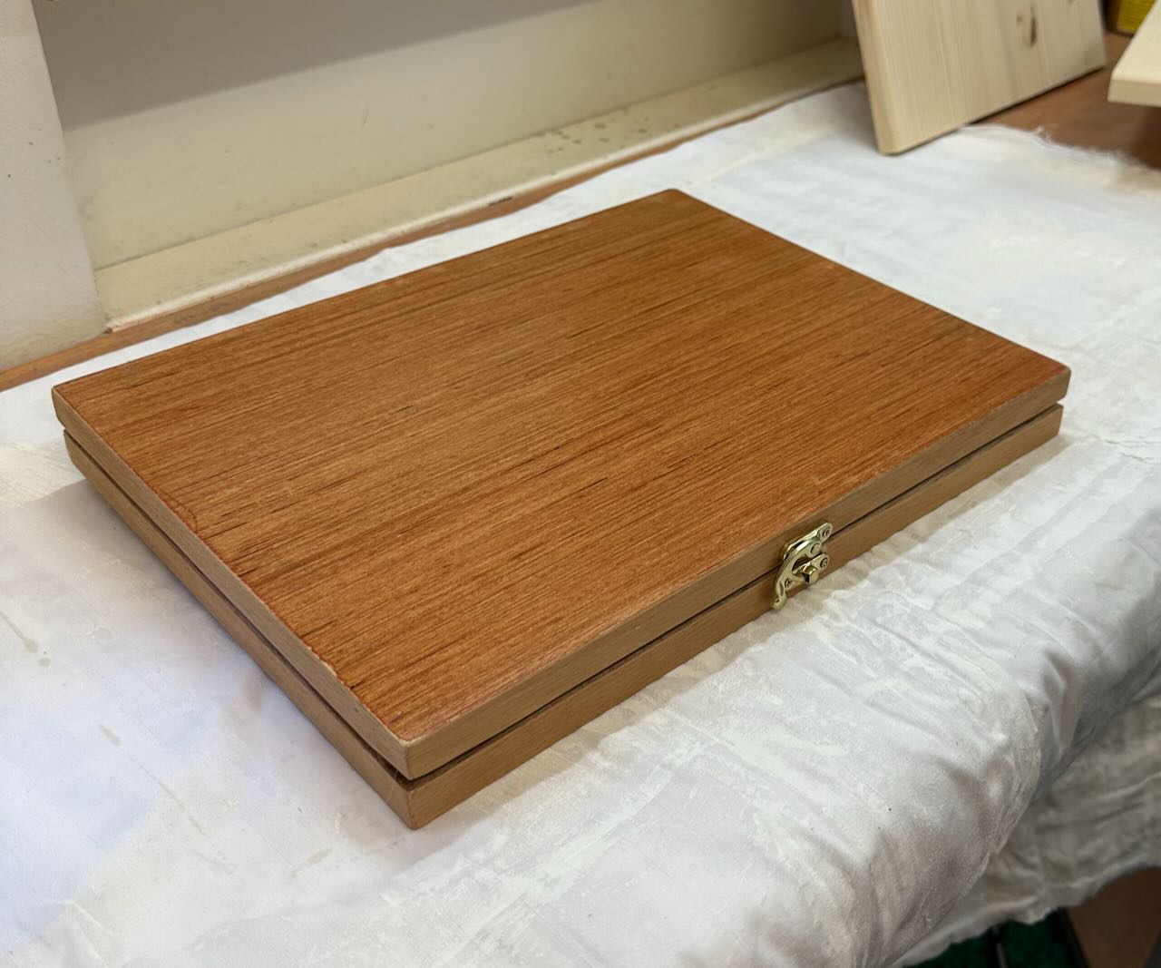
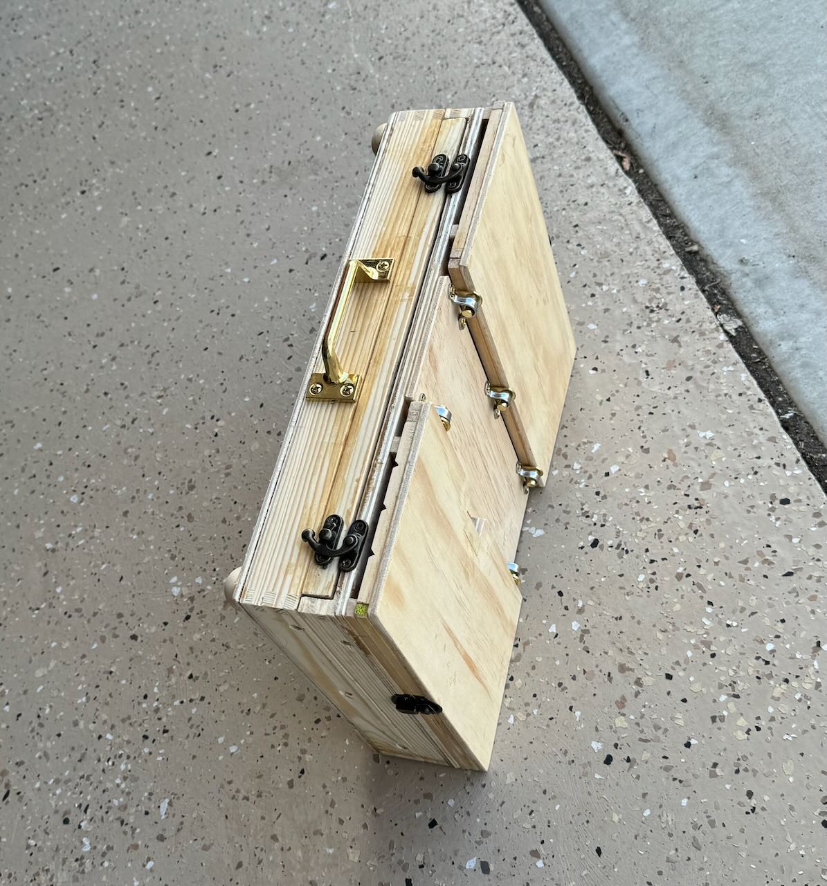
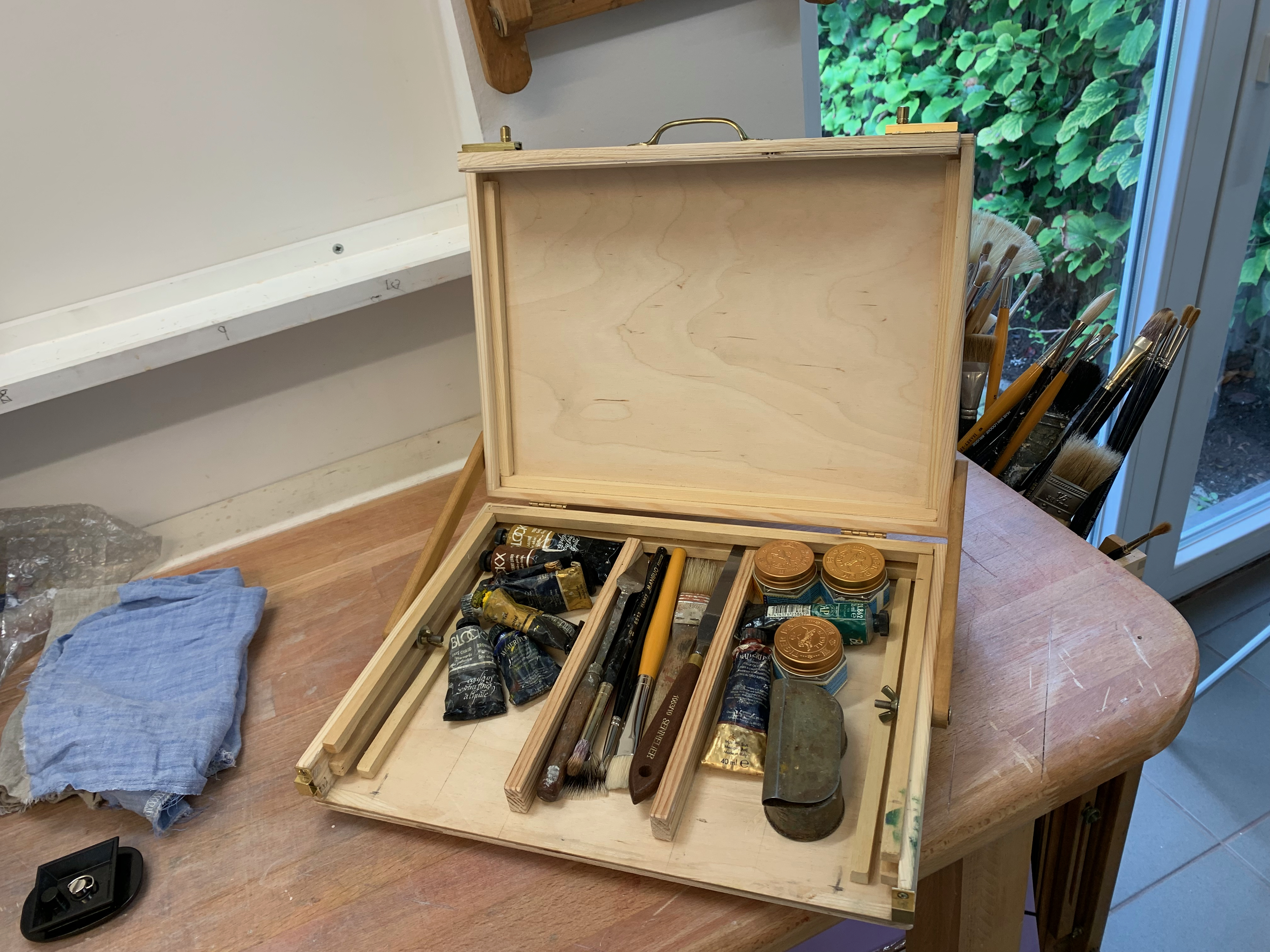
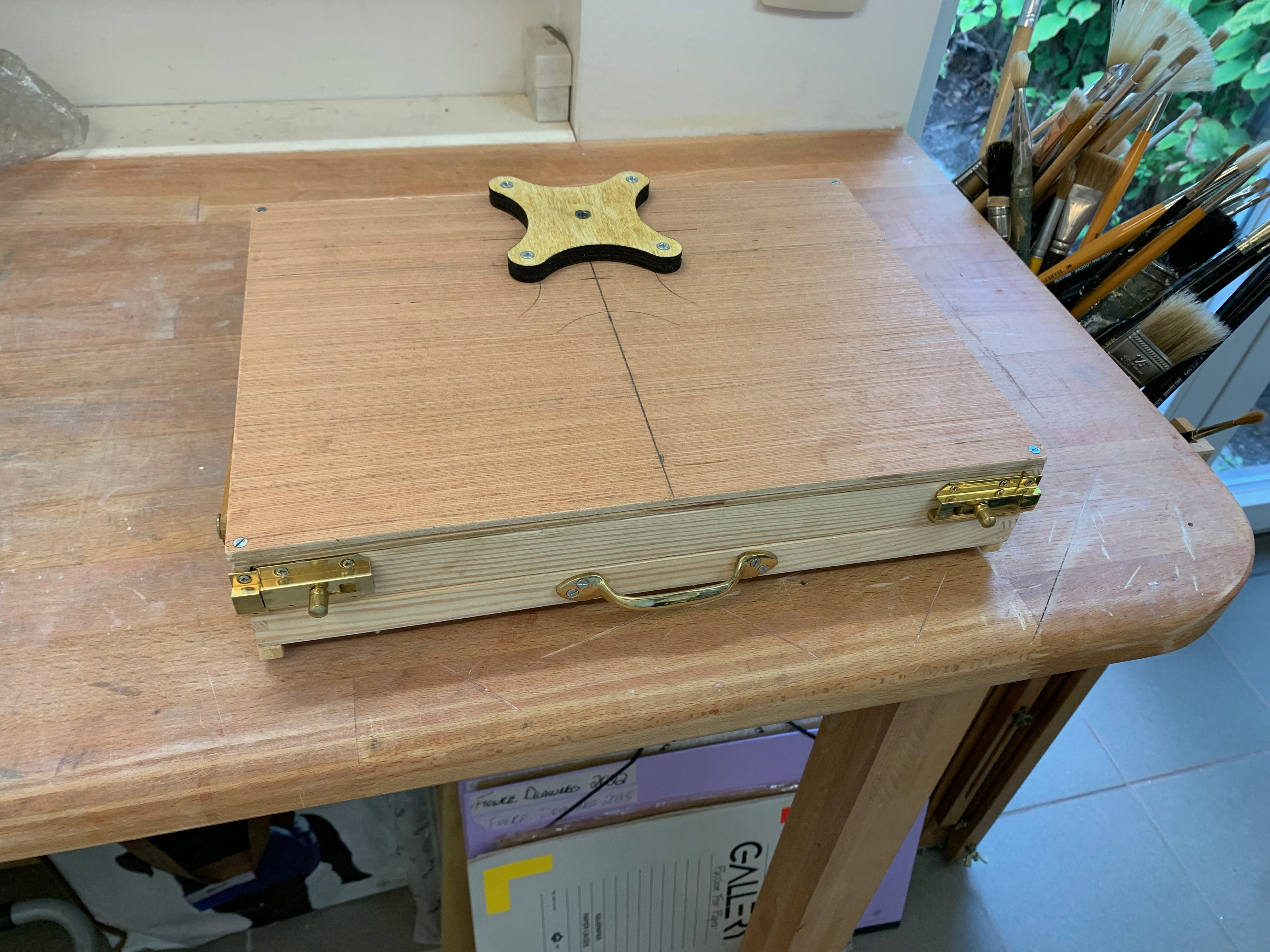
I cut two pieces of 1/4″ plywood board 3/4″ wider and deeper on both sides than a standard 9 x 12″ watercolor block. I glued in hardwood struts (5 cm x 1.8 cm) along all sides, cut to the width and depth of the plywood, as I wanted to nest a standard block inside the lid. Then I hinged it at the rear with a piano hinge (which will also create the easel’s tilt). This created a slim attractive box. I screwed in a little clasp (from Hobby Lobby) on the front side to keep it closed. Fixed adhesive magnets to the interior along the base, so that a color box, water cups and pencil box could be placed there while working.
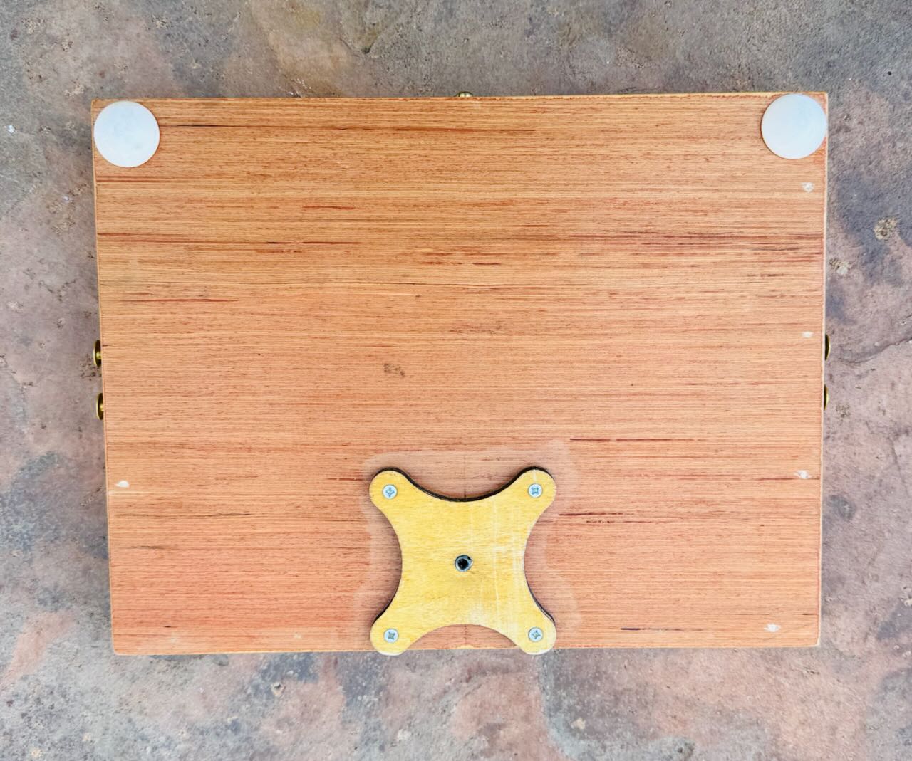
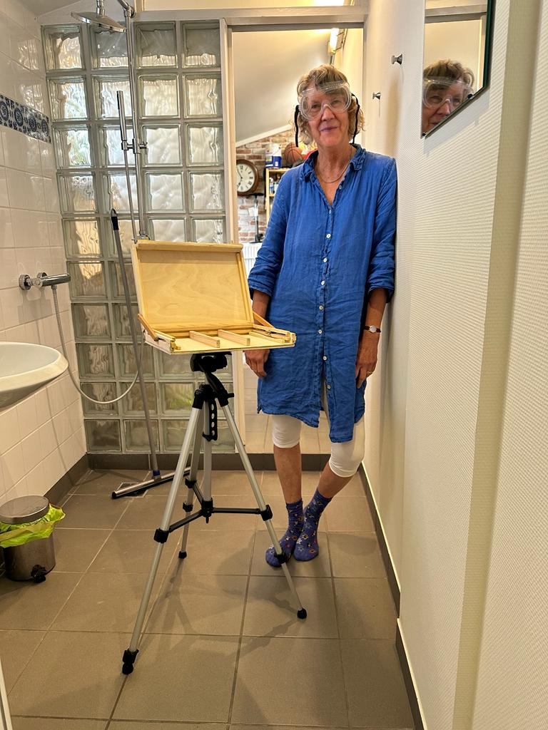
On the underside I placed a 1/4″ thick tripod bracket from Jackson’s Art Supply. This allows me to attach a standard 1/4″ 20 thread camera tripod. I also placed some 1/4′ depth round feet to the underside (along the front) so I could work at a flat table top, too. That was version I. It was just about 1″ thick. Nice!
After my first few field tests I determined the need to change a few things. I wanted to create additional depth in the interior so that the watercolor color box, cups and drawing box could fit inside not only when working but also when traveling, that is, when the lid was closed. This meant adding an additional 3/4″ or so of space between the two halves. I did this by glueing additional struts on the bottom half. I also added small removable angle brackets along the sides to keep the easel top from closing while working. Creating those brackets with my minimal tools and skill set was defo a challenge but in the end I came up with something I think quite serviceable – and elegant (enough).
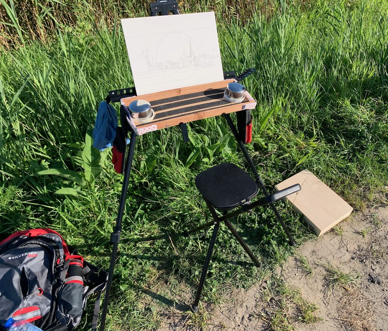
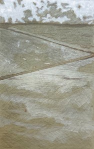
Our recent trip to the Grand Canyon was a test drive. It yielded up a few watercolors here and here along with a few happy working surprises. Having a box/easel freed up my both hands (which previously had been needed to hold the watercolor block) allowing me to draw with my whole arm (not just my hand) – and at a comfortable distance. That’s huge!!!! I was able to use my whole body to capture gesture (so it felt different), while also achieving more distance for judging my progress. I used a charcoal pencil for my initial sketch as it’s quick and sensitive, but way too dark and smudgy for watercolors. So I lightly erased that and traced in a linear drawing using a .2 H graphite pencil.
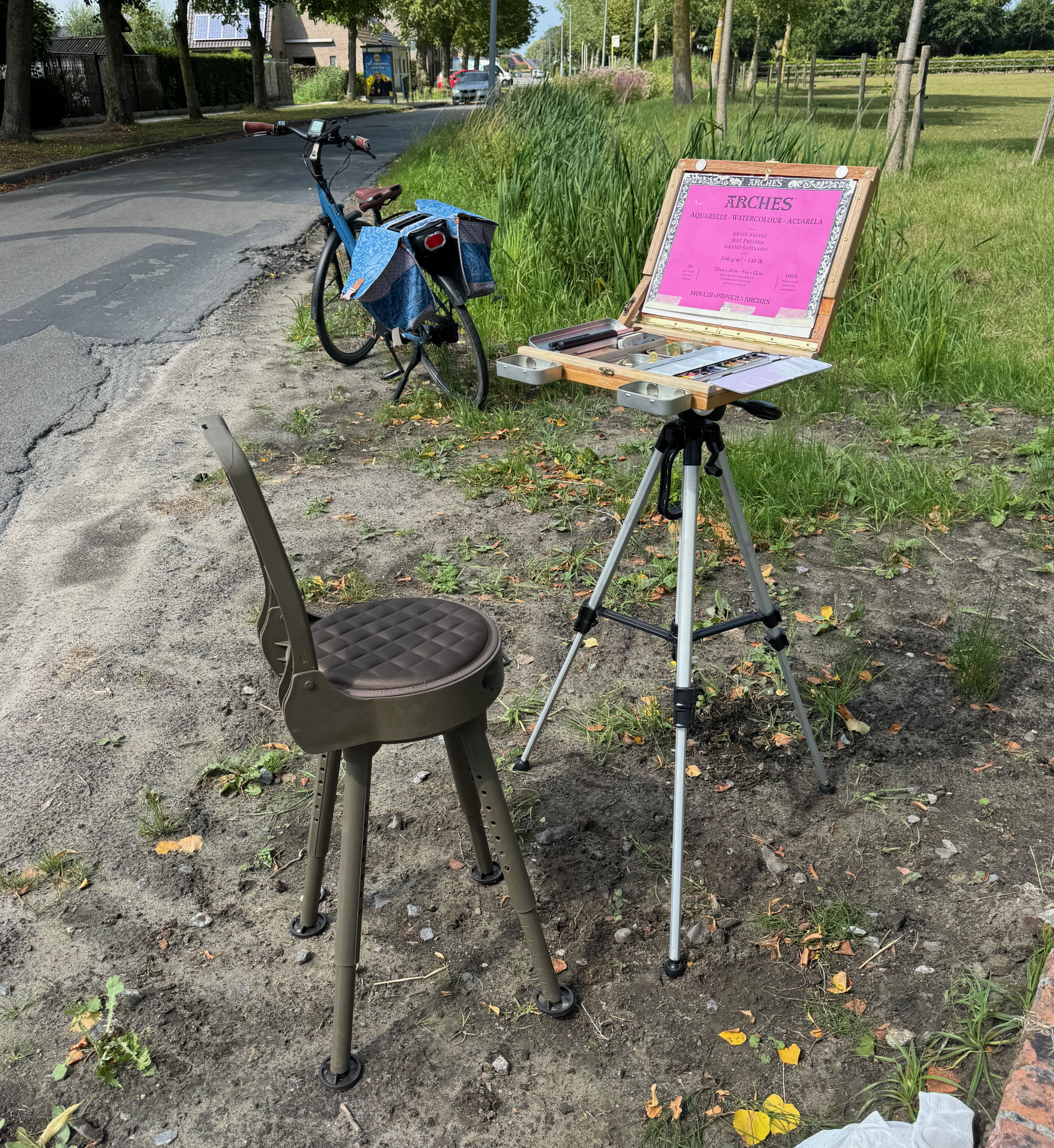
I recently upgraded this set up further to allow for a vertical orientation (of my watercolor block) as needed. Also I attached magnets to the front side so small water trays can be stationed there while working. The in situ pic here shows my folding chair, box and tripod from a recent session. Everything collapses and packs up nicely in the saddlebags of my e-bike. Adventure ho!
Creating a pochade box for oils, version II (March 2024)
March 30, 2024
After creating a pochade box for my studio in Belgium, I wanted to create a similar one for my studio in California. While attending a course called “preparation for landscape painting” at the Watt Atelier, I picked up a few tips and tricks.
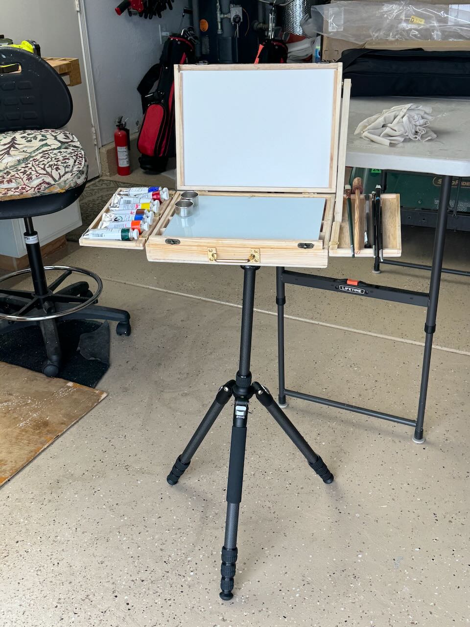
Primarily, they suggested sourcing a good glass 9 x 12″ palette with a while underside. Important! Since my previous palettes had been wood toned, now I could finally see the colors I was mixing! Size-wise it was just another reminder of how important it is to work with standard sizes. Your gessoed boards, palette, pochade, daypack not only can be easily sources they also can easily interact, while frame sizes for the end result are cheap and simple.
I purchased an A4 box from Amazon and brought along a few of my tripod brackets from Jackson’s Art Supply. Since I did not have any hardware for fixing the top of the easel at an angle, I had to improvise with a side bar. Additionally, I realized how important it would be to have expandable side trays for holding paints and brushes while working. They would need to nesting later for traveling.
In the end, just before we returned to Belgium, I came up with this. Neither version had been field tested however, between the two I had made the following changes: side trays, easel arm and glass palette mentioned above, but also the orientation of the compartments underneath. (I had changed them from vertical to horizontal in VII so as to function better for brush and tube storage.) I knew I’d want to make similar adjustments (to version I) once we got back to Bruges but that was entirely possible.
Now truly, if only the weather would cooperate, I was ready for a summer of en plein air painting.
Creating a pochade Box for oils, version I (November 2023)
November 3, 2023
Last summer I began to return to en-plein-air painting in the environment around Bruges. At first, just watercolour. I would walk or bike to my location of choice. As my explorations expanded, my e-bike allowed me to get to remote locations, because my bags could easily hold all my stuff: a light weight field easel, a folding chair, a watercolor box, brushes and pad. No problem, though everything was kinda flimsy, makeshift and easily toppled over by the wind (or even me ;-)). 😉
Then I began to dream of doing oils (once again) yet in a similar fashion. I already had a beautiful Mabef wooden field easel but it weighed about 30 pounds and couldn’t be transported by e-bike. Primarily for that reason I had given up on my en plein air explorations. (I don’t drive a car much around Bruges, also because I have MS, I really can’t very walk far or stand for very long, but e-biking works). So maybe, just maybe, I could use the same condensed setup I now had for aquarelle and just substitute a (condensed) quantity of oil tubes, potions, palette and brushes instead? I already knew, the biggest plain-air challenge (besides the act of painting itself), was transporting a wet oil painting back home without smearing, so that was design challenge #1.
I bought an A4 (9 x 12 x 2″) wooden box on Amazon. The top section was 1/2″ deep while the bottom section was 1 1/2″ deep. I cut a slice out of the front along the bottom section and glued that insert to the top lid. This would could potentially nest a wet gessoed panel. I then glued thin runners inside along the sides of the bottom section. This created a box, allowing my thin gessoed panels (and palette) to seamlessly slide in and out, keeping everything from smearing, while storing tubes and brushes beneath. The lid could close and everything remained in place. My first foray with this system worked out fine. Nothing smeared (though my metallic field easel proved far too flimsy to function as an easel).
I began to dream of further improvements. Could I use the upper section of the box itself as a field easel? How to mount it? And to what? When attached, how to tilt the lid to provide a stable angle for painting? Would I then be able to carry my paints, palette and brushes in the bottom section of the box? If so, could I still keep one painting protected during transport? And what about carrying a wet palette, would that be possible? Above all I wanted to design an elegant, simple solution which could minimise the amount of gear I had to carry.
The Tripod and Mount
After some surfing around I determined that a standard camera tripod is fully adequate to function as an easel. It has a detachable mounting plate with a projecting 1/4″ bolt, consisting of 20 threads. You just need to match that plate to a bracket able to receive the bolt, affixed to the underside of your box. For starters I bought a tripod from a local appliance store. Then I looked around and sourced a beautiful bracket from Jackson’s Art Supply in England. Affixed to the box’s underside, it can take that 1/4″ 20 thread bolt. I just needed to laminate an extra piece of 1/4″ plywood to stabilize the base.
In the end I had something like this, ready for a test drive. But by now it was the beginning of November, end of the painting season. That all important test drive would have to wait for the spring.
A non-dual definition of art
August 4, 2023
Art is: (in the Dutch language) een gevoelsmatig einheid. Period. The “gevoelsmatig” element refers to the channel of consciousness on which it vibrates, while the “einheid” element (which I’ve also written about here) refers to the unifying thrust inherent to the creative process as well as to its manner of perception.
Translated and expanded into English the definition becomes: a felt-intuition succinctly and evocatively expressed/communicated as a sense-based unity. It might be helpful to unpack that a little bit.
“felt-intuition”
The Dutch word, gevoelsmatig guides me here. I’ve written about that word (particularly in the context of Western philosophy) here and here. Gevoelsmatig refers to a sensitively refined, intuitive, instinct-type of feeling-knowing that is not only fundamental to all forms of art but to existence itself. It refers to an inception, a feeling-knowing which may be based on sensations, emotions, or impressions not entirely understood and so (at least to the subject, but also to others) may appear irrational. Nevertheless, it’s a subject-based channel for acquiring “knowledge”, self-knowledge. Birds know when to fly south, humans know when a relationship has ended: it’s gevoelsmatig.
In English I have chosen the compound word felt-intuition as a translation for gevoelsmatig instead of emotion or feelings. Using the word emotion especially to describe art would, I feel, be reductive because not all instances of art are transmissions of emotion. Rather most, if not all, speak to and through the senses, describing/communicating how some external or internal event felt to the artist, allowing the perceiver/receiver to experience something similar. (which is, by the way, a good example of non-duality) The word feelings too, is inadequate because it does not include the knowing aspect of the word “gevoelsmatig”, for the greatest art communicates a sense of meaning even – or especially if – that meaning is not entirely understood. Art can speak directly, viscerally and transcendentally to the person, to the transpersonal (mythic or religious imagery) or the supra-personal (abstraction) levels – or all three simultaneously (!).
“expressed/communicated”
Everyone experiences emotions and felt-intuitions. The artist tries to communicate such things through a process of objectification. The artist needs to be grounded in his or her own experience in order to communicate directly from it, extracting the essential. Still, not everyone possesses the capacity to objectify evanescent feelings or intuitions, that is, to recreate them effectively. Additionally, not everyone gives themselves permission to be in contact with their own deeper levels and to express from those spaces: cultural/upbringing factors may encourage attractive emotions which, when expressed as “art” become simply superficial; while those same upbringing factors may force unattractive emotions to either be repressed or suppressed. This may be the reason why the biographies of many famous artists depict their lifetimes as a series of taboo-crossings – for like many rock-n-roll icons – not every lover is left alive. Felt-intuitions penetrate deeper, are both singular and personal. Art as an expression-and-communication speaks to it all.
“succinctly and evocatively”
This is where craft of the artist comes in. Every artist knows that the less said the better, that craft means being succinct. This is true in acting, in writing, in music, in dance and in the visual arts. Art succeeds when it extracts the refined essence of an intuition or an experience so effectively that it can evoke something similar in the viewer. This allows the perceiver/receiver to experience a reconstruction within the sphere of their own feeling-world – entirely without the use of concepts. Strong emotions in the perceiver may then be elicited: surprised by joy; disturbed by fear. A discovery. A release.
“a sense-based unity”
Past definitions for art may have relied on the word “form” to describe the resulting piece. But that word is inaccurate because though that piece may very well exist as a form, as a thing, as an object, what makes it art is the fact that, it is a vibrant unity created from disparate elements: thoughts, words, feelings, sensations, movements, notes, lines or splashes of paint. These sense-based communications allow the perceiver/receiver to recreate a similar unity within themselves. (again, an example of non-duality) And aesthetic pleasure resides entirely in this: the subtle recreation of an intuition or an experience so deeply felt and communicated that we too resonate with it – entirely without the use of language-based concepts. And in addition, our lived-experience becomes enhanced by this resonance.
Prachtig! (that’s great!)
Aboriginal Culture
June 23, 2023
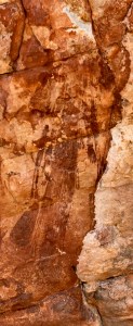
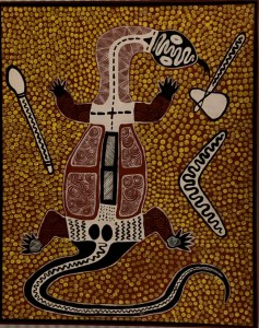
Cave painting of a dancing, ritualistic figure from Jar Island – at least 30,000 years old, if not more.
After our return from Australia and before I get on with the normal activities of our life here in Europe, I feel the need to put down some thoughts and feelings about the Aboriginal people and art that I encountered there. First, the word “aboriginal” is a Latin term, roughly translating to “from the beginning”, which was categorically applied by Australia’s white settlers in the early 19th century to distinguish between themselves and the dark-skinned natives they encountered there. But just to clarify, when the settlers arrived, there were already approximately five hundred different tribes scattered throughout the land: they spoke different languages, had different rituals, ate different food (bush tucker) and had different migration habits, depending on the climate. However, as an umbrella term, it stuck. It’s usage immediately reinforced larger cultural and racial divisions which hardened over time.
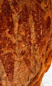
Cave painting from Jar Island – at least 30,000 years old, if not more.
The dark-skinned indigenous tribes wished to continue with their hunter-gatherer way of life, sustained by the stories which had been communicated orally (mostly in secret initiatory rites) and maintained (so they claim) in an unbroken line for tens of thousands of years. In fact, the current date collaborated to by scientific archeology places the presence of hunter-gatherers at specific locations within Australia from 50,000 to 60,000 thousand years. On encountering these “dreamtime” myths and stories, primarily through the art that continues to surface, I experienced the sense of a living connection to “Country”, the term they use to describe their sense of a land animated by Spirit-Gods, immanent within the animals, birds, plants, trees, insects, rocks, water and wind. It’s an animistic group-identity connecting these people to each other and to the land through customs prescribed by the Law (the moral precepts) given to them by the first Spirit-Gods.
In contrast, the white-skinned settlers, mostly farmers and miners, were interested in the open land of the New World. They were part of the European colonial expansion already sweeping the globe. In this case, in Australia and especially in the 19th century, Britain laid claim to a land they conceived of as being empty (terra nullius). They brought with them their culture – and more effectively, their civilization. As in other areas of the New World, an orally transmitted culture of hunter-gatherers was no match to the technologies of civilization: guns, money, law, agriculture, houses, roads, and a unified and unifying language cemented by Gutenberg’s books. It was an inevitable and unstoppable wave which ultimately resulted in an indigenous culture becoming extracted from the sustaining conditions of its generation and relocated to settlements on the edges of the white fellas’ world.
Racial differences, of course, were easy markers, signposts of the deeper cultural contrasts within. In some places assimilation proceeded gently with the help of missionaries introducing the natives to their (Christian) God, agricultural methods and language (English). In other places, for a continent peopled at least in part by Victorian society’s rejects (the penal colony prisoners), the transition was much harsher. Also, and at the same time, mere physical contact with the white man meant an introduction to his diseases (things like polio, diabetes and alcoholism just to name a few). It was catastrophic to the isolated and genetically unprepared immune systems of these tribes. Thus, over approximately two hundred plus years, the attrition brought on by war, disease and displacement caused profound challenges to the identity of these people. Within the settlements, there was not only a decimated population, there was also a listlessness and general lack of purpose which at times threatened to wipe these people off the planet. The story could have stopped there but it didn’t. There’s always a swing of the pendulum.
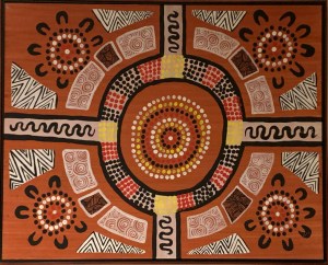
Aboriginal art from our hotel room in Broome.
Over the centuries, as cultural assimilation (slowly) proceeded and an aversion to (overt) racism grew, the more difficult challenge of overcoming cultural chauvinism loomed (and still does, though to a much lesser degree). The later half of the twentieth century had seen a general increase in public interest for the situation of the indigenous Australians, while for the latter, through the more general acquisition of the English language as well as becoming educated in Australian law, came the opportunity to challenge it. At root is/was the issue of ownership: political ownership and/or cultural ownership, where they meet and where they do not. In Australia, as culture and politics slowly change, two events of the last fifty years stand out.
Aboriginal art from our hotel room in Broome.
The first change was cultural. Sometime in the 1970’s, when an art teacher (Geoffrey Bardon) in an indigenous settlement north and west of Alice Springs (Papunya) noticed his young students drawing patterns in the sand, he encouraged them to paint and draw these forms and shapes – which they did. Before that they had been copying the images of cowboys and Indians from TV and films. Soon the elders, who had been watching from the sidelines, began requesting paint and canvases for themselves, too. “Aboriginal art”, as a movement, had been born. That’s a simplistic explanation – and from an external perspective – but perhaps for an indigenous human being steeped in Dreamtime stories (invoking a reality perceived as concurrent to the conditions of life within the shacks of a settlement) turning to these stories was like turning on the spigot to a source of fresh water: easy, natural, and virtually effortless. For myself, as both philosopher and artist, I tend to think that if it had not been for Picasso, Freud and/or Jung impacting the world of western culture in the early part of the twentieth century as they did, what was and is being communicated from the sidelined Aboriginal cultural world would not have received the appreciation that it has. For example, besides exhibitions in major galleries and art centers around the world, currently there is a wing dedicated to Aboriginal art in the National Museum in Canberra.
The second event, just as transformative, was political. In 1992, in the Mabo vs Queensland decision, the Supreme Court of Australia overturned the terra nullius precedent which had been used by England to justify its seizure of land during the continent’s colonial era. Challenging this precedent had put the Indigenous People in the strange position of needing to prove something legally that – but for vested interests – was generally acknowledged as common-sense. In 1993, this decision was quickly followed by the Australian Parliament’s passing of the Native Title Act. The NTA sought “to provide a national system for the recognition and protection of native title and for its co-existence with the national land management system”. Of course, the devil was in the details. As a Belgian lawyer once quipped to me: “Possession is nine tenths of the law”. So, the NTA opened the door but did not grant entry. Legal challenges continue to be an ongoing process within the states and territories: claims are mounted for landmarks deemed especially valuable to the local tribes; citizens, mining companies and pastoral concerns fight back. Thus you have, in modern day Australia, an on-going political/legal situation. Who owns what? And who has the right to decide it?
During our visit in May 2023, before a classical music concert in Sydney, we were surprised to hear an acknowledgement of tribute to the local tribe as traditional owners of the land on which Sydney’s Opera House stood. Later, the same occurred in Perth. On the entry walls in the Art Museums of both Sydney and Perth, we read the same – in so many words. During our stay in Perth, we noticed banners proclaiming 2023 as the “Year of Reconciliation”. While on a Friday, as we traveled by bus to King’s Park we encountered a number of young friendly Aboriginal kids excitedly journeying to the “Walk of Reconciliation”, a festival taking place there that day. As we wandered through the park’s natural beauty, we noticed stations set up for demonstrations of indigenous music, dance, painting, pottery, weaving and bush tucker. Cool.
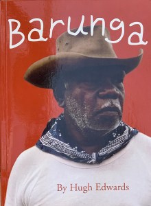
Albert Barunga by Hugh Edwards.
Later, in our hotel, I finished reading the biography of a native man named Albert Barunga. I had picked it up after conversing with his grandson, Warren Barunga, in a shack off Freshwater Cove in the Kimberley. There, Warren was selling a few books, his art-work and that of some other clan members. His grandfather, Albert Barunga had been an Aboriginal man raised in the bush sometime during the 1920’s. Later he was educated by missionaries. During his lifetime he had achieved success through his ability to function well in both worlds. He helped to translate parts of the New Testament into his native Worora tribal language. He was skilled in managing horses, boats and people and worked as a scout for the Australian navy in WWII. Later he functioned as an advocate for his tribe. In 1977, he and his wife were invited to meet the Queen of England when her yacht was moored off the coast. Though the book was an interesting biography, documenting the particulars of a transition from a hunter-gatherer way of life to a (western) civilized one, one passage in particular stood out to me. It highlights a difference in the method-of-knowing emphasized by these contrasting cultural environments.
He described an experience which occurred during the Second World War. He was about to board a Catlina flying-boat airplane heading out on patrol. He had never flown before and so was excited about the opportunity, however as he approached the plane, a cold feeling came over him. His aversion was noticed by the Captain who simply suggested “Perhaps another time, Albert”. So, he remained behind, despondent at his “failure”, only to hear hours later that the plane had been shot down by the Japanese, losing all fifteen crew members. He remembered then the cold feeling and concluded: “something told me it was a death ship. I can’t explain what it was. […] This kind of feeling is not uncommon with Aboriginals. A sixth sense, the white men call it. When I was younger and closer to the bush I had it much more strongly. [..] But the white man has rubbed across my brain and these sensitive things have gone. Now we are away from our own country, the spirit-feelings don’t come back.”
Douwe Tiemersma
Douwe Tiemersma, our Dutch-language-based teacher of non-duality, earned an interdisciplinary PhD in the fields of biology and philosophy. So of course he was an accomplished scholar within reason-based methods-of-knowing. But as a teacher of non-duality and a lifelong practitioner of yoga and meditation, he was particularly keen to emphasize the importance of a gevoelsmatig kind-of-knowing. Gevoelsmatig then refers to a sensitive, intuitive, instinct-type of feeling-knowing that is not only fundamental to all forms of art but to existence itself. For my husband and I, as his English language translators, we often found it difficult to translate the word “gevoelsmatig” into English – using just one word. It refers then to an inception, a feeling-knowing which may be based on sensations, emotions, or impressions not entirely understood and so (at least to the subject, but also to others) may appear irrational. In Dutch, “gevoelens” are feelings, “gevoelig” refers to being sensitive, so these channels of communication play a nuanced role in the word “gevoelsmatig”, however in English, if you use “instinct” or “intuition”, the main etymological clue is the prefix “in”, which points internally without much of a clue about which channel of communication may be involved. Additionally, if you use “feeling” or “emotion”, the sense that it is a subtle mode of intelligent communication may be less apparent.
Also, as Albert Barunga noticed about his intuition, it’s something that an individual (and his or her living conditions) can either encourage or discourage – but never entirely eradicate. It creeps up on us in our dreams, the shadowed world of our daytime neglect. The non-dual perspective suggests it’s intrinsic to human nature and complimentary to reason. On the cultural level then this tends to surface as our collective and recurring myths. Thus, within western culture, particularly in the twentieth and twenty-first century, as science and philosophy have proceeded to demythologize religion, Picasso, Freud, Jung and now Aboriginal art, through psychology and art, have given myth a heightened value. To a mind focused exclusively on reason as a method-of-knowing, subtly felt intuitions may appear as magical thinking, yet to a mind open to alternatives, a good intuition may indeed tell reason where to dig. To my mind it’s a question of balance, personally and culturally.
The Silverpoint Composite Underdrawing
June 6, 2022
Silverpoint on tinted acrylic ground. 3 1/2 feet wide by 5 1/2 feet tall or 106 cm x 168 cm.
I’ve finally completed the sixty-four silverpoint underdrawings in preparation for a painting – as yet to come. The panels were developed individually – and were based on black and white sectionals of a photograph. The MDF panels were all prepared with an acrylic ground tinted with a mixture of dry pigments to simulate terre verte, because the actual dry pigment, terre verte, reacts negatively with acrylic rendering it unworkable – in that particular medium. Of course, I could have used a tint of white for my ground colour but I already knew how much I enjoyed working from a toned ground. The silver lines could be used to subtly create linear form while then the addition of an acrylic wash of white highlights could help it to “pop”! In addition, I coated each tinted gesso panel with a transparent covering of Golden’s Pastel Ground, in order to create a fuzzy toothiness.
Assembling the panels on the backing board.
Now, since this level has been completed I’ve encountered two main problems-to-solve: 1) in the areas of darkest value which required a lot of cross-hatching of the silver particles, the image possesses a reflective sheen. Is it possible to minimise this reflectivity?; 2) even though silverpoint has the reputation for leaving an indelible mark, I have found that that is not really the case. Both water and a kneaded eraser can, in fact, diminish the image. So, before I proceed any further, I want to “fix” the drawing. What material should I use to do this? A traditional pastel fixative or a matte acrylic varnish? In addition, would this proposed fixative help to diminish my sheen problem?
After some research and consultation with the expert folks at the University of Delaware’s MITRA forum, I have decided to spray an adequate covering of Lascaux (an acrylic medium containing B-72) Fixative over the whole assemblage before proceeding any further. Because I anticipate further layers of abstraction, using a Liquitex transparent titanium white spray over the image my silver sheen issue may take care of itself?
Fast forward to a few months later. The fixative, fixed, and the matte spray pain reduced the sheen.
What remained was for me to throw some paint at it.
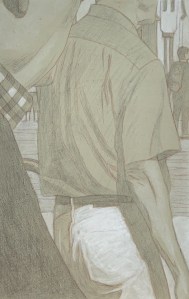
Underdrawings in silverpoint, batch #3
October 8, 2021
Pieces of Me #36, silverpoint underdrawing on toned ground tightened with acrylic
After a long hiatus (at least from posting here) I’ve got another batch of silverpoint underdrawings to publish. These were created during our recent trip to California – in my new studio there. The new studio is in our garage, so besides the new working-space, I envision that I will have more room to create larger pieces there (who needs cars anyway?). My current working-space here in Belgium exists in a long rear hallway to the house. It measures about 4 x 10 feet but since Euro-compression-design rules the day I have been able to pack many useful features into it. Still. it’s cramped.
Pieces of Me #58, silverpoint underdrawing over toned ground tightened with acrylic
When I began this project I knew of course that the silverpoint pencil nib is quite restrictive, so the challenge in these panels was how to render various highly textured, amorphous and abstract shapes with a very fine, low in value line. Mostly impossible. For many of these compositions then, if I were to use just silverpoint, I’d have only very flat uninteresting underdrawings to offer. But since they are executed on a toned ground, the addition of the while highlights (using tubes of titanium white acrylic) allows for greater manipulations. Washes quickly establish the tonality, texture and gesture – things which are otherwise very difficult to achieve in silverpoint alone.
Pieces of Me #38, silverpoint underdrawing over toned ground hightened with white
The silverpoint then establishes the basics of the design and hints toward the darker values, while the white moves the image forward. I enlisted the help not only of brushes but also sponges, hands and fingers. And since each panel is about the size of a standard book, I could rotate the panel to get my washes to drip in whatever direction I needed. Nice. That’s really hard to do with a big panel or canvas. 😉
Pieces of Me #57, silverpoint underdrawing on toned ground tightened with white
All in all I created fourteen panels during this recent time. They are still resting in their little beds in California, however I was able to take some photographs of them before leaving. I’m hoping to put the whole series together there during our next trip, where I will have enough space in that garage to throw some paint at the final assemblage. As ever, we’ll see.
Colour by Victoria Finlay: a book report
June 13, 2021
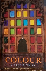
Colour by Victoria Finlay
I recently reread this treasure from my book shelf. It was as entertaining now as it was almost fifteen years ago at my first discovery. For anyone interested in colour, professional or otherwise, I highly recommended it. It’s written by a well informed storyteller, who roams the planet in search of the animal-vegetable-mineral sources that have been used for centuries to express the rainbow spectrum of human thoughts, tactile feelings and animating emotions. It’s about pigments then, as well as their wearable counterparts in the form of dyes.
Although the book itself is light on theory, the author organises her material according to the spectrum of RGB additive light (I wrote about that a few years ago here). That theory recognises white light as the cumulative ‘colour’ achieved by adding together the separated spectral components of red, green and blue light. Additive light theory exists in contrast to subtractive. Subtractive light/colour theory states the opposite, that is, the cumulative ‘colour’ achieved by adding its primaries (red, yellow and blue paint) is black. Subtractive light/color exists in the world of reflection, such that whatever colour we perceive is actually a reflection of the spectral wavelengths that any particular object does not absorb. For example, an apple absorbs mainly green and blue light, so it reflects red. We learn to mix the colours of subtractive light in kindergarten while later on we experience the more sophisticated cyan-magenta-yellow-black of commercial printing.
Since we are all children of light, internally I think we dream in coloured light (that is, in additive light), even though when we start to create (or recreate) those internal images on opaque and reflective surfaces, we use subtractive colour mixing. We try to travel back up the rainbow. That’s why the final result of even a well crafted image can often be disappointing – at least to the artist – for it never quite matches the inner imagination. In any case, it’s important to be aware of both models. Clearly Victoria is guided and inspired by the rainbow colours of additive light, while she so passionately explores the materials of the earth which reflect its hues subtractively. There’s a story here, too, for many of these organic dyes and inorganic minerals are increasingly being replaced by their synthetic counterparts. Qualitatively, the differences may be great or they may be small, so much depends on subtlety and the test of time. Thus, though she doesn’t seem to have an axe to grind, she knows what she likes.
The tales of this itinerant traveler then make for an appealing and not too technical read. She is imaginative and more adventurous than many (for example, she traveled in the early 2000’s to areas of Taliban-ruled Afghanistan in order to see its storied mines of lapis lazuli). I especially appreciated her recognition of the importance of tactile sensitivity – in the creation of art – and in the discovery of the materials it uses. She states:
“When we see a finished painting we tend to assess it for such things as composition, emotion, colour and perspective. But what the artist experiences moment by moment in his or her turpentine-smelling studio is the scrape or smear or splatter or stir of one substance against another. Does the artist think of butter or tiramisu or of diesel as the paint is applied? Or does the laying down of paint happen without mental images at all? It depends, of course, entirely upon the individual. But either way, painting is sometimes an entirely tactile act where time is forgotten, and it is sometimes a paint’s ability to drip – or not to drip- and the colours it goes with rather than its propensity to poison which has been the deciding factor in whether it is welcomed on the painter’s palette. As James Elkins writes in ‘What Painting Is’, where he explores the parallels between painting and alchemy: ‘A painter knows what to do by the tug of the brush as it pulls through a mixture of oils, and by the look of the coloured slurries on the palette'” (pg. 146)
I call this factor the muladhara chakra, or gevoelsmatig bewustzijn or aesthetic consciousness or quite simply, like Victoria, tactile sensitivity. In any case, in this sense she’s clearly a writer after my own heart.
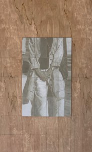
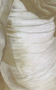
Underdrawings in silverpoint, batch #2
June 3, 2021
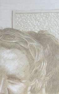
Silverpoint #05 over toned gesso ground. 13.3 x 21 cm or 5 1/4 x 8 1/2 in.
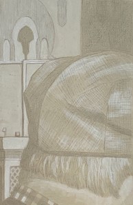
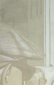
I’ve completed six more panels, so I figure it’s time for an update. Illustrated here are a few of those that I that have found to be particularly interesting/beautiful for various reasons. The most evocative seem to be those whose compositions include human beings or parts thereof. It’s as though each one is from some unwritten comic book – captions not included. (Hergé would have understood.) Additionally, the abstract panels cause me to wonder/admire anew at how the iconoclastic impulse of Islamic art continues to produce such interesting varieties of texture and pattern.

Silverpoint #08 over toned gesso ground. 13.3 x 21 cm or 5 1/4 x 8 1/2 in.
Further, one very general note. I feel I am serendipitously creating 21st century daguerreotypes(!). (Who knew?) It’s as though by using silver to recreate images based on a digital photograph the mechanistic process has come full circle: human to machine back to human. And again, because the drawing stylus is silver it’s almost impossible to achieve a line darker than a 50% grey value. All values are compressed thereby, necessitating a multitude of small decisions. Then, adding in the white highlights truly makes each panel come alive. That’s my artist’s pleasure.

Silverpoint #11 over toned gesso ground. 13.3 x 21 cm or 5 1/4 x 8 1/2 in.
Finally, the raison d’être for these remains as underdrawings. And I have no doubt that their beauty and subtlety will contribute to the whole in yet-to-be-experienced ways. (Can’t wait) However, because of their beauty and subtlety – which at least compositionally I don’t take credit for – some will be held back for individual display and appreciation. For this, I think I have a plan…
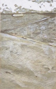
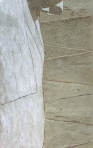
Underdrawings in silverpoint, batch #1
May 12, 2021
Panel #10. Silverpoint underdrawing over tinted gesso, highlighted with white. 13.3 cm x 21 cm, or 5 1/4 x 8 1/4 in.
I’ve been doing some underdrawings for a new project. It will be a different approach to the same image/subject matter as the “A Piece of Me” project, completed in December 2020.
Panel #01. Silverpoint underdrawing over tinted gesso, highlighted with white. 13.3 cm x 21 cm, or 5 1/4 x 8 1/4 in.
However, instead of being executed in a full textural and chromatic range this one will be untextured, monochromatic and ghosted back. It will be done in silverpoint on acrylic and overpainted (in acrylic or oil, TBD) on sixty four panels.
Illustrated here is a selection of some of the individual panels I’ve created so far, along with some of my notes. 1) Using silver point means that I can never reach a rich dark value (SP is not india ink!). So that’s fantastic and exactly what I’m looking for. 2) In addition, since I’m creating them on already tinted grounds, the darkest values provide less contrast than if I were starting from a white ground. Again, excellent! 3) The tinted ground itself establishes a middle value and allows me to lay in white washes for the highlights. 4) Inevitably, the value range is compressed and subtlety reigns. Nice. That’s how I like it.
Panel #02. Silverpoint underdrawing over tinted gesso, highlighted with white. 13.3 cm x 21 cm, or 5 1/4 x 8 1/4 in.
Also, even though these are intended as underdrawings I can already see that, when the composition warrants it, a few of them are or will be worthy of individual display – though I’m not sure how I’ll handle that. Should I create them (only) for integration into the final piece? Or should I create some for appreciating in isolation (only)? It’s a great problem to have which, for the moment, I don’t have to solve. I can simply create the little panels, fall in love and see where it all goes

