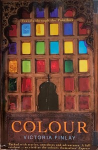
Colour by Victoria Finlay: a book report
June 13, 2021

Colour by Victoria Finlay
I recently reread this treasure from my book shelf. It was as entertaining now as it was almost fifteen years ago at my first discovery. For anyone interested in colour, professional or otherwise, I highly recommended it. It’s written by a well informed storyteller, who roams the planet in search of the animal-vegetable-mineral sources that have been used for centuries to express the rainbow spectrum of human thoughts, tactile feelings and animating emotions. It’s about pigments then, as well as their wearable counterparts in the form of dyes.
Although the book itself is light on theory, the author organises her material according to the spectrum of RGB additive light (I wrote about that a few years ago here). That theory recognises white light as the cumulative ‘colour’ achieved by adding together the separated spectral components of red, green and blue light. Additive light theory exists in contrast to subtractive. Subtractive light/colour theory states the opposite, that is, the cumulative ‘colour’ achieved by adding its primaries (red, yellow and blue paint) is black. Subtractive light/color exists in the world of reflection, such that whatever colour we perceive is actually a reflection of the spectral wavelengths that any particular object does not absorb. For example, an apple absorbs mainly green and blue light, so it reflects red. We learn to mix the colours of subtractive light in kindergarten while later on we experience the more sophisticated cyan-magenta-yellow-black of commercial printing.
Since we are all children of light, internally I think we dream in coloured light (that is, in additive light), even though when we start to create (or recreate) those internal images on opaque and reflective surfaces, we use subtractive colour mixing. We try to travel back up the rainbow. That’s why the final result of even a well crafted image can often be disappointing – at least to the artist – for it never quite matches the inner imagination. In any case, it’s important to be aware of both models. Clearly Victoria is guided and inspired by the rainbow colours of additive light, while she so passionately explores the materials of the earth which reflect its hues subtractively. There’s a story here, too, for many of these organic dyes and inorganic minerals are increasingly being replaced by their synthetic counterparts. Qualitatively, the differences may be great or they may be small, so much depends on subtlety and the test of time. Thus, though she doesn’t seem to have an axe to grind, she knows what she likes.
The tales of this itinerant traveler then make for an appealing and not too technical read. She is imaginative and more adventurous than many (for example, she traveled in the early 2000’s to areas of Taliban-ruled Afghanistan in order to see its storied mines of lapis lazuli). I especially appreciated her recognition of the importance of tactile sensitivity – in the creation of art – and in the discovery of the materials it uses. She states:
“When we see a finished painting we tend to assess it for such things as composition, emotion, colour and perspective. But what the artist experiences moment by moment in his or her turpentine-smelling studio is the scrape or smear or splatter or stir of one substance against another. Does the artist think of butter or tiramisu or of diesel as the paint is applied? Or does the laying down of paint happen without mental images at all? It depends, of course, entirely upon the individual. But either way, painting is sometimes an entirely tactile act where time is forgotten, and it is sometimes a paint’s ability to drip – or not to drip- and the colours it goes with rather than its propensity to poison which has been the deciding factor in whether it is welcomed on the painter’s palette. As James Elkins writes in ‘What Painting Is’, where he explores the parallels between painting and alchemy: ‘A painter knows what to do by the tug of the brush as it pulls through a mixture of oils, and by the look of the coloured slurries on the palette'” (pg. 146)
I call this factor the muladhara chakra, or gevoelsmatig bewustzijn or aesthetic consciousness or quite simply, like Victoria, tactile sensitivity. In any case, in this sense she’s clearly a writer after my own heart.
