Creating a pochade box for oils, version II (March 2024)
March 30, 2024
After creating a pochade box for my studio in Belgium, I wanted to create a similar one for my studio in California. While attending a course called “preparation for landscape painting” at the Watt Atelier, I picked up a few tips and tricks.
Primarily, they suggested sourcing a good glass 9 x 12″ palette with a while underside. Important! Since my previous palettes had been wood toned, now I could finally see the colors I was mixing! Size-wise it was just another reminder of how important it is to work with standard sizes. Your gessoed boards, palette, pochade, daypack not only can be easily sources they also can easily interact, while frame sizes for the end result are cheap and simple.
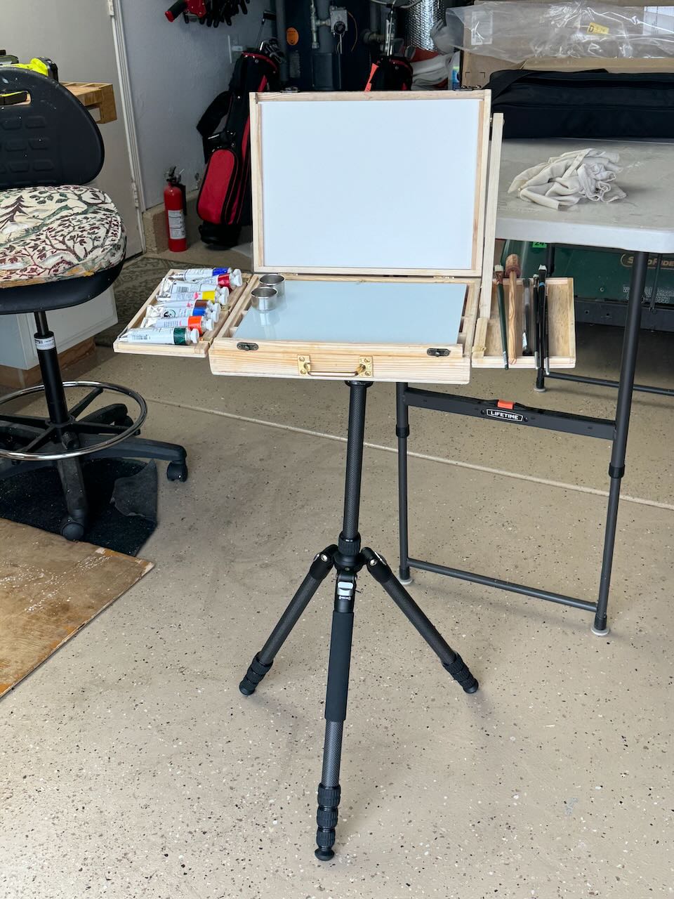
I purchased an A4 box from Amazon and brought along a few of my tripod brackets from Jackson’s Art Supply. Since I did not have any hardware for fixing the top of the easel at an angle, I had to improvise with a side bar. Additionally, I realized how important it would be to have expandable side trays for holding paints and brushes while working. They would need to nesting later for traveling.
In the end, just before we returned to Belgium, I came up with this. Neither version had been field tested however, between the two I had made the following changes: side trays, easel arm and glass palette mentioned above, but also the orientation of the compartments underneath. (I had changed them from vertical to horizontal in VII so as to function better for brush and tube storage.) I knew I’d want to make similar adjustments (to version I) once we got back to Bruges but that was entirely possible.
Now truly, if only the weather would cooperate, I was ready for a summer of en plein air painting.
Creating a pochade Box for oils, version I (November 2023)
November 3, 2023
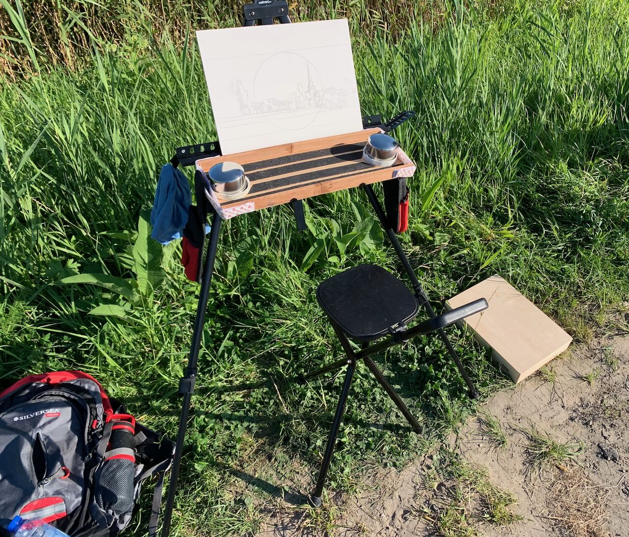
Last summer I began to return to en-plein-air painting in the environment around Bruges. At first, just watercolour. I would walk or bike to my location of choice. As my explorations expanded, my e-bike allowed me to get to remote locations, because my bags could easily hold all my stuff: a light weight field easel, a folding chair, a watercolor box, brushes and pad. No problem, though everything was kinda flimsy, makeshift and easily toppled over by the wind (or even me ;-)). 😉
Then I began to dream of doing oils (once again) yet in a similar fashion. I already had a beautiful Mabef wooden field easel but it weighed about 30 pounds and couldn’t be transported by e-bike. Primarily for that reason I had given up on my en plein air explorations. (I don’t drive a car much around Bruges, also because I have MS, I really can’t very walk far or stand for very long, but e-biking works). So maybe, just maybe, I could use the same condensed setup I now had for aquarelle and just substitute a (condensed) quantity of oil tubes, potions, palette and brushes instead? I already knew, the biggest plain-air challenge (besides the act of painting itself), was transporting a wet oil painting back home without smearing, so that was design challenge #1.
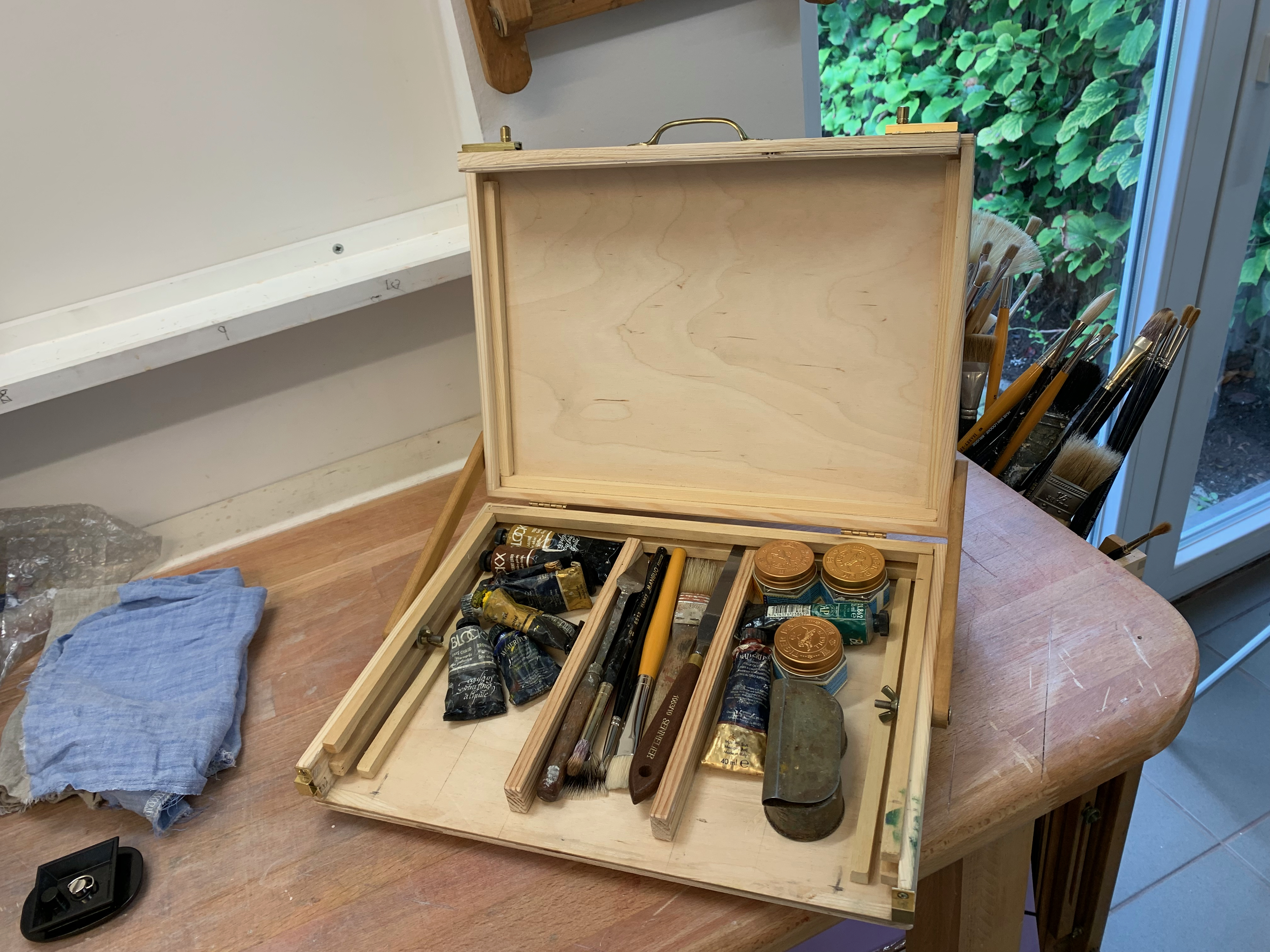
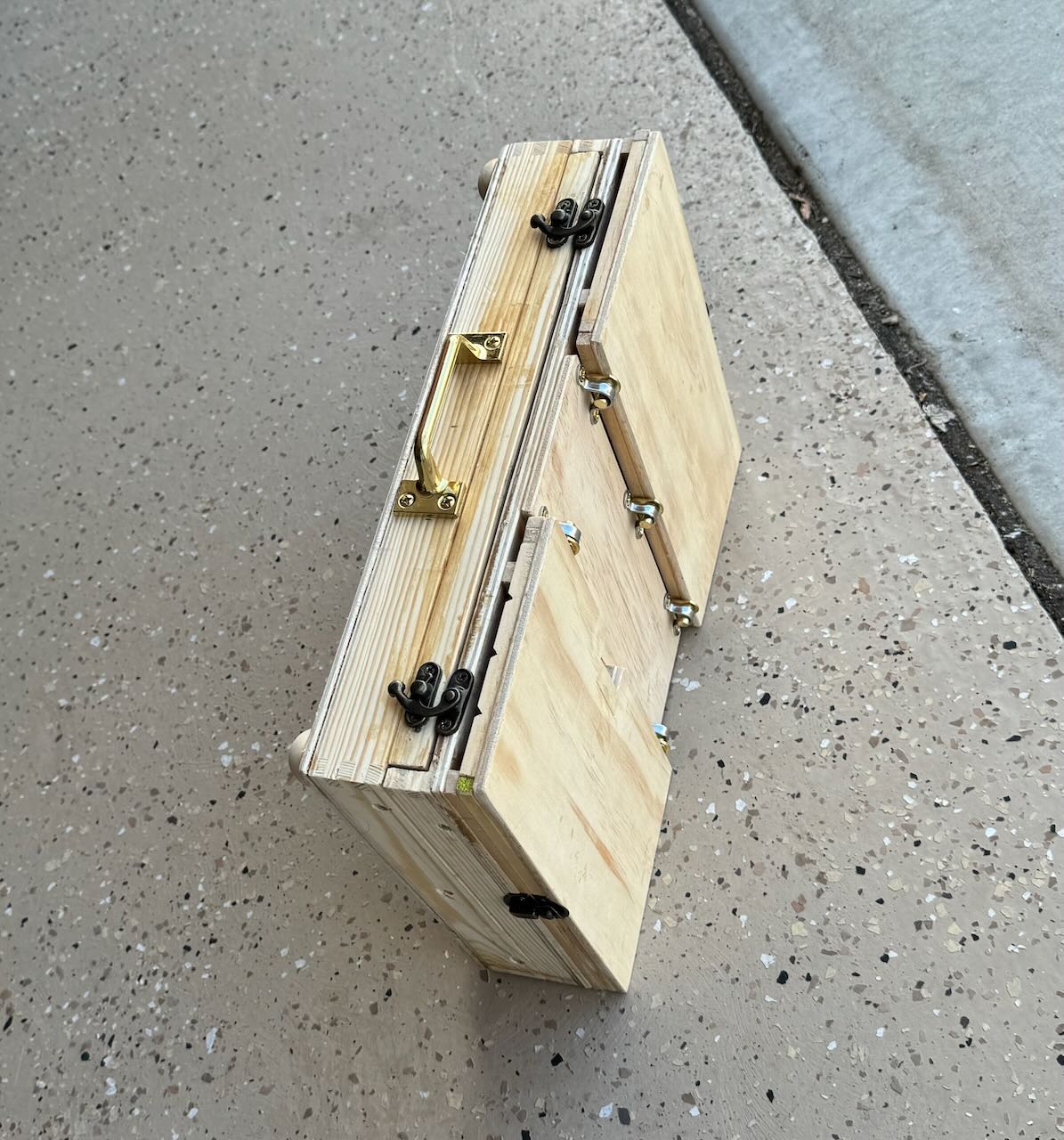
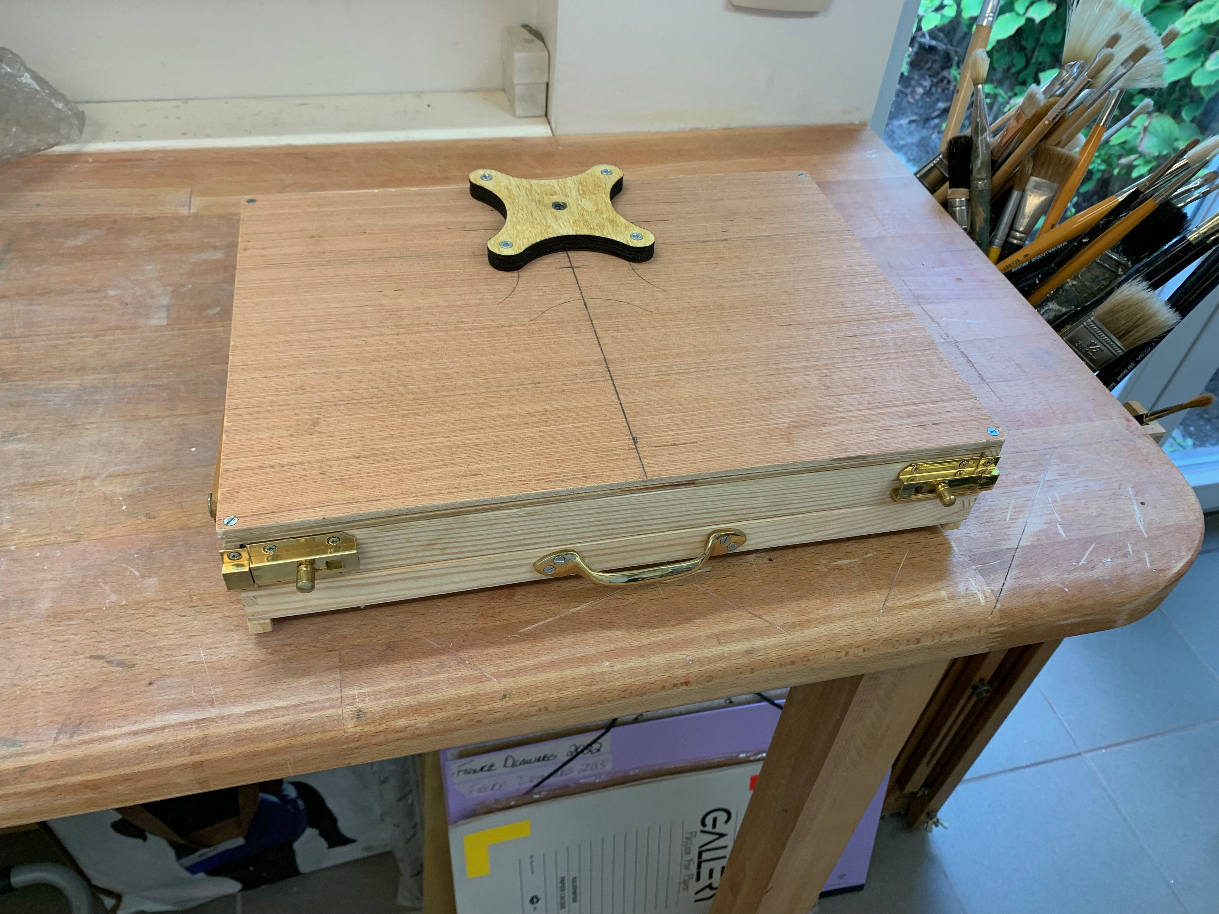
I bought an A4 (9 x 12 x 2″) wooden box on Amazon. The top section was 1/2″ deep while the bottom section was 1 1/2″ deep. I cut a slice out of the front along the bottom section and glued that insert to the top lid. This would could potentially nest a wet gessoed panel. I then glued thin runners inside along the sides of the bottom section. This created a box, allowing my thin gessoed panels (and palette) to seamlessly slide in and out, keeping everything from smearing, while storing tubes and brushes beneath. The lid could close and everything remained in place. My first foray with this system worked out fine. Nothing smeared (though my metallic field easel proved far too flimsy to function as an easel).
I began to dream of further improvements. Could I use the upper section of the box itself as a field easel? How to mount it? And to what? When attached, how to tilt the lid to provide a stable angle for painting? Would I then be able to carry my paints, palette and brushes in the bottom section of the box? If so, could I still keep one painting protected during transport? And what about carrying a wet palette, would that be possible? Above all I wanted to design an elegant, simple solution which could minimise the amount of gear I had to carry.
The Tripod and Mount
After some surfing around I determined that a standard camera tripod is fully adequate to function as an easel. It has a detachable mounting plate with a projecting 1/4″ bolt, consisting of 20 threads. You just need to match that plate to a bracket able to receive the bolt, affixed to the underside of your box. For starters I bought a tripod from a local appliance store. Then I looked around and sourced a beautiful bracket from Jackson’s Art Supply in England. Affixed to the box’s underside, it can take that 1/4″ 20 thread bolt. I just needed to laminate an extra piece of 1/4″ plywood to stabilize the base.
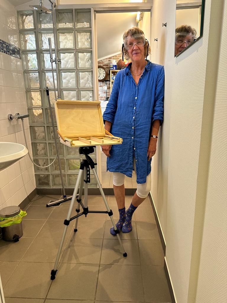
In the end I had something like this, ready for a test drive. But by now it was the beginning of November, end of the painting season. That all important test drive would have to wait for the spring.
The Connecticut Landscapes 1979-1980
February 28, 2021
I’ve been scanning some of my archived material from the late 1970s. Luckily my professors had always said: be sure to take slides of your work(!). Not all of them are well lit or even in pristine focus but hey, it’s better than nothing.
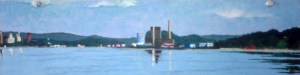
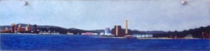
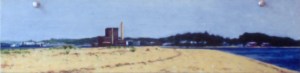
New Haven from Lighthouse Park II. 1980. Oil on panel. 5″ x 15″.
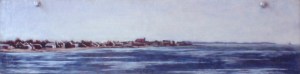
New Haven from Lighthouse Park I. 1980. Oil on panel. 5″ x 15″.
This series illustrates my initial attempts to paint landscape. They were done ‘en plein air’, in the sense that they were painted on site and not later in the studio. But even then, my approach was not impressionistic, which seeks to quickly render an evanescent moment. Rather, I would frequently return to the scene of the crime, building up layers (until the surface could hold no more), as I sought to describe something eternally universal about my chosen view.
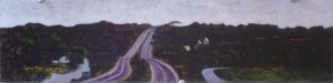
I was living in New Haven Connecticut at the time, thus a number of them are harbour scenes from the city parks on the east and west side. In addition, there is an interstate 90 highway scene plus a seascape from a beach house in Old Saybrook, Connecticut where I lived one winter (the large red roof in the middle ground belonged to the family home of Katherine Hepburn, probably still does).
New Haven from Sandy Point. 1980. Oil on panel. 5″ x 15″.
Westbrook, Connecticut. 1979. Oil on Panel. 5″ x 15″.
Old Saybrook. 1978. Oil on panel. 5″ x 15″.
The provenance of the unusually long horizontal format is this. The father of a friend of mine used to prowl the local dump for useable building materials. One day he came home with a contraption consisting of seven 5″ x 15″ masonite panels which all hung from a bar. I detached them, stripped the panels of their paint but left the holes at the top intact – this is why you can still see the push pins I used to hold them to the wall.
At the time I created seven scenes. This is a record of five of them. I gave all of them away before I left the East Coast but I no longer know who has what. If some old friend ever pops up with an image of the other two I’ll happily update this page.
Underdrawing for oils
October 24, 2020
I hesitate to say something about a topic that may (or should) already be well covered in artist manuals and/or the blog-o-sphere but since I have had a steep learning curve myself these past few weeks, I thought it might be helpful to document these lessons for others. I’m thinking that the main reason there is less information out there is because most painters these days prefer to paint on an acrylic gesso ground. It’s cheaper, easier, faster and less toxic. I also think that most painters are interested in using an alla prima approach to painting, it’s the fashion and one which generally does not make use of an underdrawing. ‘Nuff said.
To set the stage for my problem: I had a series of 3mm HDF panels (note, not canvases) which were sized with rabbit skin glue and then primed with a lead white primer. I had used Old Holland Lead White, in a 120 ml can: lead carbonate ground with cold-pressed linseed oil which was diluted with five parts turpentine (to one part stand oil, my mistake, NEVER do that again. The stand oil introduces an unnecessary element of fat into a ground that should always be as lean as possible). These panels were primed over one year ago. They were fully cured.
I now wanted to transfer my designs onto these panels – and from that design, create an indelible underdrawing which could serve as a foundation upon which to build an image. The problem/challenge was to find a medium that would be absorbed by this lean oil ground and yet (after an adequate amount of drying time) would not dissolve into the successive layers of fatter oil paint on top. (This business of painting is always a two way street.)
I set about transferring my first set of designs by printing a black and white version of the image to size onto a piece of paper, covering the back side of the paper with vine charcoal, and then tracing the design by pressing the tip of a dull stylus into the main lines. The resulting charcoal design on the panel could be erased or modified, but now I had something upon which to base a more permanent underdrawing.
Acrylic Ink?
Due to my recent experience in developing underdrawings for acrylic, I already knew that black acrylic ink (which is perfect for drawing on an acrylic gesso ground and then painting in acrylics over that) would not be appropriate for drawing on an oil ground. The practical and simple logic is such: oil can be superimposed upon acrylic but not vice versa.
India ink?
I set about drawing in my designs with a pen nib using permanent india ink. They appeared to bead up. The ground was not receptive to india ink. No amount of drying time would change that. It was an oil and water thing. My ground was too fat for the india ink, so I cleaned it off and started over.
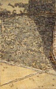
Underdrawing in light black oil wash over collaged panel primed with lead oil ground.
Mars black oil paint heavily diluted with turpentine and painted in with thin washes?
What did painters, painting on oil based grounds for centuries, do? Well, first, surely they did not add stand oil to their ground(!) (my bad.) But still, since the oil ground is oil, they must have used a medium to which it was receptive. My first series of underdrawings then were done with mars black oil paint heavily diluted with turpentine. They looked great and appeared to be well received by the oil ground. Hooray #1. See image above, left. However after three or four days of drying time, they began to lift off the ground when lightly touched with a kneaded eraser to lift off that original charcoal tracing design. Not good. I began to think I would have to start over by priming a whole new set of panels without the addition of that nasty stand oil.
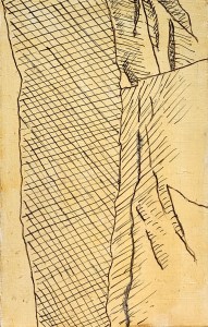
Underdrawing created with a mars black oi paint diluted 25:75 or so with turpentine, drawn on an oil based ground using a pen stylus.
Mars black oil paint less heavily diluted and drawn in with a pen nib?
Then I also realised that I could try creating a black oil drawing medium which was less diluted (that is, contained more oil). So I mixed up a small jar with a blob of oil paint and an amount of turpentine, roughly 25:75. Test strokes. Trial and error. I wanted to create something fluid and siccative, which would work with a pen nib but which was thicker than my previous dilutions. I reasoned that this new batch would fare better with firm, linear lines rather than the fugitive, heavily diluted brush strokes. The paint/ink could be thicker than before and also this form of thick strokes could take up less “space” on the ground. I completed a few yesterday and will let them fully dry but I think and hope I have solved my problem. Time will tell. I hope to update this page as the project progresses.
A Piece of Me – the beginning
September 12, 2019
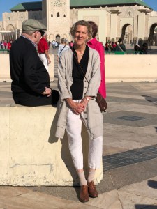
Self portrait in Casablanca outside of the Hasan II mosque.
Last week I finished the preparation of 64 identically sized panels (21 x 13.3 cm or 8 1/4 x 5 1/4 in.) for a new project. It consists of cutting up a full length photograph (which happens to be a self-portrait, see left) into 64 identically sized pieces and then painting each piece differently, so in a different medium. Since there are not 64 different mediums, in effect, I’ve reduced my approach to five: egg tempera, encaustic, the mixed technique, oils and acrylics. Preparation-wise then, each medium receives the ground appropriate to it: egg tempera receives chalk gesso; encaustic and mixed technique, ditto; while oils receive an oil ground; and acrylics, acrylic gesso. Additionally each panel receives a pre-treatment (or not) thus: plain wood (so, no treatment); linen (glued on, using rabbit-skin glue); collage (glued on, again using rabbit-skin glue); pre-textured sculpting (I used acrylic modeling paste for the acrylic and oil panels while I experimented with pastiglia for the egg tempera, encaustic and mixed technique panels). Needless to say such an approach presents a bit of a logistical nightmare but excel spreadsheets can, indeed, work miracles.
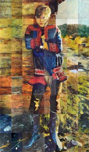
Nils, 1978, final full-sized assembled painting. 6‘ 02” x 3‘ 6” or 188 x 107 cm
Anyway, instead of this appearing to be a new direction, actually, it’s not. It’s a return to the kind of work I was doing approximately forty years ago, see “Nils” right. You can read more about that painting project here. I also did a few other smaller pieces at that time trying out that same approach and I briefly dabbled with it again (as an approach) in 2011. But after stumbling upon an appropriate photograph earlier this year, I’m drawn to return to it now with a deeper understanding of many things. So, here we go. I love how the compositions you receive with this approach are completely arbitrary and spontaneous. The challenge, as always, is to create a sensorial unity, something beautiful and interesting in its own right individually and of course, in the final assembled result.
Oils
May 26, 2009
Most books advise a beginner to begin with oils as it is more forgiving. It is easier to correct a mistake for example, than with watercolor. That may be true – especially if one uses opaque pigments – but oils, by nature of the medium itself, are viscously translucent, thus understanding their innate capacity to transmit light through a clear film is ultimately critical for both succesful manipulations of form without pentimento as well as transmission of light. Eastlake noted, in referring to Jan Van Eyck, “The leading attribute of the material of oil painting, as distinguished from those of tempera and fresco, viz. its power to transmit light of an internal surface through superimposed substances more or less diaphanous…”.
There are two main approaches to painting in oils, alla prima and indirect. Although much art is created as a mixture of the two approaches, in themselves they are distinct. The contemporary art world relies quite heavily upon directly percieved and expressed imagery, thus an “alla prima” approach is emphasized. Information on the indirect methods of painting is out of style, so you have to search for it. More and more sites, blogs and forums continue to pop up on the internet. Here is one site I have found that is a fine, yet relatively dis-interested treasure trove. There are others.
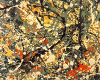
Jackson Pollock Abstract Expressionism
Alla prima essentially means executed in one session as exemplified by Jackson Pollock in his drip paintings. There can be no argument against this method of approach as both its demands and results can be superlative. After all, if a painting has any chance of reflecting the evanescent truth of the moment, it needs to be created in the same spirit, with a Zen-like accuracy and intensity.

the Mona Lisa
What then are the values or possibilities of a more indirect technique? Does a laborious technique result in a tedious and heavy painting (it often does!)? Can a painting developed indirectly still retain the freshness of the moment? If so, then how? Thus, for those who feel themselves drawn to an indirect method, the knowledge of ancient techniques is extremely helpful. Indirect painting simply means developing an image through a series of manipulations over time and calculated to achieve a particular result. A further refinement of the indirect painting technique is the mixed technique. Both allow for a methodological layering which in itself creates optical effects of great beauty and luminescence. Subject matter aside – what can be more eternal than that?
the Oil Pallette
May 20, 2009
I suspect that every artist has his or her favorite pigments and colors. It is necessary to find your own. It can be quite challenging at first to sort one’s way through the huge selection of colors available at any art supply store. Experience is the best guide. But that’s hard when you don’t have it.
Here’s what I use:
Color
- Two yellows (a cool and a warm one, like citron yellow and cadmium yellow medium)
- Two reds (a cool and a warm one, like alizarin crimson and cadmium red medium)
- Two blues (a cool and a warm one, like thalo blue and ultramarine blue)
The Earth Colors
- Sienna (burnt and raw, though I most use burnt)
- Umber (burnt and raw, though I mostly use raw)
- Mars Red (a red iron oxide)
- Yellow Ochre
Neutrals
- Two whites (Lead white and Titanium)
- Warm gray
- Mars black
From these basic colors I can mix just about any thing I need while maintaining a clear idea of how I got there. In addition, the spectral purity of a color can best be appreciated by employing it directly out of the tube, unmixed. Therefore, one can try to achieve certain ‘mixed’ colors through translucent layers of paint, rather than mixing on the pallette. Doing this means becoming familiar with the characteristics of the pigments themselves (opacity/translucency, saturation/tinting power and capacity to absorb oil). It also means using the translucency effects of the oil medium to create rich vibrant colors, that resonate like a sunset.

