Green with envy – or was it ivy?
July 31, 2010

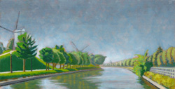
Kruispoorte version #1, 2009, a lovely painting but perhaps the development of the greens was a little flat.
Anyone who attempts to paint landscape has to deal sooner or later with the problem of green. Of course, some might not even consider it to be a difficulty – but I do. So what’s the problem? In a nutshell: #1) the profusion of greens in the natural world contrasted to #2) the difficulty of rendering them to any degree of accuracy on the pallete/canvas/panel.
From a pigment point of view, there are relatively few tube greens out there in contrast to the wide arrary of tube choices for other colors. Viridian, the strongest green pigment, is widely used, otherwise if you need something different, you just mix it up from some combo of yellow and blue, or even yellow and black. However, if you attempt (as I do) to arrive at a beautiful green through color layering (for example, a blue glaze over a yellow substrate) then you might indeed create a wonderful green, but find yourself unable to modulate it very much to it’s other (very green) surroundings. Hence an indirect technique for color development is a bit too inflexible.
Thus, my current approach, to painting in general, but also to green in particular, is to minimize my pigment choice, decide on an approach and then modulate my color relations to it. For painting greens, this can mean using or mixing a master green, modulating a master chartreuse, blue green and/or gray green from that. Then tints and shades from each of those. If I am painting wet into wet, then the color of my glaze will certainly have a direct (color) effect. If it is an earth glaze (umber or sienna), the effect is quite grounding (no pun intended). Nevertheless, color is absolutely relational (a la Josef Albers) and nowhere is this more true than in the attempt to render the multitudinous greens of the natural world.


August 19, 2015 at 9:29 am
[…] You can read about the work-up of this piece here. […]