After years of experimentation and study, I have come to a technique that at least allows for the possibility of fine painting, in my case landscapes. I’ll try to describe it briefly here below using illustrations from a current project, the Sint Anna Kerk here in Brughes. The value study is completed “en plen air”; the studio work is done in the atelier in successive stages, each oil session is completed “alla prima” (within a few hours). The intent is to capture as much spontneity as possible, within the long time frame that defines an indirect technique.
 The start is a value study describing mid-afternoon light. It’s usually a simplified version of where I hope to finally go. I consider it invaluable for setting up both the composition and tonality of the final piece. This study here is done with pencil, white chalk and ink on standard charcoal paper. Highlights and shadows are developed to render a simple direct statement. Any addition information needed can be augmented from photographs and direct observation, since I live around the corner, though I try more and more to rely on my own pictorial memory.
 The main elements of the composition are transposed to a panel using line, texture, shading and form. Traditionally, fine drawing pens loaded with india ink are used for transferring the linear, graphical part of the drawing but I have recently been experimenting with using a silverpoint stylus for my underdrawing. The final result is softer, warmer and subtler than india ink (see the grey tones). However, that descriptive subtlety is often lost in the intervening layers of paint, thus, I have begun augmenting the silver point with india ink in order to accentuate the contrasts of the foreground. Thus, distance is described from the beginning in a few ways. The decisions made now guide many aspects of the final result, so it is important to be sure and thus avoid pentimento.
 In order to minimize the amount of oil needed to achieve layers of color, I use a traditional egg tempera technique to begin the painting. Oil can be painted over egg (fat over lean), however egg cannot be painted over oil. In addition, egg tempera must be painted on a hard, firm surface, otherwise it will crack, thus the panel is prepared with a traditional gesso surface.
I use the egg tempera technique to indicate basic broad areas of local color. All objects at this point are better stated as pastel suggestions rather than full strong colors. In this version of the Sint Anna Kerk, I have been careful to keep my colors light in order to avoid an oversaturated painting in the middle and background areas. I have learned (the hard way) that control of hue, saturation and value are critical for describing distance. The vibrations of complimentary colors are hinted at but not yet fully explored. Also, I try to use single pigments only for spectral purity; no color mixing is done on the pallette. Colors (like certain greens and oranges) that might require mixing are indicated through separate layers of translucent paint. This layer will be dry to the touch almost immediately, but it should dry at least one week before attempting to work in oil.
 Although it may seem like a sin to cover the fine egg tempera painting with a blanket of brown, the imprimatura quickly helps to establish the overall key of the piece as well as to unify any disparate elements. The previous egg tempera layer must be not only completely dried but sealed with a layer of glue size to protect it from the succeeding layers of oil based paints. The lines and colors of the previous layers continue to shine through, adding texture and interest, particularly in the mid tones and shadows. The imprimatura is a mixture of damar varnish, turpentine, and brown pigment (in this case, burnt umber). I brush it on, wait a minute or so and then wipe it off with a dry, lint free, soft clean cloth.
Since I was very interested to retain the purity of the whites in the highlight areas of the picture, I went back into the fresh imprimatura with a brush dipped in fresh turpentine to remove the brown tint from the highlight areas. My theory/concept is that even though I will be painting over these areas in white oil paint to create mass and to soften edges, whatever is underneath ultimately does matter. If I want to somehow simulate the intensity of pure light – even if it is reflective and not transmissive – then the purity of the original gessoed board is important. I let the imprimatura then dry a day or so, and begin painting in the Mixed Technique.
 I squeeze a quantity of cadmium yellow onto the pallette and dip a thin, wide bristle brush into the clear medium (1 part Damar, 1 part Stand Oil, 1 part Turps), then scumble in a very thin coat of yellow over the whole surfce. It sets for a minute or so and then I wipe it back off with a soft, lint free cloth. The idea is to leave some translucent color tint with some tack and work the first levels of oil back into it. Because it’s a panel and not canvas, the tackiness of the oil/varnish medium catches the brush stroke well, functioning like the weave of a canvas in attracting the brushstroke yet leaving no trace of a fabric-like texture.
At this stage, I work with two basic colors, yellow and gray. I mix up a gray to match the same value of the pure cadmium yellow medium, in order to set the overall darkest value. I then mix up a series of tints (5 or 6 steps) from both the gray and the yellow to white. I begin painting in large areas trying to quickly cover the whole painting with one of these tints, using a thick bristle brush and an emulsion for the pigments (1 methyl cellulose glue, .5 oil/.5 varnish, 1 water) which hastens the drying time. The drawing and egg tempera levels have already set the stage, so to speak, and function not only as guides but also as mirror like reflections. It takes only a few strokes to bring out a form. I use a fan shaped dry brush to merge forms together.
It’s fine to be working with a limited palette now, thinking ahead by laying in a more saturated yellow for both the greens and the oranges. I use the gray for neutral tonalities, shadow and to suggest distance. The overall contrast is quite low.
 I squeeze a small amount of a cool, translucent red pigment out onto a pallette board. In this case I use crimson lake, in the past I have used alizarin crimson. Dipping a wide, flat bristle brush into clear medium (1T,1D,1SO) and then into the pigment, I proceed to scumble a thin layer of translucent red over the entire piece. After a minute or so, I wipe this off with a clean soft cloth, taking off as much pigmented medium as possible. The remaining surface has a slight tack to the touch.
I mix up three colors this time. Red, in a series of tints up to white. Warm gray mixed in a series of tints up to white and yellow, mixed in the same way. (The value of the pure red is the same value as the pure warm gray, both being close to a pure medium gray value.) Using a big bristle brush and emulsion, I work quickly to re-establish all the values and colors of the intended piece. Occassionally I need to mix a color that requires a combination of two of the premixed tints.
But look, some strong greens are emerging although I haven’t used any green or blue pigment yet! It’s only yellow refracting back through levels of drawing, egg tempera, imprimatura and glaze. Because I use an emulsion (1 methyl cellulose glue, .5 oil/.5 varnish, 1 water) as my painting medium, the work dries quickly, the colors maintain a level of transparency, and the layers of paint are rather lean.
 This is the blue level. I premix my intended colors: yellow in a series of 5-6 tints up to white, red, blue and Payne’s gray all mixed in the same way. There are about 20 little blobs of paint, which I may or may not use but I want to be able to work quickly and precisely in my choices.
I squeeze out a small amount of pure cyan (Thalo Blue) and dip my brush in clear medium (1T, 1V, 1 SO). Cyan is a highly saturated pigment with strong tinting power so a little goes a long way. I scumble it on and after a few moments wipe it back off, leaving a slightly tacky surface that has still more blue in it than I would actually prefer. I remind myself to use Ultramarine Blue next time…
I begin to reclaim the highlights and quarter tones, working with a big brush for starters. Any color I paint now picks up a bit of blue from the glaze. Hmmm…that’s good and it unifies the painting, but is there too much blue? A lot of unexpected colors start to happen. OK, let them emerge. I need to reintroduce the main color contrasts, like the orange for the clay tile roof, the brown bricks and the green vegetation. After the main value and hue statements are set, a few details are reintroduced with a smaller brush to help refine those shapes: window and trim, shadows and highlights. After a few hours, I’ve covered the panel. But is it done?
 After the blue session, all the color statements have been made and I’m happy, sort of, but there remains a bluish tint to the whole piece. I could leave it that way, but the intended gray of the church steeple and road pavement encourage me to attempt some gray balance adjustment. So, I cover the entire piece with a clear glaze of medium and wipe it back off (as usual). I mix up a series of tints using Payne’s gray this time as it is both darker and more neutral than the lighter warm gray pigment I have been using. I squeeze out lead white but mix it 50/50 with titanium white; since the painting is moving into it’s oilier stages. I strengthen the pure whites, the gray steeple and pavement, even scumble some body back into the buildings on the shadow side of the street. I put a glaze of yellow on the buildings on the left for local color, and add the final highlights to the tree. There is not much to do, but what is done crisps up value contrasts and defines gray balance.
Eh, voila. C’est fini! The cherries on top are the final touches of gold to the church steeple.
Oils
May 26, 2009
Most books advise a beginner to begin with oils as it is more forgiving. It is easier to correct a mistake for example, than with watercolor. That may be true – especially if one uses opaque pigments – but oils, by nature of the medium itself, are viscously translucent, thus understanding their innate capacity to transmit light through a clear film is ultimately critical for both succesful manipulations of form without pentimento as well as transmission of light. Eastlake noted, in referring to Jan Van Eyck, “The leading attribute of the material of oil painting, as distinguished from those of tempera and fresco, viz. its power to transmit light of an internal surface through superimposed substances more or less diaphanous…”.
There are two main approaches to painting in oils, alla prima and indirect. Although much art is created as a mixture of the two approaches, in themselves they are distinct. The contemporary art world relies quite heavily upon directly percieved and expressed imagery, thus an “alla prima” approach is emphasized. Information on the indirect methods of painting is out of style, so you have to search for it. More and more sites, blogs and forums continue to pop up on the internet. Here is one site I have found that is a fine, yet relatively dis-interested treasure trove. There are others.
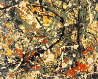
Jackson Pollock Abstract Expressionism
Alla prima essentially means executed in one session as exemplified by Jackson Pollock in his drip paintings. There can be no argument against this method of approach as both its demands and results can be superlative. After all, if a painting has any chance of reflecting the evanescent truth of the moment, it needs to be created in the same spirit, with a Zen-like accuracy and intensity.

the Mona Lisa
What then are the values or possibilities of a more indirect technique? Does a laborious technique result in a tedious and heavy painting (it often does!)? Can a painting developed indirectly still retain the freshness of the moment? If so, then how? Thus, for those who feel themselves drawn to an indirect method, the knowledge of ancient techniques is extremely helpful. Indirect painting simply means developing an image through a series of manipulations over time and calculated to achieve a particular result. A further refinement of the indirect painting technique is the mixed technique. Both allow for a methodological layering which in itself creates optical effects of great beauty and luminescence. Subject matter aside – what can be more eternal than that?
the Indirect Method
May 20, 2009
Indirect painting simply refers to the method of using multiple layers or levels of paint to develop an image. A subset or refinement of indirect painting is the mixed method or mische techinique. The best general description of the indirect painting technique that I know of comes from the out of print book, “The Painter’s Companion: a Basic Guide to Studio Methods and Materials”, by Reed Kay. The book was originally published in 1961 by Webb Books, Inc. and later by Doubleday in 1972 with the new title “The Painter’s Guide to Studio Methods and Materials” .
I have followed his instructions with more and less success for a number of years. I’m hoping to attract others who also have done so and are willing and interested to share their experience. Please use the “Comment” link at the bottom of this article to post questions or experience.
“Indirect Painting
Indirect painting involves procedures in which the final effects in a picture are built up gradually by placing several layers of paint, one over the other, the upper layers modifying, but not altogether concealing, the lower layers.
Indirect painters put their first strokes on the canvas with the expectation that they will paint over them again when they are dry in order to change their effect in some way. Therefore when they put on the first layer of paint, called the underpainting, they do not try for a finished effect, complete in final color, drawing definition, and pattern emphasis. Instead at the beginning of the work they concentrate on one or two of these problems, and they depend upon (and make allowance for) the subsequent layers of paint to develop and modify the underpainting until the remaining problems are finally solved.
Indirect methods of painting have been employed in the past by many artists including Van Eyck, El Greco, and Rembrandt. More recently such painters as Soutine, Modigliani, Rouault, Braque, and Paul Klee have utilized the optical effects of indirect processes.
The existence of indirect painting arises from the fact that although paint may be used opaquely to conceal what is beneath it, it can also be applied so as to be transparent, revealing to a greater or lesser extent what it covers. For example, an oil color, such as cadmium red, in paste consistency may be brushed over an area of thoroughly dried yellow paint. If it is applied evenly and fairly heavily, it will conceal the yellow color entirely. Alternatively the red paint may be thinned with an appropriate diluent and may be spread so thinly over the dried yellow color that it lies over the yellow like a sheet of red cellophane, tinting the area a fiery orange color, while allowing the shape and every surface brush mark on the yellow area to remain visible. The orange tone thus obtained, by superimposing a layer of transparent red on an opaque yellow, will differ considerably in optical character from an orange made by combining the same red and yellow pigments in direct mixture on the palette. The directly mixed tone will have a weighty solid opacity, whereas the orange tone produced through the indirect, or “optical,” mixture of the two colors will have a more luminous vibration, rather like that seen in stained glass when light passes through it.
By exploiting this characteristic of the oil technique, painters found that they could develop a brilliant luminosity whose exact character was unobtainable in the direct techniques. The procedures most commonly used in indirect painting are called glazing and scumbling.
Glazing
A glaze is an almost transparent film of color laid over another paint surface, modifying the original tone of the area. It is usually a dark color placed over a lighter one. Some colors, such as alizarin crimson or viridian green, tend naturally toward a glaze-like transparency. Almost any color can be used as a glaze if it is thinned enough and placed over a lighter tone.
Scumbling
A scumble is related to a glaze in that it is a film of color laid over another paint surface so that it modifies the original color but does not completely conceal it. Unlike a glaze, the scumble is usually a light, semi-opaque color placed over a darker one. Some colors (Naples yellow, for example) are particularly suitable for this technique, but any color may be combined with opaque white and used as a scumble when it is placed over a darker tone. Scumbles are usually characterized by a pearly opalescence or by a soft smoky optical effect.
Mediums
The film of either a glaze or a scumble must be thin enough to allow the paint below it to be visible; otherwise the glaze or scumble would be completely opaque, and its chief characteristic would be lost. The simplest way to obtain the required thin transparent film is to take a little color straight from the tube-for example ultramarine blue-and rub it over a solid, dry, heavily applied area of light underpainting-let us say in this case, pure white. If the blue is scrubbed on vigorously with the brush or rubbed on with a rag or fingertip, it will spread over the white underpainting as a clear transparent tone of rich blue, which can be made lighter the more vigorously it is rubbed and dispersed. The white underpainting must be dry and hard as a rock to withstand the rubbing of the blue paint, or it will smear into the blue and produce a muddy mixture. If the paint is rubbed over too large an area, the binder may be stretched too far and may leave the pigment badly attached to the picture. However, most oil colors now on the market contain sufficient oil to prevent this occurrence.
A different character of glaze or scumble may be obtained by thinning the paint with a diluent or glazing medium, so that it need not be rubbed. This medium may be made up of various combinations of oils, varnishes, and volatile solvents. As in the case of the painting medium, the personal requirements of each artist must determine the exact composition of such a medium. A painter who wishes to glaze rather heavily and to obtain an even vitreous film over an area may want a glaze medium that can be applied evenly and rapidly to the picture surface. The artist may also want the glaze to set quickly so that the picture may be placed upright in a short time without the paint’s trickling. Such rapid setting mediums contain varnish or driers or both, along with the oils, and require a certain skill in handling, since they quickly become tacky and then cannot be reworked or easily removed.
In the original text this formula for a rapid setting medium is given.
- 3 parts by volume stand oil
- 2 parts by volume damar varnish(5-pound cut)
- 3 parts by volume turpentine
- 1 or 2 drops cobalt drier per pint of medium
In present times artists looking for a rapid setting medium would use Liquin by Winsor Newton or Galkyd by Gamblin.
Another painter may prefer a slower setting material so as to be able to deepen or lighten it, remove it or add to it, or reinforce modeling transitions with it. Such a medium might consist solely of stand oil with a little turpentine added.
In general, the less medium used, the better. The glaze or scumble should be made lighter or thinner by dispersing or rubbing rather than by adding excessive amounts of glaze medium as a diluent.
When discussing the merits or disadvantages of a given glazing medium, one must keep in mind the way it is to be used. If only small amounts of medium are added to conventional tube colors, such factors as the yellowing of a particular oil (sun-thickened oil, for example) or the possibility of redissolving a soft resin varnish (such as dammar) are much less hazardous than they would be if the painter were to use large amounts of the medium in proportion to the tube color. The practice of adding glaze mediums to oil paint until it has the consistency of a watercolor wash seems to me to be unnecessary and to magnify all the technical dangers of the oil technique. The desired effects can usually be obtained with less medium and more skill.
Notes
A. The glaze or scumble actually accentuates all brush marks and surface irregularities in the underpainting. Thus the character and direction of all strokes in the underpainting should be meaningful and consistent with the painter’s purpose.
B. Colors diluted with too much glaze medium may trickle. Sometimes such overthinned color develops small spots in the dry film which look like dust spots. Actually they are particles of color clumped together like islands of pigment in a sea of oil.
C. The underpainting must be bone dry before it receives a glaze or scumble.
D. Glazes containing so much medium as to create a glassy surface are dangerous, since subsequent films cannot adhere well to them and must crack at the first movement of the canvas.
E. Glaze films containing high amounts of spirit-resin varnishes (such as dammar) in relation to the oil and pigment content are extremely vulnerable to cleaning operations, since the varnish is always resoluble in the cleaning agents used by most restorers. Glazes that are the final or finishing films on a picture are especially vulnerable since they are usually thin.
F. Pictures glazed with slow-drying colors and very slow-drying mediums (such as walnut oil or poppyseed oil) should be shielded from dirt and dust while they dry.
G. Unsuccessful scumbling or glazing effects may be removed while the glaze is still fresh without disturbing the underpainting by wiping the surface with a clean, soft, lintless rag, moistened, if necessary, with a little turpentine. Such removals are possible only if the underpainting was thoroughly dry before the glaze was applied.
Technical Procedures
Technical complication and variety increase with indirect painting. One method frequently employed may be described in the following general terms:
1. A brush drawing involving only one or two colors is developed to mark out the important locations and divisions on the canvas. The paint is thinned by means of a “lean” medium (such as 1 part sun-thickened oil, 1/2 part varnish, 3 parts turpentine) to a brushable consistency which flows rather easily.
2. The dark and light contrasts are developed by the use of a “lean” fast-drying white (such as flake white) in all the light areas. [Flake White is lead based and therefore rarely used nowadays. Various manufacturers now make alkyd based fast drying whites that are less poisonous]. In the light middle tones the white is mixed slightly with another pigment (ocher, for example, or Indian red). Darks are produced by adding more color or mixed grays to the white, but all darks are kept much lighter than they will appear in the finished painting. The main effort, at this point, is to produce strong placement and gesture of shapes and volumes. These should be expressed broadly with little surface detail but should be accurate as to the relationships of the larger major pictorial masses. At this stage, the effect of this underpainting must be lighter, both in the lights and the darks, than the artist wishes the finished picture to be (Figure 3-16).
3. When this underpainting has dried thoroughly, color relationships are developed over the light monochrome by the use of glazes. These may be brushed on and then modified by wiping them down with a rag or a clean brush so that they emphasize and reinforce the drawing and movement of the underpainting.
4. Color effects are strengthened and made more definite by vigorous direct painting into the glazes (either when the glaze has dried or while it is still wet) with substantial strokes of opaque color. Glazes that have lowered the tone of an area too much may be scumbled over with a lighter color to raise their tonality. Drawing and edges are redefined, especially where glazing or scumbling has caused a passage to lose its initial strength.
Notes
In considering the many possible variations of this procedure, it is wise to keep in mind a few of the possible difficulties.
A. The glaze tends to darken the general tone of the picture. To compensate for this, the underpainting must be kept considerably lighter than the final painting.
B. The glaze and the scumble tend to create soft, unified, diffused effects. Therefore the underpainting should be strong, even somewhat “harder” than the anticipated final effect.
C. If the quality of the glaze is not relieved by some opaque painting and vigorous redrawing, the total effect of the picture may become too washy, spotty, and transparent.
D. In all indirect processes where more than one layer of paint is anticipated, successive layers should be applied “fat over lean.”
Copyright ©1972 by Reed Kay, “The Painter’s Guide to Studio Methods and Materials” (Doubleday & Company)
the Oil Pallette
May 20, 2009
I suspect that every artist has his or her favorite pigments and colors. It is necessary to find your own. It can be quite challenging at first to sort one’s way through the huge selection of colors available at any art supply store. Experience is the best guide. But that’s hard when you don’t have it.
Here’s what I use:
Color
- Two yellows (a cool and a warm one, like citron yellow and cadmium yellow medium)
- Two reds (a cool and a warm one, like alizarin crimson and cadmium red medium)
- Two blues (a cool and a warm one, like thalo blue and ultramarine blue)
The Earth Colors
- Sienna (burnt and raw, though I most use burnt)
- Umber (burnt and raw, though I mostly use raw)
- Mars Red (a red iron oxide)
- Yellow Ochre
Neutrals
- Two whites (Lead white and Titanium)
- Warm gray
- Mars black
From these basic colors I can mix just about any thing I need while maintaining a clear idea of how I got there. In addition, the spectral purity of a color can best be appreciated by employing it directly out of the tube, unmixed. Therefore, one can try to achieve certain ‘mixed’ colors through translucent layers of paint, rather than mixing on the pallette. Doing this means becoming familiar with the characteristics of the pigments themselves (opacity/translucency, saturation/tinting power and capacity to absorb oil). It also means using the translucency effects of the oil medium to create rich vibrant colors, that resonate like a sunset.
Value Study
May 12, 2009

Langerei North value study
I spent years dragging my portable easel out to inspiring locations to paint. Although I managed to create a few interesting paintings, I threw away just as many failures. The changes of season, weather, and light caused any particular landscape to fluctuate enough so that I ended up with mud more often than not. Thus, I had to ask myself, how is it possible to capture anything eternal about what I am viewing?
One solution, I knew, was an impressionistic alla prima technique, and although its effects can be strikingly fresh, for better or worse, my own temperament is drawn to painting in layers, often termed “indirect painting”. Yet attempting to use an indirect technique for sequential forays of painting “en plein air” spelled trouble if I didn’t know fairly precisely where I wanted the painting to go.
Thus, I began to create fairly detailed studies both in watercolor and in pencil in order to understand what I felt and wanted to finally express in paint. Of the two approaches, I felt the (pencil, charcoal or ink) value study to be the most effective for describing my essential reaction to a view. The medium toned paper gives space for imagination to roam, inviting the perceiver in to participate in forms as they arise.
Alternatively, although it is clearly possible to take a photograph in order to capture “a moment” as preparation for a painting, photographs themselves are a mechanistic interpretation of visual reality, inevitably reducing three dimensional space to two. If I want to personally interact with the view before me, to dance with it, to make love to it, to merge with it, then the means needs to be an extension of my fingertips, vibrating with the energetic impulses of my own blood. This is in no way intended as a criticism of the fine art of photography, only a criticism of the use of photography as a means for a study upon which to base a painting.
When I have created a value study that resonates, then I transpose it to a panel and begin preparing for development of the painting.

