Reinventing the wheel – Tempera White
August 24, 2015
After years of experimenting with the mixed technique I have confirmed two things. I love glazing; and too much glaze absolutely kills oil’s refracting light. Thus I have often, even repeatedly, found myself at cross-purposes.
Most of my experiments in the recent years have been attempts to preserve this light. Painting backwards is one of my more notable successes. However, reclaiming the white of the original panel through painting backwards doesn’t really work tactically speaking if the neighboring areas of paint have already been worked-up. And adding it back at the finish line (like I did here) is OK but you can’t always guarantee that the surface will accept it by then or that the light so added will be integrated in the way you want it to be. I needed light within the painted surface, a reintroduced light, applied within and over the developing image. And of course it needed to be lean enough to bear a layer or two of glaze. How did the old masters accomplish this? Tempera white.
What is tempera white? Basically, white pigment (I use zinc white but the old masters most probably used lead) ground up in a very lean egg/oil emulsion. The emulsion I use comes from the mixed technique (one could just as easily substitute an egg yolk for the methyl-cellulose glue component of the recipe I list here). I have used white (lead ground in oil from the tube) before for reintroducing light values within each layer of colored glaze while developing an image chromatically. For examples see: I am curious yellow, Seeing red, and I’d rather be blue. But in all previous attempts, I did not introduce tempera white directly over the egg tempera/imprimatura underpainting, from the get-go, so to speak. That’s what I wanted to do this time, as doing so can free me from any pre-conceived plan of chromatic image development via glazing.
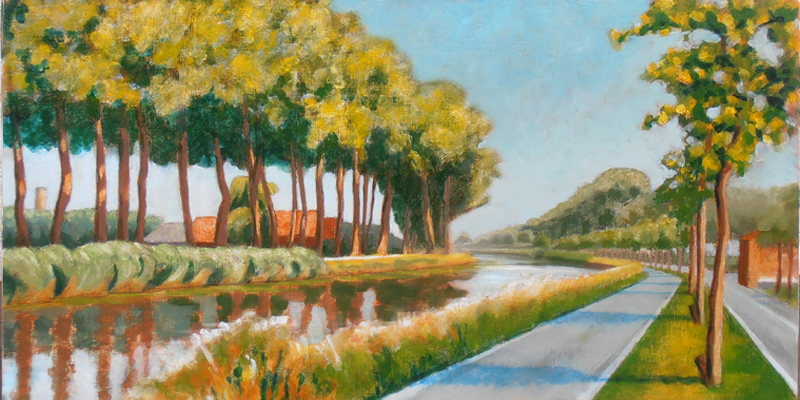
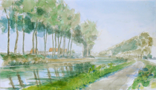
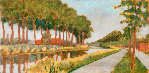
So I’ve been working on a landscape of a farm on the Dammevaart just outside of Bruges. I created a watercolor study of it a few years ago. This functions for the basic composition, color relations and light study.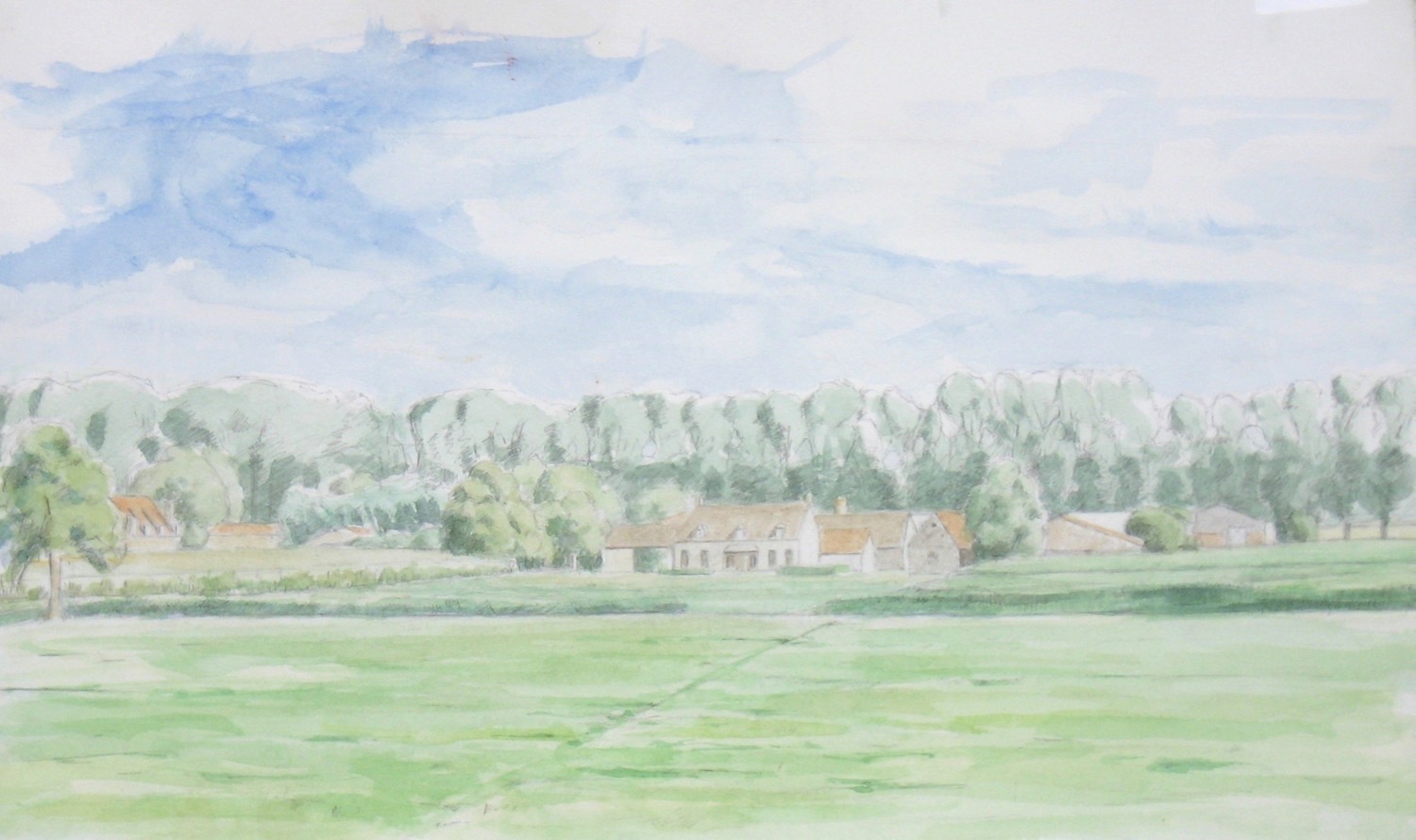
Based on this watercolor then, I transposed the design to a gessoed panel and worked it up in silverpoint, which tends to be very light valued.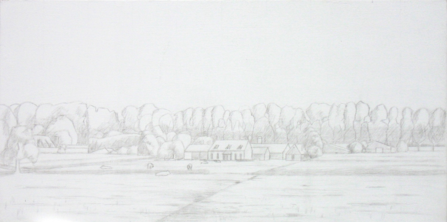 I then laid in light areas of color via egg tempera, anticipating the colors to come. Sorry, no picture of this stage is available (but just imagine the watercolor laid in over the silverpoint drawing and you won’t be far off). My interest for the ET level was stating color relations but keeping them as just hints – not fully developed and certainly not saturated. I let the ET fully dry and oxidize for a few weeks before laying in a toned (burnt sienna) imprimatura. Sorry, no image is available of this stage either. The imprimatura acts like a very lean glaze, bringing everything into relation through its hue and tonality. But additionally it also places an inevitable veil over all design elements. The already lightly developed composition got flatter and the ET colors were only slightly visible, as though through a tinted filter.
What to do? White tempera to the rescue. 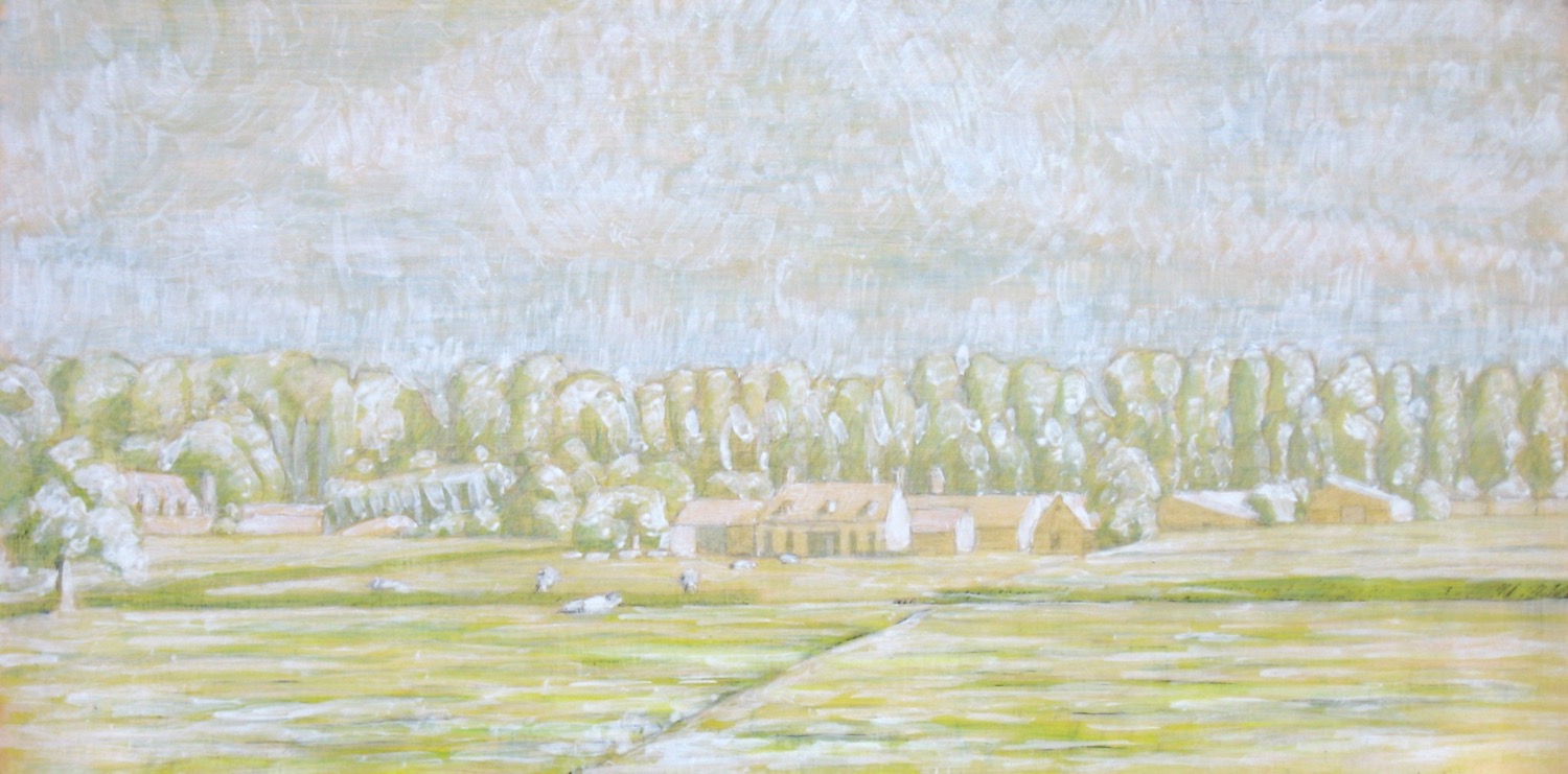 It helped to reintroduce the forms by stating the highlight and quarter tone values. All my seeming tedious homework from the earlier layers played through. My aim now is to complete the painting with just one session of painting into a glaze. The aforementioned homework should allow me to work quickly, spontaneously and yet accurately. And despite all the detail of the under layers, I don’t aim to create a fully detailed realistic painting, rather my goal is a painting that gives the viewer’s imagination space to wander – even if just a little bit. So stay tuned.
NB: When I returned later to do the first glaze my white paint dissolved. I’m thinking that my emulsion was no longer fresh so it’s binding properties broke down. Rather than delete this post, I’m leaving it up just to show and document my mistakes which can be just as teachable as any success.
The yoga of figure drawing
April 14, 2014
Figure Drawing #31. Conté crayon on warm gray pastel paper.
Back in the seventies when I was discovering my wings as a young art student, I fell in love with a book called “The Zen of Seeing/Drawing” by Frederick Franck. It was filled with inspiring text and drawings about the experience of drawing itself. Over the years, though I may have forgotten about the specific contents of that book, the direction it fed has remained, such that I always regard drawing as a meditative experience.
How so?
The way I see it (in life in general, and in drawing specifically) there is one main element to transcend – myself as a separated personality. And if you are into transcendence (as I am) it’s good to know exactly how that restricted sense-of-self functions. So there are two primary aspects to it: one temporal and one spatial. The temporal aspect is especially mind based while the spatial aspect is especially body based and although there are a million and one ways to transcend these limits, participating in timed drawing sessions of a naked human being is surely one of them. It provides a visceral impetus to concentrate temporally, into the moment, while simultaneously expanding spacially, into the other. In a certain way it’s that simple.
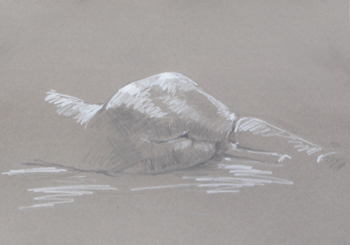
Figure Drawing #32. Pencil and white conté pencil on warm gray pastel paper.
Most of the time figure drawing sessions are very open situations. There is a studio space and a model. Everyone chips in to pay the model’s fee. No guru, no teacher. Usually also there is a loose structure for the number and duration of the poses. And that’s it. It’s really about chopping your head off (in order to avoid drawing from some preconceived kind of place) and getting into your tactile body. Feeling the paper, feeling the chalk, feeling the model (as yourself), letting go and staying aware. Sometimes I don’t look at the paper at all, content with just feeling the chalk explore the contours of the model’s body. Sometimes I wait to feel the model’s pose in my own body before I start. Where is the weight? Where is the movement? But then, also, what is happening on the paper? Seeing the model there, watching the figure taking shape. Feeling its life coursing through my fingers.
Additionally, drawing in this way isn’t about achieving some external standard of “likeness”, rather it’s about discovering your own authenticity. It’s about making footprints in the sand: remnants of a journey whose importance far outweighs it’s trace.
Bend in the Damse Vaart
August 30, 2013
I posted a WIP (work-in-progress) about a month ago. Yesterday I completed the last glaze on that project so here’s the final result. I’m quite happy with it, as there were a number of technical challenges.
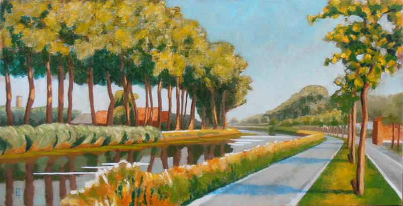
Bend in the Damse Vaart, Oil on panel. August 2013.
The first challenge was the light. I felt that the previous en-plein-air painting session (see WIP) had been quite successful but that I had lost the light statement which had been so apparent in the imprimatura. I decided on major surgery. I extracted the paint from the highlight areas (using medium instead of turpentine because it’s a softer method of extraction of fresh paint and you can paint back into it quickly and easily). Then I reintroduced light via a fast drying tempera white (zinc white mixed with emulsion). The resulting impression was a bit like a coarse blanket of snow(!).
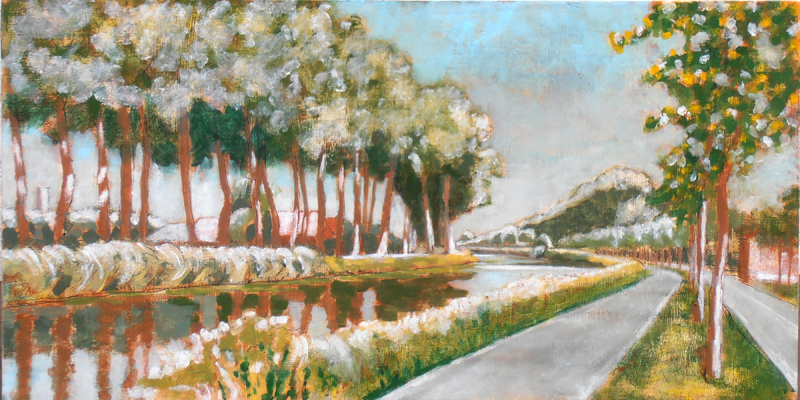
Snow on the Damse Vaart…
The second challenge was what’s called a sunken-in painting surface. What’s that, you might ask? Well, as the en-plein-air painting session dried, I noticed that many areas of the painted surface had become dull and gray instead of luminous and light. (Yuk!) This can occur when the chalk gesso ground is too thirsty and absorbs paint too quickly. Luckily this can be remedied by a light coat of retouch varnish, which I did and it was. So now the painting had been resuscitated but it was defo an ugly duckling: functional but with an unpleasant tactile quality.
I decided to complete the project in the studio, since technically there were too many balls to juggle. I kept with the same minimal palette that I had used en-plein-air: cadmium yellow, alizarine crimson and thalo blue – mixing any color I needed from these three with the addition of lead white and warm gray for my tints and shades. I started by glazing and painting the left bank only. I hate working this way since the development isn’t global but there wasn’t a way around it (that I could see). After the first studio session I had the image below:
Rive gauche
Now the painting was starting come alive and I was in love (really!). When this begins to happen it’s very important to listen to what the painting is saying instead of imposing any extraneous ideas upon it. For example, working en-plein-air at this point would be counter-productive. The hard part was waiting the few days it took for the glaze to dry enough so as to work on the adjacent area. When it was, the challenge was simply in staying true to the developments of the other side. See image here below:
Rive droit
So then again, after the appropriate drying time, the final step was more of a follow through than a creation: mirroring the development of the painting in the water’s reflections while attempting to give it a sense of wind-life. (See the initial image above)
Now, on to the next…
A work in progress…
August 3, 2013
After a long hiatus (precipitated by moving into an old Bruges row house and renovating it, along with creating a little painting studio for myself) I finally had the chance to get back into painting these last few weeks – and the weather has been great!
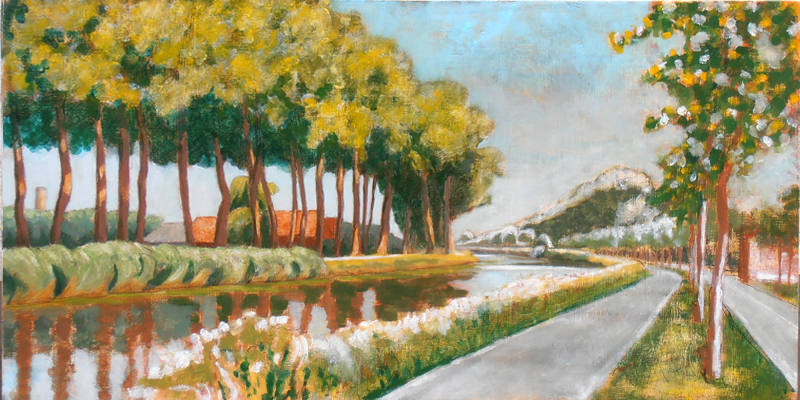
I decided to do an oil of a watercolor study I had completed in 2011 of the bend along the Damse Vaart canal outside Bruges. It’s a great perspective, particularly around mid-day. There are some interesting middle ground structures on the left, while on the right the receding treeline stretches almost all the way to Damme. The strong mid-day shadows complement the movement and function as an anchor.
watercolor of the bend in the Damse Vaart, 2011
I transposed the basic composition of the watercolor to a panel, but decided to do the foundational ink drawing and egg tempera levels en plein air. For the ink level, I reverted to the stylus and nib quill-pen style of my youth, instead of the technical drawing pens I’ve been using ever since. I wanted to let the pen nib respond to my hand pressure with a thinner or thicker line, mirroring my response to nature. It worked quite well, except the ink jar fell over spilling most of its contents. Enough remained to complete my work, even if the drawing ended up being a little sketchier than I might have envisioned it.
So I quickly moved onto the egg tempera stage. I brought three pigments with me pre-ground into pastes: cadmium yellow medium, alizarin crimson and thalo blue, in addition of course to the egg yolk. In future, I plan to mix up my paints with egg in the studio before going out – just to minimize the hassle: there are already enough uncontrollable factors to contend with in nature, like the wind, rain, sun and insects, why shoot yourself in the foot? In any case, I mixed up my paints in situ and laid in some washes over my ink drawing to indicate future color developments.
india ink and egg tempera underpainting of the Damse Vaart bend
Though it may not be very visible in the reproduction image here, I paid special attention to lay in more saturated colors in the foreground and lighter washes in the distance. I’ve learned from experience that it all makes a difference in the long run – any color, no matter how subtle equates to less light.
After a week or so, the egg tempera level was cured enough to paint over. It dries immediately but don’t be deceived, the egg/oil combo also has to cure. Gentle UV light can help. I painted a toned imprimatura of burnt sienna over the piece. My purpose in doing so was to unify the disparate foundational parts and lay in a preliminary value study. Using turpentine, I extracted the imprimatura from the highlights and lighter quarter tones revealing the underpainting beneath, while painting a more saturated layer into the shadows. I did this in the studio and it came out quite well(!). Now it’s starting to get exciting.
imprimatura, bend in the Damse Vaart
I let this level dry for almost a week. That’s not really necessary, at least if you don’t mind a little imprimatura bleeding into the next level of glaze, but since I did, I let it dry. Also, the shadowed areas were painted with a slightly heavier sienna wash, so they needed more time.
Finally, I set my field easel up in situ on a clear sunny day with a mild breeze. My homework was all done, the question was how far would I be able to bring the painting in one working session? I covered the whole panel with medium, wiped it back off leaving a slight tack to the panel surface and started in. Four hours later, I had the following result:
Level 1 oil, Bend of the Damse Vaart
I consider it an excellent start, though a little too coarse and graphic for my taste. I’d like to reintroduce the atmosphere of the imprimatura by softening a number of transitions and reintroducing the light. We’ll see if that’s possible. Fingers crossed for Bend in the Damse Vaart, part II.
A question of balance…
August 22, 2012

Langs de Vaartdijk
Today I created the final glaze on one of my favorite views along the Vaartdijk, a canal on the outskirts of Bruges, Belgium. On a clear day by about 11:00 a.m. the light makes a nice silhouette of a distant church tower with great rooftop variations inbetween: an interesting study of light. Additionally (at least in summer), the green vegetation and red roofs create a wonderful complimentary color juxtaposition, too. I wanted to try to maximize both in a painting.
I began last year with a watercolor study. This was helpful for setting out the general composition but didn’t come close to conveying what I saw (or felt about what I saw). I knew oil was needed to set it right. After working up an underdrawing in india ink followed by an underpainting in egg tempera, I set out attempting to maximize the reds and greens as I felt them through layers of pigment – in the studio. Working en plein air is great for quick studies but it’s almost a contradiction in terms for manipulating layers of oil here in rainy and unpredictable Belgium. Additionally, I knew I needed to concentrate on my own vision and not become distracted by the changeful atmospheric conditions attendant to working in situ. Describing distance with oil paint is a huge challenge, as any hue or value too weak (or too strong) belies the intended effect: it’s a question of balance.
I ended up dancing between cadmium yellow light and cadmium yellow medium for my yellow pigments and ultramarine or thalo for my blues. So my greens would vary from an almost neon green (cadmium YL and thalo) in the foreground, to just slightly dirty in the middle (cadmium YM and ultramarine), to a warmish gray at the back (cadmium Y M and thalo plus burnt sienna). And my reds alternated between two wonderful earth pigments: an opaque mars red and a more translucent burnt sienna.
But these developing color thrusts demanded a regular rebalancing of the whole through reasserting the original statement of light. I often had to reintroduce opaque white pigment in order to reclaim a highlighted area that had become obscured. Of course, it’s always best not to lose light in the first place, but perhaps it’s just a necessary evil of the glazing process? In any case, in addition to the vibration of color, the circulation of light was an equally important factor to integrate in this piece. The image above is the final result. I quite like it.
Notes on figure drawing
June 28, 2012

Figure drawing, March 2012
I’ve been attending a weekly figure drawing session for over a year now. A local artist loves to draw from the live model so he throws open his studio on Monday nights and invites any and all like-minded others to join in. There’s usually jazz blowing through his sound system and a small fire in the wood burning stove. We chip in for the model’s fee and that’s that, no teacher, no guru: one naked body in motion and rest.
When I began coming to these sessions I hadn’t drawn from the figure in almost 25 years so I felt pretty rusty. For these last decades I’ve been concentrating on rendering landscape, which doesn’t move even though the light and atmospheric effects on it certainly do. So from my terrestrial work I knew about my penchant for motion, for tracing the land’s skeleton, for shapes and the contrasts of light and dark, but how to get the essence of model’s pose down quickly and with some sense of accuracy?
I began with medium toned gray paper, slashing out indistinct highlights and blocking in coarse shadows. Most days the figure floated somewhere in space, sometimes a bit amputated, or just distorted from forcing a three dimensional entity onto a two dimensional space. I experimented with different grades of pencil, conté crayon, oil pastels and sticks of black carbon.  I tried white sketching paper, cheap recycled toned drawing paper, charcoal paper and Canson Mi-Tientes, each medium possessing a different tactile quality for recording sensation. I felt myself like a caterpillar with legs and antennae outstretched, sensing these forward vibrations with my own febrile tentacles.

Figure drawing, May 2012
Ingrained in my little head are the words of a friend’s former teacher, Nicholas Wacker, of the Ecole des Beaux Arts in Paris.
- Mise en page (placement on the page)
- Circulation de la lumière (circulation of light)
- Grisaille (gray/shading)
Thankfully, these principles guide me like a mantra in each sucessive attempt. Over time I developed an approach. For longer poses I sketch in the outline of the figure using a 6B or 8B lead pencil on a heavy weight Canson pastel paper. When I am satisfied, I block in the essential highlights with white chalk or pastel. If I have time, I return for the shadow accents.

Figure drawing, June 2012
For the shorter poses, 8B pencil, red conté crayon or black chalk on toned paper suffices. I remember that no line is superfluous so I try to erase as little as possible. John Ruskin in The Elements of Drawing advises, if you begin gently enough, any inaccuracies can be corrected with a new and heavier line. All lines are forays into the unknown, honor them as such. But if it at some point it all turns into an illegible chaos then it’s simply time to start over. And no harm done.
Encaustic revisited
May 10, 2011

Nils #26, encaustic on collage, summer 1978
About 30 years ago I did some mixed media “puzzle” paintings using, among others, a melted wax technique called encaustic. Although I liked the final result, the cumbersome nature of the materials that the technique required has not suited my nomadic lifestyle since that earlier time. It’s only recently that I decided to give it a re-try. In the intervening years on the world stage, encaustic has become quite a hobby craft, so there is a lot of information and materials available for it on the internet.
One main element needed for encaustic painting is a metal pallette whose heating temperature can be adjusted. 30 years ago, for 5$, I had a welder create a pallette for me from scrap metal, found a few hotplates to insert under it and voila, I could mix my pigments, varnish and melted beeswax, no problem. However, one piece of equipment I never did get was a hot lamp to “fuse” the final painting. Back then, I just left some of the finished paintings out in the sun (it was summertime) to heat up and “fuse”. It seemed to work well enough, and the paintings I created at that time are still alive and well. The memory I retained from this experiment was that this was a coarse technique full of wonderful textural surprises but hard to control for realistic detail.

Anna, #18, encaustic with collage, April 2011
This time around, I found a raclette warming tray at my local thrift store. For about 10$ I got my pallette, adjustable hot plate and fusing element all in one. Nice coup! Main equipment hurdle: check.
Next step: making the medium. I ordered some bleached beeswax and pulled out my pulverized damar varnish crystals. I melted the beeswax and then added the damar crystals to it at a portion of 4 to 1 (wax to varnish) by weight. The varnish requires a higher temperature than the wax to melt, so I had to adjust and stir constantly. When the liquid was clear I poured it into small molds. Both toxicity and flammability are factors in this process, so if you do it yourself, be sure to research it well first and be attentive all the way through. Don’t use your favorite souffle pan; any pan or wooden spoon called to arms will be ruined (at least for cooking).
Once the medium is created you can go two different ways: one way is to remelt the medium and add dry pigment directly to it or add oil colors from the tube. Having now experimented with both, I would heartily recommend adding dry pigments directly. Although it’s more effort up front, there is no question of shelf life due to the oxidation of the oil. Thus now I have a few cakes of different colors ready to go. Hurdle #2, paint: check.

Anna, #09, encaustic on panel over egg tempera, April 2011
I began slowy, carefully, selecting the first squares of open abstract patterns, knowing that I had already determined to do half of the face in this technique, so I needed to get up to speed. If the Fayum mummy portrait painters could paint such beautiful portraits, there must be a way. Due to the quick hardening time of the wax, my first strokes reaffirmed the clumsiness I had expected. How to render facial detail? After more research and surfing, I located a hobby source for an electric hot-pen or brush. Yes! This tool made all the difference. I could load up my hot-brush and render a long gentle stroke without the wax hardening in transit. Fine lines became possible, softer transitions, too. Hooray for hobby-craft!
Even though it is still a work in progress (because the backside of each panel will also be painted) you can view the front side of this mixed media collage here.
Egg tempera revisited
May 10, 2011

Anna, #17, egg tempera, silverpoint and india ink
Although I’m a huge fan of egg tempera, as a medium I generally use it for underpainting. It’s quick drying and relatively easy to manipulate, establishing firm graphical forms, through firm graphical brushstrokes that tend to be light in tonality. But for creating soft, smooth, subtle gradations that’s not its forte unless you have boatloads of patience. So in my book, that makes it great for underpainting, but as a stand alone medium, I’m not a purist, at least, not yet.
However, in my most recent “puzzle” painting project I planned to do just that. Each of the 25 squares involved were developed in silverpoint, india ink and egg tempera – as underpainting or underdrawing, respectively. Then, many of those panels received a further development in oil or wax or a combination thereof. But, I planned to leave 8 of thsoe panels alone remaining as a treatment in pure egg tempera, so for those 8, my skills in manipulating the medium had to suffice. Would they?

Anna, #8, egg tempera
The trickiest section by far was the face (which I left for the last). Early on I had decided to underpaint all the flesh tones with green earth, or terra verte pigment, similar to the Siennese painters of the Renaissance. (At that stage the figure looked rather ghoulish and I had to console myself that it would change.) Darker facial details were also painted with the same green earth. As I began to overlay with my warmer colors, the face came to life. Great! That particular facial square had also received some pre texturing with sculpting putty so the sculpting contributed in its own way, for example, the hair on the left only required of a few layers of burnt umber as a wash.
The final mixed media collage can be seen here.
The Inside-Out: final version
October 17, 2010
A few years ago I located a couple of carpenters who spoke enough English (and were pretty good at sign-language) to readily understand what I wanted them to create. A few weeks later they contacted me, “het is klaar” (it’s ready). My concept: I wanted to create a two sided painting (on a wooden panel) with a rotating inner core. The core needed to be extractable duing my creation process but afterwards could be fixed (permanently) in place.
 But why create two paintings on one panel? It’s a ton of work. And what would be the reward? That’s very hard to say, except this: it’s a clear and definite way to demonstrate relation. Relation of what to what? You choose, but of course it offered the fundamental and very pregnant possibility of contrasting realism with abstraction in a direct and visceral way. For one side, I chose a landscape. A realistic, almost academic landscape based upon a value study of one of my favorite views of the Predijkherrenrij here in Bruges, Belgium.
 And for the other side? Initially, and for a long time, I planned on an open blue field containing a text from Nisargadatta Maharaj, “I am, I am aware, I like it.” My thinking was simply this: if you have to use words to convery your intent, then these words from Maharaj summarize just about all that you ever really need to know. So, that’s what I created.

The Inside-Out

The Outside-In
When the inner core was rotated, it offered views as seen here left and right:
Thus, so far so good, kinda, but the text really bugged me. It took up way too much mental activity – thus creating a tendency to negate not only the unique mental-activity-bypass possibilities of the visual arts, but also the inner intent of the quotation itself! So last week, I painted over the text, to render a pure open field of blue. Ahhhhhh…

The Inside-Out revised
The Outside-In
When the inner core was rotated into “reality” I got this revised version as seen here left and right. Double ahhhhhhh……. Mucho bueno.
Green with envy – or was it ivy?
July 31, 2010

Kruispoorte version #1, 2009, a lovely painting but perhaps the development of the greens was a little flat.
Anyone who attempts to paint landscape has to deal sooner or later with the problem of green. Of course, some might not even consider it to be a difficulty – but I do. So what’s the problem? In a nutshell: #1) the profusion of greens in the natural world contrasted to #2) the difficulty of rendering them to any degree of accuracy on the pallete/canvas/panel.

Kruispoorte version #2, 2010, blue level, I’m struggling with my differentiations here.
From a pigment point of view, there are relatively few tube greens out there in contrast to the wide arrary of tube choices for other colors. Viridian, the strongest green pigment, is widely used, otherwise if you need something different, you just mix it up from some combo of yellow and blue, or even yellow and black. However, if you attempt (as I do) to arrive at a beautiful green through color layering (for example, a blue glaze over a yellow substrate) then you might indeed create a wonderful green, but find yourself unable to modulate it very much to it’s other (very green) surroundings. Hence an indirect technique for color development is a bit too inflexible.

Kuuispoorte #2, 2010, brown glaze level, a solution of sorts.
Thus, my current approach, to painting in general, but also to green in particular, is to minimize my pigment choice, decide on an approach and then modulate my color relations to it. For painting greens, this can mean using or mixing a master green, modulating a master chartreuse, blue green and/or gray green from that. Then tints and shades from each of those. If I am painting wet into wet, then the color of my glaze will certainly have a direct (color) effect. If it is an earth glaze (umber or sienna), the effect is quite grounding (no pun intended). Nevertheless, color is absolutely relational (a la Josef Albers) and nowhere is this more true than in the attempt to render the multitudinous greens of the natural world.

