I’ve already created a few pochade boxes for oil painting and written about there here and here. But late last summer I began to see the utility of creating a similar set-up exclusively for watercolors. In fact, my field explorations in watercolor had originally inspired me to create something simple and efficient for oils, now the same occurred to me, but in reverse. Since we travel a lot and I like to do watercolors on these journeys, I put on my design cap. The idea was super slim and simple.
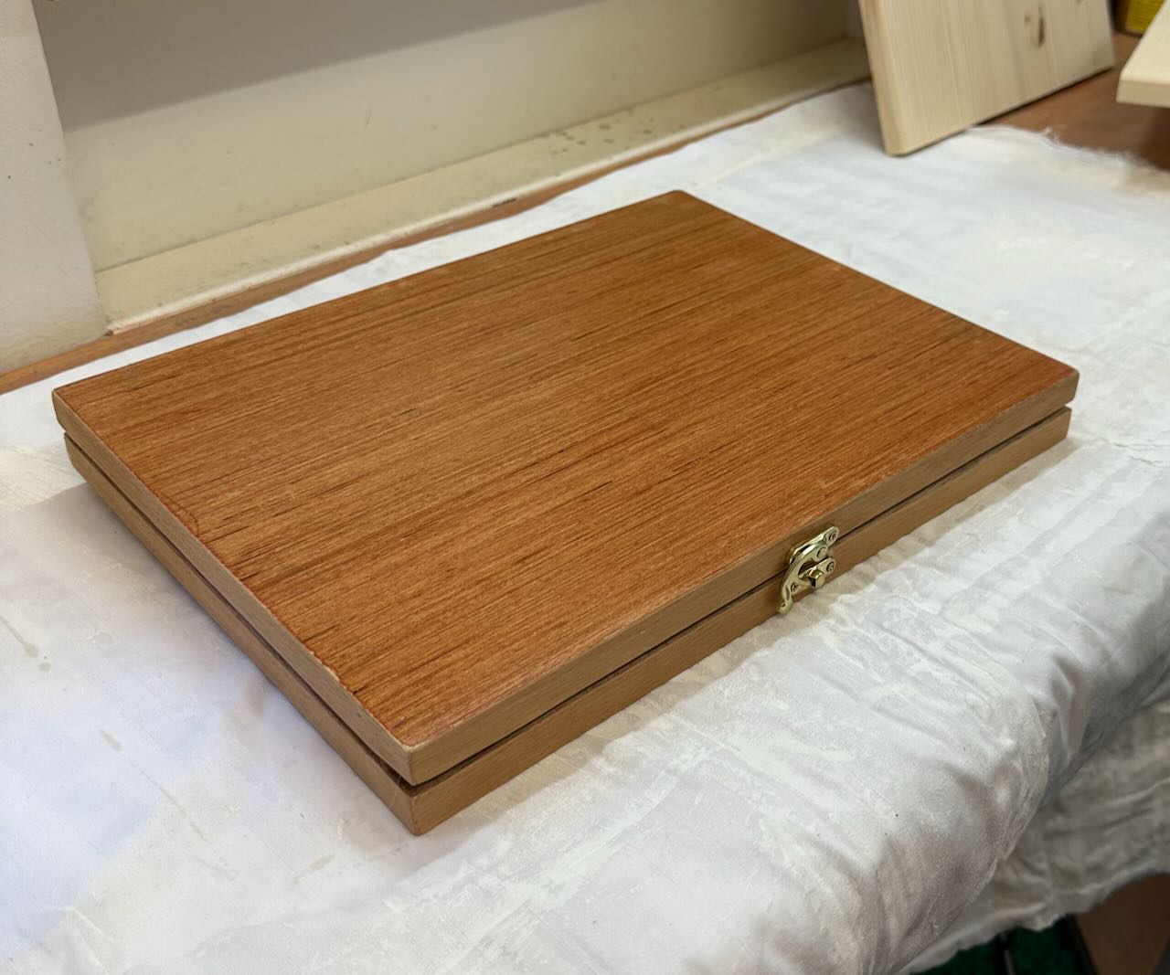
I cut two pieces of 1/4″ plywood board 3/4″ wider and deeper on both sides than a standard 9 x 12″ watercolor block. I glued in hardwood struts (5 cm x 1.8 cm) along all sides, cut to the width and depth of the plywood, as I wanted to nest a standard block inside the lid. Then I hinged it at the rear with a piano hinge (which will also create the easel’s tilt). This created a slim attractive box. I screwed in a little clasp (from Hobby Lobby) on the front side to keep it closed. Fixed adhesive magnets to the interior along the base, so that a color box, water cups and pencil box could be placed there while working.
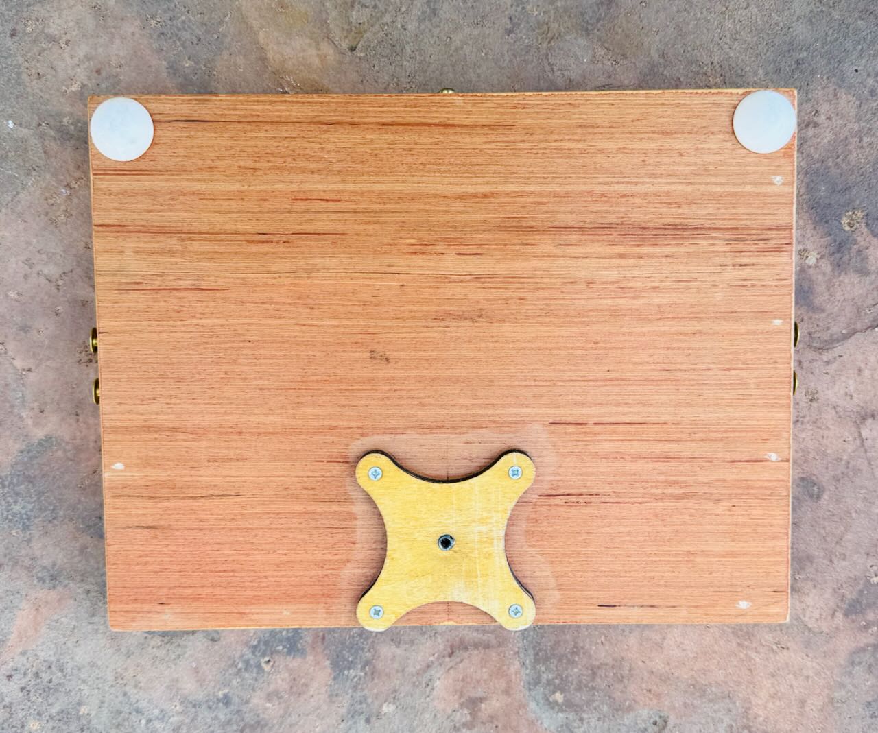
On the underside I placed a 1/4″ thick tripod bracket from Jackson’s Art Supply. This allows me to attach a standard 1/4″ 20 thread camera tripod. I also placed some 1/4′ depth round feet to the underside (along the front) so I could work at a flat table top, too. That was version I. It was just about 1″ thick. Nice!
After my first few field tests I determined the need to change a few things. I wanted to create additional depth in the interior so that the watercolor color box, cups and drawing box could fit inside not only when working but also when traveling, that is, when the lid was closed. This meant adding an additional 3/4″ or so of space between the two halves. I did this by glueing additional struts on the bottom half. I also added small removable angle brackets along the sides to keep the easel top from closing while working. Creating those brackets with my minimal tools and skill set was defo a challenge but in the end I came up with something I think quite serviceable – and elegant (enough).
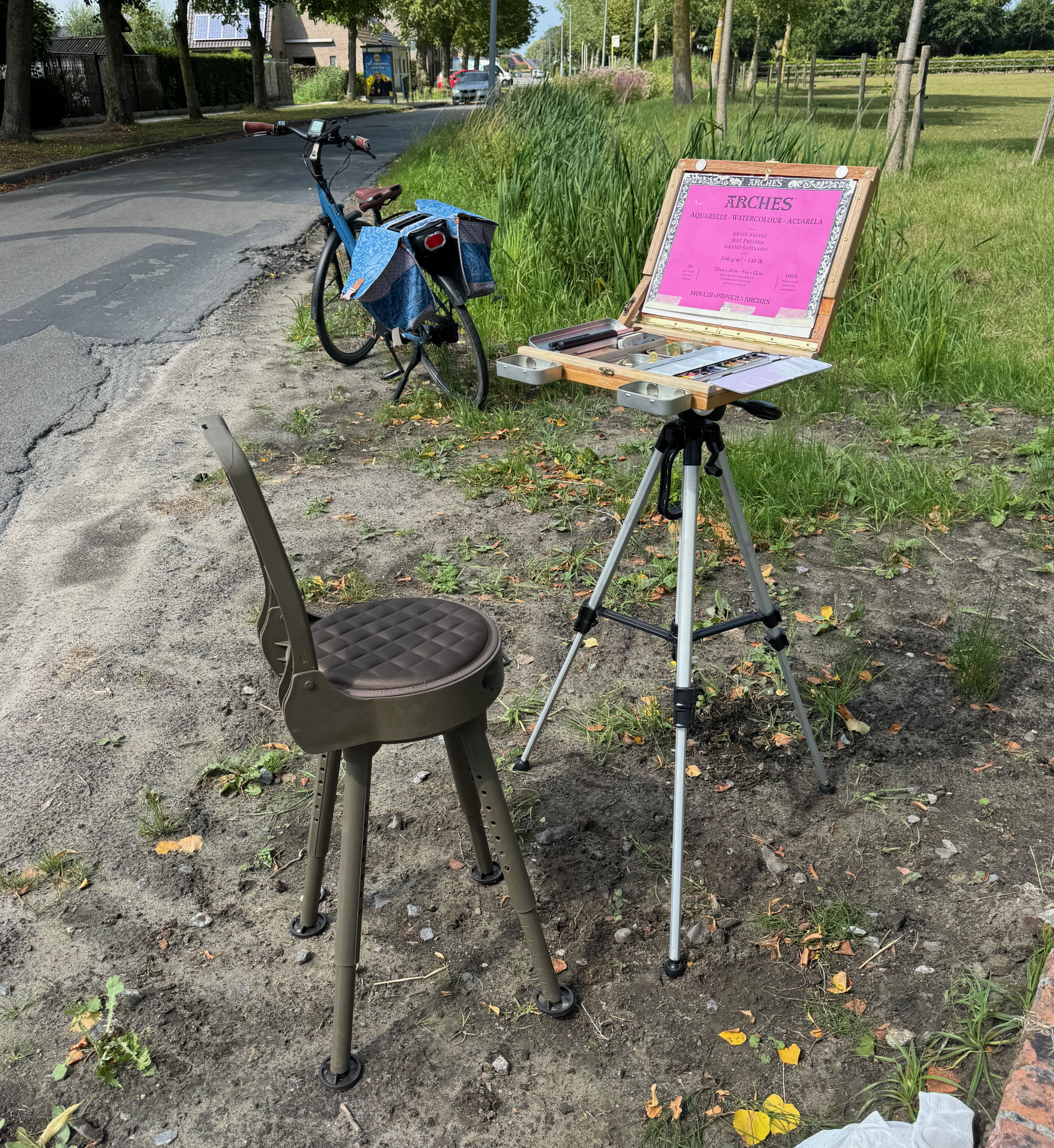
Our recent trip to the Grand Canyon was a test drive. It yielded up a few watercolors here and here along with a few happy working surprises. Having a box/easel freed up my both hands (which previously had been needed to hold the watercolor block) allowing me to draw with my whole arm (not just my hand) – and at a comfortable distance. That’s huge!!!! I was able to use my whole body to capture gesture (so it felt different), while also achieving more distance for judging my progress. I used a charcoal pencil for my initial sketch as it’s quick and sensitive, but way too dark and smudgy for watercolors. So I lightly erased that and traced in a linear drawing using a .2 H graphite pencil.
I recently upgraded this set up further to allow for a vertical orientation (of my watercolor block) as needed. Also I attached magnets to the front side so small water trays can be stationed there while working. The in situ pic here shows my folding chair, box and tripod from a recent session. Everything collapses and packs up nicely in the saddlebags of my e-bike. Adventure ho!
More Painting Backwards
October 20, 2011
In early July this year I created a watercolor of a view along the Damse Vaart nearby Bruges, just in front of where the steamboat, the Lamme Goedzak, docks. I really liked the composition created by the canal stretching out into the distance, as well as the light of the evening as it progressed.

Damse Vaart watercolor
By remaining in one location for a few hours, just painting, just watching, I could let the scene tell me precisely which light to try and capture. The sun was slowly setting in the west (here in midsummer, it doesn’t completely descend until almost 11:00 p.m.), so although the composition in terms of land, trees and water did not change, the light on them certainly did. I snapped a few photographs of the different transitions as I made my choice.
Back in the studio I transposed the composition to a panel and quickly sketched in the main elements, suggesting the central movements and thrusts as I felt them, the textures and the chiaroscuro. I used india ink for the stronger value details and silver point for the lighter, softer ones. (sorry, no photo of this stage available) The next time the weather was good, I went back out to do an underpainting using egg tempera (in the field). Egg tempera is not a technique that easily lends itself to field work but I wanted to experiment. I worked with a limited palette and preground my colors into a paste using distilled water. Since I knew the last levels of painting would probably be in the studio, I wanted as much authenticity-of-place as possible. I decided to use the landscape color convention of stong yellows in the foreground, greens in the middle and blues for the background. Values were kept fairly light, with everything suggested yet still fairly coarse. (no photo available)

Damse Vaart Oil
Two months later, after a rainy August, one month’s holiday and tons of other stuff inbetween, I had the chance to do the imprimatura. I mixed up a blob of burnt umber tube oil-color with retouch varnish (1 damar to 2 turps). I painted it on, letting it absorb into the panel for about a minute and then wiped it back off. It left a thin veil of warm brown over the whole image. With another small brush dipped in turpentine, I began wiping the brown tint back off from the pre-painted highlighted areas. Within fifteen minutes the process was complete, the highlights jumped out and the shadows pushed back, both filled with descriptive details and vibrating with life. I was tempted to call it done.

Damse Vaart Oil on panel
Nevertheless, the following year I decided to finish the piece – in the studio. I covered it with a tinted glaze of bunrt sienna and painted directly into that, wet-on-wet. This kept the wood areas vibrating with additional warmth and the greens and the blues well grounded. The challenge as always was to mix an array of receding greens to describe the distance. When it was dry I brought some highlights back in using tempera white (zinc white mixed with emulsion). Some of those final highlights required a little glazing just to bring it all back in balance. The resulting painting had a lovely color vibe, the red warmth of the wood contrasted to the greens (and yellows) of the vegetation.

