Creating a pochade box for oils, version II (March 2024)
March 30, 2024
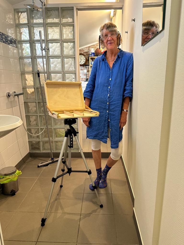
After creating a pochade box for my studio in Belgium, I wanted to create a similar one for my studio in California. While attending a course called “preparation for landscape painting” at the Watt Atelier, I picked up a few tips and tricks.
Primarily, they suggested sourcing a good glass 9 x 12″ palette with a while underside. Important! Since my previous palettes had been wood toned, now I could finally see the colors I was mixing! Size-wise it was just another reminder of how important it is to work with standard sizes. Your gessoed boards, palette, pochade, daypack not only can be easily sources they also can easily interact, while frame sizes for the end result are cheap and simple.
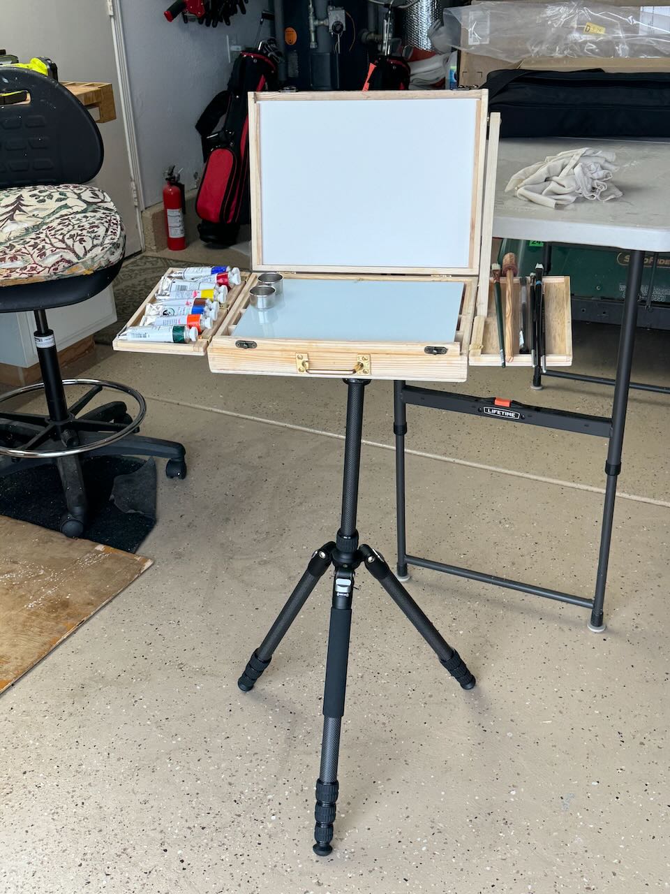
I purchased an A4 box from Amazon and brought along a few of my tripod brackets from Jackson’s Art Supply. Since I did not have any hardware for fixing the top of the easel at an angle, I had to improvise with a side bar. Additionally, I realized how important it would be to have expandable side trays for holding paints and brushes while working. They would need to nesting later for traveling.
In the end, just before we returned to Belgium, I came up with this. Neither version had been field tested however, between the two I had made the following changes: side trays, easel arm and glass palette mentioned above, but also the orientation of the compartments underneath. (I had changed them from vertical to horizontal in VII so as to function better for brush and tube storage.) I knew I’d want to make similar adjustments (to version I) once we got back to Bruges but that was entirely possible.
Now truly, if only the weather would cooperate, I was ready for a summer of en plein air painting.
Creating a pochade Box for oils, version I (November 2023)
November 3, 2023
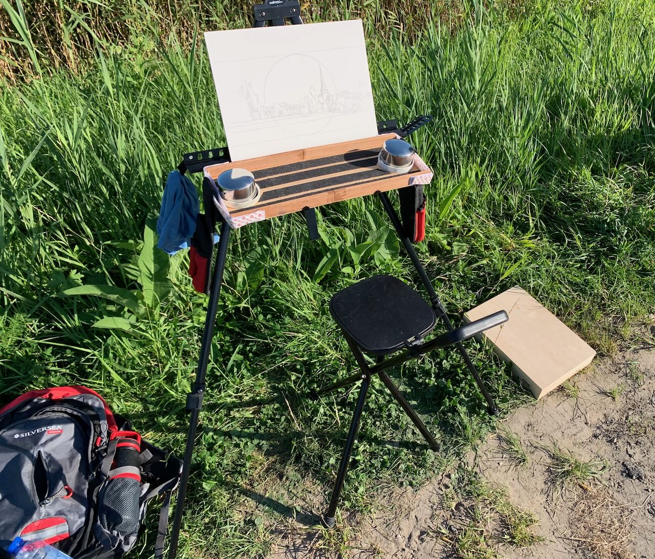
Last summer I began to return to en-plein-air painting in the environment around Bruges. At first, just watercolour. I would walk or bike to my location of choice. As my explorations expanded, my e-bike allowed me to get to remote locations, because my bags could easily hold all my stuff: a light weight field easel, a folding chair, a watercolor box, brushes and pad. No problem, though everything was kinda flimsy, makeshift and easily toppled over by the wind (or even me ;-)). 😉
Then I began to dream of doing oils (once again) yet in a similar fashion. I already had a beautiful Mabef wooden field easel but it weighed about 30 pounds and couldn’t be transported by e-bike. Primarily for that reason I had given up on my en plein air explorations. (I don’t drive a car much around Bruges, also because I have MS, I really can’t very walk far or stand for very long, but e-biking works). So maybe, just maybe, I could use the same condensed setup I now had for aquarelle and just substitute a (condensed) quantity of oil tubes, potions, palette and brushes instead? I already knew, the biggest plain-air challenge (besides the act of painting itself), was transporting a wet oil painting back home without smearing, so that was design challenge #1.
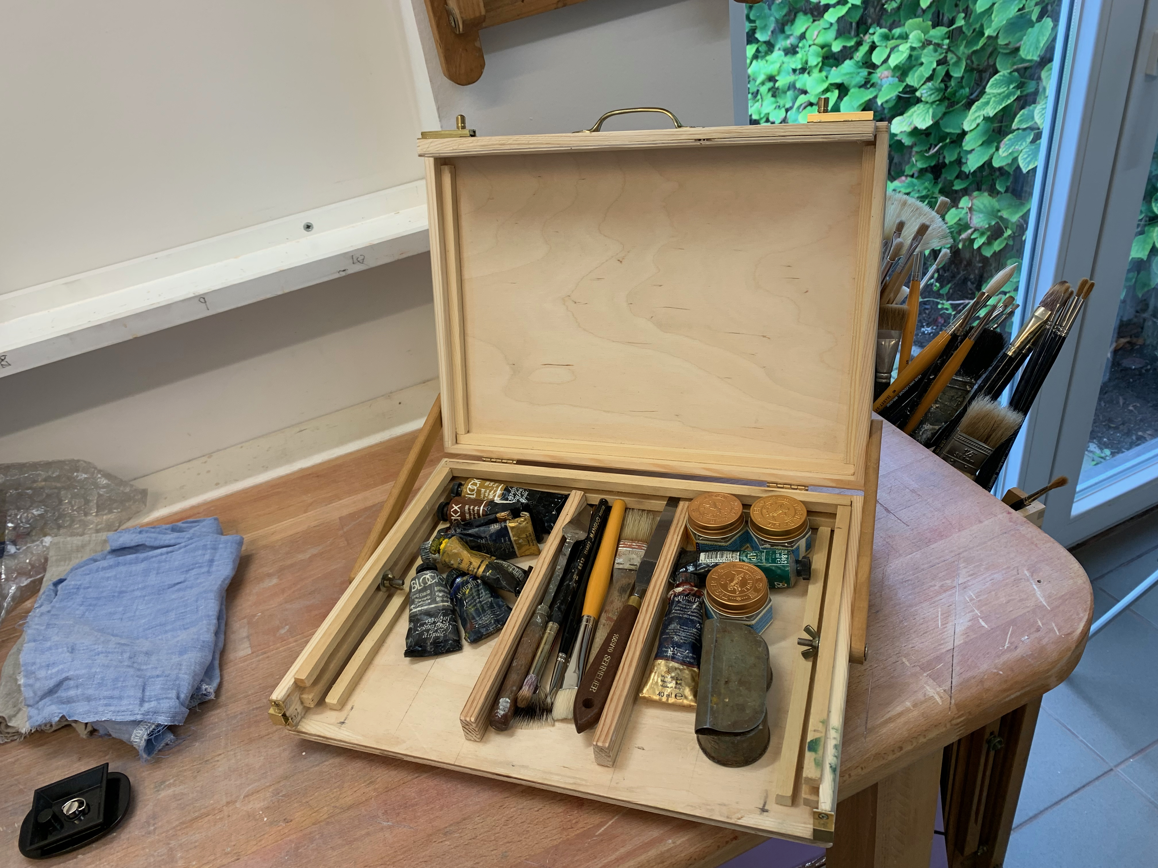
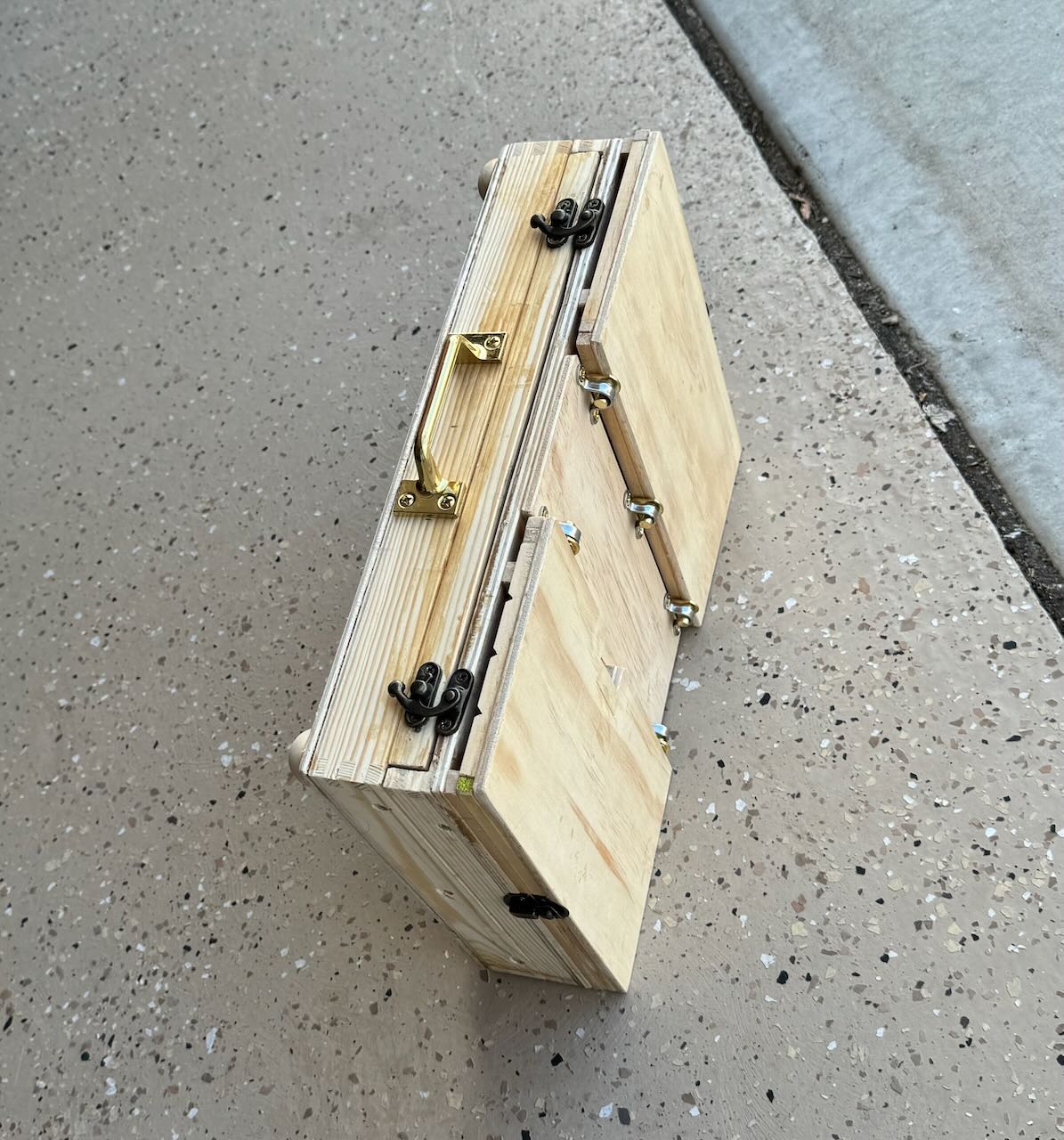
I bought an A4 (9 x 12 x 2″) wooden box on Amazon. The top section was 1/2″ deep while the bottom section was 1 1/2″ deep. I cut a slice out of the front along the bottom section and glued that insert to the top lid. This would could potentially nest a wet gessoed panel. I then glued thin runners inside along the sides of the bottom section. This created a box, allowing my thin gessoed panels (and palette) to seamlessly slide in and out, keeping everything from smearing, while storing tubes and brushes beneath. The lid could close and everything remained in place. My first foray with this system worked out fine. Nothing smeared (though my metallic field easel proved far too flimsy to function as an easel).
I began to dream of further improvements. Could I use the upper section of the box itself as a field easel? How to mount it? And to what? When attached, how to tilt the lid to provide a stable angle for painting? Would I then be able to carry my paints, palette and brushes in the bottom section of the box? If so, could I still keep one painting protected during transport? And what about carrying a wet palette, would that be possible? Above all I wanted to design an elegant, simple solution which could minimise the amount of gear I had to carry.
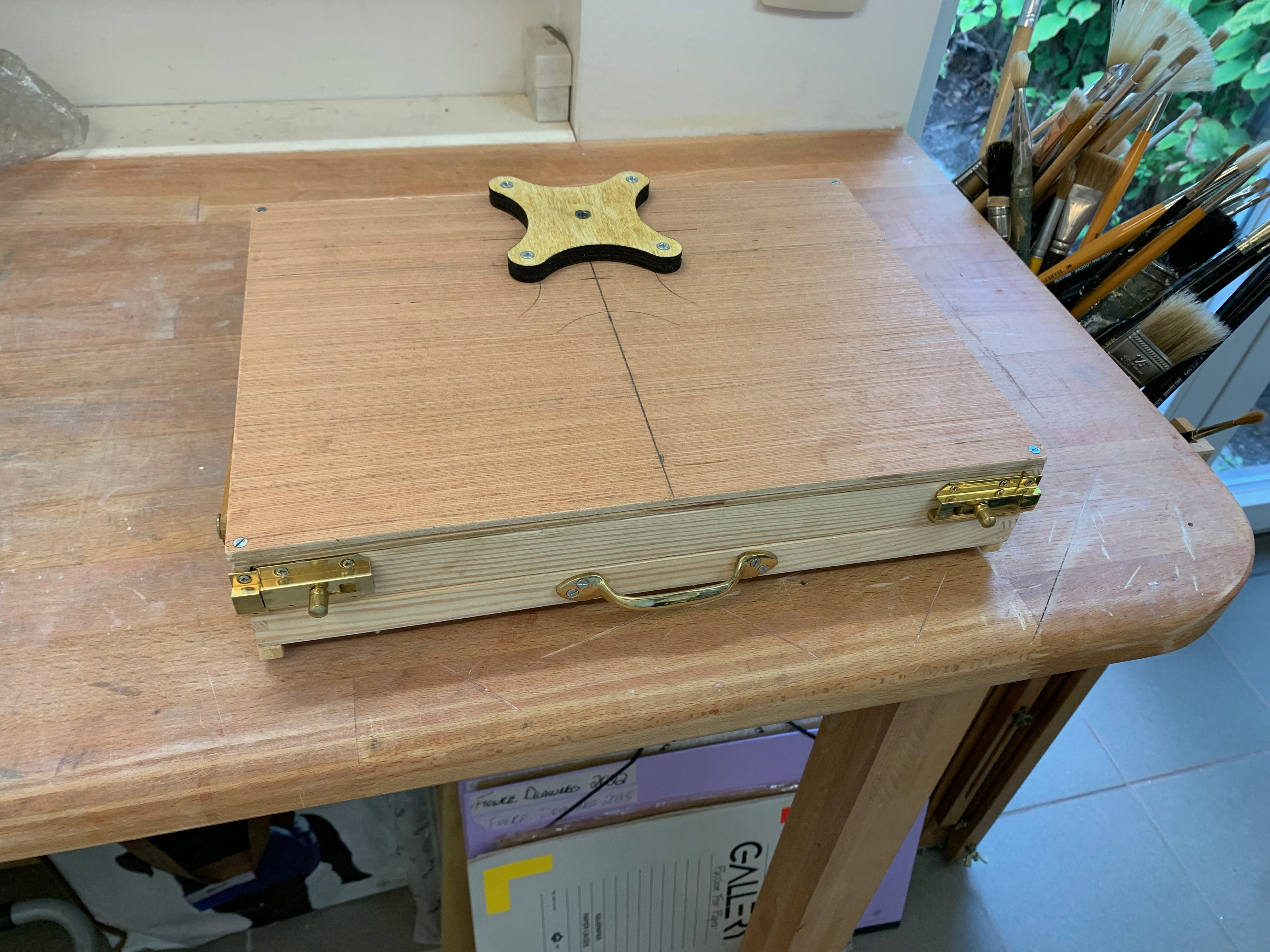
The Tripod and Mount
After some surfing around I determined that a standard camera tripod is fully adequate to function as an easel. It has a detachable mounting plate with a projecting 1/4″ bolt, consisting of 20 threads. You just need to match that plate to a bracket able to receive the bolt, affixed to the underside of your box. For starters I bought a tripod from a local appliance store. Then I looked around and sourced a beautiful bracket from Jackson’s Art Supply in England. Affixed to the box’s underside, it can take that 1/4″ 20 thread bolt. I just needed to laminate an extra piece of 1/4″ plywood to stabilize the base.
In the end I had something like this, ready for a test drive. But by now it was the beginning of November, end of the painting season. That all important test drive would have to wait for the spring.
The Silverpoint Composite Underdrawing
June 6, 2022
Silverpoint on tinted acrylic ground. 3 1/2 feet wide by 5 1/2 feet tall or 106 cm x 168 cm.
I’ve finally completed the sixty-four silverpoint underdrawings in preparation for a painting – as yet to come. The panels were developed individually – and were based on black and white sectionals of a photograph. The MDF panels were all prepared with an acrylic ground tinted with a mixture of dry pigments to simulate terre verte, because the actual dry pigment, terre verte, reacts negatively with acrylic rendering it unworkable – in that particular medium. Of course, I could have used a tint of white for my ground colour but I already knew how much I enjoyed working from a toned ground. The silver lines could be used to subtly create linear form while then the addition of an acrylic wash of white highlights could help it to “pop”! In addition, I coated each tinted gesso panel with a transparent covering of Golden’s Pastel Ground, in order to create a fuzzy toothiness.
Assembling the panels on the backing board.
Now, since this level has been completed I’ve encountered two main problems-to-solve: 1) in the areas of darkest value which required a lot of cross-hatching of the silver particles, the image possesses a reflective sheen. Is it possible to minimise this reflectivity?; 2) even though silverpoint has the reputation for leaving an indelible mark, I have found that that is not really the case. Both water and a kneaded eraser can, in fact, diminish the image. So, before I proceed any further, I want to “fix” the drawing. What material should I use to do this? A traditional pastel fixative or a matte acrylic varnish? In addition, would this proposed fixative help to diminish my sheen problem?
After some research and consultation with the expert folks at the University of Delaware’s MITRA forum, I have decided to spray an adequate covering of Lascaux (an acrylic medium containing B-72) Fixative over the whole assemblage before proceeding any further. Because I anticipate further layers of abstraction, using a Liquitex transparent titanium white spray over the image my silver sheen issue may take care of itself?
Fast forward to a few months later. The fixative, fixed, and the matte spray pain reduced the sheen.
What remained was for me to throw some paint at it.
Underdrawings in silverpoint, batch #3
October 8, 2021
Pieces of Me #36, silverpoint underdrawing on toned ground tightened with acrylic
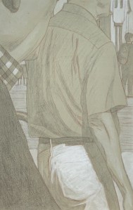
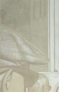
After a long hiatus (at least from posting here) I’ve got another batch of silverpoint underdrawings to publish. These were created during our recent trip to California – in my new studio there. The new studio is in our garage, so besides the new working-space, I envision that I will have more room to create larger pieces there (who needs cars anyway?). My current working-space here in Belgium exists in a long rear hallway to the house. It measures about 4 x 10 feet but since Euro-compression-design rules the day I have been able to pack many useful features into it. Still. it’s cramped.
Pieces of Me #58, silverpoint underdrawing over toned ground tightened with acrylic
When I began this project I knew of course that the silverpoint pencil nib is quite restrictive, so the challenge in these panels was how to render various highly textured, amorphous and abstract shapes with a very fine, low in value line. Mostly impossible. For many of these compositions then, if I were to use just silverpoint, I’d have only very flat uninteresting underdrawings to offer. But since they are executed on a toned ground, the addition of the while highlights (using tubes of titanium white acrylic) allows for greater manipulations. Washes quickly establish the tonality, texture and gesture – things which are otherwise very difficult to achieve in silverpoint alone.
Pieces of Me #38, silverpoint underdrawing over toned ground hightened with white
The silverpoint then establishes the basics of the design and hints toward the darker values, while the white moves the image forward. I enlisted the help not only of brushes but also sponges, hands and fingers. And since each panel is about the size of a standard book, I could rotate the panel to get my washes to drip in whatever direction I needed. Nice. That’s really hard to do with a big panel or canvas. 😉
Pieces of Me #57, silverpoint underdrawing on toned ground tightened with white
All in all I created fourteen panels during this recent time. They are still resting in their little beds in California, however I was able to take some photographs of them before leaving. I’m hoping to put the whole series together there during our next trip, where I will have enough space in that garage to throw some paint at the final assemblage. As ever, we’ll see.
Underdrawings in silverpoint, batch #2
June 3, 2021
Silverpoint #05 over toned gesso ground. 13.3 x 21 cm or 5 1/4 x 8 1/2 in.
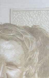
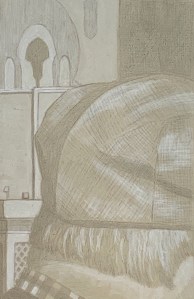
I’ve completed six more panels, so I figure it’s time for an update. Illustrated here are a few of those that I that have found to be particularly interesting/beautiful for various reasons. The most evocative seem to be those whose compositions include human beings or parts thereof. It’s as though each one is from some unwritten comic book – captions not included. (Hergé would have understood.) Additionally, the abstract panels cause me to wonder/admire anew at how the iconoclastic impulse of Islamic art continues to produce such interesting varieties of texture and pattern.

Silverpoint #08 over toned gesso ground. 13.3 x 21 cm or 5 1/4 x 8 1/2 in.
Further, one very general note. I feel I am serendipitously creating 21st century daguerreotypes(!). (Who knew?) It’s as though by using silver to recreate images based on a digital photograph the mechanistic process has come full circle: human to machine back to human. And again, because the drawing stylus is silver it’s almost impossible to achieve a line darker than a 50% grey value. All values are compressed thereby, necessitating a multitude of small decisions. Then, adding in the white highlights truly makes each panel come alive. That’s my artist’s pleasure.

Silverpoint #11 over toned gesso ground. 13.3 x 21 cm or 5 1/4 x 8 1/2 in.
Finally, the raison d’être for these remains as underdrawings. And I have no doubt that their beauty and subtlety will contribute to the whole in yet-to-be-experienced ways. (Can’t wait) However, because of their beauty and subtlety – which at least compositionally I don’t take credit for – some will be held back for individual display and appreciation. For this, I think I have a plan…
Underdrawings in silverpoint, batch #1
May 12, 2021
Panel #10. Silverpoint underdrawing over tinted gesso, highlighted with white. 13.3 cm x 21 cm, or 5 1/4 x 8 1/4 in.
I’ve been doing some underdrawings for a new project. It will be a different approach to the same image/subject matter as the “A Piece of Me” project, completed in December 2020.
Panel #01. Silverpoint underdrawing over tinted gesso, highlighted with white. 13.3 cm x 21 cm, or 5 1/4 x 8 1/4 in.
However, instead of being executed in a full textural and chromatic range this one will be untextured, monochromatic and ghosted back. It will be done in silverpoint on acrylic and overpainted (in acrylic or oil, TBD) on sixty four panels.
Illustrated here is a selection of some of the individual panels I’ve created so far, along with some of my notes. 1) Using silver point means that I can never reach a rich dark value (SP is not india ink!). So that’s fantastic and exactly what I’m looking for. 2) In addition, since I’m creating them on already tinted grounds, the darkest values provide less contrast than if I were starting from a white ground. Again, excellent! 3) The tinted ground itself establishes a middle value and allows me to lay in white washes for the highlights. 4) Inevitably, the value range is compressed and subtlety reigns. Nice. That’s how I like it.
Panel #02. Silverpoint underdrawing over tinted gesso, highlighted with white. 13.3 cm x 21 cm, or 5 1/4 x 8 1/4 in.
Also, even though these are intended as underdrawings I can already see that, when the composition warrants it, a few of them are or will be worthy of individual display – though I’m not sure how I’ll handle that. Should I create them (only) for integration into the final piece? Or should I create some for appreciating in isolation (only)? It’s a great problem to have which, for the moment, I don’t have to solve. I can simply create the little panels, fall in love and see where it all goes
Preparing Grounds for Silverpoint
April 25, 2021
The winning test panel. Silverpoint over tinted acrylic gesso, treated with GOLDEN Pastel Ground, highlighted with acrylic titanium white. 13.3 cm x 21 cm, or 5 1/4 x 8 1/4 in.
I’ve been doing a number of tests in preparation for an upcoming project. It will consist of a series of uniformly sized HDF panels prepared with a tinted ground upon which I intend to create images executed in silverpoint. These silverpoint images will be touched up with white (probably gouache). Since silverpoint does not create a strong dark line (that’s part of its beauty) I wanted to create tinted grounds that were not too dark, say, between a 10 – 20% grey value. The silverpointed strokes could softly emerge from this but never become stronger than a 40-50% value. Likewise the highlights could softly arise in the opposite direction, creating a nuanced chiaroscuro effect. Further, I imagined the hue of the background to be a terre verte. Since I planned to create a series of these panels whose grounds should be uniform I wanted to create a tint which could be reproducible across the whole series.
Relative to the ground itself, silverpoint requires a drawing surface prepared with a significant amount of “tooth” to catch the silver of the stylus. The substrate for that ground can be flexible or inflexible. The grounds for flexible substrates, such as paper or cloth, then need to create this tooth while also remaining somewhat flexible. Such grounds tend to be acrylic based (though this rule is, in itself, not inflexible). The grounds for inflexible substrates possess more latitude. They can be acrylic or traditional (based on rabbit skin glue), these latter tend to be more brittle. In the case of this project, since I had already chosen HDF, I had a range of media to choose from.
Additionally, contrary to what the word “tooth” might seem to imply, it does not so much refer to the texture of the ground as it does to its hardness. Because the silver (or any metal point) creates its mark by leaving tiny deposits of metal, the hardness of the pigment filler suspended in that ground is what provides this tooth. The carrier might be acrylic or rabbit skin glue while for the filler an array of white pigment particles may be used. These may include mixtures of chalk whiting (calcium carbonate), titanium white and/or zinc white. After it dries, the ground may be polished smooth or left with a bit of texture – artist’s choice. Experience quickly demonstrates that small, meditative motions of the stylus create soft, almost indelible lines whose value intensity increases only with repetition – not pressure.
At the outset of this project then, I had a few questions to answer:
- Since I already knew I would be using an inflexible substrate, should I use an acrylic based carrier or a traditional rabbit skin glue for my gesso? In theory, both might be appropriate.
- If acrylic, how should I introduce my tint? Terre verte in dry pigment form is known to be chemically incompatible with acrylics, so mixing up a combination of other pigments in an aqueous dispersion would be my best option.
- Alternatively, if I choose RSG as my carrier how do I introduce the tint? From a technical point of view, terre verte could be added to the dry pigment filler base of my RSG ground. However because it has such a low tinting index and its hue varies greatly from supplier to supplier, it’s not a good choice. An aqueous dispersion of high tinting dry pigments might be necessary here too.
- Whatever medium I choose, along with whatever tinting mechanism, its hue should be reproducible.
I began creating a number of test panels using different carriers and differing tinting solutions. After much experimentation I discovered:
- I experimented with adding a few blobs of tube acrylic “terre verte” to my acrylic gesso. It worked well enough for one panel but would clearly be difficult to calibrate chromatically across a large series. Also, I thought it would be a more expensive.
- By combining small but precisely measured amounts of cadmium yellow, burnt sienna, mars black and viridian I could grind up a hue that I liked. I added small amounts of distilled water until I had a paste which could be further diluted into a well-dispersed yet concentrated tinting solution.
- This hue could be reproducible across the series since I had not only maintained records of my dry pigment tints but also how much gesso base I had used (either various GOLDENS acrylic gessoes or various RSG recipes). In this way I knew how to ultimately manage my white component.
- Finally, the winner was an acrylic combination. See above, left. Though I truly prefer the haptic experience of a traditional RSG gesso for silverpoint, in this case acrylics won out. My reasons were: facility, it’s easy to use, for when you are planning on creating sixty four panels, this matters (RSG recipes can be more finicky); uniformity, the tinted, sanded surface of the acrylic ground was uniform (this was not always the case with my RSG gessoes); value, the silverpoint line was not too dark on the acrylic ground (surprisingly, the RSG/zinc white ground created a darkest line of all); line clarity/or not, a transparent coat of GOLDENS Pastel Ground applied onto the acrylic ground turned the surface texture into a rough sandpaper. In turn this made my silverpoint strokes a whispy sfumato, whereas the baby butt-smoothness of the burnished RSG grounds created fine, strong, clear lines (not what I was looking for in this project). Highlighting, washes of white gouache were well received on the acrylic ground and easily manipulated (because they were in an aqueous solution, this was not the case with the water-permeable RSG grounds). However, ultimately I opted for doing my highlights in (titanium white) acrylic since in the long run it requires less protection. Versatility, since I am beginning to imagine further (semi-translucent) coats of paint over the whole series after they are completed and fully assembled, the robust versatility of the acrylic medium seems to be the best choice.
It can sometimes seem like a lot of extra effort to do your homework like this, but it’s worse to create a whole project only to find that the materials you use don’t let you do whatever it is that you envision.
Besides, I think you have to enjoy creating mud-pies. 😉
The Connecticut Landscapes 1979-1980
February 28, 2021
I’ve been scanning some of my archived material from the late 1970s. Luckily my professors had always said: be sure to take slides of your work(!). Not all of them are well lit or even in pristine focus but hey, it’s better than nothing.

New Haven from Lighthouse Park II. 1980. Oil on panel. 5″ x 15″.
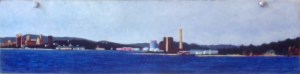
New Haven from Lighthouse Park I. 1980. Oil on panel. 5″ x 15″.
This series illustrates my initial attempts to paint landscape. They were done ‘en plein air’, in the sense that they were painted on site and not later in the studio. But even then, my approach was not impressionistic, which seeks to quickly render an evanescent moment. Rather, I would frequently return to the scene of the crime, building up layers (until the surface could hold no more), as I sought to describe something eternally universal about my chosen view.
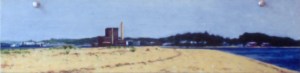
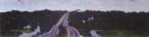
I was living in New Haven Connecticut at the time, thus a number of them are harbour scenes from the city parks on the east and west side. In addition, there is an interstate 90 highway scene plus a seascape from a beach house in Old Saybrook, Connecticut where I lived one winter (the large red roof in the middle ground belonged to the family home of Katherine Hepburn, probably still does).
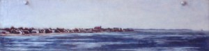
New Haven from Sandy Point. 1980. Oil on panel. 5″ x 15″.
Westbrook, Connecticut. 1979. Oil on Panel. 5″ x 15″.
Old Saybrook. 1978. Oil on panel. 5″ x 15″.
The provenance of the unusually long horizontal format is this. The father of a friend of mine used to prowl the local dump for useable building materials. One day he came home with a contraption consisting of seven 5″ x 15″ masonite panels which all hung from a bar. I detached them, stripped the panels of their paint but left the holes at the top intact – this is why you can still see the push pins I used to hold them to the wall.
At the time I created seven scenes. This is a record of five of them. I gave all of them away before I left the East Coast but I no longer know who has what. If some old friend ever pops up with an image of the other two I’ll happily update this page.
Underdrawing for oils
October 24, 2020
I hesitate to say something about a topic that may (or should) already be well covered in artist manuals and/or the blog-o-sphere but since I have had a steep learning curve myself these past few weeks, I thought it might be helpful to document these lessons for others. I’m thinking that the main reason there is less information out there is because most painters these days prefer to paint on an acrylic gesso ground. It’s cheaper, easier, faster and less toxic. I also think that most painters are interested in using an alla prima approach to painting, it’s the fashion and one which generally does not make use of an underdrawing. ‘Nuff said.
To set the stage for my problem: I had a series of 3mm HDF panels (note, not canvases) which were sized with rabbit skin glue and then primed with a lead white primer. I had used Old Holland Lead White, in a 120 ml can: lead carbonate ground with cold-pressed linseed oil which was diluted with five parts turpentine (to one part stand oil, my mistake, NEVER do that again. The stand oil introduces an unnecessary element of fat into a ground that should always be as lean as possible). These panels were primed over one year ago. They were fully cured.
I now wanted to transfer my designs onto these panels – and from that design, create an indelible underdrawing which could serve as a foundation upon which to build an image. The problem/challenge was to find a medium that would be absorbed by this lean oil ground and yet (after an adequate amount of drying time) would not dissolve into the successive layers of fatter oil paint on top. (This business of painting is always a two way street.)
I set about transferring my first set of designs by printing a black and white version of the image to size onto a piece of paper, covering the back side of the paper with vine charcoal, and then tracing the design by pressing the tip of a dull stylus into the main lines. The resulting charcoal design on the panel could be erased or modified, but now I had something upon which to base a more permanent underdrawing.
Acrylic Ink?
Due to my recent experience in developing underdrawings for acrylic, I already knew that black acrylic ink (which is perfect for drawing on an acrylic gesso ground and then painting in acrylics over that) would not be appropriate for drawing on an oil ground. The practical and simple logic is such: oil can be superimposed upon acrylic but not vice versa.
India ink?
I set about drawing in my designs with a pen nib using permanent india ink. They appeared to bead up. The ground was not receptive to india ink. No amount of drying time would change that. It was an oil and water thing. My ground was too fat for the india ink, so I cleaned it off and started over.
Underdrawing in light black oil wash over collaged panel primed with lead oil ground.
Mars black oil paint heavily diluted with turpentine and painted in with thin washes?
What did painters, painting on oil based grounds for centuries, do? Well, first, surely they did not add stand oil to their ground(!) (my bad.) But still, since the oil ground is oil, they must have used a medium to which it was receptive. My first series of underdrawings then were done with mars black oil paint heavily diluted with turpentine. They looked great and appeared to be well received by the oil ground. Hooray #1. See image above, left. However after three or four days of drying time, they began to lift off the ground when lightly touched with a kneaded eraser to lift off that original charcoal tracing design. Not good. I began to think I would have to start over by priming a whole new set of panels without the addition of that nasty stand oil.
Underdrawing created with a mars black oi paint diluted 25:75 or so with turpentine, drawn on an oil based ground using a pen stylus.
Mars black oil paint less heavily diluted and drawn in with a pen nib?
Then I also realised that I could try creating a black oil drawing medium which was less diluted (that is, contained more oil). So I mixed up a small jar with a blob of oil paint and an amount of turpentine, roughly 25:75. Test strokes. Trial and error. I wanted to create something fluid and siccative, which would work with a pen nib but which was thicker than my previous dilutions. I reasoned that this new batch would fare better with firm, linear lines rather than the fugitive, heavily diluted brush strokes. The paint/ink could be thicker than before and also this form of thick strokes could take up less “space” on the ground. I completed a few yesterday and will let them fully dry but I think and hope I have solved my problem. Time will tell. I hope to update this page as the project progresses.
The Mixed Technique and indirect painting
October 14, 2020
A Piece of Me #07, the mixed technique on panel.
The “mixed technique”, as I use it, refers to the development of an egg/oil emulsion that can be used to grind amounts of dry pigment powder into a useable paint OR using that same emulsion to extend already existing manufactured tube oil colour into a faster drying, leaner paint. Some scholars and painters claim that the “oil technique” discovered in the fifteenth century by the Northern Renaissance painters (beginning with Van Eyck) was actually a discovery of this emulsion. While others claim that Van Eyck’s new oil technique (or “mische techniek”) consisted of the judicious use of oil glazes over a well developed egg tempera underpainting. Whether there actually was an in-between phase of a new emulsion (as described above) appears to be a matter of debate. You can find authoritative resources either way. For myself, I have tried creating paintings with both approaches but, like a moth to the flame, continue to be drawn to this new emulsion and the effects it creates. My results have reflected the analogy correspondingly: sometimes scintillating; sometimes trash.
A Piece of Me #37, the mixed technique on panel.
This “new emulsion” then dries more slowly than egg tempera and yet faster than oil. It allows for smoother transitions in blending. It also allows for wet-in-wet brush stroke integrity (which the oil technique, when applied wet-in-wet tends to slur). Relative to the emulsion recipe I use, when created freshly, it looks and handles like mayonnaise. Because it’s created with methyl cellulose glue instead of an egg yolk it lasts a lot longer. An emulsion created with the yolk of an egg should create a well functioning “mayonnaise” too, I just haven’t tried it.
For this series of panels I applied the few steps with which I have become familiar over the years:
- the choice of a firm substrate, in this case, a 3 mm HDF panel with a hardwood veneer on both sides
- sizing the panel with rabbit skin glue
- coating the panel with approximately 10 layers of traditional chalk gesso
- another coat of size to reduce absorbency
- a well developed underdrawing, created with india ink. Depending on the subject matter, sometimes pen and ink, sometimes a series of washes, sometimes both.
- a well developed underpainting
- a clear glaze painted on and allowed to dry for approximately 15 minutes before wiping off
- mixing emulsion into my colors as I painted into this clear glaze
- doing so made for smooth, easy to blend transitions
- you can click this link for a full view of the mixed technique series of panels for the A Piece of Me project

