Oils
May 26, 2009
Most books advise a beginner to begin with oils as it is more forgiving. It is easier to correct a mistake for example, than with watercolor. That may be true – especially if one uses opaque pigments – but oils, by nature of the medium itself, are viscously translucent, thus understanding their innate capacity to transmit light through a clear film is ultimately critical for both succesful manipulations of form without pentimento as well as transmission of light. Eastlake noted, in referring to Jan Van Eyck, “The leading attribute of the material of oil painting, as distinguished from those of tempera and fresco, viz. its power to transmit light of an internal surface through superimposed substances more or less diaphanous…”.
There are two main approaches to painting in oils, alla prima and indirect. Although much art is created as a mixture of the two approaches, in themselves they are distinct. The contemporary art world relies quite heavily upon directly percieved and expressed imagery, thus an “alla prima” approach is emphasized. Information on the indirect methods of painting is out of style, so you have to search for it. More and more sites, blogs and forums continue to pop up on the internet. Here is one site I have found that is a fine, yet relatively dis-interested treasure trove. There are others.
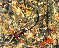
Jackson Pollock Abstract Expressionism
Alla prima essentially means executed in one session as exemplified by Jackson Pollock in his drip paintings. There can be no argument against this method of approach as both its demands and results can be superlative. After all, if a painting has any chance of reflecting the evanescent truth of the moment, it needs to be created in the same spirit, with a Zen-like accuracy and intensity.

the Mona Lisa
What then are the values or possibilities of a more indirect technique? Does a laborious technique result in a tedious and heavy painting (it often does!)? Can a painting developed indirectly still retain the freshness of the moment? If so, then how? Thus, for those who feel themselves drawn to an indirect method, the knowledge of ancient techniques is extremely helpful. Indirect painting simply means developing an image through a series of manipulations over time and calculated to achieve a particular result. A further refinement of the indirect painting technique is the mixed technique. Both allow for a methodological layering which in itself creates optical effects of great beauty and luminescence. Subject matter aside – what can be more eternal than that?
Encaustic
May 26, 2009
Encaustic:

portrait in encaustic
Interestingly, encaustic or hot wax painting, was known to be one of the major creative techniques used by the ancient Greeks. The Egyptian tomb portraits, which are some of the finest examples of encaustic portrait painting available today, were (according to Ralph Mayer) done by Greeks (not Egyptians). In recent times Jasper Johns has used the technique with a great deal of success in his series of images of the American flag. It is a technique that traditionally requires alot of cumbersome tools. Today the process has been streamlined with simpler tools but for purity, simplicity, and honesty’s sake I will try to describe the technique that I have used.
The Ground:
The Greeks reportedly used encaustic on walls and panels. A revival of the technique in the 18th/19th century concentrated mostly on mural painting – with reportedly insubstantial results, now 200 years later. My own experience has been entirely on wooden panels, prepared with traditional chalk gesso (the same treatment that is used for egg tempera).
Tools:
As the medium is melted beeswax, the first tool one needs is a pallette for mixing the colors in a molten state. Years ago, I went to my local metal junk yard and commissioned a pallette measuring 18″ x 28″ of 1/4″ steel plate welded on four sides by legs 5″ high (also of 1/4″ steel plate). This pallette then sat on top of a hot plate with an air space of approximately 2″. At the time, I remember it cost me about $10. The second tool one needs is a hotplate. The best are the kind that allow for variable temperature adjustments. A quick search at the local flea market should offer what you need.
Materials:
The same dry pigments that can be used for egg tempera can be used in encaustic. Purchase a few blocks of fine beesawax. Melt some wax and mix it with approximately 20% damar varnish crystals by volume. Mix this molten fluid together with a similar amount of dry pigment and keep it in a metal cup on the warmed pallette. Mix up a few colours as needed for the project at hand and keep them warm on the pallette. These days encaustic sticks can be purchased with the resin/oil component already mixed in. Your choice.

encaustic flag by Jasper Johns
Painting:
Molten colors can be applied using bristle brushes or even the pallette knife. As the paint hardens almost immediately upon contact with the panel, expect a highly textured, immovable result. [My original experiments were done outside in the hot humid summertime, so setting time worked slightly to my advantage.]
Burning In:
Further manipulations can be obtained by heating the panel surface with a heat lamp. Be careful to keep the surface horizontal to avoid runs. The final “burning in” is also done with a heat lamp close and evenly rotated over the surface to achieve a final fused result. In this way heavy impasto effects can melt into thin, veil like veneers.
There are some other resources for encaustic. The University of Delaware’s MITRA forum is an invaluable reference for artists on all things technical. Notebook is another. These days there are many blogs dedicated to the arts and crafts practice of encaustic. They can provide useful tips and tricks but, of course, it’s best to always do your own research by consulting tried and true technical manuals, like Reed Kay’s, The Painters Guide to Studio Methods and Materials. Englewood Cliffs, NJ: Prentice-Hall, Inc., 1983.
Egg Tempera
May 25, 2009

Egg tempera Medici Portrait by Botticelli
Egg tempera is an time tested technique, especially well loved by panel and icon painters. It renders flat graphical shapes and fine precise detail quite well. Softer gradual modulations are possible but take practice and patience. The unvarnished final work has an almost chalk-like finish to it. This technique formed the backbone-skill to any medieval or renaissance painter’s tool chest. The twentieth century has witnessed its revival with Andrew Wyeth being perhaps its most famous spokesman.
For anyone wishing to ask experts geeky questions about the medium check out the MITRA forum. In the past there has also been the Society of Tempera Painters (whose informative forum is currently offline). The Tempera Society had a well established site and forum, documenting many aspects of the process as well as related techniques. In its absence, I’d suggest picking up a good book and starting in. The online version of Daniel Thompson’s, The Practice of Tempera Painting is one of the most extensive sources around. Cennini is charming even if a bit antiquated in his terminology and procedures. If you are looking for something more general in order to get started, try Ralph Mayer’s “The Artist’s Handbook of Materials and Techniques”, Reed Kay’s “The Painter’s Guide to Studio Methods and Materials”, or “The Materials of the Artist and Their Use in Painting” by Max Doerner. All are tried and true comprehensive source books for the craft of painting.
Egg tempera is a paint made from an emulsion of oil and water. The final paint film is not as flexible as oil. Thus, to avoid cracking, the painting is executed on a firm and stable panel not on a stretched canvas. At the moment, I use egg tempera primarily as an underpainting. The links here on the right offer some info – by no means extensive – about how I prepare my gesso and panels.
Pigments:
Be sure to supply yourself with a good collection of dry pigments – avoiding poisonous materials whenever possible. You don’t want to breathe in toxic dust. By grinding your own paints you get to know the specific characteristics of each pigment – opacity/translucency, saturation, hydrophobic or philic, chromatic nuance. Online suppliers are very helpful if you do not live in a large city with a big art supply store. Get a thick piece of frosted plate glass and a glass muller. Otherwise a pallette knife and wooden painter’s pallette can suffice in a pinch. Grind up a small amount of each pigment you want to use in distilled water, making a smooth paste. The pastes can be stored in plastic film containers for short periods without drying out. To extend that drying out time I usually insert a piece of sponge at the top of the jar. Keeping it moist prolongs the life of the pigment paste.
The Egg:
Locate as fresh an organic an egg as you can. Crack the shell carefully in half without breaking the yolk. Carefully move the yolk between shell halves to isolate the yolk from the white (all the while protecting the egg yolk membrane from puncture). Let the white albumen drip away. Pass the yolk back and forth between the palms of the hands in order to dry it off. Roll it across a piece of absorbent paper towel for further drying. Eventually you should be able to pick up the yolk by it’s sac. Hold it over a small clean jar (empty jelly jars from hotels are great for this) and pinch the bottom. The pure yolk will drip out. Add an equal amount of distillled water, cap, and shake it. Store in the refridgerator.
Tempering the Paint:
On your glass palette add equal amounts of pigment paste and egg yolk. I use a palette knife to measure a “bean” of pigment paste and a small pipette to measure the same by dipping into my prepared egg. Mix until smooth. If you have already ground up your pigments in distilled water, then adding the egg binder now is easier and requires much less grinding. Some pigments will require more yolk, others less. To make sure you have tempered your paint correctly, Take a moistened sable brush, dip it in your newly mixed paint and lay a stroke on a nearby piece of window glass. It should dry quite quickly. Then take a one-sided razor blade and gently scrape the paint swash off. It should maintain its own consistency and curl off like a ribbon. If you have not added enough egg the pigment will return to powder and flake off. If you have added too much egg the paint film will lack chromatic saturation. Let experience be your guide. Soon you will get the knack of it.
When you are satisfied that you have tempered your paint correctly, transfer this mixture to a painting cup. I use a nested set of porcelain dishes that have a top cover. The tempered paint is rather thick, too think for painting, so at this point it is important to add additional water in order to arrive at the right mixture of pigment/yolk. How much water? Apparently, that doesn’t really matter. If your paint has been tempered correctly you can (if you wish) dilute it with large amounts of water so as to paint with many fine watercolor-like washes. As you work, it may seem as though the color is not building, but be patient and you will see that it does.
Painting:
Sable brushes dipped in this watered down paint will be too saturated for the painting stroke. Using your thumb and forefinger press the excess liquid out until the brush renders a clean full stroke without leaving behind a blob of paint at the end of the motion.
Egg tempera does well with many light thin strokes. Do not immediately rebrush a stroke. Let it dry, then add another level. Because it dries so quickly this is usually not a problem at all. In this way soft transitions can be achieved. But is is important to let your brush dance over your whole painting. Do not obsess in any one area, if it has not thoroughly dried it can become overworked and lift off earlier levels of paint, creating a hole that is difficult to repair. Stay light and playful, attentive to the whole work. Each artist decides how to use this medium to his/her own ends.
Fresco
May 20, 2009

fresco from the Sistine Chapel
Historically, fresco was used to decorate large interior spaces – often in churches. The Sistine Chapel remains as one of humanity’s great treasures executed in this technique. In the 20th century during the great depression, the WPA sponsored many public works in fresco which yet survive today. Working in fresco is very coarse, simple and elemental. The paint is applied directly upon fresh plaster. The chemical changes that occur as plaster sets lock the pigment into the surface. There is no eraser. Small mistakes may be able to be handled in fresco secco (no guarantee). Larger mistakes simply require a fresh start.
The information here does not come from long, in depth experience, rather this is what I know from a few experiments. If you are serious and interested, I recommed a good book, course, or seminar. Notebook is an informative disinterested site with more information as well as additional links. This site from Sister Lucia Wiley a (deceased) WPA fresco artist is quite informative and helpful. If you do not have a wall handy on which to experiment, the back side of large tiles from your local tile shop may offer a highly textured surface fully appropriate for your first fresco experiments.
Arrichio:
A wall that is ready for a mural must be of relatively even surface but coarsely textured. It must be solid and not allow moisture to enter from the rear. It is a good idea to wet the entire wall surface with a hose the night before applying the arrichio in order to insure a good bond. The arrichio is a mixture of slaked lime and sand (1 part lime putty to 2-3 parts coarse sand), applied about 1/2″ thick. It can hold the basics of the underpainting. If you are painting on tiles, you can omit this step and go straight to the intonacco.
Sinopia:
The full scale design or drawing can be transferred to the arrichio. The Renaissance Masters seem to have used red sinopa pigment for laying in the basics of the design. It will be covered by a final layer of plaster called the intonocco, so the purpose is to lay in the complete composition to determine relationships in situ, as well as provide a guide for the ‘giornata’.
Intonacco:
This is the final layer of plaster upon which one paints. It is a mixture of slaked lime putty, sand and powdered marble (one part lime putty to two parts fine sand plus 10% marble dust), applied approximately 1/4” thick. Be sure to wet the surface well to insure a good bond with the plaster (this is an important step in order to avoid the having plaster flake off a year or two later due to an insufficient bond). An amount of fresh plaster is mixed and plastered onto the wall (or tile) for one day’s effort (which is then called the ‘giornata’). The ‘sinopia’ (or design that has been laid on the arricio) is used as a guide to determine where to lay in the ‘giornata’. Artifical boundaries (like the traditional grid for transposition) are avoided, whereas edges of bodies, buildings etc..form natural boundaries. The working session for one day of fresh plaster can at best be 12 – 14 hours (depending on your external climate). Therefore, the design needs to be well thought out ahead of time in order to be able to complete the day’s section well and to allow it to invisibly merge with the rest of the painting. The color of the fresh paint may not exactly match that of the dried, so at least be sure that your pigment mixes are the same, then the dried painting will be fine. Allow about an hour for the fresh plaster to set before beginning to paint.
Cartoon:
If there is no sinopia, a monochromatic design rendered full scale for the project, is then transferred to the fresh plaster intonocco via a pounce bag tapped over tiny holes that have been pricked into the drawing. This can help one to work quickly and effectively. Be careful, the pricked holes become part of the final painting, so only transfer dark lines, or use a light to medium value pigment in your pounce.
Pallette:
Because the action of setting the pigment occurs as a chemical change within the plaster, the pigments need to be chosen carefully. Stick with known minerals from the earth as the lime burns organic and vegetable pigments. See the seperate page for fresco pallette recommendations. Using a pallette knife, simply mix a small amount of dry pigment with distilled water to create a useable paint.
Painting:

fresco WPA of Fisherman's Wharf
Now, finally, to painting. A tip on technique: as in watercolor, many dilute strokes can be absorpbed to build up color. In this way one can avoid large garish mistakes while gently building up the design. This of course, needs to be balanced with the need to work quickly. Remember to let an area dry before returning to it to apply fresh paint. Have on hand a variety of sizes of good sable brushes. Mix up your colors and tints before hand. Good luck. Have fun.
If you run out of time, or find small errors that need correcting, it is possible to continue in Fresco Secco after the plaster has dried.
the Indirect Method
May 20, 2009
Indirect painting simply refers to the method of using multiple layers or levels of paint to develop an image. A subset or refinement of indirect painting is the mixed method or mische techinique. The best general description of the indirect painting technique that I know of comes from the out of print book, “The Painter’s Companion: a Basic Guide to Studio Methods and Materials”, by Reed Kay. The book was originally published in 1961 by Webb Books, Inc. and later by Doubleday in 1972 with the new title “The Painter’s Guide to Studio Methods and Materials” .
I have followed his instructions with more and less success for a number of years. I’m hoping to attract others who also have done so and are willing and interested to share their experience. Please use the “Comment” link at the bottom of this article to post questions or experience.
“Indirect Painting
Indirect painting involves procedures in which the final effects in a picture are built up gradually by placing several layers of paint, one over the other, the upper layers modifying, but not altogether concealing, the lower layers.
Indirect painters put their first strokes on the canvas with the expectation that they will paint over them again when they are dry in order to change their effect in some way. Therefore when they put on the first layer of paint, called the underpainting, they do not try for a finished effect, complete in final color, drawing definition, and pattern emphasis. Instead at the beginning of the work they concentrate on one or two of these problems, and they depend upon (and make allowance for) the subsequent layers of paint to develop and modify the underpainting until the remaining problems are finally solved.
Indirect methods of painting have been employed in the past by many artists including Van Eyck, El Greco, and Rembrandt. More recently such painters as Soutine, Modigliani, Rouault, Braque, and Paul Klee have utilized the optical effects of indirect processes.
The existence of indirect painting arises from the fact that although paint may be used opaquely to conceal what is beneath it, it can also be applied so as to be transparent, revealing to a greater or lesser extent what it covers. For example, an oil color, such as cadmium red, in paste consistency may be brushed over an area of thoroughly dried yellow paint. If it is applied evenly and fairly heavily, it will conceal the yellow color entirely. Alternatively the red paint may be thinned with an appropriate diluent and may be spread so thinly over the dried yellow color that it lies over the yellow like a sheet of red cellophane, tinting the area a fiery orange color, while allowing the shape and every surface brush mark on the yellow area to remain visible. The orange tone thus obtained, by superimposing a layer of transparent red on an opaque yellow, will differ considerably in optical character from an orange made by combining the same red and yellow pigments in direct mixture on the palette. The directly mixed tone will have a weighty solid opacity, whereas the orange tone produced through the indirect, or “optical,” mixture of the two colors will have a more luminous vibration, rather like that seen in stained glass when light passes through it.
By exploiting this characteristic of the oil technique, painters found that they could develop a brilliant luminosity whose exact character was unobtainable in the direct techniques. The procedures most commonly used in indirect painting are called glazing and scumbling.
Glazing
A glaze is an almost transparent film of color laid over another paint surface, modifying the original tone of the area. It is usually a dark color placed over a lighter one. Some colors, such as alizarin crimson or viridian green, tend naturally toward a glaze-like transparency. Almost any color can be used as a glaze if it is thinned enough and placed over a lighter tone.
Scumbling
A scumble is related to a glaze in that it is a film of color laid over another paint surface so that it modifies the original color but does not completely conceal it. Unlike a glaze, the scumble is usually a light, semi-opaque color placed over a darker one. Some colors (Naples yellow, for example) are particularly suitable for this technique, but any color may be combined with opaque white and used as a scumble when it is placed over a darker tone. Scumbles are usually characterized by a pearly opalescence or by a soft smoky optical effect.
Mediums
The film of either a glaze or a scumble must be thin enough to allow the paint below it to be visible; otherwise the glaze or scumble would be completely opaque, and its chief characteristic would be lost. The simplest way to obtain the required thin transparent film is to take a little color straight from the tube-for example ultramarine blue-and rub it over a solid, dry, heavily applied area of light underpainting-let us say in this case, pure white. If the blue is scrubbed on vigorously with the brush or rubbed on with a rag or fingertip, it will spread over the white underpainting as a clear transparent tone of rich blue, which can be made lighter the more vigorously it is rubbed and dispersed. The white underpainting must be dry and hard as a rock to withstand the rubbing of the blue paint, or it will smear into the blue and produce a muddy mixture. If the paint is rubbed over too large an area, the binder may be stretched too far and may leave the pigment badly attached to the picture. However, most oil colors now on the market contain sufficient oil to prevent this occurrence.
A different character of glaze or scumble may be obtained by thinning the paint with a diluent or glazing medium, so that it need not be rubbed. This medium may be made up of various combinations of oils, varnishes, and volatile solvents. As in the case of the painting medium, the personal requirements of each artist must determine the exact composition of such a medium. A painter who wishes to glaze rather heavily and to obtain an even vitreous film over an area may want a glaze medium that can be applied evenly and rapidly to the picture surface. The artist may also want the glaze to set quickly so that the picture may be placed upright in a short time without the paint’s trickling. Such rapid setting mediums contain varnish or driers or both, along with the oils, and require a certain skill in handling, since they quickly become tacky and then cannot be reworked or easily removed.
In the original text this formula for a rapid setting medium is given.
- 3 parts by volume stand oil
- 2 parts by volume damar varnish(5-pound cut)
- 3 parts by volume turpentine
- 1 or 2 drops cobalt drier per pint of medium
In present times artists looking for a rapid setting medium would use Liquin by Winsor Newton or Galkyd by Gamblin.
Another painter may prefer a slower setting material so as to be able to deepen or lighten it, remove it or add to it, or reinforce modeling transitions with it. Such a medium might consist solely of stand oil with a little turpentine added.
In general, the less medium used, the better. The glaze or scumble should be made lighter or thinner by dispersing or rubbing rather than by adding excessive amounts of glaze medium as a diluent.
When discussing the merits or disadvantages of a given glazing medium, one must keep in mind the way it is to be used. If only small amounts of medium are added to conventional tube colors, such factors as the yellowing of a particular oil (sun-thickened oil, for example) or the possibility of redissolving a soft resin varnish (such as dammar) are much less hazardous than they would be if the painter were to use large amounts of the medium in proportion to the tube color. The practice of adding glaze mediums to oil paint until it has the consistency of a watercolor wash seems to me to be unnecessary and to magnify all the technical dangers of the oil technique. The desired effects can usually be obtained with less medium and more skill.
Notes
A. The glaze or scumble actually accentuates all brush marks and surface irregularities in the underpainting. Thus the character and direction of all strokes in the underpainting should be meaningful and consistent with the painter’s purpose.
B. Colors diluted with too much glaze medium may trickle. Sometimes such overthinned color develops small spots in the dry film which look like dust spots. Actually they are particles of color clumped together like islands of pigment in a sea of oil.
C. The underpainting must be bone dry before it receives a glaze or scumble.
D. Glazes containing so much medium as to create a glassy surface are dangerous, since subsequent films cannot adhere well to them and must crack at the first movement of the canvas.
E. Glaze films containing high amounts of spirit-resin varnishes (such as dammar) in relation to the oil and pigment content are extremely vulnerable to cleaning operations, since the varnish is always resoluble in the cleaning agents used by most restorers. Glazes that are the final or finishing films on a picture are especially vulnerable since they are usually thin.
F. Pictures glazed with slow-drying colors and very slow-drying mediums (such as walnut oil or poppyseed oil) should be shielded from dirt and dust while they dry.
G. Unsuccessful scumbling or glazing effects may be removed while the glaze is still fresh without disturbing the underpainting by wiping the surface with a clean, soft, lintless rag, moistened, if necessary, with a little turpentine. Such removals are possible only if the underpainting was thoroughly dry before the glaze was applied.
Technical Procedures
Technical complication and variety increase with indirect painting. One method frequently employed may be described in the following general terms:
1. A brush drawing involving only one or two colors is developed to mark out the important locations and divisions on the canvas. The paint is thinned by means of a “lean” medium (such as 1 part sun-thickened oil, 1/2 part varnish, 3 parts turpentine) to a brushable consistency which flows rather easily.
2. The dark and light contrasts are developed by the use of a “lean” fast-drying white (such as flake white) in all the light areas. [Flake White is lead based and therefore rarely used nowadays. Various manufacturers now make alkyd based fast drying whites that are less poisonous]. In the light middle tones the white is mixed slightly with another pigment (ocher, for example, or Indian red). Darks are produced by adding more color or mixed grays to the white, but all darks are kept much lighter than they will appear in the finished painting. The main effort, at this point, is to produce strong placement and gesture of shapes and volumes. These should be expressed broadly with little surface detail but should be accurate as to the relationships of the larger major pictorial masses. At this stage, the effect of this underpainting must be lighter, both in the lights and the darks, than the artist wishes the finished picture to be (Figure 3-16).
3. When this underpainting has dried thoroughly, color relationships are developed over the light monochrome by the use of glazes. These may be brushed on and then modified by wiping them down with a rag or a clean brush so that they emphasize and reinforce the drawing and movement of the underpainting.
4. Color effects are strengthened and made more definite by vigorous direct painting into the glazes (either when the glaze has dried or while it is still wet) with substantial strokes of opaque color. Glazes that have lowered the tone of an area too much may be scumbled over with a lighter color to raise their tonality. Drawing and edges are redefined, especially where glazing or scumbling has caused a passage to lose its initial strength.
Notes
In considering the many possible variations of this procedure, it is wise to keep in mind a few of the possible difficulties.
A. The glaze tends to darken the general tone of the picture. To compensate for this, the underpainting must be kept considerably lighter than the final painting.
B. The glaze and the scumble tend to create soft, unified, diffused effects. Therefore the underpainting should be strong, even somewhat “harder” than the anticipated final effect.
C. If the quality of the glaze is not relieved by some opaque painting and vigorous redrawing, the total effect of the picture may become too washy, spotty, and transparent.
D. In all indirect processes where more than one layer of paint is anticipated, successive layers should be applied “fat over lean.”
Copyright ©1972 by Reed Kay, “The Painter’s Guide to Studio Methods and Materials” (Doubleday & Company)
the Oil Pallette
May 20, 2009
I suspect that every artist has his or her favorite pigments and colors. It is necessary to find your own. It can be quite challenging at first to sort one’s way through the huge selection of colors available at any art supply store. Experience is the best guide. But that’s hard when you don’t have it.
Here’s what I use:
Color
- Two yellows (a cool and a warm one, like citron yellow and cadmium yellow medium)
- Two reds (a cool and a warm one, like alizarin crimson and cadmium red medium)
- Two blues (a cool and a warm one, like thalo blue and ultramarine blue)
The Earth Colors
- Sienna (burnt and raw, though I most use burnt)
- Umber (burnt and raw, though I mostly use raw)
- Mars Red (a red iron oxide)
- Yellow Ochre
Neutrals
- Two whites (Lead white and Titanium)
- Warm gray
- Mars black
From these basic colors I can mix just about any thing I need while maintaining a clear idea of how I got there. In addition, the spectral purity of a color can best be appreciated by employing it directly out of the tube, unmixed. Therefore, one can try to achieve certain ‘mixed’ colors through translucent layers of paint, rather than mixing on the pallette. Doing this means becoming familiar with the characteristics of the pigments themselves (opacity/translucency, saturation/tinting power and capacity to absorb oil). It also means using the translucency effects of the oil medium to create rich vibrant colors, that resonate like a sunset.
Light and Color
May 19, 2009
To talk about color divorced from whatever medium in which it is suspended means necessarily taking a theoretical approach. So, a small digression here:
There are many ways in which both the painter and the scientist approach color. For the scientist, a rational model is constructed to categorize and describe it as a phenomena. At colorsystem.com there is an excellent presentation in German of the various scientific theories that have been created over time. Additional to scientific theories, artistic color theories tend to be more relational, more psychological, and ultimately more visceral. The theories of Josef Albers, in ‘The Interaction of Color’ and Johannes Itten, in ‘The Art of Color’ are two such 20th century examples.
Another way to approach color involves viewing it from the standpoint of light itself, that is, additive and subtractive light. Notebook has an interesting resource page on the topic of Light and its qualities. Thus, while the painter’s craft necessarily exists in the world of subtractive light, by manipulating mediums and pigments to experientially stimulate thoughts, emotions and sensations, it derives – as does life itself – from the world of additive light.

additive primaries
The primary colors for additive light are red, green and blue. Thus, if three different spotlights are focused together upon one location, and one light is covered with a filter of red, the second of green and the third blue, the location itself will reveal white light to the human eye. The technologies of television, computer screens and color separation in the printing industry are all based upon additive light theory or RGB (red, green, blue).

subtractive primaries
The primary colors of subtractractive color theory are yellow, red, and blue. Every young child learns this in kindergarden. He/she learns quickly that yellow plus red makes orange, yellow plus blue makes green, red plus blue makes purple, and all three together create black (or a very mucky brown). I call this kindergarden primary color.

process pramaries
A further refinement to subtractive color theory are the primary colors of the printing industry. Rather than the yellow, red and blue of kindergarten, the printing industry uses process yellow, magenta, cyan and black. Process yellow actually contains the slightest bit of green in it – a cool, translucent, lemon yellow. Cyan is a translucent and dark turquoise kind of blue. While magenta is a cool, translucent ruby red, similar to the external fleshy covering of pomegranate seeds. These subtractive primaries, derived from additive light theory combine in different ways – principally through layering – to create the whole gamut of visual color that we experience in 99% of our printed material.
I tend to speculate that if magazine green never comes from green ink, then why should an artist mix his or her colours so easily on the pallette? Similarly, through the luminosity of oil, a painter’s green created from superimposed layers of yellow and blue is qualitatively a different experience than that of a mixed green on the pallette. Thus, since painting occurs in the world of reflective light, and subtractive color combinations are intuitively clear, it’s reasonable to ask, how much palette mixing is truly necessary if the beauty of light itself is the goal? Additionally, any colour we perceive in the natural world is always more beautiful in the degree to which it can transmit light. The ancient techniques for creating imagery are time tested procedures for isolating, cherishing and showcasing the spectral purity and luminosity of individual pigments. The medium of oil is particularly adept at transmitting light through layers.
The Fresco Pallette
May 19, 2009
Everything changes when you begin to do fresco. The whole process is a chemical reaction in the plaster itself that can take up to 6 months to a year to ‘cure’. So it’s really important to stick with known and trusted colors; the traditional pallette is mainly comprised of earth minerals.
Here is a list:
Browns
Raw umber – Natural earth – Highly Permanent – Tedancy to flour : needs a lot of binder
Burnt umber – Burnt natural earth – Highly Permanent – Mix it well before puddling the colour
Raw Sienna – Natural earth (Italy) – Highly Permanent
Burnt Sienna – Natural earth (Italy) – Highly Permanent – Mix it well with the brush before application
Purples
Cadmium red purple (genuine) – Cadmium sulfo seleniure – Highly Permanent
Reds
Venise red – Iron oxide – Highly Permanent – Very good light resistance – stable in mixture (Mars Red, Pozzuoli Red)
Cadmium red (genuine) – Cadmium sulfo seleniure (minéral) – Highly Permanent – Covering – don’t mix with leads or titanium white
Oranges
Mars orange – Iron oxide – Durable
Yellows
Yellow ochre – Natural earth – Highly Permanent – Many variations and shades of this exist, Italian, Greek, and French
Cadmium yellow (genuine) – Cadmium sulfide – Highly Permanent – Covering – don’t mix with white lead or with ultramarine blue
Greens
Viridian (genuine) – Hydraded chrome oxide – Durable – Very solid in mixture – use it in glazes
Chromium oxide green – Chrome oxide – Highly Permanent – Covering and coloring – very stable in mixture
Green earth (Terre Verde) – Natural earth – Highly Permanent
Blues
Ultramarine blue – Silico-aluminate of polysulfuretted sodiums – Highly Permanent – Luminous and intense – don’t mix with chrome yellow
Cerulean blue (substitute) – Barite sulfate and phtalocianine blue – Highly Permanent – High colouring capacity
Cerulean blue (genuine) – Cobalt stanate – Highly Permanent – Opaque – unvarying in mixture
Cobalt blue – Cobalt aluminate – Highly Permanent – Excellent light resistance – stable in mixture
Black and white
Titanium white – Titanium dioxide – Highly Permanent – Don’t mix with cadmiums – luminous – intense
Lime white – slaked lime – Highly Permanent – dull highlights, natural plaster tint
Lamp black – Carbon – Highly Permanent – the favored black for fresco
This blog space is for those who are actively working with these pigments and who want to exchange information about them. Thus additions and corrections are welcome.
Medium and Pigments
May 18, 2009
Pigments ground into an appropriate binding medium create paint. The medium defines the paint: the handling (brushwork and siccative qualities), viscosity, translucency, toxicity and permanency. Oil paints are pigments ground and suspended in linseed oil, as acrylics are pigments ground and suspended in acrylic resin. Watercolors are pigments suspended in gum arabic and egg tempera is pigment suspended in the yolk of a fresh egg. Encaustic uses resinated hot wax, while for fresco the setting of the fresh plaster creates the permanency of the water diluted pigment.
Quite naturally, the medium has it’s own qualities which then become a matter of personal taste, capacity or preference. Oil, acrylics and encaustic as mediums, leave a tactile residue of their own quality. Does that quality resonate within you? Find out! All mediums require a support, as for some like watercolor or fresco the support plays a critical, essential role. Do the qualities of the support resonate within you? Find out!
Most modern artists don’t need to grind their own colors to practice their art. However, for the artist working in fresco or egg tempera contact with the powdered pigment is essential. In addition, knowing which pigments to use for which medium is critical not only for successful in-the-moment-handling but also for longevity and personal health. Manuals like ‘Artist’s Handbook of Materials and Techniques’ by Ralph Mayer or Max Doerner’s ‘The Materials of the Artist’ are time honoured general resources. Daniel Thompson’s ‘The Practice of Tempera Painting’ is probably the best comprehensive resource for the tempera painter. Each pigment has its own nuances of hue, saturation and value, also transparency and opacity. Getting to know both mediums and pigments qualitively is a real and exciting adventure. At makingpaint.com you can find extensive information from another working and experimenting artist.
Finally each medium defines its pallette. Fresco due to the chemical interactions of plaster and pigment offers perhaps the most limited choice, while oil may offer the widest. Becoming familiar with pigments and mediums up-close-and-personal is like becoming a master chef. You choose the ingredients based upon experience and a good cookbook, but it’s the attention to detail in the processing that determine a truly successful dish. And who doesn’t enjoy a well prepared meal? Should we treat our eyes with any less care?
Silverpoint
May 15, 2009

Hans Holbein silverpoint
Silverpoint is another ancient technique that is receiving renewed attention these days. Jan van Eyck and the Flemish masters are reputed to have regularly used it as a drawing tool. Artists like Picasso and Joseph Stella brought it into the 20th century art world. The final design stands softly but well on its own or can be incorporated as an underdrawing into a painting.
There is an informative site at silverpointweb.com which offers a lot of practical information as well as sales of silver tips and a ground for the drawing support. I bought some of my pure silver tips from him a few years ago. The silver renders a soft, warm gray line that can darken upon exposure to light – just like the silver content of a photograph. The line itself is indelible so it cannot be erased. Another experiential resource is international silverpoint archives.
Drawing with silver is a very simple but time consuming technique. A thin piece of silver is inserted into a drawing stylus instead of a piece of lead. The silver can be obtained from a local silversmith. I have used both pure silver and sterling. The pure silver is reputed to create a slightly darker line, but I have not yet noticed the difference (which could be due to my gessoed surface not having enough tooth, so take my experience with a grain of salt). Points can be chiselled fine or beveled. Darker tones are achieved by repeated gestures and not by an increase in pressure.

silverpoint Joseph Stella
The drawing surface seems to make a great difference in results. The surface should have a slight “tooth” to it, to draw out the silver particles. I have used both white gessoed panels and toned paper. The toned watercolor paper clearly had the tooth to pull out the silver, but the value of the silver was so close to that of the paper that I finally opted for the white panels. Thus far the panels have given fine results which I have then used as underdrawings for some of my paintings.

